Friday, February 26, 2010

What Passes For Fine Art

I happened onto a website the other day offering "fine art" prints. The prices were pretty exciting to say the least. Here was a person I'd never heard of offering ink jet prints for as much as $1000.00+.  A quick check using Google confirmed that, basically, no one else had heard of this individual either.  I looked at the portfolio being offered and saw shots that looked like the early days of my pushing buttons in Photoshop just to see what would happen. One looked like it might have been taken in Italy somewhere and had a four point posterization filter applied. Another looked suspiciously like an image with a Water Color filter stuck on it. If someone is going to just push buttons and pass it off as art, they'd better rethink their pricing. Today's image took a lot more steps than a single button push. To find out what was done, hit the "read more".

Read more!

Wednesday, February 24, 2010

The Start And The Finish

Today's image is another one of those that has a fairly dramatic change from what came out of the camera to what ended up in the frame. The thought process was that the image needed to be much "darker" in mood than the light, airy window scene that was shot. Producing the drama was a project that does take longer than the quick "corrections" that we normally do to create a fine art piece. There are several major changes to get to the final print. Cropping is obvious, as is coloring the sash, the liquids, the stoppers, and the floor of the bay window. The number of individual layers adding up to the result is considerable. Each color change is on its own layer. Each burning and dodging has its own layer. Every angle of the mullions (center dividers in the window) has its own coloring and layer. There are clipping layers, blending changes, and flips from RGB Mode to LAB Mode and back. The layer panel looks like a scroll rather than a panel. If you'd like to find out more about the changes in the color of the liquids, hit the "read more".

Read more!

Monday, February 22, 2010

How To Get A Model To Pose

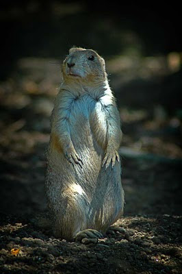
Based on the title of today's post you might think it's a little "tongue in cheek". It's about impossible to get a "critter" to pose, unless the little guy is of the inquisitive sort. Some animals are shy, some are bold and threatening, some are just curious. I'd like to say we snuck up on this guy out in the tall grass, but the truth is he was in the St Louis Zoo. Max (that's what I'll call him) and his buddies were wandering around their enclosure, popping up on their hind feet every once in awhile. They'd sit there for a moment or two and then scamper off to play. The key to isolating a "model" like Max is to use a shallow Depth of Field (DoF). Keeping the subject sharp and creating some bokeh as a background serves to "pop" the subject out from the background. Some people object to zoo animals in photograph. Their thinking is something along the lines of not enough suffering went into "getting the shot". I don't know? I don't "suffer" a whole lot when I set up a top table or do a product shot with a light tent in the gallery. I'm nice and warm (or cool, depending on the season), I have a beverage nearby, I'm controlling the light and life is good. There are times when a field trip is called for and hunting down an elusive whatever is the way to go. If a client is paying you for a shot of a mountain goat in Rocky Mountain National Park you'd better not try to fool 'em with a shot taken at the local Cabela's. If you'd like to read the story about how we happened to be at the St. Louis Zoo, read the "read more".

Read more!

Friday, February 19, 2010

History Has No Buttons

One of the things I've done as a result of thirty plus years of interest in photography is judge a lot of photo competitions. Something that's sure to garner a photographer a lower than possible score is obviously punching buttons without knowing a little of the history of what the effect is. In Photoshop there's a filter called Solarize. People will click on it, see an interesting effect and say they created an artistic image. Some think solarization, or more accurately the "Sabattier Effect", is something out of the minds at Adobe. The reality is that it's an effect that's been around for about 180 years. Some of the legends of photography are names associated with early experimentation with image manipulation. Have you ever seen, or heard of, a "Daguerreotype"? Louis Deguerre mentioned the effect in some of his notes. He didn't have a name for it, but through experimentation he described it. One of the attributes of solarization of an image is the development of Mackie Lines. Lines of contrast around the most prominent edges of elements in the image. Alexander Mackie is credited with being the first to describe the lines found in the effect. Today's image is obviously not a solarization of the scene, but is another old, wet darkroom effect. To find out what the effect is and how it has become a "button" to push in Photoshop, hit the "read more".

Read more!

Wednesday, February 17, 2010

Make Sure It's Right In The Camera

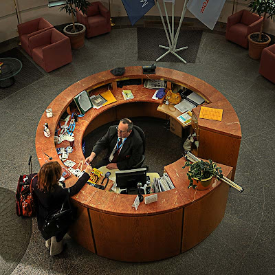
About ninety percent of the entries on this blog have been about how to do things in Photoshop. You might think that the photography is a minor part of what goes on in the gallery. Actually, getting things right in the camera and then playing is about one hundred percent of what we try to do. To take a poor shot and fight with it to make it into an acceptable image is way too much like work for work's sake. Today's image is a case of getting it right and then finishing it using Adobe ACR (Adobe Camera Raw) or Adobe Photoshop Lightroom or Adobe Photoshop itself. The unique angle of the shot appears to be a natural light shot. Just point the camera and snap the shutter. A couple of things were going on when the shutter was clicked. An SB 600 Nikon Speedlite was fired through a shoot through umbrella, camera left, held high on a stick. If you look, you'll see the modeling on the face of the man at the desk. There's detail throughout the image, even under the desk. All this with an SB 600. Nikon's lowliest flash capable of general use with Nikon's CLS (Creative Lighting System). (The lights that go with Nikon's R1C1 close up rig are specialized and not counted in this discussion. I have the R1 set up and am familiar with its use.) If you'd like to know more about "why" SB600s and "how" the extension stick was made, hit the "read more".

Read more!

Monday, February 15, 2010

It's The Simple Things

Sometimes we make "hard" the point of what we're doing. Today's image "looks" pretty simple, but it took more work than you might expect. Things that should have happened in the camera didn't. The light spillage on the background made it a very dark gray rather than a pure black. The angle the stem comes into the shot was steeper than what's apparent and the "in camera" crop was too tight to allow for any rotation. Basically it should have been scrapped and reshot. Instead it became a Photoshop project. If the potential of an image doesn't start to develop in the first couple of minutes or if it looks like it's going to take an inordinate amount of time, it gets to the point of ending up with the image relegated to the "never was" bin. The early days of messing around with an images for hours on end just isn't necessary any more. I have discussions with people, see articles in magazines or view tutorials online where very clumsy methods are used to accomplish a task. When face to face with people willing to learn (as I like to think I am) and hear that they're using a method that works, but means fighting to get the job done, I'll put my two cents in (politely of course) and show/explain a technique I've incorporated into my workflow. They can take it or leave it. (After all, free advice is worth what you pay for it.) I've spent about ten years studying (actually studying) Photoshop. Methods I used six, seven or eight years ago have been supplanted by much better, easier techniques that not only produce better results, but are typically much quicker. Rather than fighting with an image I work with a image to do what needs to be done to bring out its potential. To find out what needed to be done to today's image, hit the "read more".

Read more!

Friday, February 12, 2010

Setting A Mood

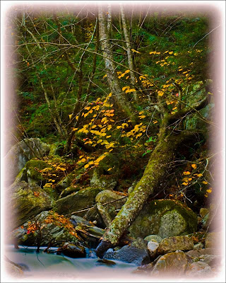
Sometimes you want to set a mood with an image. That's the case with today's image. It has a couple things working for it. It's toned down to show the darkness of the forest in the early morning light for one. Another is the use of the reverse vignette. Not all vignettes have to be from a lighter center to a darker edge. Here we see the image fading off. The branches of some of the trees can be seen going out into the softening edge. There a few things to consider when you have this sort of image. Just the same as a properly produced music album (CD) has an ebb and flow to it, so should a gallery show. If every image is bright and cheery there becomes a sameness and the show quickly grows boring. Again, like a music album, you want to have a break in what's expected. A rock band with a ballad or two space out within the selections gets more attention than "just another" rock song. Broadway shows are the same. Take "Les Miz" as an example. A pretty sober story about redemption where the hero dies in the end. In both acts you find light moments with the innkeeper and his wife. They bring the mood up before going on with the morality play. The same thing, like the music album or the Broadway show, holds true for a gallery show. Today's image was the lead image as people entered the building. Further along they came across many of the images you can find here on the blog. Scattered about were images of total whimsy, meant to put a smile on the face of the viewer. What I consider to be the "best of show" image wasn't the last image in the walk through. It came just a couple positions before the end. If you'd like to find out more about how today's image was finished, hit the "read more".

Read more!

Wednesday, February 10, 2010

The Importance Of A Vignette

I was at a meeting last night and one of the folks there asked me how often I put a vignette on any of my images. My response was "every time". Today's image gives an example of the improvement that is made to a shot simply by adding one more step to your processing. In order to make sure the effect of the vignette can be seen in the "for the web" version of the shot it has been left pretty ham handed. If you look at almost every image posted here on the blog you may be able to see a vignette on the image. A notable exception (since it's the posting just below this one) is the highly graphic type of image recently featured. Today's discussion is a little unusual because to shows the finished image, the next to last step and the vignette itself. We'll take them in order. The shot on the upper left has been color corrected, selectively blurred and sharpened. (Blurred and sharpened is not as strange as it might seem.) Lower Left is the vignette itself and the right hand image is the finished shot. To find out how the vignette was made and applied, hit the "read more".

Read more!

Monday, February 8, 2010

Using A Bald Sky

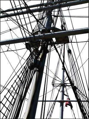
Over the past month or so we've had three or four posts about replacing bald skies. A straight replacement, a replacement when a mask was needed to clean up some stray highlights and using a replacement to tone down highlights in areas other than the sky. Typically, bald skies are the kiss of death for an image, but in today's image the bald sky is an major element, it's the thing the sets off the shot. If the drab, gray sky had been left in the image would have been a muddy mess. With the stark contrast between the lines, mast and spars and the completely blank sky we end up with a powerful image. The spot color of the red stripes of the flag, positioned just below the intersection of thirds in the lower right corner draws the viewer's eye to the important "statement" of the image. The message of the shot becomes very clear. We realize the primary element of the image is a "tall ship". A symbol of the might of the nation when it was young. We call attention to the country the ship belongs to by the spot color in the flag. To find out about how this image was created, hit the "read more".

Read more!

Friday, February 5, 2010

Is Architecture Editorial?

I think just about everyone knows or has heard stories of the perils of editorial shots being sacrosanct and nothing can be done to them to alter the reality of the scene. Photographers have been fired for adding or subtracting elements from their shots. The dilemma for today's image is, has the "reality of the scene" been altered? Looking at the shot it does pass as a straight shot, something right out of the camera, but. ??? Was it? Well, it should be sort of obvious that "something" was done if the question is being asked. The entire interior is exactly as shot. The only things done to that portion of the image are things that are definitely permitted in editorial usage. Color correction, sharpening, straightening the shot up, a vignette and possibly removal of sensor dust that shows up in the shot. All within the realm of what's permissible for editorial. So, if everything inside the building is "within spec", the discussion has to center on what's outside the building. To hear about what's going on beyond the building, hit the "read more".

Read more!

Wednesday, February 3, 2010

Sometimes You Feel Like You're On Top Of It All

First thing I'd like to do is give a shout out to the folks over at ALLTOP. Alltop is a news aggregator where you can plug in a search term, such as Photoshop, Photography, Lightroom (the three I use) or just about any other topic you might be interested in and it'll gather up a large array of sites based on the subject you've specified. I use it every day to do a quick catch up on the things that directly influence things around the gallery. Well, if you were to do an Alltop grouping of all things Photoshop, The Kayview Gallery will now show up on the list. It's an honor to be listed among some pretty select company.

It sort of rare to find a landscape image with the diverse color range that we see in today's image. Coming directly out of the camera as a raw file it looked very little like what you see here. It's one of the few shots I've had where every single color was muted. At first glance it was a pretty dull, drab looking set of pixels. Contrast was another problem and there was no snap. If ever an image went from an ugly duckling to a beautiful swan (by comparison at least), this was it. Is it the definitive shot of the Grand Canyon? No, but it does capture, for me, what I saw stand on the edge of the abyss. To find out how this shot was "developed", hit the "read more".
Read more!

Monday, February 1, 2010

Playing With Post Production Lighting Effects

If today's image looks somewhat familiar, not only do you have a good eye, but you've been reading this blog since the wee small numbers. A similar shot (same flower, different pose) was used back in May '09, more the one hundred posts ago. I was flipping through the files, looking for something to build a topic around and came across the session where the shots of this flower lay. I wondered if I could figure out how to resurrect an image that had been passed over before. The problems with today's raw shot were many. The flower was tilted toward about ten o'clock, the stem came directly out of the southeast corner, there was too much negative space above the stamen and on and on. It looked sort of bleak. I didn't want to spend a lot of time on it, so I gave myself a limit of five minutes to make it look promising and no more than a half hour to complete the transformation. As soon as I did a Select All (CRTL A) and Free Transform (CTRL T) I thought I had something. Turning the flower from the thirty degree angle to the near vertical did a couple good things, and several bad things. The good included giving the flower a much more pleasing appearance while bringing the stem out from the absolute corner to a more manageable location. Since the shot was reasonably tight, it also gave blank white triangles of non-image in each but the northeast corner. To find out what trickery I used to fill in the corners and "light" the flower, hit the "read more".
Read more!