Seems like anyone not jumping on the HDR (High Dynamic Range) bandwagon is doing panos. You'll see articles in magazines and online about one or the other. Those writing about panographic shots usually talk about tripods, locking exposure values, locking focus, and overlaps of about 30%.
More after the jump. (Click on the "Read More" link below)
Panos were shot long before digital photography was ever thought of. In the '40s there were specific panographic cameras. The lens would move across the plane of the film and take a very long singular image. This technique was used, a lot, in taking group shots, such as high school graduating class group photos. Sometimes it's easy to spot shots taken with these cameras. Because the lens moved slowly across the entire group (and the fact that these were teenagers) you can, occasionally, see the same person in several areas of the picture. An enterprising student (typically a guy) would be on the left end of the group and show up on the right side also. Being fleet of foot was helpful in this type of endeavor.
A third method (multiple shots being #1, pano cameras being #2) is available and has been since the beginnings of photography. It's called "cropping". There's nothing wrong with this method. That's how today's image was formed. Cuckolds Light, at the mouth of Boothbay Harbor, Maine is on an island. If you read the descriptions of Cuckolds they'll typically say it's best shot from a boat. Now, a boat on the water is not really conducive to making a pano using the multiple shot approach. I haven't seen any, specifically built extreme wide format digital cameras. If there are such beasts they would, undoubtedly, be far out of my price range. I'd have to become a pano maniac to justify the price.
So, we're left with cropping. With today's high megapixel sensors, in even point and shoot cameras, cropping is a legitimate option. You can't go crazy with it, but if your final result is something less than a wall sized print you should be in good shape. Companies like MPIX offer pano printing to sizes like 10" x 30". I'd be tempted to have one made of today's image, but I'd hold my breath and cross my fingers that it works. If the image had been cropped only from the top and bottom I'd have no worries, but there was a little bit taken off the right side of the image to improve the drama of the shot.
One way to have fun with panos is the multiple shots being stitched together method. Another is to create drama with cropping. Panos are fun. I'd recommend you try both methods, depending on what you're presented with. Either way it's an interesting way to showcase an image.
Read more!
Monday, June 29, 2009
Friday, June 26, 2009
My Art Versus Your Art - The Great Debate
They say that art is a subjective thing. I'll go along with that, but the image we're talking about today is not an image of Christos work. The lamp itself could be considered a work of art in itself. If we were to limit a photographer to only those things man didn't have a hand in we'd all be nature photographers. One of the things we do as photographers is try to "see" art in combinations of objects. A bowl of fruit for example. Someone crafted the bowl, if it's mass produced or individually thrown on a potter's wheel. It's someones creation. Same with a really great shot of a locomotive, a lighthouse, a bridge or a cityscape. Yep, we are recording what's in front of us, but it's the way we make that recording that makes an image "our" art.
Read my thoughts after the jump.
Today's image certainly can be called art on it's own. If it were to be published for money it would be nice to give Christos a nod, but I can't imagine splitting the payment with him. His "art" isn't recognizable on it's own. Without the orange frame or the inclusion of other "Gates" the drape becomes just that, a drape. It could have, just as easily, been in the studio. There are bedsheets of the same color and five minutes in Photoshop could have produced the same thing. If something is in the public domain, available for anyone to freely view, it would be difficult to successfully keep a photographer from using it as an element in her/his artistic creation.
Obviously you wouldn't be able to pay money, walk into an art museum, grab a shot of a famous painting and say "hey, look at my art". If you had to pay money to get to the place where the original artwork resides, it ain't your art. In fact, you might find yourself on the arm of someone in a uniform being escorted toward the door. On the other hand, the Minuteman Monument, Fisherman's Memorial, the interior of the Guggenheim Museum have frequently been the subjects of photographic art.
How far you can, would, should go is up to you. There are plenty of people willing to tell you where the imaginary line is that separates your dipping to far into someone else's art pool Read more!
Wednesday, June 24, 2009
Risking Life and Limb - or Maybe Not
Photographers are a nutty lot. All you have to do is go to Flickr or any of the photo sharing sites and you can find images where the photographer had to be in some very serious places. Today's image looks easy enough, it's actually right next to the road. Trouble is ... it's right next to the road. The car couldn't have been more than 25' away. The road in this case doesn't run beside the waterfall, the waterfall runs under the road at this point. My back was up against the wall of the bridge going over the water. The arched gap the water flows through is right on my right shoulder. The biggest problem is that the rocks were wet and slippery.
A couple things are apparent about the shot. The silkiness of the water says the shutter speed was slow enough that this wasn't taken handheld. So, add a tripod to the gear to haul down the wet, moss laden, non-trail. It's a rock scramble to get down to this point. The only thing keeping me upright was a few twigs I talked myself into believing were strong enough to save me if needed. Once in position the tripod legs were spread out to the maximum possible. In this case the max possible was about 6" . The camera had to be set low to get the right angle on the falls. That meant squatting down, which proved to be a problem in it's own rite. Every time I started the squat my butt would hit the rocks of the bridge and pitch me forward. The first time came as a surprise and almost launched me into the stream. I finally got a series of shots and that's when the fun began. Getting down the 15' or so from the road to the edge of the stream was tough, but getting back up proved to be an adventure of it's own.
The thin trees I relied on to get down were no match for putting weight on them for pulling myself back up. After ripping the first few out I determined they weren't going to be very helpful. So, now I have a camera, a tripod and no way to get out. The water flowing through the bridge opening was fast enough as to make going though to the other side another bad choice. I actually had to climb up the rocks on hands and knees, resting the gear on a rock and pulling myself up to match the height of the gear and repeating this several times. All this for a lousy 15'. You would have thought I was on Denali.
I'm sure very photographer reading this has similar stories to tell. Isn't it amazing what we'll do to get a shot. Just proves photography leads to some sort of mental illness. We all must be crazy. Read more!
Monday, June 22, 2009
Plug-ins and TV Dinners
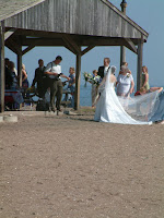
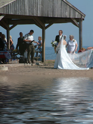
Take a look at the two images in today's post. What happened to the water in the smaller shot? The left hand shot is very dramatic. The bride and groom standing on the edge of both the water and a new life together. Did the tide go out that far? Could it be that the shot was taken up on the Bay of Fundy, location of the world's highest tides. The time difference in that case could have been just a moment or two. (The tide does roll in or out that fast up there.) It would have been interesting to tell everyone at the wedding to freeze for a couple of minutes while the tide rises. The other alternative is that I was up to my neck in water and for some insane reason decided to make the shot less interesting by removing the water. There's another option and that's the subject of today's post.
.
The image on the left has been "doctored" using a plug-in. Plug-ins are add on pieces of the Photoshop puzzle. They're made to make life easier for the user. They're sort of like the Automatic or Program settings on the camera. You can wind up at the same spot using the camera in Aperture Priority or Shutter Priority or Manual modes, if the photographer has a good grasp of what the camera is doing or what adjusting the aperture does to the shutter speed. You might want to control the shutter speed by adjusting the aperture. If you have an idea how the camera works with light you, most likely, won't run your camera on Automatic or Program (there are cases where you might play with Program, but never (???) on Automatic). In the Automatic mode the camera makes all the decisions and the person at the controls in only there to adjust composition (and that only marginally). Plug-ins can't do anything that Photoshop doesn't allow. That doesn't mean plug-ins are bad.
.
Plug-ins, such as the one used on today's image, make life easier (or maybe "Automatic"). The plug-in used today is from a very clever company named "Flaming Pear". (name is a link) They make a variety of plug-ins to make different effects. This one is called "Flood". When you invoke the plug-in you're presented with a dialog box with several options. You can decide how high on the shot you want to apply your "shoreline". You have control over the shape and frequency of the "waves", the type of wave and the shading the wave has. The thing is, you can do all of this is Photoshop. You can copy and flip the image, apply a blur, use the "Distort" filter to produce a wave ripple and on and on. The trick is that you (one) have to know how to do all that and (two) have the time to go through a twenty or thirty step process to get where you want to go. Using a plug-ins can be like putting the camera on the Automatic mode and just punch buttons or it can be like using the Aperture Priority mode. In AP mode or in many plug-ins you are the decision maker. AP or the plug-in is there to do the heavy lifting. There a lot of mathematics being done by the camera in AP mode, just as there's some serious math being done within a plug-in.
.
Plug-ins are great devices for Photoshop users. They cut down the time a professional needs to spend to achieve an effect. They're worth every penny a working person spends if it speeds thier work flow. They're also a crutch for many who have no idea how their camera or Photoshop work. Just like kids today rely on computers or calculators to do math and have no idea how to make change when flipping burgers, an emphasis should be put on understanding what that time saving plug-in is doing before relying too heavily on them.
Friday, June 19, 2009
Sticking With a Theme
You, like me, probably come back from vacation with a ton of images. My brother-in-law and sister-in-law just got back from an Alaskan cruise. Sister-in-law said she took over 500 pictures. That's a lot for a non-photographer for seven days. She also said, when she looked through her images, that she couldn't believe how many were close to be the same shot over and over again. I'm not sure if they had all 500 printed and then culled through to find the ones that wound up in the little photo album, or if the selection process was under way before the printing was done. In any case, they ended up with thirty or forty shots to be able to relive "the trip of a lifetime". Chances are good that, unless they really fell in love with Alaska, the trip was a "one off" and they won't be there again. To have a small book with forty (?) shots that tell the story of the trip and capture the memories is a great thing. To do anything that serves as a record, saying "we were there" or "we've done" this or that is something anyone with a camera should strive for. That goes for the person who just got a camera or for a grizzled old shooter who's been behind the lens for a hundred years. There are shots that are saleable and, chances are, the veteran will get more of those than the newbie. But, if the "old hand" gets so jaded that he/she looses sight of the joy of capturing moments just for the moments sake they've lost something rather important, and not just a simple, personal image.
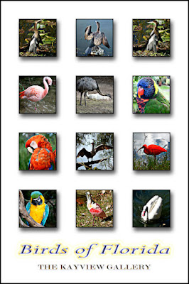
The "poster" for today's post is another way to, simply, keep a memory fresh. The actual "poster" hangs on the wall of the playroom at the house. We spent some time down in Florida a few years back and came home with thousands of shots. Some shots of the birds we saw were saleable, these were not. They did, however, give a small representation of some of the birds we'd seen. That Florida trip was long enough ago that it was about the time I made the jump to full blown Photoshop (v. 7.0). I decided to play with setting something up in a grid. I was interested in learning some of the more basic things PS can do. I was happy to find the ability to do a "Stroke" around each image. To add a Drop Shadow to give the illusion of depth. To over play the Outer Glow function. At the time I thought this was pretty hot stuff, so I had a 20" x 30" poster made of it. It's a reminder of our trip to Florida, but it's also a reminder of the joy of discovery when I was just starting out with Photoshop. I don't pay a whole lot of attention to the poster as I pass, but once in while it catches my eye and I smile, for two reasons.
Take a look at Moose Peterson's Blog (his name is the link) and try to find one of the posts where he uses "the Moose Cam" to demonstrate some technique or place or anything that comes into his head. Typically he's shooting his stills at some wildlife that's standing reasonably still. Sure, the head turns, the eyes open or close, or the subject moves a little, but most of Moose's work is animal portraits. If you listen to the narration in the video from the Moose Cam you'll hear him fire off a couple of shots. He's on high speed shutter control. He calls this making in camera backups. Not a bad idea. Read more!
Wednesday, June 17, 2009
Chaos, Cacophony and Color
I've been yakking about finding the center point of the shot and drawing the viewer's eye to that area. Sometimes the biggest thing the photographer has to figure out is what is the "focus" of the image. The shot accompanying today's post is of the inside of the Port Clyde General Store. The outside can be found in the center of the banner of this blog. It was also the first ever post here. So, what is it we're looking at in this shot. It certainly isn't the bottles of Aquafina (r) water for $.99 in the back refrigerator case. It's probably not the eggs or the butter, the 12 packs of soda or the Ortega jerky snacks. It's color. You can find just about any color of the rainbow here. Is this a saleable print? Probably not (unless you happen to own the store). It's just fun. It's an exploration of how far the colors can be pushed before it becomes a cartoonish "illustration".
In the original you can enlarge parts of the shot to see the labels on the stock (to a point). If you enlarge the image (in the original, I wouldn't bother trying it in the web quality image here) you can make out the fact that it is Aquafina water. That the red sticker says it cost 99 cents, but you almost have to squint your eyes and select just the right amount of enlargement to make it out. It kind of makes me think of the difference between a "photograph" and a "digital painting". The absolute master of digital painting is, in my opinion, Bert Monroy. (Bert's name is a link to his website.) Featured on his site is his work titled "Damen". Click on the "Take a Closer Look at Damen" link. Although the image looks like a stylized photograph, it's actually created by hand, each piece faithful down to the last nut, bolt or piece of rust. The "Depth of Field" is 100%, front to back. You can't get as much detail in a photograph as Bert produces in his work. Check out the size of the finished image. Just to put it in a frame of reference, he's now working on his next painting (about Times Square) that makes Damen look small.
The object of today's ramble is that the person playing with the pixels has to make choices, to make compromises, to decide what the important part of the shot is. In the case of today's image, it's color. A celebration of color. A riot of color. Color for color's sake. Sometimes we don't need to be moved by an image, we just want to be tickled by it. Read more!
Monday, June 15, 2009
Focus the Viewer's Eye
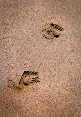
Too often I see images where the photographer "finishing" the shot forgets one step. The image is left for the viewer's eye to fall off the edges of what's presented to them. Today's shot is extremely simple in it's composition. A diagonal line from lower left to upper right. Two foot prints, yet it tells a story. Someone was the first person of the day to walk on this portion of the beach. I tend to refer to this type of image as a "wandering" image. One that takes the mind on a flight of fancy. It could be anywhere (well, anywhere warm enough to have someone walking on a beach). It could be anyone. A Robinson Crusoe, along on a barren island. Maybe the person is out in the morning, running to be first in the water. Is the shot taken close to the ground and the feet are very small, or taken from a height and the feet big? The one thing that keeps you "in the picture" is the slight vignette holding you, directing your gaze, not allowing your eye to fall out of the frame.
The "frame" of an image doesn't have to be a piece of wood or metal surrounding the paper the image is printed on. It can (and should) be an integral part of the "finishing" of a print. The eye should be held in the shot by something other than a physical frame. It should also be subtle. There, typically, isn't a reason to beat someone over the head with the vignetting. Occasionally it'll work, but that would be a very rare occasion. If it gets that bad, you might as well put flashing arrows saying "look here". The only thing the viewer should be thinking is the he/she doesn't want to leave the subject of the shot. Anywhere looked at should delicately redirect the person viewing the print back to the area the photographer wants.
Putting a vignette on an image (in Photoshop) couldn't be much simpler. If you have many layers (more than one) affecting the image, first make sure the upper most layer is selected. Get a composite of the completed image by clicking on (get this one) Crtl, Shift, Alt, E. This will put a flattened copy of your image at the top of the stack. Select the Marquee tool and set the "feather" to a reasonably high amount (about 15% of the image's width). The reason for not suggesting a specific number is that we haven't discussed the resolution of the image. If you have a very high resolution image it would be one number, a lower resolution would be a very different number of pixels. Create a marquee, centered, leaving somewhere around 20% of the image around the outside. On a 16" x 20" I'd start at the 2" x 3" point and drag the marquee to about the 2" x 17" point and pull the "marching ants" out to the same dimensions on the right side of the image. Once you have the marquee set, click the delete key. Looking at the thumbnail you should see the the center has been punched out. Change the "Blend Mode" to Multiply. You'll see a fairly dark outer edge of the image has been produced. Use the "Opacity" slider to give you infinite adjustment over just how dark the vignette area is. This is, by no means, an absolute. You may want your vignette to be off centered to draw the eye to the main subject. If that's the case, an offset vignette would be called for.
Remember, finish the image. Don't allow the person viewing the print to decide where to look. Direct the viewer's eye to the place in the shot where you want them to focus. Read more!
Friday, June 12, 2009
What Can You Do If You Don't Have the Right Lens?
I don't know about you, but I certainly don't have the budget to own every lens Nikon has available. There are great places to shoot that cry out for a certain lens. The shot that goes along with this post is a classic. If you're ever up on the Maine coast, you too can have a shot very much like this one. Pemiquid Light is one of those places that almost has a Kodak sponsored marker saying "stand here, point your camera toward the lighthouse, squat down and click the shutter". The small "well" in the rocks fills, daily, with water providing a reflection of the buildings. The clouds are a little more iffy. You can't expect to get the same, dramatic clouds every day. It's a bonus if they're there, but you can't count on it like you can count on the water being in the depression worn into the rocks.
I gave a reasonable sized print of the lighthouse to a couple of friends. They thought it was good enough to frame and gushed about the image. Later, after we parted company they did a Google "images" search on Pemiquid. Up popped a gazillion shots just like the one I had just given them. Next time I saw these folks they said "hey, we saw that same shot online. Did you really take that shot?" I had to explain that Pemiquid Light, from that viewpoint, is one of New England's classic shots and every photographer who's ever shot on the Maine coast has probably stopped there. Portland Head Light is the same way. It's probably been shot (or painted) since the day it was built (1791). I wouldn't be surprised to see degarotypes of the light. (Think Civil War photography.)
What makes the accompanying image a little different from many is the "wideness" of the shot. It was shot using a Nikon 18 - 200mm VR lens, at 18mm. In post production (in Photoshop) a perspective distortion was applied, stretching out the bottom. This gives the impression of having been shot with something closer to a 9 or 10mm rectilinear fisheye. The net effect is to make the distance between the puddle and the buildings appear greater than it actually is.
The other comment I hear about this shot is that it appears to be an HDR (High Dynamic Range) image. Nope! The only (color) thing that was done to the shot in Photoshop was that the saturation of the individual colors (red, yellow, green, cyan, blue and magenta) were brought up past "normal". The high intensity of each color produces a faux HDR shot. Other than that, the super clouds were there. That was just a matter of hanging out until the cloud framing the light got to the right position. They say that timing is everything. It certainly doesn't hurt.
If you ever do get to the Maine coast and shoot Pemiquid Light make sure you stop by at Shaw's Fish and Lobster Wharf. As you can see from the link, it's good. Have a good weekend. See you on Monday. Read more!
Wednesday, June 10, 2009
Get Rid of Color Cast
First things first. Before starting to saturate colors in an image the colorcast needs to be eliminated. Beginning with neutral image, with no shift in color in one direction or another is an essential step when optimizing a picture. It's easier than you might think. It follows a formula and determines what's black, what's white and what's medium grey. Once you're there the colors can be manipulated in any direction. That would be the case in today's image.
.
The absolute first step is to determine what is the final image you're looking for. Therefore, we'd crop to the aspect ratio of the finished print. That out of the way, it's time to apply the formula for zeroing out any colorcast. This isn't something developed here at the gallery. I first saw it written up by Dave Cross (of Photoshop Guys fame). It absolutely works great and is probably faster to do than it will be to read in this post.
.
First, get a Threshold Adjustment Layer. (The Adjustment layer icon is the B&W "Cookie" at the bottom of the Layers Panel.) This produces a strictly black & white representation of the shot. Drag the slider all the way to the left. This results in a completely white image. Start bringing the slider back to the right until a small piece of black appears in an important area of the image. (If there is something like a night sky in the picture it's going to remain black. Move on to something critical to the image.) In the Tools Panel, select the eyedropper (the Color Sampler Tool The eyedropper with the target). Place a sample point on the piece of (important) black. Second, move the slider all the way to the right. This produces a completely black image. Bring the slider back to the left until the histogram indicates the first "important" area that goes white. With a large enough sample revealed, place a second sample point. (Large enough is governed by what your sample size is set to. 1 x 1, 3 x 3 or 5 x 5 pixels.) We now have the maximum black point and the maximum white point of the image. Place a new layer under the Threshold Adjustment layer. CTRL click the "New Layer" icon to put the layer under the Threshold Adjustment layer. Change the "Blend Mode" to "Difference". What this does is fold the distribution of tonal values back on itself at the 128 level point. Click back on the Threshold Adjustment layer. You'll see that the max value is now 128. Slide the slider back over to the extreme left. Middle gray will be at the far left. As soon as you see a useful black area appear in the image on the histogram, place a third color sample point on that spot. Now we have black, white and gray.
.
At this point either eliminate the gray layer and the Threshold Adjustment layer, or turn off their visibility. You'll see your original image with the three sample points. Occasionally it's tough to spot one or more of the sample points. You may have to look for it. Select a Levels or Curves Adjustment layer for the actual colorcast removal. Up to this point it's all been prep work. You'll see a set of eye droppers on either Adjustment Panel. There will be a black, a white, and a gray eyedropper. Amazing. Select the black eye dropper and click on the #1 sample point. This will set your black point. Select the white eye dropper and click on the #2 sample point. This will set your white point. I'm pretty sure I can leave it up to your imagination what to do with the gray eye dropper.
.
Tada!!! You image is now color neutral. Any colorcast has been removed. Now you can "start" modifying the colors to deliver the punch you're looking for in your shot. Like I said at the start, it took you longer to read this than it will to do it. Give it a try. Some images need very little correction and others need major adjustments. Be willing to play.
Monday, June 8, 2009
Know Before You Go
There's a saying called the Five P's. It stands for Prior Planning Prevents Poor Performance. That's often the case when it comes to photography. Today's shot was taken in Watkins Glen Gorge in New York State. The hiking trail through the gorge is 1.5 miles long and has an elevation change of about 500 feet. The trip through the gorge takes you past 19 waterfalls. If you're into waterfalls, that's a pretty good falls per miles walked average. You may be able to tell from the accompanying shot (or maybe not), but it's dark in there. We decided to hike down from the top and take the shuttle bus back.
So, there we were, hiking along with cameras around our necks and me with a tripod slung over my shoulder. The cameras have matching quick release plates. Whichever one of us saw a shot would pop the camera onto the tripod and shoot away. As we walked many people looked at us askance. Well, truth be told, they were looking at me with a wary eye, carrying the tripod. Cameras aren't that rare in the gorge, but, apparently, tripods are. Like I said, it's dark in there. To get any sort of Depth of Field (F22) your ISO needs to be jacked up and your shutter speed still winds up at about a gazillion. One woman, hiking up the gorge, commented that she should have thought to have brought her tripod. If she was interested in a shot like this one, yes. If she wanted a shot of "Dad and the kids in the gorge", no. An off the camera flash, shooting on rear sync, would have produced some very nice shots of a family outing.
Needless to say, stopping and shooting on a tripod did make the hour long walk into an all morning affair. This image came toward the bottom of the trail, just past one of the many stone bridges you cross in the gorge. There was a little "step out" area where a tripod could be setup without interrupting the flow of people. I was shooting with a Nikon D300 and rather than sticking my face to the camera was using the "Live View" feature to do my composition. The sound of foot steps fell away, which I attributed to intense concentration. That is until I turned around and saw a crowd, looking over my shoulder checking out the image on the LCD, blocking the entire trail. Oops! It's amazing how many people can see what's going on on a 3" screen. Due diligence was paid and each exposure was made using the self timer to reduce the effect of mirror slap. That might have been just a little over kill considering the pounding feet trouping past (once the crowd dispersed).
The "morale" of the story is to think ahead. If you can picture the shot(s) you might want to get and can visualize the conditions you're likely to find, you can probably figure out most (some) of the gear you'll need to carry with you. Remember, whether it's a tripod, speedlights, filters or other gear, Prior Planning Prevents Poor Performance. Read more!
Friday, June 5, 2009
It's Contest Time
If you've been following this blog for any length of time, or have read through older posts, you probably recognize this image. It's been discussed before.
Just for something different we're going to have a contest over this weekend. The prize will be a 20" x 24" print of this image. The contest is easy. Just click on the photo to the right to enter the contest. All you have to do is have the people you invite to check out this blog answer two questions. The first is "Who sent you?". Your friends, family, business associates or strangers would put your full name there. It would be impossible to determine the winner with just the name "John". It could be John Smith, John Jones, John ... The second question is "What is that person's email address. I sort of need this information to be able to contact you. Neither your name nor your email address will go any further. After the winner is contacted, the file with the information will be dumped.
Rather than a random drawing, the winner will be the person who gets the most people to give them credit for suggesting this blog. If "Fred" invites "Sue" and Sue puts Fred's name in as the person who recommended the blog, Fred gets a point. If "Sue" invites a friend of hers, she would get the point. It's not going to flow back up to Fred. I have no interest in making this a pyramid scheme. It's just a fun way to introduce more people to the blog. Good Luck. Read more!
Wednesday, June 3, 2009
"They Give Us Those Nice Bright Colors ... I Love to Take a Photograph. So Momma Don't Take My Kodachrome Away..." (Paul Simon 1973)
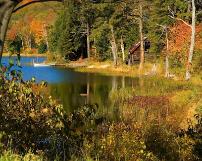
Here's an example of an image that has the colors brought to the tipping point. Any more saturation and it becomes cartoonish. Any less and you don't get the intense feeling of the fall colors in Acadia National Park.
This one winds up being a faux panorama. Rather the several images being stitched together, it's cropped into a pano format. That means decisions have to be made. The first is what is the picture you're going for. It's full width, but taken in from the top and bottom. The bottom of the original has the grassy patch leading up to the edge of the forest. The top had plenty of trees, but not a whole lot of color. Out they go. Neither one was adding to the image and both became distractions. With the grass on the bottom you'd look at it and want to see "something" of interest in the grass. Had there been a woodland creature (a rabbit, a squirrel, a bird pecking for worms) it would have been the "center of interest" and the foliage would become secondary. There was nothing there, so it added nothing to the shot. Why keep it.
The "focus" was to create a mild abstract. To give the colors the stage. If the colors are the objective in the print they might as well be bright colors. Were the colors really that bright? Probably not in the natural world. If you were to look at the original print you'd be able to pick out depictions of things. On the right side you can "see" the head of a person, mouth agape, made up of a couple of yellow leaves that just happen to come together at that moment. Other things that can be seen are depictions of a bird and a squirrel. Neither are actually there, but you can justify them in the image.
There is a master of hiding things in her paintings. Bev Doolittle has done several paintings where the more you look at it the more you see. An example is "The Forest Has Eyes". (The title is a link to a site showing the painting.) Everywhere you look you see Indians watching. It would be interesting to be able to create similar images in photography without making the hidden objects too obvious. I'll have to work on that.
Remember, you can click on every image on this blog and see a larger version. Read more!
Monday, June 1, 2009
And Now, Something Completely Different
Occasionally, ya just gotta play. Sometimes that playing takes a bit of forethought. Such is the case of the image that goes along with this post. You won't typically see a lot of trees with white foliage, but here we have a few. This image is a combination of a straight color shot and an infrared shot of the same scene.
If you read any of the articles on infrared digital photography they'll say you'll have to have your camera modified with the filter covering the sensor removed. With this type of modification you can take infrared shots fairly quickly and you have a dedicated "infrared camera". But, if you'll willing to take long exposes you can coax an infrared image out of a "typical" digital SLR. One of the big things you need is an almost opaque red filter. It's just about something you could use to watch welding going on. If you hold the filter up to your eye, you can't see through it. You have to take it as a matter of faith that light (some portion of the spectrum) will get through. Exposure for the setup used in the infrared piece of this image ( going for max Depth of Field, aperature setting - F22), with the light available on the day it was shot, run about 20 seconds. Having a bright sunny day is a definite help when trying this. The filter was put on with about one thread caught. A set of alternating shots were taken. One for the infrared, then, with the filter off, one for the "normal" color image. The color shots were taken at the meter read shutter speed.
Once the images are captured the post production starts. The infrared shots are tinted red (this can probably be avoided by setting the camera to monochrome setting). Converting the red image to straight B&W can be done in any of several different ways. If you've ever made a B&W out of a color shot you can do the same here. Once you have a good infrared B&W image you'd pair it up with the same image shot in color. Then it's a matter of using the blending modes in Adobe(r) Photoshop (tm) to make the combined image shown here.
With shutter speeds of 20 seconds for the infrared and 3 seconds for the color image, this isn't a casual, spur of the moment type of photography. You need to have an idea what you're looking for in the final image before you click the shutter. It's a style of photography, it's not for everyone, but there are photographers around who do it as a "signature" style. To the rest of us it's something to explore, to get a taste of and move on. It is fun and worth playing with. Read more!
Subscribe to:
Posts (Atom)