Showing posts with label technique tutorial. Show all posts

Monday, February 23, 2015

Hurray For Hollywood...and Photoshop

Today's image is just a little goof on the fact that the Academy Awards were last night.  Just in case some readers are too young to figure out what it's supposed to represent, it looks sort of like film did back in the day.  You'd have to thread some plastic (celluloid) through the camera on sprockets.  (Little wheels with teeth on them to engage the holes you see.)  Another limitations the young folks might not realize is that you had to change out the film after either twenty four or thirty six shots.  You couldn't shoot all day and then dump everything anywhere.  There was no preview screen and you didn't know if you got the shot until the slides or negatives were "developed" using chemicals.  My, how things have changed.  To get an idea of the steps used to make today's image, hit the "Read More". 
Read more!

Monday, July 21, 2014

Untouched By Photoshop

Today's image is a little down stream from the site of the previous post.  It was taken on the way to the falls, not after the fall down the falls.  (See previous post.)  You can see that there is a definite uphill component to the stream.  As with all flowing water, there are drops and there are quiet spots.  You can see one of the "quiet spots" toward the top of the image.  Had I scrambled about fifteen yards upstream this would have been a shot of the pool, filled with reflections.  The power of the water would have been lost in the apparent stillness.  All the way up to the falls I took five shot sequences with one stop bracketing.  Between last week's image and today's image neither area a result of HDR.  To find out what I did to both images, hit the "Read More".

The "specs" on the shot are ISO 200, F 22 @ 1/2 second.  The "companion" shots for HDR ranged from 1/4 second to 4 seconds.  As you can see, the image is based on the one stop above the darkest image of the set.  The big reason for that is that it was dark in there.  The camera's meter bases what it thinks is a "proper" exposure by trying create a neutral gray average to the shot.  When it reads a scene that it calculates to really dark, the camera adjusts upward.  Therefore, the darkest shot (the 1/4 second shot) is still fairly bright compared to what the eye would see.  Using one of the images from the longer exposures would have left blown out highlights.

As is noticeable, there are some bright areas and some darker areas in today's images.  For me, this is a pretty straight image.  It never made the trip from Adobe Photoshop Lightroom (LR) to Adobe Photoshop (PS).  Now, that is unusual for an image from me.  I'm typically adding, subtracting, multiplying or dividing something in an image that can't be done in LR.  Not today!  100% LR.  The boulders on each side of the stream were brightened.  The green moss deepened,  The color of the rocks warmed up using the Color space in the Adjustment Brush.  I've found an amazing amount of control can be developed using that Color box.  Once you get a shade of color that's semi close to what you're looking for you have all the "tools" (sliders) of the Adjustment Brush available to you.  Not exactly the color you were thinking of?  Use the Temperature and Tint sliders.  Not a deep enough shade?  Use Exposure, Highlights, Shadows, or Clarity to zero in on what you feel is ideal.

The water also took a hit using the Color block of the Adjustment Brush.  The water was a nondescript sort of gray.  No life to it at all.  Giving it a little blue cooled the water off and made it look a slight bit more translucent.  (Even though it isn't.)  The quiet pool was hit with another Adjustment Brush pin and made a little greener to accent the reflection of the trees.

All told, about fifteen to twenty individual Adjustment Brush pins were dropped in various parts of the image.  Getting a good digital negative, in camera, should be the goal of every photographer.  Developing that digital negative into a useable image is what one section of post processing is all about.  If Ansel Adams or Alfred Stieglitz, or Matthew Brady had had access to LR they would have embraced it in order to "develop" their images.  Read more!

Tuesday, June 24, 2014

Aim To The Right

"Aim to the right"?  Sounds like I'm coaching somebody at a rifle range.  I typically use two methods when I'm out shooting (photographically) for my personal use.  If I see something that might make a good (interesting) HDR image I'll set the camera to take five, seven or nine shots one F-stop apart.  I "always" (99% of the time) have my camera set to -.3 EV (Exposure Value), so the images come out on 1/3 increments.  (-.3, -1.3, -2.3...)  That way I have choices as to what exposures to select.  If I'm shooting something that probably wouldn't lend itself to HDR I'll switch up the settings.  I'll go no more than five shots and set the F-stops to .3 separation.  That way I'll have one exposure that I think will give me the optimum density.  Today's image is one of those that probably would not be "enhanced" by HDR.  It was shot with option two, the .3 stop steps.  It was taken in bright sunlight at the absolute worst time of the day.  My choices were very dense, where I'd have to bring back the shadows or pretty light, where I'd have to tone down the wildly overexposed areas.  To find out which option I chose and why, hit the Read More.

Read more!

Wednesday, May 7, 2014

Create A Background That Wasn't Really THere

I guess it's time to start getting "serious" about making some images.  Those who know me will understand why the word "serious" is in quotes.  Today's image is a result of a "Fun Trail Ride and Obstacle Course" at the 2nd Governor's Horse Guard in Newtown Connecticut over the past weekend.  I'm not sure if there was a fee for the riders, but "spectators" were welcomed and treated royally.  There was a Major in charge of the day and we were invited into the barn area to watch the unit's horses brought in after their workout and being brushed down and groomed.  Flashes were not allowed, so the I had to crank up the sensor sensitivity pretty far.  When we got back outside the trail riders were just getting back and starting the obstacle course.  Most riders used English style riding hat (helmets) and didn't give the look I was looking for.  Then came along the "Marlboro Man" in today's image.  So I had the right horse, the right guy and still had a pretty crappy background.  Possibly because of the cold spring or maybe just because it was the first weekend of May the trees in the background were just a bunch of sticks.  To me, my cowboy looked like he'd been out riding the range and had just come down from the mountains.  I decided that was the setting he "needed" to be in.  To check out how he got there, hit the "Read More".


Read more!

Thursday, April 3, 2014

NIght Photography Made Easy

Have you ever gotten the urge to grab your camera and go out and shoot in the middle of the night?  Photography at night is an adventure.  You stumble around, set up your tripod, guess at a starting exposure (not really), stumble around some more, probably freeze your butt off, take forty two shots of the moon, stumble around again and on and on.  You'd thing that Hollywood, making big time epics, would avoid all that stumbling at all costs.  Actually, they usually do.  Next time you're watching a movie where the hero (heroine) is out wandering around in the dark, take a closer look.  Chances are you'll see shadows cast by things like trees, street lights, buildings, anything that sticks up from the ground.  Wow, they must have been shooting that scene under a full moon. Not!  Movies have been using a trick for as long as movies have been made.  Still photographers used to use the same trick, but it either has been forgotten or today's "new" shooters have never learned it.  "Back in the day" photographers ran around with a stack of filters to fit various lenses and conditions.  If you had daylight film in the camera and you had to shoot an inside shot, you'd check on the lights and put on either a tungsten to daylight filter (an 85A) or a fluorescent to daylight filter (an FLD).  Same in reverse.  It you had tungsten light balanced film and had to run outside into the sunlight you'd slap on a daylight to whatever light you were coming from filter (an 80A for tungsten light).  To find out how this relates to today's image, hit the "Read More".

Read more!

Friday, March 7, 2014

Adding Details In Photoshop

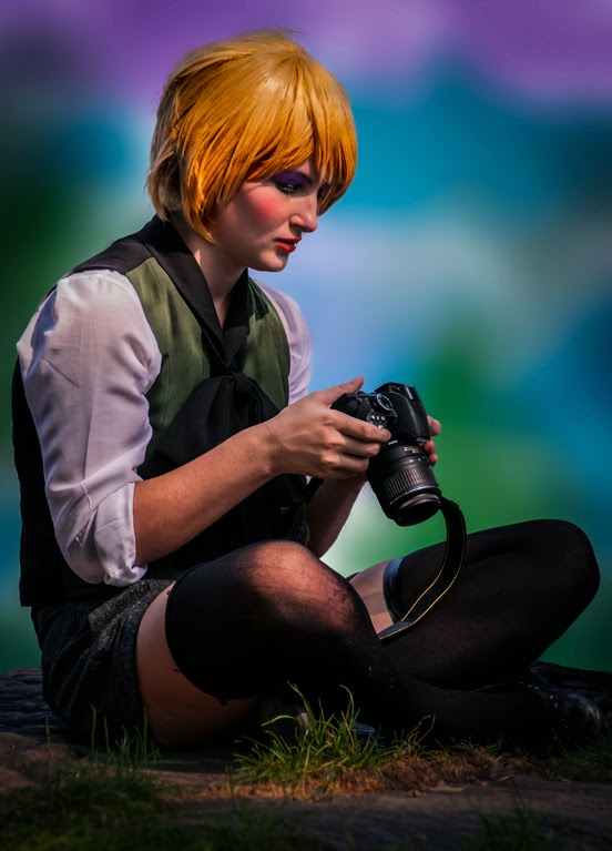
I don't know why, but a lot of posts sort of start out with "I was talking to a friend..." lately.  Guess I must have more friends than I thought.  Well, I was talking to a friend the other day and showed him the deconstructed restoration of the baseball umpire from the 1880's (?).  At first he was suitably impressed by the work, but then said "wait a minute, there's detail in the "fixed" image that isn't available in the "original".  You can't add detail if it's not there to start with".  I sort of cocked my head, dropped my chin to look over the rim of my glasses and came back with "of course you can".  Where's nothing added to today's image that wasn't there to start, but you can see the detail a lot better by emphasizing it.  Today's image actually has two very separate techniques applied.  Since she was portraying an Anime character she was wearing very little makeup.  Since I was giving my spin to the image, I did her makeup for her.  I didn't want to turn her into something from Ringling Brothers, but thought some nice subtle makeup might be nice.  The other technique was something I saw Scott Kelby do.  Kind of a Dodging and Burning using Curves Adjustment Layers.  The interesting thing about this method of Dodging and Burning is that you use the color information already in the image.  This would be unlike using the technique of using a 50% gray Layer, changing the Layer Blend Mode to Overlay and painting White or Black to get highlights and shadows.  To find out a little about both techniques used on today's image, hit the "Read More".

Read more!

Wednesday, March 5, 2014

Lightroom and Layers and Masks, Oh My

If you're a frequent reader of The Kayview Gallery you know I typically have a problem with HDR'd skies.  Seems no matter how "realistic" you make an HDR scenic image the skies still come out unnatural. In today's image I sort of took the long way around to get to the finished image.  It went from Adobe Photoshop Lightroom (LR) to Adobe Photoshop (PS), back to LR for tone mapping, and once again to PS to replace the HDR sky and back to LR for storage.  There's two reasons for the trips over to PS.  The first was to create the HDR image.  The second was to replace the sky.  Other than that, everything was done in LR.  I tried going to Nik's HDR Efex Pro, but didn't like the result.  (I know, Blasphemy.) Sometimes the HDR Pro that comes with PS is more than "good enough".  Sometimes it gives a better representation of what I'm looking for as a starting point.  There's a couple things that were done that are a little "out of the ordinary".  To find out what those things are, hit the "Read More".

Read more!

Monday, March 3, 2014

Twenty First Century Use Of The Pen Tool

I was talking to a friend the other day and he said he was getting into using the Pen Tool (P) in Adobe Photoshop (PS).  I must have had a quizzical expression on my face, because he said "What!".  I told him I didn't think anyone, who didn't already know how to use the Pen Tool (P), had bothered to learn how to use the it in this century.  I asked him to give me a little demonstration of how he was using the tool.  He's been known to develop his own hard way to do some simple things in PS.  Just in case you've come to PS during this century, let me give a short explanation on using the Pen Tool (P) in PS.  You place a dot to start.  Place another dot somewhere else on your blank page.  You'll see two handles come out from the second point.  You can pull them, stretch them, spin 'em around in circles or let them sit.  Put a third dot on your document and another two handles appear.  Pull one, twist one, do something to one of the handles.  You'll see that the straight line between point two and point three deforms depending on how you move the handle.  The line between point  one and point two remains fixed.  (As long as you didn't move the handles.)  What's happening between points two and three is called a Bezier Curve.  Back in the day (probably around PS 5 (not CS5 - just plain PS 5) it was essential that you learn to use the Pen Tool (P) to make a Selection.  Today there is a large variety of methods to make Selections.  The Pen Tool (P) is almost dead.  The Quick Selection Tool (W) with its Refine Edge feature just about eliminates the need for the Pen Tool (P) or reduces its functionality to touching up hard lines.  The way my friend was using it is another one of his "let's make something harder than it should be" tricks.  His method consisted of laying out a point, cutting off the leading handle and making his next point.  There is a valid reason for cutting off the leading handle, but it's to be able to make hard point turns (i.e. a 90 degree turn) in the direction you're plotting, not just going to the next point on a curve.  Basically what he's done is find the hardest way imaginable to use the Polygonal Lasso Tool (L).  I used the Pen Tool (P) on today's image, but only for experimentational reasons.  To find out what I found and how I used the Pen Tool (P), hit the "Read More".

Read more!

Thursday, February 20, 2014

Keep It Simple In Photoshop

If you look at today's image you might scratch your head and think "what do ya mean, simple?  It's three different shots composited together".  Well, simple is a matter of degrees.  I shot the sequence on high speed shutter.  Through the swing about seven shots were taken.  The first thing I tried is using all seven.  What happened was a mess.  The whole composite was just too confusing.  There were arms and legs all over the place.  The whole process of making the composite is a lot easier than I've seen some people try their hand at it.  My thing has always been "let the computer figure it out".  That does not mean let the computer make the decisions.  No!  Computers are there to be brutes.  Tell it what you want done and let it do the math.  That goes for computers on the desktop and for the computers in your camera.  You've paid hundreds (the laptop) or thousands (the camera) to own a computer.  Let it compute.  To find out how simple compositing is, hit the "Read More"
Read more!

Friday, May 17, 2013

Making Your Own Brushes In Photoshop

A friend was checking out a few of my recent images and asked how the backgrounds were made.  Just flip down through the last couple of posts (you might have to dig down four or five) to see what he was looking at.  I explained that the backgrounds came from Brushes made from shots of clouds I had taken.   To get the effect you see in the images, cloud brushes are just about the ideal thing to use.  Clouds aren’t solid.  Clouds have texture.  Clouds are readily available.  If there aren’t any today, look out the window tomorrow.  Sooner or later you find some interesting clouds.  I keep Folders of clouds.  I Keyword every cloud image so I can pull them up quickly in Adobe Photoshop Lightroom (any version).  I pop them into scenes that have bald skies and I use them to make Brushes for creative backgrounds.  Clouds are useful little suckers.  Today’s (main) image is a Brush I made this morning to be able to capture the steps to make a cloud Brush.  To follow along, hit the “Read More”.
Read more!

Tuesday, July 31, 2012

Fighting With Photoshop CS6's Adaptive Wide Angle Filter


Okay, guess what?  The Adobe Photoshop CS6's Adaptive Wide Angle Filter (Filter/Adaptive Wide Angle) won.  What a shock!  Okay, maybe not so much.  It's new in CS6, I was playing with a pano and selected the Panorama option in the dropdown asking "what type of image are you working on".

Today's image is a five shot panorama.  The shots were taken vertically to get me the most of a very dramatic sky.  As is usual when shooting this type of pano, the wall in front was bowed,  It looked a lot like the landscape was smiling.  Made, what could be, a fairly serious landscape shot look rather comical.  The corn field at the crest of the hill appeared to be a crewcut hairstyle.  All that would have been needed was a couple of eyes to produce a landscape "smiley face".

The Fix:

Since the shot is made up of four images, CS6 couldn't figure out what (single) lens was used.  Once multiple shots are combined, CS6 drops the lens info from the meta data that goes along with a single shot.  Seems logical.  The computer can't keep track of if the combined image comes from a cohesive sets of shots (as in today's image) or if it's made from a combination of unrelated shots.  I chose to do the pano, as I have to live with that limitation.

It's a pano!  CS6's new Adaptive Wide Angle Filter has several choices when it wants information about what you're trying to do.  The dropdown is titled "Correction".  What you do is draw a line along the curve you'd like to straighten.  When click the dropdown and you see "Fisheye", "Perspective", "Panorama"  and "Full Spherical" to pick from.  Well I made a pano, so naturally I picked Panorama.  It turned the broad smile into a sly grin.  Not exactly what I was looked for.  That when the fighting started.  I tried anything I could think of.  I came to the conclusion that I just didn't get it.   I finally left it with its "sly grin" and thought I was asking too much of the Adaptive Wide Angle Filter (AWAF).

After a night's rest I thought I'd look at it again.  I'm a big fan of NAPP's Photoshop Guys.  One thing they all advocate is pushing buttons.  Sure, that's what it's "supposed to do" , but what happens if you try ....  What the heck, there's four choices and I'd been fighting with the one that seemed reasonable.  After all, I shot a pano and the AWAF had a panorama choice.  I couldn't "hurt" anything by pushing buttons.  I figured "it's not a Fisheye, it's a pano".  What's the worst that could happen if I selected Fisheye?  Make the grin back into another "big smile"?  Nope!  The wall instantly became straight as an arrow.  Just what I was fighting for. 

The "Morale":

If any version of Photoshop gives you choices, try them all.  You can't screw things up too bad.  You may get the effect you were trying for.  And, if nothing else, you'll learn a little more about Photoshop.
Read more!

Wednesday, July 25, 2012

Adding Drama To A Face Using Photoshop Curves


We had dinner with some friends last night (she's an excellent photographer and photoshopper) .  They're moving to Florida at the end of the week and it was our last time to get together.  During the course of dinner the subject of adding drama to a face came up and the fact that I routinely "enhance" a person's face using Scott Kelby's Curves Adjustment Layer "trick".  I've been playing with it since hearing SK explain it not too long ago.  She asked if I would let her in on Scott's secret.  It wound up too hard to explain just verbally, so I said I'd make today's post about it.   The easiest way I could come up to clearly show what was going on was to "cartoon" it.

Figure 1 is the little cartoon I made up in Adobe Photoshop CS6.  I'm a photographer, not a sketch artist, so don't laugh about my crude cartooning ability.  Hey, it's got two eyes, a nose and a mouth (sort of).  Think of it as a model with little to no makeup, flat lighting and a straight on shot.

Figure 2 shows the finished toning.  If you take a look at any of the shots with the Layer Panels showing you'll see that I copied both the shadows Layer and the highlight Layer.  In a real situation you wouldn't duplicate the Adjustment Layers.  I just had to do it so the highlighting and shading would be visible.  If you do it right (on a human) you won't see the changes unless you turn on and off the visibility of the Layer.  So, don't freak out about the copy Layers.  It's just so you can see what happened.

Figure 3 just proves that I did it in PSCS6.

Figures 4 through 7 is where the magic happens.  In Figure 4 we're looking at the Properties Panel for the Curves Adjustment Layer.  You can see that the Curve has been brought up very high in the highlights area.  This will give the overall image a really blown out look.  The Layer Mask is then Inverted (CTRL I [eye]) making it black and getting us back to a normal look to the image.  The "trick" is to use a small (5 or 6 pixel), hard (I was at 96%) brush and draw lines where ever the highlight needs to be emphasized.   In this case I went under the mouth, along the centerline of the nose, the cleft of the chin and above the eyes.  Since this is an Adjustment Layer of the original image you'll see variations based on the lightness of the shot.  I parts of the shot that are bright already the lines will look pretty faint.  In the highlights of darker areas of the image the lines will be pretty pronounced.  Because you're taking the cues from the images itself everything will match up well.

Figure 5 is just the opposite.  The Curve is pulled way down giving deep tones.  The same principle applies.  Anywhere you need to emphasize a shadow, put a line on it. 

Now here's "the secret".  Feather the Mask.  In CS6 you have a Properties Panel for every (I think it's every one of them) Adjustment Layer.  You can control either what you're adjusting and its Mask.  Click on the Mask icon and you have sliders for Density and Feathering.  Keeping an eye on your image, slide the Feather Slider until those lines are blurred enough so they become either shading or highlights.

A few of the recent posts here have used this technique.  You can see it used in the post of the girl blowing bubbles, where it was used to define her chin and her cheekbone.  Others were in the 6/25 post and the 6/27 post putting emphasis on the uniforms
Read more!

Monday, December 19, 2011

Selective Sharpening In Photoshop CS5

Everybody (well, just about everybody) knows about using an Unsharp Mask (Filters/Sharpen/Unsharp Mask) to sharpen their images.  It is an oxymoron that comes from the film days of sharpening images.  Many (well, some) know how to use a High Pass Filter (Filters/Other/High Pass) to do some very controllable sharpening.  An even smaller set of people know about using the Luminance Channel in LAB (that's L A B, not referring to some laboratory somewhere) Mode.  There, you don't mess with the color Channels (the A Channel and the B Channel) and only Sharpen the L Channel .  By only Sharpening the grey scale of the L Channel you eliminate any chance of producing a color shift.  And then there's a Brush on Sharpening technique that very few people use.  I suppose some of the "early adopters" probably tried using the Sharpening Tool (no keyboard shortcut - it's located under the Blur Tool) and found it lacking.  I believe the Sharpening Tool fell into Adobe's JDI (just do it) tweaks that came in Adobe Photoshop CS5.  The JDI's were a set of little, niggling, things that bugged enough end users and (apparently) Adobe Product Managers that they made the decision to fix many things before releasing CS5.  Dodge and Burn is a good example.  They put in a checkbox that says "Protect Tones".  Prior to CS5 the Dodge and Burn Tools (O) would just muddy up whatever they were applied to.  With the JDI fix, they work as they were always supposed to.  Being able to set a default in the Stroke (Edit/Stroke) dialog box was another.  Before it was set to Red and had to be changed every time it was used.  In CS5, if you choose to do so, you can set the default color to whatever you frequently use.  If 90% of your Strokes are Black, set it to Black in one case and it'll remain "sticky" until you change it.  A great sanity fix.  Lots of people were bugged with that one.  Another is the subject of today's post.  To find out how it was used in today's image, hit the "Read More".
Read more!

Wednesday, December 14, 2011

Wednesday Q&A - Saving Files to Lightroom

I gave a class last spring and saw one of the attendees the other day.  He said "ya gotta clear something up for me".  In the class I had taken an image from Adobe Photoshop Lightroom 3 (after going as far as I could initially) over to Adobe Photoshop CS5.  There I played with adding a couple Layers, added a couple pieces from other images and generally messed with the shot.  When I was done there, I wanted to do other things back in LR3.  The part the fellow wanted clarification on was how I saved it.  That took me back a little and I asked "what do you mean"?  He explained that he "always" does a Save As rather than just plain Save.  I asked him to tell me why he did that.  That's when I saw why he wanted some explanation.  His justification for using Save As was that he wanted to preserve his original image.  Take a look at today's image.  It's the same shot, four different ways.  The original is on the upper left.  The other three have had one, two and three trips over to PS CS5 and back.  Each time, a simple Save was used, yet there are now four files that show up in LR3.  (It also applies to Adobe Bridge.)  To find out what's going on, hit the "Read More".
Read more!

Wednesday, October 26, 2011

Wednesday Q&A - Making Better Selections With Adobe Photoshop

I've seen a lot of frustration with friends and readers trying to make selections using Adobe Photoshop CS5's Content Aware Fill.  Today's image shows three versions of the same image.  It's not on the blog because it's some wonderful image.  It's here as a "teaching tool".  It's the same shot, duplicated twice and spread out across a canvas.  The first (left) shows the "as shot" image.  The middle version show a typical Content Aware Fill  result, trying to take out the middle "R" and the number "7".  The third (right) shows a better result using a modified version of Content Aware Fill.  Why someone would want to remove the "R" and the "7"?  I have no idea, I'm just trying to illustrate a point.  I didn't come up with the secret method of making a better fill.  I saw it in a video from Adobe.  I've been using it, tweaking the way I work with it, and have developed a strong confidence in being able to extract exactly what I want.  To find out what the trick is, hit the "Read More".
Read more!

Monday, October 24, 2011

Playing With Adobe Pixel Bender

Actually, playing with Adobe's Pixel Bender is the last step in today's image.  It went through several trips back and forth from Adobe Photoshop Lightroom 3 to Adobe Photoshop CS5.  There are things I find easier in CS5 and other things easier in LR3.  As an example, the face of the barn was "texturized" in LR3, but the "brightness" of the red leaves was goosed in CS5.  The sky couldn't be (at least I couldn't) handled properly in CS5, so it was treated in LR3.  The end image wound up being TJP8764-Edit-2-Edit-Edit.psd.  That gives you a little idea of what when on in beating up this poor image.  Not only that, but it started life as a five stop HDR.  The biggest "trick" as far as I'm concerned was getting the texture of the face of the barn to come out.  To give the barn a nice weathered appearance the Clarity was brought up using the Adjustment Brush... five times.  The Adjustment Brush was selected with the Exposure brought down the maximum of 4 stops.  I find that to be an easy way to directly see where I'm selecting.  After the barn face was properly selected I double clicked on the word Exposure to reset the value back to zero.  I then put the Clarity up to 100%.  I did the same thing, placing four more pins.  "Paint" the face, return the Exposure to zero and crank the Clarity up.  After the fifth time the barn face had the texture I was looking for.  This same technique can be used to apply a "grunge" effect.  Thanks to Matt Kloskowski of NAPP for demonstrating that trick.  Where to apply it is up to you.  I picked this image to play with it.  I don't think it went all the way to "grunge", but it did supply something.  There's a half dozen (or so) other tricks that were applied to today's image.  To find out what they are, hit the "Read More".
Read more!

Friday, February 18, 2011

Eight Steps To Using A Complex Mask Tutorial

This is the image at the start of the process.
Adobe Photoshop CS5 has this great new tool called the Quick Selection Tool (W). There have been a lot of tutorials done showing how well it does, when used with the Refine Mask dialog box, to select wispy hair and other complex "solid" objects. One place I haven't had much luck with it is on complex objects that look like Swiss Cheese. Something with lots of open space within the outline of an object. Today we start out with an image that has possibilities, but a rather bland sky. The Quick Selection Tool - Refine Mask combination can't figure out the internal lattice of the trees. In order to make an accurate selection and come up with a Mask we'll take one step back to take two steps forward. The one step back is using the Calculations dialog box (Image/Calculations) to come up with a good Mask. The rest of this tutorial is all visual with captions to walk through the "two steps forward".


One of the things I like to see in tutorials is what's going on "behind the scene. So, each image will show the whole screen so you can follow along easier. " Hit the "read more" to follow the steps.
Read more!

Friday, February 11, 2011

10 Minutes - Start to Finish - Nothing But Net

Okay, the "nothing but net" is an add on.  The title just reminded me of one of those commercials with the basketball players from a few years ago.  A friend of mine saw today's image and said something like "that must have taken you a long time".  I asked him for a estimate of how long he thought it would take to complete the image.  His reply was "oh, hours I'd guess".  I told him it was closer to ten minutes.  Also being named Thomas, he was a doubter and challenged me to produce a similar image.  Today's post is the result of that challenge.  I started from scratch, set a timer on my second screen and did a screen capture every one minute.  The entire process took far longer than the ten minutes, doing the screen capture, cropping it to show what was going on, saving it,  So, it was work for one minute, spend two minutes documenting what was done during the one minute, resetting the screen and going for the next minute.  The result is today's post.  To see what my screen looked like, minute by minute, hit the "read more".


Read more!

Monday, January 31, 2011

A Simple Photoshop Blending Mode Tutorialreflections under the cup, just to the left of the plate.

The shot of the cup, roll and flower needs a little explanation before we get into the tutorial.  One, there's too much image.  It needs some cropping, in from the right and left, down a little from the top.  We don't "need" to show the handle, the viewer will "know" that the cup has a handle somewhere.  The right edge of the plate can go also, it doesn't add needed information.  The exposure for this shot was about 20 seconds.  The light came from an LED flashlight played around the setup.  The "setup" was a plastic panel over a black mountboard.   Nothing was needed for the background since the falloff of light was enough to render the wall black.  The first thing to do (after cropping) is clean up any distractions.  There's a couple of reflections under the cup, just to the left of the plate.  The easiest way to fix them would be to create a new Layer and use the Spot Healing Brush (J) to quickly remove them and any other stray light in the lower left of the shot.  I can sit and tell you all day that the cup is full of hot coffee, but there's nothing to indicate that's the case.  There are images all over the web (such as in Flickr) of people playing with smoke.  Many come from taking shots of burning incense smoke.  Many are colored and manipulated into very interesting shapes and patterns.  To learn how a shot of incense smoke provides to "steam" coming from the coffee cup, hit the "read more".
Read more!

Friday, January 28, 2011

Adobe Photoshop's Secret Weapon

Here's a quickie for a Friday.  We'll take a look at an extremely under used tool available in Adobe Photoshop CS5 and several preceding generations.  To start with we have a well exposed shot of the moon and a shot of a church scene in late autumn.  If we were looking for a simple shot of the moon in the clear space of the sky we'd have a one click for that.  Just change the Blend Mode.  There's several options, such as using a Screen Blend Mode or a Lighter Color Blend Mode.  Either will do a pretty good job of dropping out the black of the moon Layer.  Our Background Layer would be the shot of the church and the upper Layer would be the moon.  That's all well and good, but it makes a rather uninteresting image.  More interesting would be the moon behind some of the branches of the tree.  If we were to simply move the moon over the branches with the straight Bland Mode switch the moon would appear in front of the branches.  That wouldn't fool a three year old.  The church with the branches is one image, yet we want to slide the moon behind the branches.  There's a hard way and there's an easy way.  To find out what the two methods are, hit the "read more".
Read more!