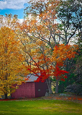
 Actually, playing with Adobe's Pixel Bender is the last step
in today's image. It went through
several trips back and forth from Adobe Photoshop Lightroom 3 to Adobe
Photoshop CS5. There are things I find
easier in CS5 and other things easier in LR3.
As an example, the face of the barn was "texturized" in LR3,
but the "brightness" of the red leaves was goosed in CS5. The sky couldn't be (at least I couldn't) handled
properly in CS5, so it was treated in LR3.
The end image wound up being TJP8764-Edit-2-Edit-Edit.psd. That gives you a little idea of what when on
in beating up this poor image. Not only
that, but it started life as a five stop HDR.
The biggest "trick" as far as I'm concerned was getting the
texture of the face of the barn to come out.
To give the barn a nice weathered appearance the Clarity was brought up
using the Adjustment Brush... five times.
The Adjustment Brush was selected with the Exposure brought down the
maximum of 4 stops. I find that to be an
easy way to directly see where I'm selecting.
After the barn face was properly selected I double clicked on the word
Exposure to reset the value back to zero.
I then put the Clarity up to 100%.
I did the same thing, placing four more pins. "Paint" the face, return the Exposure
to zero and crank the Clarity up. After
the fifth time the barn face had the texture I was looking for. This same technique can be used to apply a
"grunge" effect. Thanks to Matt
Kloskowski of NAPP for demonstrating that trick. Where to apply it is up to you. I picked this image to play with it. I don't think it went all the way to
"grunge", but it did supply something. There's a half dozen (or so) other tricks
that were applied to today's image. To
find out what they are, hit the "Read More".
One of the first "final" images had the grass in
the foreground too dark. When printed it
looked a lot like it was a black pit in front of the barn. To "fix" that the entire stack of
Layers was selected and converted to a Smart Object. It was then copied and the Blend Mode changed
to Screen. That brightened the who
image, so a Layer Mask had to be applied.
The whole upper portion of the Mask was painted black using the Brush
Tool (B). The Opacity was then lower to
taste.
Another trick was using only a couple of Hue Saturation
Adjustment Layers in CS5. Usually I'll
pop all the individual colors (Red, Yellow, Green, Cyan, Blue and Magenta) up
with Hue/Saturation Adjustment Layers.
In this case, only the Red, Yellow and Green colors were maximized. What I do is create a Hue/Saturation
Adjustment Layer for the Reds. I then
push the Saturation slider to 100%.
Holding the Shift Key down I'll either tap the Down Arrow Key or roll
the wheel on the mouse to bring the value of the Saturation down by ten points
at a time. The difference between 70 and
60 will be noticeable. The difference
between 75 and 74 won't be.
"Walking" the value down in 10 point increments gives you
visual clues to what you're doing. I'll
repeat the procedure for each color.
That way you'll have a Mask that can be individualized per color.
There was a sign of some sort on the right side of the
door. That was taken care of using a
simple application of the Spot Healing Tool in LR3. The ability to push or pull the target area
made matching the vertical lines very easy.
The roof of the barn is, apparently, very new. It looked a little too blue. The Saturation and Luminance were brought
down slightly in LR3.
The sky was darkened using a Gradient in LR3.
Noise was reduced slightly in LR3.


0 comments:
Post a Comment