 I don't know. Seems
like we're doing a couple mashups this week.
Monday was "Norman Rockwell Meets Photoshop" and that was a
pretty straight looking HDR composition.
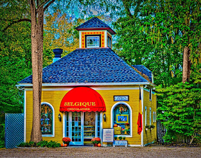
Today we go to the other end of the scale with a fictional character
meeting the far side of HDR. Today's
image actually comes from the Scott Kelby World Wide Photowalk of a couple of
weekends past. It's just down the street
from last week's image from the walk and miles away as far as technique
goes. Here's a little comparison of the
two images:
·
Both are five shot HDRs
·
Both are in the small New England town of Kent
Connecticut
·
Both are on the west side of Main Street
·
One tends toward the photorealistic, the other
is more illustrative
·
One is a straight shot (for something that's
HDR). The other has large sections
cloned out using Content Aware Fill
·
One tries for true (almost) colors. The other kicks the sh** out of the colors.
If you'd like to see what was done to the photorealistic
image from last week, click here. To see
what was done to today's image, hot the "Read More".
As was said, today's image is a five shot HDR done in Adobe
Photoshop CS5's HDR Pro. It, as are most of my HDR sequences , was hand
held. More of the HDR that I do are sort
of spontaneous rather than well thought out, on a tripod, all that
"stuff" that many blogs and websites tell you has to be done. One of the keys is, naturally, having enough
light that the slowest shutter speed can be handheld. This coming weekend we'll be out doing some
night photography, with exposures of several minutes. Obviously that'll be on a tripod. But, enough about philosophy and what will be
done, let's get into today's image.
To the left and right of the chocolate shop, in the trees,
are other buildings. Once the HDR image
was assembled in CS5's HDR Pro the same program's Content Aware Fill
(Edit/Fill/Content Aware Fill) was used to hide a garage on the left and a
house on the right. The big thing that
makes the use of CAF possible is the use of either a Mask of a separate
Layer.
The Mask method is simply to make a mask that hides anything
that might interfere with the texture you want to use. On the left side of the shop the Rectangular
Marquee Tool (M) was used to select the trees.
Going back to the image (rather than the Mask) and using the Loop Tool
(L), the bits and pieces of the garage showing through the trees within the masked
area were selected and CAF applied.
Because the rest of the image was masked, the only place CS5 had to pick
from was in the selected area. With the
shop masked out, it could not be "seen" by the program. The same technique was used on the right side
to eliminate the house.
With the colors enhanced using individual (Red, Yellow,
Green, Cyan, Blue, and Magenta) Hue/Saturation Adjustment Layers ((Layer/New
Adjustment Layer/Hue/Saturation) the major trees in front and to the right of
the shop still didn't have a whole lot of color. I used the Quick Selection Tool (W) to select
the trunks and major branches of the trees.
A dark brown color was selected from the Swatches Panel and the selections
(on a separate Layer) were filled (Edit/Fill/Color). This gives a childish looking opaque paint
job. The Blend Mode was then changed to
Color, allowing the detail to show through the applied color.
The image was sharpened and
a vignette applied in Adobe Photoshop Lightrrom 3 to "finish" the
image.


0 comments:
Post a Comment