Friday, July 31, 2009

When Does an Image Stop Being a Photograph?


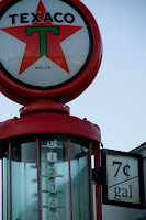
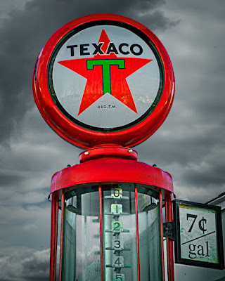
On the left you see what today's image looked like right out of the camera. On the right is the finished image. The first question that comes to mind is, if I wanted a shot of the entire pump, why didn't I step back, or crank the zoom a little wider, or change lenses, or something to make life a little easier. Well, the truth is I didn't expect to do anything with the shot. I just thought it was a cute little shot showing the price of gas a long, long time ago. Figured it would sit on the harddrive and be one of the images that was never looked at again. Then, on a whim, I was looking for a challenge one day and came across the shot of the old pump with the top and left side not there and the bald sky and said "can I rebuild the pump?" If you're interested in reading about the gyrations I went through to make the final image, hit the "Read more".

The first thing that was necessary was expanding the canvas. There are several ways to do this, including "uncropping" the image. Typically, using the crop tool in PS means you're going to take some part of the shot and make it the image. You can also go in the opposite direction. Instead of pulling the handles inward, you can pull them outward and make the canvas larger. If precision is what you're looking for you can go to Image/Canvas Size and enter either the exact size you want or how much bigger you'd like the canvas to be. Control of where the additional area is put is controlled by a grid box that can be made to point to where the space is to be added. There's no point to giving the numbers I used because it dependant on the original image size and the PPI you're working at.
.
The next step was to copy and paste, Free Transform and Warp pieces of the right side of the pump and fit them to the left side and top. This gave the shape of the pump, but scattered shadows all over the place. Using the Color Picker and painting in the proper shading with the Blend Mode set to Color made reasonably easy work of making highlight areas shadows and shadow areas highlights. Doing the same type of thing made for replacing the left hand side of the pump body. The right side was duplicated, flipped horizontally, moved and the price sign was removed by cloning.
.
So, the pump was in pretty good shape. Putting in the threatening sky was pretty easy. The sky in the pump shot was almost bald. A little blue showed in the top of the image, but that was easily painted out with white. The clouds came out of my "clouds" file. If you're outside, with your camera in your hands, and see some spectacular cloud formations, shoot them. If there's no interesting foreground, so what. The objective is to get an image element. An early post on this blog talked about shooting an evergreen branch in a white out. These are pieces you can use to "make" an image. As long as you're not trying to present the final image as reality, no problem. Painters take creative license when producing "art". There's no reason a photographer can't take "creative license" if the objective is "art". So much for a rant. Back to the matter at hand. There are several ways to place the clouds behind the pump. You can make a selection, using any of the selection tools available and use good masking techniques to insure you don't have ghosting. The easiest way I know how would be to use the Blend If sliders found in the layers effects panel. To get a nice tight edge you would probably have to split the sliders (holding down the ALT key, click and drag the left or right side of each slider to split it.)
.
The final step is to get the clouds to appear through the glass bowl of the pump. Make a selection of each portion of the glass. Only the parts you'd be able to see all the way through. The roofline and the support shafts of the pump (front and back) make it so you can't see what's behind them, they shouldn't be included in the selections. Put the selection in their own layer. CTRL J will do it. Bring the layer above the sky layer and lower it's opacity until you get a believable blend of the glass with the sky visible.
.
That's about all there is it this one. On a couple of occasions I've said it took you longer to read the explanation than it would take you to do the thing being discussed. This "ain't" one of those times. There's some work to be done to do this sort of manipulation. But, if you're up for a challenge, have a go at it. Work your way through the problems you come up against and have fun. .
Read more!

Wednesday, July 29, 2009

Who Knew? Tom & Huck Grew Up.

Sometimes you has have to admire the spirit of people. The fellows in today's image appear to be enjoying themselves as they head off to where ever it is they're going. It could be work, it could be home from work, maybe the boss sent them on a chore. Whatever it is, they're having fun. An image like today's is one of those that's there to make you think. Are they singing to go along with their little dance? This is a "grab shot" that happens in real time. They didn't see me or agree to pose for a shot, they were just doing their thing and the moment was captured. This is the type of shot that a photographer can't (shouldn't) try to make money on. There's no "Model Release" that goes along with the image. At least one man, if not both men, is recognizable. If a shot is taken and is for personal use only, as is this shot, a Model Release is not needed. Things change when money changes hands. For more info on when an image is legal, hit the "read more".


There are several places on the Internet to find information about Model Releases and Property Releases from people with the knowledge and authority to know what they're talking about. As a caveat, nothing written in today's post is gospel. Please don't take my word for what is "legal" or what you can and can't do with your images. One of the places I go to to research what can and can't be done is Carolyn E. Wright's "Photo Attorney" blog (link). Another source where you can get a specific question answered would be Ed Greenberg and Jack Reznicki at "Igotaquestion@thecopyrightzone.com". Ed and Jack write a column for Photoshop User magazine if you're interested in following their monthly advice. A search with Google for +legal +photography will provide a host of links with information and forms for model, minor, product and property releases. Another caveat, you always want to look at information found on the Internet with a jaundiced eye. Make sure what you're reading is verifiable. ASMP (American Society of Media Photographers) (link) appears to have some good information and examples of different release forms.
.
Why is this important? One reason would be to protect yourself from law suits. Another would be to assure you have the right to be paid for the use of your image. Photographic images come under what is commonly called IP "intellectual property".(link) Basically the image is your creation and you have the rights to that image, as long as you have taken the proper steps to protect that IP. i.e. Copyright the image. A huge example of not protecting IP is why Intel Corporation names their processors with things like Pentium(r) or Core(r) or Xeon(r). Back in the 286 and 386 processor days Intel's chief competitor used the same numeric designations. The processor weren't the same, but the numbers were. Consumers were confused. Intel sued. The outcome of the suit was that a number cannot be copyrighted and Intel did not protect their IP. The actual Intel callout of the processors were I286 and I386 (eye286 and eye386). Intel, in ads and in daily correspondence, referred to the parts by their numbers only. The judgement was that Intel didn't do enough to protect their IP, therefore it didn't have IP rights on the names of the processors.
.
So, what's this all have to do with today's image? Nothing really, since I have no plans of trying to make money on it. But, it is an image that could be used in some sort of advertisement. Without some sort of protection the image is fair game for anyone on the Internet using it for whatever purpose they wish. If you want to keep the rights to your intellectual property you'll need to do "something" to protect it.
Read more!

Monday, July 27, 2009

Sometimes You Just Get Skunked

Great weekend. Good time, great weather (other than the severe rains in the middle of the night on Friday), interesting location, and all the right gear. How could all that end up with today's headline? The shot accompanying this post was taken on Saturday at about 6:30 PM. It's the Point Judith Light Station in Rhode Island, as seen from the parking lot of the public fishing area down the beach a little bit. Early in the morning we had shot the fields of sunflowers in Griswold, Connecticut and then spent the rest of the daylight hours "scouting" locations for some sunset and night photography. Just after this "test shot" was taken we took a break and had a nice dinner in Gallilee, a couple miles away and the site of another shooting location. So, how could all this good "stuff" result in today's headline? To find out, hit the "read more".


Alright, what happened? We had three locations selected for the sunset and night photography. The lighthouse in today's post, some fishing boats (real fishing boats, not the tourist sport fishing yachts) in Gallilee and a lighthouse in Snug Harbor. Snug Harbor was on the way back to the hotel and would take long enough to get near to assure true night photography. After dinner, to kill time, we took one more lap around the peninsula. We had done a number of laps checking out various locales to shoot. Shortly before 8:00 PM we decided it was about time to head for our first location, the fishing area near the Point Judith Light Station. That's when it all started going wrong.
.
Heading down the main road toward the light we noticed some fog was starting to roll in. Great, it'll add some drama to the shot and most certainly kill any of the wires running from the light to the small huts nearer the beach. The nice bright light making it's rounds of the sky would produce it's own form of a "God beam" streaking out toward the sea. The shot in my mind was getting better and better. We got to the parking lot of the fishing area and decided to take the short walk to the end of the lot before digging out all the gear. That's when I figured out why lighthouses have fog horns and cars have fog lights. From the exact spot that today's "test shot" was taken we couldn't even see the light, let along the lighthouse. So we were skunked at our first location.
.
Back in the car we headed for location number two, the port of Gallilee, to get the rigging of the fishing boats in the afterglow of the sunset. We didn't even bother driving down the access road to the port. The fog had pushed in far enough that the road was shrouded in fog and it would only get worse closer to the water. Skunk number two. We started heading back toward the hotel with little hope of the lighthouse in Snug Harbor being any better. Route 1, heading toward Westerly, is far enough inland, at the cutoff to Point Judith, so the fog was gone by the time we got there. Our spirits bolstered, we had renewed hope for Snug Harbor. As it happens, Route 1 dips back down toward the ocean as you travel west. When we arrived at the turnoff to Snug Harbor we were back in some dense fog. Skunk number three. We headed back to the hotel without clicking a shutter, other than the "test shots" for most of the day. But wait, there's more. !!!
.
The hotel was much closer to the morning shooting location than the beaches, about an hour west, back in Connecticut. The GPS showed us a "shortcut" that avoided the highways. That time of night is prime for people headed home and the highways are, typically, heavily traveled then. The shortcut was probably our best bet. We got about a third of the way back to the hotel when a misguided deer decided the road was clear enough to attempt crossing. It wasn't. I've driven for decades (several decades) and never came close to hitting a deer. For the second time in eight months, (and this is important) in Doris' car, I clipped a deer. The first time, the only damage was a broken headlight cover. This time? Nothing! A couple of hanks of deer fur, but that's it. The deer was pretty impressive. I figure he must have had prior practice on the move he put on the car once he/she got whacked. All I know is that the sucker's back legs were pointed skyward and he/she was attempting a forward flip with a half twist over the car. Stunned, it wound up in a heap in the grass along the side of the road. I thought of reporting it to the local police, but figured they wouldn't be that interested in arresting a deer for hit and run. Now there's two deer, one on either side of Connecticut, telling his/her buddies "you see this bruise on my hip? Yea, right there where the bald spot is...". For the rest of the ride to the hotel Doris preferred a speed that could best be described as a walk.
Read more!

Friday, July 24, 2009

Sometimes You Want to Concentrate the Viewer's Eye

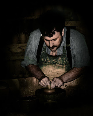
I've written before about making the person looking at an image follow where you want them to go within the image. Here's a rather extreme example of the use of light and dark to guide the eye. A couple of techniques are in use here. Some of the color has been drawn out of the image, a severe vignette has been used to keep the viewer from exiting the shot on any corner or side and the areas of prime interest have been brightened. All of this is an attempt to match the concentration shown in the subject's action. The vignette isn't complete. You can see the shelves of pottery behind the potter. You get the idea that this is a vocation and, possibly, a calling. Someone showing that much intensity over producing a small, utilitarian piece has to have the power of the image match his work. The two key areas are his face and his hands. Everything else is darker and receding from those two points. To read more about the thinking behind this image, hit the "read more".

The origin of the shot was much fuller and more colorful. The brightness of the shop made colors that popped and didn't lend the tone of hard, concentrated work that the image needed. Decisions need to be made about each image produced and this is certainly a departure from the vibrant, richly colored prints I normally make. I wouldn't call this subtle, but it is subdued. There's a place for the loud, bright images I typically do and there is, most assuredly, a place for a restrained piece. Some of the best images I can remember have soft color shifts. One of the places I look to find outstanding landscapes is a site called "Landscapes 2.0" (link) . The images found there are typically, very soft, very luxurious, lush, opulent, and about any other descriptive word you can think of. The use of soft light, slow shutter speeds and (I'm fairly sure) the use of Neutral Density and colored filters is done with a deft hand by each of the photographers.
.
Okay, does the potter match up with the images found on Landscapes? No, of course not. They're two different sectors of what may be called subtle colors. I haven't departed too far from my typical "in your face" style. Certainly not to the point of the images found on Landscapes. Before the summer is over I'll make a attempt at producing a Landscapes worth image. It's not like I haven't "reverse engineered" the "how" of the shots and I do have the ND and colored filters sitting in my lighting bag. So, all I have to do is tap into my sensitive side and show a modicum of restraint.
.
I might have my chance this weekend. We'll be shooting along the shore in Rhode Island trying to get some sunset and night shots of the lighthouses. We'll see if I can keep my "normal" style in check and come back with quite a bit softer than my usual "stuff" Read more!

Wednesday, July 22, 2009

In the Still of the Night

I was playing out on the deck the other night at about 9:45 and came up with this image. Naturally the camera was on a tripod, but there is no unusual filtering. We'll be heading out to do some night photography in the next couple of weeks and I wanted to work out any kinks in the methodology well before leaving. I will admit to color correcting the image, but it was exactly the same workflow I use on daylight shots. What I see is three different light sources, with two color temperatures. The lights on the posts are solar powered LED lights. At best they give a soft glow when viewed in real time. Here they appear to be high illumination, powered lights. The next light source is a street light about 150' away. A tree stands between street lamp and the wall of the house, casting the mottled shadows on the wall. It shows the relationship of light temperatures between the white of the LEDs and the warm, reddish color of the incandescent street light. The third source lights the sky. It's light pollution from the center of town about a mile away. The reason for the red glow is the same as for the mottled light of the rear wall. The street lights and, probably, the lights in most of the buildings are the same incandescent type found right outside along our street. I may have to do something about showing this image to the town fathers and asking them to reduce the town's electrical bill by going to more energy efficient bulbs. Well, that explains the experiment. If you'd like to know more about the night photography project, hit the "read more".

Before getting to the project I'll have to explain a little about night photography. It is a little bit of "by guess and by golly" photography. There are a couple of traps to watch for and things to remember. First would be that it ain't like daylight photography. There's no grab shots in night shooting. You have to do some preplanning and you might want to bring a tripod, some sort of remote release, a flashlight, a chair and an adult beverage. You're going to be awhile. It doesn't hurt to be able to visualize what the camera to doing without needing to put your eye to the viewfinder. Trying to look through probably isn't going to help a lot anyway. It's also helpful to understand hyperfocal focusing. That's where the flashlight comes in. You may want to put a red filter over the business end of the flashlight so you don't wreck your ability to "see" in the dark. The red filter won't effect your "visual purple". http://en.wikipedia.org/wiki/Rhodopsin Chances are you don't want to wait a half hour after each time you light the flashlight to be able to find your camera. Sort of counterproductive.
.
Back to the original intent of this post. If you understand where the "in focus" range for a given focal length falls you'll be able use the flashlight to help set the focus using the focus ring on your lens. (Make sure you have the lens on manual focus, any vibration reduction off.) "Most" night photography falls into the wide angle category. If you're looking for star trails or a big ol' moon you'll get into longer focal lengths, but "most" will be wide. So, we're at a small focal length. Something like 18 or 24mm. If the camera is on a tripod, set to a "normal" height and you use a small F-stop (F11, F16, F22) your shortest focus distance would be about 6' or 8' in front of you. You "should" have everything in pretty sharp focus. If you're down low to get the rocks at the edge of the water you have an different set of focusing problems to deal with.
.
Now, sit back, get comfy and have that adult beverage. You're on the bulb setting for your shutter speed. Make sure whatever way you have your shutter release set up you follow that routine. If you can click to start the exposure and click again to end the exposure, great. If you have to hold the release to keep the shutter open, make sure you use your non adult beverage holding hand. You can start making your exposures. With the lens stopped down you're going to be a while. One thing to keep in mind is that the write time to get the image onto your memory card is going to be just about the same as your exposure time. If your exposure is one minute, as in today's image, your write time will be about one minute. A five minute exposure would have about a five minute write time. Ten minutes = ten minutes. One hour = one hour. You can see that you won't be getting a lot of shots. You might as well take the camera off that high speed shutter, it ain't gonna help. There's other things to think of, but this is starting to get to be a ramble.
.
The project is to get some decent, salable shots. Simple as that. I'm thinking no one will be paying for a print of today's image, unless your my wife (wait a minute, she won't pay me either. rats!) The immediate purpose is education. I'll figure out how to sell something later.
Read more!

Monday, July 20, 2009

Believing the Lies

There are stories about doctored photos that go back to when photography first started. During the Cold War the USSR was famous for rewriting history to suit a political need. One of the more famous shots from the USSR was of a group of astronauts. There are two versions of the same shot. The story goes that one of the astronauts died in an accident. I'm a little hazy on if he met his end in space or in a launch pad accident, but in version two of exactly the same shot he was gone. Playing with the content of an image has been the subject of great debates. Over the weekend I was teaching a group some Photoshop tricks. I showed how the colors in an image (similar, but not the same as today's images) can be manipulated to convey a different version of "reality". One of the attendees called out that the simple change of color was "cheating". The "original", in today's case, is the smaller image. To get my thoughts on "cheating, hit the "read more".

The key to if it was "cheating" is intent. Not the moral conundrum of making any change being "cheating". The intent we have here is what is the image's function. If the shot were to be used for a story about "why there isn't any variety in kayak colors", obviously this type of manipulation would carry some serious weight. Photojournalist's have been fired over things like that. Rightly so. If a photo is trying to tell a "true" story, you'd better have a "truthful" representation of what went on. In the case of the USSR photo of the astronauts it was obvious that the "intent" of the second (doctored) photo was to mislead. There is a "code of conduct" for folks trying to make their living informing the public through photography.
.
Another area would be pure nature photography. If a photographer got to the "dry darkroom" of the computer, only to find he/she had two "almost" good shots it could present an issue. One shot where the body of a bird looked great and the head was turned in an awkward position and another shot with the body looking clumsy, but the head looking great. It would be just as improper to switch heads as it would be to put a pigeon's head on a robin's body. Nature photography relies on accuracy, not believability. A photographer approached me at a competitive event a while back and informed me, in no uncertain terms, that my image was unsuitable to be in that competition. I asked him to explain his thinking. His claim was that, since there was no "hand of man", the image was a nature image and the colors in the image didn't exist in nature. Therefore, it was not a true representation of the natural world and shouldn't be used to give the impression someone could go to the place the shot was taken and see the same colors. He came so close. The one thing he missed was intent. It wasn't entered as a nature image. It was entered as a artistic, pictorial image. The intent was to have the viewer get a "feeling" of the place, not to believe such a place existed. One of last week's images was a garish image of the same stream. (I go back there semi often.) I don't think anyone would mistake it for a nature shot. Intent is what separates the use of a print or technique, not other people's interpretation of what your meaning is.
.
That brings us to today's images and the person who thought I had "cheated" by changing the color of an object in an image. As long as the "intent" is "art" and not a realistic recording of an event or scene, manipulation of colors or objects or other changes to the original capture is not a problem. Hell, look in any magazine. The images of the models (female or male) in the ads aren't there as photojournalism, they're there for advertisement. It's trying to sell something. There is a trend that's gaining a little steam among some public figures that they be shown "warts and all". Sure, before going in front of the camera the makeup is flawless, but if there's a small "love handle" at the waist they want it to be shown "as is".
.
There's a difference between the recording of an event or scene and the "art" of photography. Sometimes you get both. Check out my friend Kathy's blog (link) about the ballet event she just shot. You'll see a great union of recording a scene and art. The two (art and reality) don't have to be mutually exclusive. Intent is the key.
Read more!

Friday, July 17, 2009

See, I Told You I Hadn't Flipped Out

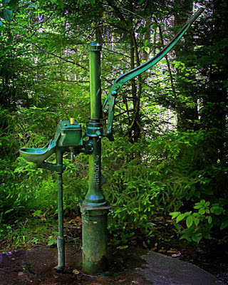
In Wednesday's post, the image was a garish, over the top, HDR shot. I said it came from just playing around to see how far that particular image could be taken. I'm back to reality and today's image was taken within a half hour and a half mile of the stream in Wednesday's image. This shot is also an HDR image. The big deal is the fact that it was taken in an entirely different way and finished as far to the right as Wednesday's image was to the left. Wednesday's image was very deliberately setup. Camera on the tripod, live view turned on, aperture set high to slow down the shutter speed and a remote trigger used to trip the shutter five times. Today's image is five shots, set one EV apart (-2, -1, 0, +1, +2), aperture set to about 5.6 to maximize shutter speed and hand held. To find out more, hit the "read more".
The way my camera (Nikon D300) is set up I only have to tap the function button, found between the right hand grip and the lens mount, and spin the command dial to adjust the number of exposure EV steps I want to take. The difference for each step is set in the menu system. The camera was set to high speed continuous shooting and the fact that I had the bracketing set to five shots automatically stopped the shooting at five. A good stance, proper camera holding technique and breath control allowed the five shots to rattle off without any significant camera movement. I "chimped" while the buffer was sending each shot to the memory card and, when I didn't see any discernible bouncing of the water pump I thought I might have something I could play with.
.
Wednesday's image was put together in HRDsoft's Photomatix. Today's was done completely in Adobe's Photoshop, soup to nuts. Before someone goes crazy and yells about the trees on the edges not having enough detail, let me explain. A vignette was applied to the semi-finished image (as far as I'm concerned, no image is "finished" until a vignette has been applied) to hold the viewer and focus attention on the water pump. Therefore, the dark edges were an "artistic" decision, not some problem doing HDR in PS. Once the image was assembled, my "normal" workflow was used to bring out the richness of the image. After a start point was established the "real" work began.
.
The burning and dodging tools in Adobe Photoshop CS4 are a vast improvement over those found in past iterations of the program. Both are very usable if used with a light hand. In order to guide the viewer through the image some parts were brightened and some toned down. The overall effect is to make the pump pop out of the background. Just as an example, the far end of the pump handle was somewhat lost in the darkness created by the vignette and the trees. A little dodging, using a low exposure in the "shadows" range, was used on the end of the handle to slowly bring the handle forward.
.
Wednesday's goofing around was fun, but the straight use of HDR looks like it has a place in the photographer's toolbox. I understand I'm a little late to the game and some HDR zealots will say "Duh", but, better late than never.
Read more!

Wednesday, July 15, 2009

Have I Gone Over to the Dark Side???

I'm not sure if the rest of the world is as nutty as I am, but I sure hope so. I've had HDRSoft's Photomatix for a while now and just never got around to playing with it. We were up in Vermont this past weekend and stopped at my favorite stream. (Thank you Dave Middleton) Since I had the tripod set up anyway I figured I'd take a few frames specifically for HDR. The goal was to do a straight, photo realistic, image and see how much detail I'd be able to pull out of a five shot, one stop differential group. Being the serious (yea, right) photographer that I am, I told myself I had no interest in "that postery effect" some people are into with their HDR work. I'm too cool for that, not!!! I do have the image you see here today and a straight version, just to make sure you know I haven't completely gone off the deep end. This was, at least, a two step process. To find out what I did, hit "read more".
.
Photomatix took me half the way there ("she was a day tripper, ya". Sorry, Beatles song just popped into my head.) Once I maximized the effect in Photomatix I thought to myself that I might be able to push it further and, at the same time, alter a couple of things I didn't like. This was actually "finished" in Photoshop using my "normal" work flow to pull max saturation from any shot. (See just about any other image on this blog and you'll see what I mean.) Once there, the bank on the other side of the stream was about a dayglow green. Looked like an attack of some alien moss creature. It just didn't go with the rest of the image. I got a new layer, took a big ol' soft brush, loaded up a medium deep brown and painted over the offending rocks. A flip of the blending mode to color made things a little more palatable. Then it was a matter of putting a mask on the layer and, using grey tones, selectively bring up or down the intensity of the brown. I don't know if I'm happy with the upper right corner yet. Leave a comment and let me know if you think I need to do a little more work on that section.
.
My first impression is that Photomatix is a hoot. I'll probably be using it more for straight shots (as straight as HDR images get) rather than falling off the scale on the other side, but I think there's a place to play also. It never hurts to get your hands dirty.
.
I'm reasonably sure this image will sell. Each year Doris donates one of her prints to the local Relay for Life (a cancer fund raiser). Her day job is at a local company that hosts a yearly hospice fund raiser that includes a silent auction of local art. She showed the organizers this blog and they asked her if I would be willing to submit a couple prints. I think a 24 x 36 might be one for the hospice auction. If nothing else, I'll try for the "if it's that big, it must be good" crowd. Read more!

Tuesday, July 14, 2009

One Step Farther

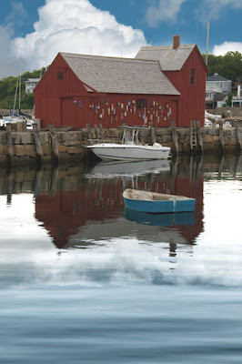
In the past couple of weeks I've taken a look at Motif #1 as a digital "Kodalith" and how to use the "Blend If" settings as a "Layer Style" setting. Today we're going to explore "Blend If" a little more. With the Kodalith version it was pretty simple to just move a slider and switch the white, blown out, sky with a nice rich black. The black with "reflected" in the water, but appeared natural (as natural as a Kodalith might get) in the finished image. With today's image, the blank sky has been replaced with a cloud filled sky. If it were left that way there would be something missing. Water is the lower half of the image and water reflects. If there are clouds in the sky there should be clouds reflected in the water. The sky is easy. A couple of sliders and we're done. It's a simple replacement of one thing with another. The water is a little trickier. We have to be able to see that there is water plus the reflection. We can't just plop some clouds in and hope people will understand what's supposed to be there. We can't have clouds resting on glass still water, 'cause water just don't sit still. Therefore, we have to have clouds. We have to have water. We have to have ripples in the water. We have to have a gradual fading of the sky into the water. As you can see, instead of one function like the Kodalith had, we now have multiple issues to deal with. What has to be done is follow a set of steps to get where we want to go.

First thing we'll need is two copies of our cloudy sky. One will be the easy part, just some "Blend If" slider action and we're good to go with that piece of the puzzle. First thing we need to do with the second copy is flip it vertically. No problem, simply hit CTRL T to get to the Free Transform, right click and select "Flip Vertical". At this point we're going to need a second copy of the main image. Just a simple CTRL J will do the trick. Give it a mask and make the mask black on the top half of the image. (We will need an opposite mask applied to the original copy of the image. Can there be such a thing? An original copy?) The original needs a mask applied opposite of what we just did on the "copy of the original copy" (???). Hold down the ALT key and drag a copy of the, already made, mask to the image layer. With the mask selected you should be able to hit CTRL "I" to invert the black & white portions of the makes. When making the mask, try to hide it in the rocks under the barn.
.
We're at the point where we can again play with the "Blend If" sliders. This time blend the clouds with the water. You may have to clean it up a tad by splitting the sliders and doing a little "air brushing" of the split to get it to be a more natural transition. Now we should have the inverted clouds blending with the water. At some point the water is going to get so strong as to completely fade the sky and you'll only have water. The problem is still that we have flat water. Not to worry, we can handle that.
.
We'll need a new blank layer. On the layer we want to put in our own "clouds". Select Filter/Render/Clouds. Does that look sucky or what. Reduce the size of your image on the screen by hitting the CTRL - (Minus) keys several times. Get to the "Free Transform" area by selecting the CTRL "T" keys. Take the vertical middle handles and pull them way out to the left and right. By "way out" I mean the area constrained by the transform should look like a very wide, thin pano. You'll see that the "clouds" are less blotchy and have taken on a look of waves (or ripples). You can't "see" the extent of the "clouds" that hang out to each side of the image but it is there. If you want to test it, take the Move Tool and slider the clouds left or right. You'll see that the rest of the clouds that were transformed are still there. We need to get rid of them. In order to control the size of the file we'll need to "crop" the image back to the original size. The last little bit should be playing with the Layer Blending Modes and the Layer Opacity. For a Blending Mode you'd probably want to start out with Overlay or Soft Light. Use the up and down arrows to run through the stack, but you will most likely come back to Overlay or Soft Light. If the 'waves" appear too strong, reduce the layer Opacity.

That should be about it. Take a shot at it.
Read more!

Friday, July 10, 2009

Now Where Was I Again?

Sometimes you can have a dramatic shot and not be able to tell someone looking at it where you were. (Another strong case for geo-tagging.) This place looks familiar. I think I saw it in "Back to the Future 2". It was the clock tower Dr. Emmett Brown climbed to catch the lightning to power the Delorean back to the present day. Sure, that looks like it. Clock, tower, dome, serious building, must be the place. Actually, it ain't Hill Valley of movie fame. I don't think you could get that color sky in the fictional town even with a Polarizer.
.
Have you ever noticed when you look at the sky it seems paler down near the horizon and deeper blue the higher you point? Well, this image has the camera pointed almost vertical. I swear there isn't a bogus sky plunked down behind the tower. The sky was that blue in January, in Antigua. The Sun must have been 90 degrees toward the left and that polarizer was working overtime. The EV (Exposure Value) was down 1.3 stops. That's a bunch, but can you imagine what the clock face would have looked like without cranking down the EV? I can, I was there clicking the shutter, saying "nope, still got the blinkies", and ratcheting down the dial another third of a stop. The value of the whites is a big number, but it does fall short to 255, 255, 255 by a good fifteen points. The cornice under the clock on the right hand return is the blackest area in the shot, but it doesn't go bouncing around at 0, 0, 0. It's about 7 points above absolute black. I defy you to see anything there (specially in the low rez, monitor ready image used here in the blog) but it's there in the original.

.
I already have a fairly successful print of the church. With a little work, this one might join the other's ranks. If you ever do get to Antigua on a cruise ship, didn't book an excursion and are looking for something to do, take a walk up to St John Basilica. It's a pretty neat place and usually good for a couple of interesting images. Would you believe there's a wooden church inside the facade you see here? Check it out, it's pretty interesting.
Read more!

Wednesday, July 8, 2009

The Myth of Digital Infrared

Every time I see an article on digital infrared photography I see the author saying he/she sent her/his camera out to be modified. What they seem to miss (or, if they know, fail to mention) is the fact that removing the IR filter from the sensor is an accommodation and not a requirement. What removing the filter accomplishes is reducing the time needed to take the shot. Today's image isn't the best infrared shot ever taken, but it was made with an unmodified camera. A Hoya R72 infrared filter was used with the camera on a tripod and an 8 second exposure at F22. Certainly not something you want to hand hold. The R72 IR filter passes light starting at about 700 nm (nanometers) and reaches peak transmission of light at approximately 720 nm. (Hence the "72" portion of the name.) If you had two of these suckers I'd bet you could make an excellent pair of welding goggles. You can't see "anything". I mean hold it up to the light and nothing, nada, blank, normal indoor lighting doesn't have a chance against this beast. To find out more about infrared with "normal" cameras, click the "read more".
The part of the equation the authors of the articles miss is that removing the IR filter from your camera reduces the shutter speed needed to take the shot. I haven't had the opportunity to use a modified camera, but I'm thinking, with the filter gone, you may be able to get to the point where you can hand hold a shot. If that's what people are writing about I'll go along with that. I've already conceded that I can't hand hold an eight second exposure. If removing the filter gets you down into the 1/30 of a second range, I can do that. Most infrared images aren't long telephoto shots. They're "normal" to wide angle shots. I'd give up a couple of F-stops and shoot all day at 1/30th and F 8. The Depth of Field (DoF) would be sufficient for most shots and the wide angle shutter speed is doable.
.
So, what am I missing? With an unmodified camera I'm giving up the possibility of taking hand held shots. Okay, if I'm shooting "serious stuff" I'm typically on a tripod anyway. I'm losing a couple of stops of DoF. Okay, if I have the tripod set to a "standing height", with a wide angle view, I probably have all the DoF I need. (With the focus at infinity on an 18 mm setting on a lens the minimum acceptably sharp area is probably fifteen feet (??) to infinity and the downward angle from "standing height" is probably twelve feet (??) before it hits the ground. The "out of focusness" (aha, a new word for the lexicons. Somebody got to make them up.) is probably still not offensive. If you're lying on your belly at the beach trying to get the beach, the rocks, the sea, the horizon, and the heavens in sharp focus you probably want to take that downward angle into consideration, but, we're at "standing height".
.
There are things to keep in mind if you're using an unmodified camera to play with infrared photography, but nothing that's insurmountable. The one thing that might cause you to pause would be the price of those filters. The tag on the 67 mm R72 Hoya at B&H is close to $90.00. To go to a 72mm, plan on shelling out an additional $200.00. Close to $300.00 for a filter to play with is a wee bit steep in my book. The 67 with a stepdown ring for the lens (a 72 mm to 67 mm Cokin at B&H for less than $15.00) is more in line with my pocketbook. You'll just have to keep in mind that you will be getting some vignetting and shoot to the center of your image. If you're going to make a living shooting IR, by all means, get the pricier filter. In fact, get the proper size for each of your lenses. If it's an experiment, borrow your buddy's setup.
Read more!

Monday, July 6, 2009

Be a Sponge

Everyone starts at the same place. Photoshop is a daunting application and everyone just starting out is overwhelmed by it. I don't care if you started with version 2 or CS 4, there is so much to Photoshop it's scary. If you think you're hot stuff try taking the Photoshop ACE (Adobe Certified Expert) exam. It will, most likely, be a humbling experience. I think I took a practice exam for the first time with CS2. Before that I didn't know there was such a thing as an ACE exam. When I tried it, it became apparent that I had never heard of the things many questions were asking about. I think I got about a 10% grade on that struggle. There's a couple of hours worth of questions and it covers just about all aspects of the program. Everything from what a photographer might use to what a straight graphics designer needs to accomplish his/her tasks. If you use PS for a specific purpose you might have a handle on the branch dealing with the things you do. A little example: I know a couple of twenty somethings who have degrees in the graphics arts. One has written a highly illustrated book and has been the artist for a couple of children's books. The other makes a living designing corporate identities, websites and the like. They both mesmerize me with the things they can do in Photoshop. I'm a photographer. When I show them some of the tricks I use in my everyday situations their jaws drop. What's familiar about Photoshop to one person is Greek to the next. If you'd like to hear about today's image, hit the "read more" link.

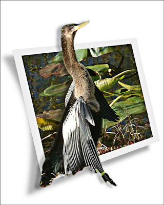
Today's image started out as a "normal" image, with the bird being surrounded by the Everglades. It was created going on seven years ago, pretty much at the beginning of my involvement with Photoshop. At that time I had, basically, no idea what was going on or what I was doing. The only thing I had was an eagerness to learn. I think I picked up every magazine that even mentioned Photoshop. Anything with a tutorial in it (there weren't that many online tutorials at that time). I'd follow the tutorial line by line, but I'd use one of my own images. That way I had to do the things the authors were talking about.
.
Today's image is a direct offshoot of part of my early learning curve. I saw a tutorial in Photoshop User magazine and thought it was pretty cool. (Picture today's shot with a baby poking out of the "photo".) The one in the magazine might have been a horizontal rather than a vertical, but that really doesn't matter. I wasn't trying to duplicate what I saw in the tutorial, I was trying to learn what was being taught in it. I've probably gone through hundreds of tutorials. Even today, if I see an online tutorial, I'll check it out and try to produce the same look and feel of what the educator is showing. The biggest difference between yesterday (many yesterdays actually) and today is when I was first starting out I'd follow the tutorial as a recipe, step by step. Today I'll watch (or read) through the lesson and then take a shot at it using the concepts being taught rather than following by rote.
.
A friend of mine excitedly told me she had found a program that allowed her to put what looked like a linen texture on the "matte" portion of her images. She'd do everything she could in Photoshop, save the image, import into this other program and apply the linen "matte". I told her I had a program that could do the same thing. She asked what I was using. I told her Photoshop.
.
Photoshop has so many tentacles, reaching out into so many niches, that those who are able to master the ACE exam are a pretty rare breed. To those who are still learning Photoshop I'd say don't be afraid to be a sponge. Follow every tutorial, check out every magazine, view as many online videos as you can. Soak up as much of the community knowledge that's out there as you can. But (and it's a big "but"), have fun doing it. It ain't no fun if you're not having fun Read more!

Friday, July 3, 2009

Happy Birthday to U.S.

If you've been following this blog you've probably noticed most of the images are not subtle. They tend to smack you up along side your head. I'm not going to pretend that the colors in today's image are not fully saturated, but there is a subtlety that takes a moment to see. One of the details of this shot (composite) is the placement of the flag. There are three silos and the flag could have been put on any of them. The reasoning behind using the middle silo was to give the "breeze" somewhere to blow. If the flag had been put on the far right silo the edge of the flag would have bumped up against the edge of the frame. It would have looked pretty awkward and have been a distraction rather than an element. To check out the subtle part of the image "read more".

When you look at the image you basically see three colors. Yes, there is the pale green of the roofs, but cool colors tend to recede and it isn't a big color element. The big, bold colors of the scene reflect the colors found in the flag, giving an overall patriotic feeling. In about 80% of the image the colors you see are either red, white or blue. Here we have a case of using color to tell a story. The flag is a very small part of the shot, but it takes on more than it's physical share of importance due to the repeating colors found in the rest of the image. We, at the gallery would like to take a moment and wish everyone following our little stories a very good 4th of July. Like most of the holidays during any given year, rather than thinking of the moment, think of the meaning. Have a good weekend.
Read more!

Wednesday, July 1, 2009

There's an old saying that if something seems too good to be true it probably is too good to be true. I know of one thing that's lived up to this type of hype, but that was in a far different part of life. Our image today has tremendous Depth of Field. Depth of Field is defined as the area of acceptable sharpness. In any given image there is only one truly sharp plane of focus, but due to the gradual drop off there is an area that appears sharp. The length of that area is determined by the aperture selected. If you'd want to get far down into the minutiae of optics it's the area where the "circles of confusion" are small enough so as not to affect the clarity of the image. Fortunately this blog isn't an optics blog and won't get into a discussion along those lines. Suffice to say, sooner or later, things get fuzzy. Can today's image really have as much Depth of Field as shown?


Sure it can, the only problem is you can't have this shot with that much DoF. With a extreme wide angle lens you can have acceptable sharpness from a few inches to infinity. We don't have infinity here, but we do have a couple hundred yards to deal with. If this shot were taken with an extreme wide angle lens and the carved tree and pen knife were in focus, the bridge would be a very small piece of the image. In order to have both the tree and the bridge as objects central to the story being told the final image was made by compositing two shots. Just as a disclaimer, no trees were harmed in the shooting of this image. The "tree" was a piece of fire wood from a tree cut down by the town's highway crew after a major storm. I got some jaundiced looks from the foreman when I asked for one piece of wood. Even more when I spent twenty minutes picking through the pile to find just the right piece.The major (background) portion of the image had been shot months before and needed "something" to make it work. The fence and tree in the foreground gave some depth, but something with impact was needed to finish the story. I spent about two night carving the heart and initials in the wood. (The little pen knife wasn't really used to do the carving, but I thought an Exacto knife would have ruined the mood.) The third night I shot it. Two speedlights were used to get the highlight and shadow detail just about right without having too obvious of conflicting shadows. The second shadow is there but, unless I mentioned it, you probably would have let it slide. The rest was just a case of, basically, doing a cut and paste of the "tree" into the covered bridge image. It is possible to get some great Depth of Field, just not as much as would have been needed in this image with the lens needed to get the bridge the right sized. When shooting, make the decisions about what you're trying to accomplish. Control the important factor, weather it's short DoF, long DoF, stopping action or accentuating motion. Once you've "seen" the final image in your mind let the camera do the mathematics. That's one of the things you paid for. While it's important for you to know the what and why the camera is going to do something, The camera is much more accurate in figuring out the how once the important decisions are made.
Read more!