It’s been two hundred and thirty four years since the first man laid down his life on the Concord Green in defense was what was to become the United States of America. It’s been one hundred and forty two years since General John Logan officially proclaimed, in his General Order No. 11, that May 30th should be observed. The first line of the order is:
i. The 30th day of May, 1868, is designated for the purpose of strewing with flowers or otherwise decorating the graves of comrades who died in the defense of their country during the late rebellion, and whose bodies now lie in almost every city, village, and hamlet church-yard in the land.
The order goes on to say that “no form of ceremony is prescribed” and that it should be up to the individual posts to arrange some sort of service. As is usual in the United States, it is the individual entity that is in charge of what should be done. Whether the individual is a military post or a neighbor’s backyard, it is the individual’s decision how the day should be observed. It could be attending a parade, having a cookout, visiting a cemetery to honor those who gave “the last full measure of devotion”, or any other way remembering what Memorial Day means.
My Dad, his brother and Mom’s five brothers all served in WWII. My two brothers and I served during the Vietnam Conflict. Everybody came home alive. Dad was an Army medical officer in England, his brother, a Marine, standing on a hill in Hawaii on December 7th 1941 and saw the attack on Pearl Harbor. Mom’s brothers all served in the Army. Some as infantrymen in Europe, Africa and the Pacific. Tom, the oldest was stationed in the US for the duration. Ed, the youngest, was an eighteen year old bombardier in the Eighth Air Corp, flying missions over Germany. My brothers and I spanned the Air Force, Navy and Army. The fact that we all made it astounds me. The fact that there is only one Purple Heart in the family is amazing. The family was truly blessed.
I can’t think of any country in the world that hasn’t lost sons or daughters in defense of their homeland. I, personally, invite all who read this to take a minute and remember those who defend the way of life you have. Have a thoughtful Memorial Day.
Read more!
Monday, May 31, 2010
Monday, May 24, 2010
Thank Goodness People Paint Barns Red
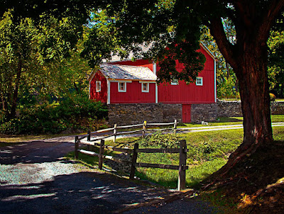
It’s a wonder what a fresh coat of paint will do for a building, particularly a barn. You usually find barns in interesting locations, like on farms. (Nothing like stating the obvious.) Today’s image comes from the Delaware Water Gap area of Pennsylvania. There’s always something to photograph there, whether it’s the river itself, or a park like the one this barn coming from, or the rolling hills from the scenic overlooks, or the hidden treasures found by wondering around the area. The barn in today’s image had just received a fresh coat of paint. The color in the image has been juiced just a bit, creating the scene more like what’s bouncing around in my memory. The brightest areas of the image (the barn roofs) clock in at a value of about 235, so there is a very little bit of detail. It may look blown out and the only way to truly determine that there’s something there is to look at the Info Panel in Photoshop. The Info Panel is a great tool for giving you information. Before you go to the Recovery Slider in either Photoshop Lightroom or Adobe Camera Raw, opening your image directly into Photoshop and looking at it critically using the Info Panel will give a clue as to if the shot is worth working on. Let me step back. If your image is really solid and not pushing the edges of the Histogram you don’t need this step. If you’re curious about an iffy shot that might be blocked up in the blacks or blown out in the whites the Info Panel can help answer your questions. You have to remember that the Recovery Slider and the Fill Light Slider can only do so much. If there’s no information at either or both ends of your Histogram all the sliding in the world isn’t going to put detail back in. Today’s image is from one shot. There’s detail in the whites and detail in the blacks. It was a little rough pulling it out, but it was there. To find out what attribute of Adobe Photoshop CS5 was used and to find out about the Hue/Saturation Adjustment Layers used bring the maximum color out of the image, hit the “read more”.
Read more!
Friday, May 21, 2010
Put Some Clouds In Your Pocket
If you browse through the last past hundred and sixty plus post here at the gallery you might see The same shot over and over again. It won’t look the same and you might have a hard time spotting them, but they’re there. You can’t always be in a great location in ideal weather conditions, nor should you want to be. Ideal for a picnic is probably not ideal for photography. Bright sunshine, a warm breeze and cool shade all sound good for a fun afternoon, but you might want to leave your camera at home (not really). The contrast between that bright sun and that cool shade is probably more than your camera can handle. There are all sorts of things you can do. If you’re shooting people, move them into that cool shade and fire away. Pull out your speedlite and practice your off camera flash technique. Set up one of those “easy up” awnings and use it for a makeshift studio. Take small, intimate shots where harsh shadows might be “artist”. Another time to get creative is when the sky is just plain flat grey. You can shoot just about anything, but your sky will probably wind up being a big blank area in the frame. If we were still back in the “olden days” of film and slides, the slide would be totally clear. That’s when having an assortment of cloud images on your hard drive is handy as heck. We don’t several examples of putting in a sky. I have to give a class to a local group in a week or so and I’ve reviewed some of the group’s work. They’re just starting out and are committing the typical rookie errors. I can spot them a mile away. Why, because I probably made the same mistakes on my way up. Taking images of clouds that will pop right into a background isn’t as easy as leaving your camera on Auto and pointing it upward. To find out about the trick to shooting clouds, hit the “read more”.
Read more!
Wednesday, May 19, 2010
Adobe Photoshop CS5 HDR Pro, Then HDR Toning, Then Content Aware Fill, Then Finishing For Effect.
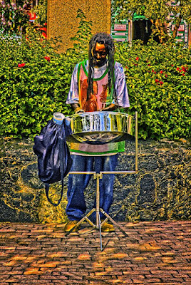
I’m pretty sure that has to be the longest title I’ve used here on the blog, but it only sums up what was done to this image to get it where it is. It looks like I’ve been sort of stuck on a tropical theme for the past week of so, but images from the tropics lend themselves to using eye popping colors. Today’s image kept leading me forward begging for more and more work to be done on it. I probably spent more time on this image than anything I’ve done in the past six months. Before I was happy with the results a half hour had flown by. Just to list the major steps used to “develop” the image makes me laugh.
• HDR Pro used to work three hand held images to one starting image
• Use HDR Pro’s Remove Ghosts checkbox to isolate one version of the drummer
• Straighten up image using upright on the drum stand as a reference
• Use Content Aware Fill to fill in triangular areas produced by straightening
• Use HDR Toning to increase the HDR effect
• Find Black, White and 50% grey using Threshold Adjustment Layer for markers
• Neutralize any colorcast using a Curves Adjustment Layer
• Use Dodge and Burn Tools (O) to create emphasis on folds in the shirt, pants and bag
• Use the Loop Tool (L) to make a loose selection around the drummer
• Feather, then delete selection to create an outline around the drummer
• Change Blend Mode to Multiply to make a vignette close to the drummer
• Sharpen the overall image using a High Pass Filter and Overlay Blend Mode change
• Repeat vignette using a feathered Rectangular Marquee Tool selection
The one thing you don’t see that’s a deviation from my “normal workflow” is that you don’t see individual Hue/Saturation Adjustment Layers for each color. The colors seemed to “pop” enough without going through that sequence. Another thing you don’t see is the false trails that were attempted. To find out how the Dodge and Burn Tools (O) were used to create the emphasis, hit the “read more”.
Read more!
Monday, May 17, 2010
Iconic is Iconic, What Can You Say
Anyone who has followed this blog for any amount of time has seen images of lighthouses. There’s been Pemiquid, Portland, Cape Natick, Bass Head, Lighthouse Park and now Key West. Is there a reason lighthouses end up featured on the blog so often? Sure, they’re iconic if you live anywhere on any coast in the country. Lighthouses have might and meaning. They bring us back to a different era in our history. They’re preserved, but no longer needed. Most venturing out on the seas today have some sort of electronic gear to tell them exactly where they are. The light shining on a clear night or the horn blaring in the fog are more for show today. The signal they give is one of nostalgia or comfort. They remind us of home, if that’s where you’re from, or a time spent at the shore as kids. Hopefully today’s generation of kids will have the same memories given them by their parents. That’s why photographers shoot them. When the waves are crashing or the weather is bad the drama of a shot of a lighthouse is heightened and the images special. If you don’t live near a lighthouse and aren’t at one on one of those magical days when the weather gives you a great backdrop for the lighthouse you have to improvise. To learn a little about the improvision in today’s image, hit the “read more”.
Read more!
Friday, May 14, 2010
Unbelievable Believable HDR with Adobe Photoshop CS5
I had an interesting encounter the other day. I ran into a retired commercial photographer I’ve known for more the three decades. He’s seventy five plus now and freely admits he bailed out just when digital photography got started rather than go though the education process as a novice. I’ve always respected his opinion and asked if he’d care to see some of my current work. I showed him today’s image and saw, what I thought was a strange reaction. I asked him what was up. He said he thought it was a fairly average shot that any amateur could take with a point and shoot camera. I have to admit I was a little put off by the comment considering all the work that went into the image. After he left I was still pretty bummed about the comment until I thought a little more about it. It was then I figured out that I had done a “good enough” job on the image to fool a very serious commercial professional. As I said, he had retired from photography at the dawn of the digital age and had no working knowledge of modern techniques, or HDR, or any of the tools we use today. He had no idea, nor could he have had knowledge that the barn was really askew in the original shot. Then I first looked at it I thought the camera might have fired accidentally while I was bringing it up to my eye the thing was leaning so much. The barn had to be rotated about ten degrees counterclockwise to straighten it up. Rather than crop into the shot I considered letting Content Aware Fill do its magic and see what would happen. Imagine a line from the lower left corner up to the top of the shadows of the fence on the lower right. That’s a pretty good chunk of real estate. Look what Content Aware Fill did. As far as I can see it did a remarkable job sorting out the shadows and highlights. Seeing as the bottom was tilted so much, the top had to be off by that much also. Luckily it was sky, but it also added in the second treetop right on the edge of the shot. Again, an amazing piece of mathematics. To find out more about other things that went into the making of today’s image, hit the “read more”.
Read more!
Read more!
Wednesday, May 12, 2010
Adobe Photoshop CS5 Content Aware Fill And Dave Cross' "Trick".
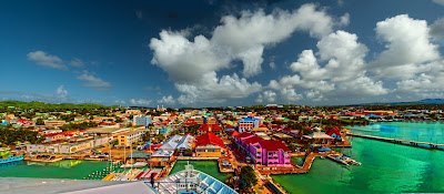
Today’s image is sort of a follow up on both Monday’s post and on last Friday’s post. Monday’s because I received a couple of questions about the colors in the Caribbean. I did saturate the colors after using Adobe Photoshop CS5s HDR Toning, but I can assure everyone that the colors in Antigua are just about that intense. Today’s image is taken from high on the cruise ship and is a three panel panorama. That’s where last Friday’s post comes into the picture (bad pun). The pano is made up of a typical hand held series of shots and has the typical offsets found when attempting to get three shots while shifting around. CS5s Content Aware Fill was used with a technique I saw Dave Cross (of Photoshop User TV fame) demonstrate. Rather than cropping to get square edges the Content Aware Fill allowed the image to be filled out creating the rectangle shape. The trick is giving CAF a head start. Check the “read more” to find out what the trick is. Meanwhile, back at the colors, the Caribbean is full of brightly colored buildings, with each island having their own, unique combinations. The images for today and Monday have both been hit with CS5s HDR Toning. It did a good job bringing out details, but pumping up the colors is better suited to being done after the HDR Toning is complete. To find out more, hit the “read more”.
Read more!
Monday, May 10, 2010
How Many Colors Does It Take? Adobe Photoshop CS5s HDR Toning Lets You Decide.
Probably the most famous song from the Broadway play “Rent” is “Seasons of Love”. One of the lines counts the number of minutes in a year. (It’s 25,600) That actually doesn’t come close to the number of colors available to people playing with HDR (High Dynamic Range) photography. The typical HDR image is rendered out as a 32 bit image and gets knocked down to either 16 bit or 8 bit for printing. When we start out with the 32 bit color the theoretical numbers of colors available is about 4.2 billion distinct colors. It’s a little overkill. But, the place where it seems all of the 32 bit color range is on display is in the Caribbean. Today’s image is of the cruise ship harbor in Antigua. One of the coolest things about Antigua is the fact that the cruise ships drive right up into town. If we could pan today’s image about fifteen degrees to the right we’d see the tip of the cruise ship in port for the day. The town of St John goes up the hill from the wharf and is one of the nicest towns in the Caribbean. Today’s image is another combination image where the sky is straight and the foreground has been toned (today, quite extensively). You can “get away with it” on shots of many of the Caribbean locations because of the bright colors used to paint the buildings. There is bright red, and bright blue, and bright yellow, and green and just about any vibrant color you can imagine. It find out more about the how of today’s image, hit the “read more”.
Read more!
Friday, May 7, 2010
What Are The Chances? Playing With Adobe Photoshop CS5 Content Aware Fill
What are the chances of two guys, in pink shirts, holding laptops in a harness on their chests are the only two people in City Hall Park in Manhattan? Pretty slim. If you compare today’s image with the original (smaller) image you can see the power of Adobe Photoshop CS5s Content Aware Fill. If you compare them you’ll see that it’s almost a “can you spot the ten differences” type of puzzle. Okay, there’s only six or seven things, but you get the idea. Did Content Aware Fill magically remove everything ? No. But, without it I’d still be sitting there cloning stuff out. Things besides the people that have been removed include the trash can and a light post. Because it duplicated the vendor behind the third guy in the pink shirt I took the easy way out and changed the shirt color of the original vendor. One of the more interesting things happened while taking out the lamp post on the left side of the walkway. I was zoomed in a little and thought the post butted up against the left edge of the image. I used the Loop Tool to select the half of the lamp and post that was visible and turned the Content Aware Fill loose on it. It figured out that there was more to what “should be” cloned out and handled the situation without a hiccup. When I noticed that I should have been zoomed back out I had to say wow. Did CAF do the job 100%? No. To find out where I had to fall back on other techniques, hit the “read more”.
Read more!
Read more!
Wednesday, May 5, 2010
Being A Control Freak Isn't Such A Bad Thing
There is a difference between posterization and what we see in today’s image. It does have some sort of effect that makes it appear somewhere between a straight photograph and an illustration. The shot was taken with an off camera flash overpowering the sunlight on the Bridge of Flowers in Shelburne Falls Massachusetts. The bridge is one of the most fun places a photographer can go during the summer months. I can’t suggest the bridge as a “destination”, but if you’re in the area it is an “interesting” stop. The background in today’s image is the river and the far bank. The light from the speedlite was enough to allow control of the shutter speed to reduce the background by several stops, creating the dramatic lighting. The blue in the bottom right is from the sun on the Deerfield River. One of the things that drew me to this image is the purple coloring on the stalk of the flowers. At first, as I was “developing” the image, I thought it was a false color and was trying to get rid of it. Then it dawned on me that it actually was a natural color that belongs to this species. Once that was determined and I thought of it as a “feature” rather than a problem it became something that caught my eye every time I look at it. The poster look to the images comes from more playing with the Lightness Slider in the individual Hue/Saturation Adjustment Layers. Sucking some of the color out (particularly in the Red) also drew out some of the detail, giving the individual pods an impressionistic look. To find out about the “secret” of today’s image, hit the “read more”.
Read more!
Monday, May 3, 2010
Something Different in Adobe Photoshop CS5 (At Least For Me)
Anyone who’s been following the blog for any amount of time has probably noticed that I’m, typically, not very subtle with the colors in my images. Most are “in your face” type of bold colors and some people have said “it’s his style”. That really bugs me. I’d much prefer not to have “a style”. Even though every image is different, if you have a style there gets to be a sameness about all your shots. When I’m looking at images by other photographers on Flickr, Landscapes 2.0, other sites or those sent in to the gallery I find I’m drawn to those that have a soft (colorwise), pastel look to them. A lot of “broad vista” type shots show this treatment, not the garish colors found in my images. Today is the start of some experimentation on my part. I want to find out why to get that “look”. Not to head in a different direction from the path I’ve been on, but as something to add to the bag of tricks at hand. Today’s image is on the lovely little town of Marigot, Saint Martin in the Caribbean. Lately, each time we visit the island we do a little day trip to Marigot to wander around the downtown area, have lunch and shoot the harbor area. As we were walking toward the harbor after having lunch the ladies stopped to do some shopping. I thought this street scene might make an interesting HDR subject. I set the camera to auto bracket seven shots. Everything from -3 to +3 at one stop increments. The heavy clouds over the hillside weren’t blocking the sun on the downtown area, so the shutter speeds (I shot in Aperture Priority Mode) were high enough so the burst lasted just a tad more than one second. To see what I tried in Photoshop CS5, hit the “read more”.
Read more!
Read more!
Sunday, May 2, 2010
Hi Dave. How About Leaving A Comment? Let Me Know What You Think. Thanks
Here is the beginning of my post. And here is the rest of it.
Read more!
Subscribe to:
Posts (Atom)