Monday, November 28, 2011

PLaying with Adobe Photoshop's Polar Coordinates Filter

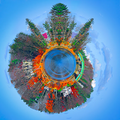
It's the holiday season, the year is winding down, jobs are getting a little scarce, so it must be time to play.  To go for the artsy stuff, something that might end up on a greeting card or some other form that can be done on spec.  It might even bring in a buck or two and that would be gravy.  Doing work aimed at the greeting card industry is kind of a seasonal crapshoot.  Too early and it won't be looked at.  Too late, same thing.  Too cute (they can hardly ever be too cute) and it won't be picked up because it's been done to death.  Too serious is probably worse than too cute.  Cards that say 'sorry you died' walk a very fine line.  Note cards, with photographs on the cover, have to convey what's written on the inside without giving away the sentiment. Today's image would fall under the heading of whimsical.  It started life as a photograph.  Actually, a five shot panorama, and ended up having something to do with a lake house.  It could be an invitation, a "new house" announcement, a cheery note signaling the start of the new season for the lake community, or other lighthearted information.  It probably wouldn't be the best card to say the house burned down or the EPA just shutdown swimming privileges because they found out someone did nuclear testing on the shore back in the forties.  You get the idea.  You have to set the right tone for the target audience.  I'll leave it up to you to figure out what you might use a card with today's image on the front.  What we'll do is discuss how the image was made.  To find out what alchemy was conjured to produce today's image, hit the "Read More".
Read more!

Monday, November 21, 2011

Special Monday Q&A - Getting Rid Of Smart Objects?

Before I decide what to write about for the Q&A on Wednesday I look through the searches that brought people to the site.  Without a doubt, the number one query has to do with Smart Objects.  I've written about the wonders of Smart Objects several times and people are directed to one of the posts.  For the past month, day in and day out, someone has been putting in a search string trying to find out how to "get rid" of Smart Objects.  At first I thought it might be one misguided soul who couldn't figure out what to do with Smart Objects.  In my opinion, the alpha and the omega of working in Adobe Photoshop CS5.  As the days wore on and the search sting was persistent I came to realize that someone really does need some help.  Not necessarily getting rid of a Smart Object, but understanding what a Smart Object is and how to use them.  I sat down over the weekend and tried to figure out "why" anyone would want to get rid of one.  The easiest explanation I could conjure up was that it could be someone new to CS5, who's not familiar with Layers (no one, on their first day, knows about Layers) and did a little right click exploring.  He/she right clicked on the Background Layer and saw that Convert For Smart Objects was available.  I'm also surmising the fact that where was considerable work put into the image the person had been working on.  Clicking on Convert For Smart Objects got her/him in trouble.  To find out how that caused trouble and how to get out of it, hit the "Read More"
Read more!

Wednesday, November 16, 2011

Wednesday Q & A: Using Photoshop CS5's Smudge Tool To Sharpen?


Today's title asked the question: "can Adobe Photoshop CS5's Smudge Tool be used as a sharpening device.  Well, looking at the two insets, flanked by the original image and the repaired image shows the answer is yes.  The (left) original image comes right out of Adobe Lightroom 3.  LR3 was used on most of the image to adjust color, tone, lighting and other things.  The Adjustment Brush was used to lighten the shadow area under the cap.  That resulted in a distinct light/dark light.  In the second inset the line is gone.  How was it done?  To find out how, hit the "Read More".

Read more!

Wednesday, November 9, 2011

Wednesday Q&A - Why Use Individual Hue/Saturation Layers?

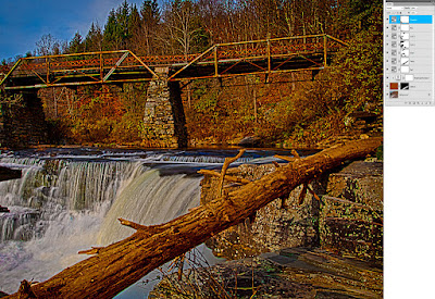
Oh boy, have I been getting questions about why I use individual (Red, Yellow, Green, Cyan, Blue, and Magenta) Hue/Saturation Adjustment Layer in Adobe Photoshop CS5.  The gist of the questions is why I'd bother using multiple H/S Adjustment Layers when it would be easier to scroll down through the colors on one Layer.  The answer is actually pretty simple.  I really don't care about the colors of the Adjustment Layers, I want the Layer Masks.  Do a double click on today's image to get to a larger view of the image.  Don't worry about the shot too much.  Look over to the right and checkout the Layers Panel I have attached.  In the Panel, look at the Layer Masks that go along with the individual colors of the Hue/Saturation Adjustment Layers.  You can see that each color (other than the Red) has a unique Mask.  There's even two Cyan H/S Adjustment Layers, each with a unique Mask.  The Masks are the key to the question of why I use the multiple Layers rather than adjusting each color on one Layer.  A secondary explanation is needed for the two Cyan Layers.  I often see tutorials where the instructor uses either different shade of gray with the brush Opacity at 100% or they'll bring the Brush Opacity down to 15%- 20% and build up the masking.  The problem I see with that technique is that if you go too far with the buildup it's almost impossible to paint over the area accurately.  By using multiple copies of the same colored H/S Adjustment Layer the area can be fine tuned and the amount of masking can be held.  So, the simple explanation of why I use multiple Hue/Saturation Adjustment Layers is to have more (better) control over what I'm getting more colors.  To find out how that effected today's image, hit the "Read More".
Read more!

Monday, November 7, 2011

Photoshop Has Led To A Photo Tour

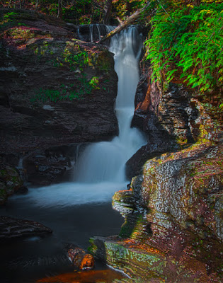
Today's image is typical of what may be found on the galleries first photo tour.  I've been asked by several people if I'd lead some sort of "domestic safari " for the purpose of shooting "something".  After looking at what's available and when to go and where to shoot, we're ready to set up a trip.  It's not meant to be a money making enterprise.  I'll just be the person coordinating a few like minded photographers, making the housing arrangements, figuring out a little Saturday night entertainment, setting up whatever needs to be set up, and generally doing the detail work to have a good time.  The place for the escapade is going to be Ricketts Glen State Park and the Endless Mountains in Pennsylvania, USA.  Today's image comes from the park, which has twenty two named waterfalls.  The trip will be a two night (Friday and Saturday nights), three day shoot with discussion and instruction about Adobe Photoshop and Adobe Photoshop Lightroom 3.  We hope to have a couple instructors and a panel for a round table discussion of photographic and Photoshop techniques.  Read future posts to find for more about the trip.   To learn more about today's image, hit the "Read More".
Read more!