Friday, April 29, 2011

Even Adobe Photoshop CS5 Can't Make This Look Better

I've got to admit it, the garage got away from me over the winter.  Some things are there for good reason.  At least it was a good reason four months ago.  In the lower left is the handle of the snow blower.  For a while it seemed like it was being used every other day for some serious snow removal.  Ten inches, twelve inches, fifteen inches.  It was a tough winter.  The reason for today's image is a promise to the wife to straighten up the garage.  I wanted a frame of reference for a starting point so, if it doesn't meet with her complete approval, at least I could show the improvement.  While I was taking a couple of shots I figured it was easy enough to fire away with the camera set on auto bracketing and see what a fringe HDR image might look like.  It turned out to be a nine shot bracket.  All nine shots were not used to make the HDR conversion.  The lightest and darkest didn't have enough information to worry about, so they were dropped.  The "proper" exposure, one two stops under and one three stops over were selected for the HDR.  I really wasn't going for any sort of exaggerated reality.  I wasn't going for any sort of reality at all.  I figured on maxing out most of the sliders in Adobe Photoshop CS5's HDR Pro.  Then the colors were pumped up even more.  The result is that I can identify every culprit that needs attention and form a plan to work toward.  For that it is a successful image.  For art?  I don't think so.  To find out just what was done, hit the "read more".
Read more!

Wednesday, April 27, 2011

Why Use Smart Objects In Adobe Photoshop CS5

I was talking to a couple friends the other evening and the conversation got around to workflow in a combination of Adobe Photoshop Lightroom 3 and Adobe Photoshop CS5 (or CS4).  Today's image is an example of why you would like to use Smart Objects for going back and forth between LR3 and CS5.  It's not exactly a stellar image, but its only there to demonstrate a point.  One of the fellows confessed that he doesn't use Smart Objects at all and just barely uses Layers.  Now, I know a few commercial photographers who make a pretty good living working with a very rudimentary understanding of how PS works.  I ran into a friend who is a part time bookkeeper for one of the photographers.  I had seen the photographer give a demonstration of his typical workflow and mentioned that his knowledge of PS was pretty limited.  She shot back that he obviously knew more than I did because he makes his living using PS to finish his photography.  There wasn't a whole lot of sense to arguing, since she had no frame of reference about my ability.  She was just convinced that the photographer must have known more.  Sort of a lame defense, but I let it go.  As I was talking with the friends and getting into how they attack a project I was dumbfounded by their methods.  The one who barely used Layers either tried doing everything on the background Layer or might have added one Layer and piled things up there.  No Adjustment Layers, no Smart Objects, no separation of work to be able to go back and change things.  The guy's a good shooter, but has basically zero knowledge of Photoshop.  The second fellow said he used Layers, Adjustment Layers and Smart Filters.  To group things into segments he uses the old "entire left hand side of the keyboard" method.  Whenever he's to the point he determines is a good place to consolidate things he holds down the Shift/Alt/Ctrl/E combination to put a flatten copy of the image on the top of the Layer Stack.  One of the things I've noticed as I've talked to a fairly large spectrum of Photoshop users is that you can almost (pretty close) pinpoint when they started using Photoshop and when they stopped learning Photoshop.  One successful photographer was giving a talk and made a flat out statement that anyone using PS had to master the Pen Tool (P).  That was true several years and several generations ago, but isn't really necessary today.  I saw a video by Dave Cross about keyboard shortcuts.  In it he said he hadn't used the Pen Tool in such a long time that he switched the keyboard shortcut "P" from bringing up the Pen Tool to bring up the Color Picker.  His justification was that he uses the Color Picker just about every day and hasn't used the Pen Tool in more than a year.  I've gone through each of the stages the people I've written about as I learned more and more about Photoshop.  To get an idea of why I'm manic about Smart Objects these days, hit the "read more".

Read more!

Monday, April 25, 2011

Look For The Details With Adobe Photoshop

At first glance, today's image probably looks like a pile of mud.  It does to me.  Click on it to see the enlarged version and you'll see the detail throughout the image.  In the deep shadow, in the highlights, in the stream, the brush, and the trees.  Detail doesn't always have to be barefaced.  It's alright that it's subtle.  This from the guy who, in probably 280 of the 298 posts on the blow puts colors and details very "in your face".  There's probably a half dozen posts where I lament the fact that I'm not very good at the nuanced image.  Today's image forces that subtlety.  It's shrouded in fog.  Fog automatically flattens out contrast.  It also makes pulling the details out that much harder.  The differences between a tree branch and the leaves of the tree is almost zero.  It's not until you look at the enlarged image that you can see how much depth there actually is.  Over on the right you can see a line of trees that goes back about one hundred yards.  On the left you can look into the wooded area and see the forest floor and the duff that's gathered there.  What looks like just a grey page is actually alive with detail.  To find out how the detail was drawn out of the scene, hit the "read more".
Read more!

Wednesday, April 20, 2011

Making The Mundane Interesting

If someone were to ask you to shoot a shot of a blanket, how would you make it interesting?  The red in today's image is "just a blanket", thrown on a chair.  It's even a solid color, so there's not a lot of detail to focus (bad pun) in on.  To give it a little life it was shot through a large Mylar backdrop.  The backdrop was hung across a backdrop stand and the end touching the floor allowed to bob and weave in whatever manner it fell.  That gave the reflective surface a lot of undulations and made the blanket sort of breathe with a sensual feeling.  The chair is actually purple, but the colors started adding up and it was changed very simply in Adobe Photoshop Lightroom 3.  We'll get into that after the "read more".  The setup for the shot was a light, aimed at the chair and blanket as though it was to be a straight shot.  A white board was use to fill in the shadows rather than allowing them to get too dark.  The whole intent was to make a plain old blanket interesting.  The end use the client had in mind was cover art and room had to be left near the top and bottom for descriptive text.  The upright of the arm of the chair serves as a divider between two sets of texts.  So, three areas needed to be formed and the arm of the chair accomplished the purpose.  Not every shot can be a beautiful landscape or model.  A "piece of art" can help get a photographer's name out in higher circles maybe a little quicker than putting things in to your local county fair, but it seldom pays the rent.  A, now retired pro once told me he takes pictures of invisible things.  I told him it must be pretty easy to convince the art buyer that you gave him/her a good image.  He said I was missing the point.  Most of what he shot on a day to day basis was everyday items.  A hinge, the screws for the hinge, a piece of metal he had no idea what it was for, and maybe a lockset.  Most of what he did was catalog work.  Not the runway models at a fashion show, but the things that show up in a workman's hands to find the right piece for a job.  It's not even thought of as a photograph, it's a pictorial description of what he/she is going to buy.  No glamour, no jostling for a better angle for a shot, just very methodical shooting, trying to make something abstract interesting.  How the chair's color was changed after the "read more".

Read more!

Friday, April 15, 2011

How Far Can You Take A Raw File Using Adobe Photoshop Hue/Saturation Adjustment Layers?

Today's image, to me, looks sort of European.  The tight buildings, the bright colors, the street lamps and similar lamps by the doors, just kind of Amsterdam-ish.  If you saw only the finished image (that would be the one on the left) you could easily say "nice, they painted the buildings with bright colors".  The truth is somewhere between the original and the finished versions.  The smaller image (on the right) is directly out of the camera, having been shot in RAW.  With Raw, nothing is done to the image "in camera".  No White Balance, no color correction, no sharpening, basically no nothing.  That's what a RAW image is all about.  What you do with it is up to you.  It has to be processed or it ends up looking like the "out of the camera" shot.  Today's image takes it a little over the top, but it a pretty straight forward processing.  The buildings had nice bright colors to start with and all I did was accentuate them.  It find out "how" each color was brightened, hit the "read more".
Read more!

Wednesday, April 13, 2011

Toning Down The Hot Stops With Adobe Photoshop CS5

Just had to put one more image in from last weekend's shoot in Roanoke Virginia.  The background on this image is that it's supposed to represent the glow in the cab when the fire box doors are open.  The "stoker" would have been shoveling coal and the engineer would be watching where he was going.  (Always a good thing.)  This image started out with a couple issues.  There was enough light on the exterior to bring up the detail of the numbers, but it also made the frame of the window (there is a small window used more or less to keep the wind off the engineer's face) and some of the banged up area of the plate in front of the numbers.  Basically nothing was done to the engineer.  Other than sharpening he is as he sat.  As can be seen, the engine is the C&O 614.  The temporary exhibit at the Virginia Museum of Transportation, titled "Thoroughbreds of Steam" goes on until the end of the month.  If you have a chance, stop by and see this wonderful tribute to the past.  While you're there, make sure you go to the other side of the tracks and visit "The Link Museum" to see some truly interesting shots of the end of the age of steam.  Okay, back to today's image.  The actor posing as the engineer had to sit still for minutes at a time to allow those shooting sufficient time for the long exposures needed.  To find out how today's image was shot and what was done to finish the image, hit the "read more".
Read more!

Monday, April 11, 2011

WhenThe Opportunity Arises...

Every once in a while an opportunity comes along where you can't miss.  Such was the case this past weekend.  A group of friends took a little ride (7 hours) down to Roanoke Virginia to take part in a set railroad shoot.  Peter Lerro has a production company under the name (oddly enough) Lerro Productions and organizes both railroad and lighthouse.  If you get a chance to attend one of Peter's "Photo Charters", grab it.  It was an excellent experience and worth every penny spent.  It was a two evening shoot and you could go for either or both nights.  The four in our group went for both sessions.  One of the keys to the best shots was smoke.  Without the smoke the shots were good, but with the smoke the shots had a whole different level of interest.  It gave the stationary engines a sense of excitement that the non-smoke shots lacked.  Today's image comes from the shoot.  Everything was taken care of.  Actors were hired (at least they were there - not sure if they were paid or volunteers from the museum), lights were set up, smoke popped, and the "sets" were up for about thirty minutes each.  A total of about nine sets per night.  A couple were similar, but different enough to get unique shots each night.  All in all a great experience.  To find out more about how today's image was finished, hit the "read more".
Read more!

Thursday, April 7, 2011

Where Does Photography End And Art Begin?

They say there's a thin line between any number of things.  Love and obsession, genius and madness and how about if we add photography and art.  Okay, there is the art of the photograph, well shot, well developed, well finished, with good subject matter and emotional appeal to the viewer.  That's not really what I'm talking about.  There are people who are very snobbish about what should be classified in a specific category.  There's the musician who says computer generated music isn't art, but who also can't diddle on their chosen instrument in an ad hoc sort of way.  Someone who has to have the sheet music in front of them or they can't make a sound.  Is that person a musician or a technician?  Knowing where to put your fingers, or knowing which buttons to push in Adobe Photoshop is a technical thing, not an artistic thing.  I'd like to set some ground rules.  Something, anything is or isn't art dependent on if it has a market value.  If it can be sold.  If someone is willing to put some money down and say "I want that for my own", then it's some sort of art.  It can be art that ends up in a corporate advertisement or hung in a gallery to be sold to the highest bidder.  Art is like a set of stairs.  Getting to the first step is pretty easy.  Getting to the top step is pretty darn hard.  In between there's many levels that can be considered "art".  Jackson Pollock was considered one of the premier artists of the twentieth century.  You can try your hand at being the next Jackson Pollock at http://www.jacksonpollock.org/.  Whenever you snap the shutter, what is your thought process?  Are you looking to create art or record an event?  Is the release of the shutter the end of your creativity or the beginning?  My formative years were spent during the time when the mantra was "Question Authority".  Who's it say if your work is art or just a photograph?  The market will tell you.  If you're in it as a recorder of events, fine.  To prove yourself as an artist, sell something.
Read more!

Wednesday, April 6, 2011

Do You See What You're Looking At?

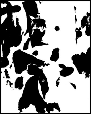
Take a look at today's image.  What do you see?  Is it just a random splash of black ink on a white page, or are there cows standing in a group?  Have you ever gone out shooting with friends and then chimped each other's shots over a beer?  Whenever I do, invariably an image pops up and everyone other than the person who took the shot says "where'd you shot that?".  Each of us typically swears that the shot wasn't anywhere that we were shooting at.  None of us saw that view, angle, entire scene, or colors or something.  Of course, the rest of us were almost shoulder to shoulder, in lockstep with the cameras all aimed in the same direction.  Someone (or ones) were the creative folks and looked in a different direction.  It could be up, down, sideways or back from whence we came, but there's something unique about a few of the images out of the entirety of the shoot.  The more we get together, the more I can identify the individuals who'll come up with the shots the rest of us pass by.  Out of a group of twenty or so, it's the same couple of people who see things in a way that escapes the rest of us.  There are things that are visible about these folks.  If it's a winter shoot, everybody else is wearing a parka, mukluks, mittens, a ski cap and obviously thirty seven layers of clothes.  The ones who get the most unique shots wear a cape, that's it.  We're out to battle the elements, they're out to experience the day.  They think different.  They're "wired" unlike any of the rest of us.  They're creative.  To find the answer to what today's image is all about, hit the "read more".
Read more!

Monday, April 4, 2011

Building An Image Piece By Piece With Adobe Photoshop CS5

Okay, it wasn't exactly piece by piece, but you can't look in any area of today's image that hasn't been tweaked in some way.  This is a single shot HDR that was ot done with Adobe Photoshop CS5's HDR Toning.  As is typical, it started out in Adobe Photoshop Lightroom 3.  A pair of virtual copies were made (Photo/Create Virtual Copy) as a starting point.  Some people go from there to double processing the copies, making one over exposed and the other under exposed.  That's actually a redundant, unnecessary step.  Select the original and the two copies.  Send them to Photoshop HDR Pro.  HDR Pro will recognize the fact that you have multiple copies of an image open.  It will not recognize that there was any pre-post-processing done to them.  All it sees is that three copies of an image was sent over.  A dialog box will open basically saying watta'sup.  It'll show the image that's been opened and how many copies were opened and give several options on what you can do with them.  It picks up the Metadata and show the shutter speed, the F-Stop and the sensitivity (ISO).  Separately it'll offer an EV (Exposure Value) box, set at zero.  If you're unfamiliar with the relationships between shutter speed, F-Stop and ISO the EV is the easiest way to change the apparent exposure.  In the case of today's image the EV's would have been set as follows:  one copy left at 0, one set to +3 and the last set to -3.  That sets the first at the "as shot" exposure.  The second, three stops above and the third three stops below the "as shot" level.  Easy enough.  To use the shutter speed, F-Stop and ISO you need to understand how the relationships work.  Using the shutter speed, the equivalent setting would be "as shot"  (1/60 sec), three over (1/8 sec) and three under (1/500 sec).  For the F-Stops the settings would be:  as shot (F 5.6), three over (F 2) and three under (F 16).  Switching up the sensitivity (ISO) would result in settings of: as shot (400), three over (3200) and three under (50).  Every setting is equal to its counterpart in the other methods of adjusting the settings.  As you can see, using the EV is the most intuitive way to do the adjusting.  To find out what happened after the HDR'ing of the image, hit the "read more".
Read more!

Friday, April 1, 2011

Adobe Lightroom To Adobe Photoshop And Back - Several Times

What do you do if you have a "story telling" shot and the sky sucks?  You shoot it anyway.  There's a dozen different ways to do "something" with it during post processing.  Today's image took several trips from Adobe Photoshop Lightroom 3 to Adobe Photoshop CS5 and back.  It started in LR3, where it's stored in the DAM (Digital Asset Management) files.  It sits where it was originally put on the hard drives, but there are several ways to point to the image.  If I knew where the actual file was stored I could use the file structure and just go pick it up.  If I haven't any idea where the file was stored (in this case I didn't have a clue) I could go to the Key Words and find something descriptive.  Boat, ocean, Connecticut were all words used for this image.  Once the file was found the first stop was in the Develop Module of LR3.  A few tweaks to the colors, a little shading using the Adjustment Brush (K), and some input Sharpening was all that was done there.  Next it was over to PS CS5 (Ctrl E in LR3) with the Lightroom adjustments.  From there the colors were maxed out using individual (Red, Yellow, Green, Cyan, Blue and Magenta) Hue/Saturation Adjustment Layers.  In several cases the included masks were used to tone down colors in some areas while boasting colors in other areas.  The red on the stack of the freighter was bumped up while the red at the waterline was kept muted.  To find out how many more trips today's image took bouncing back and forth, hit the "read more".
Read more!