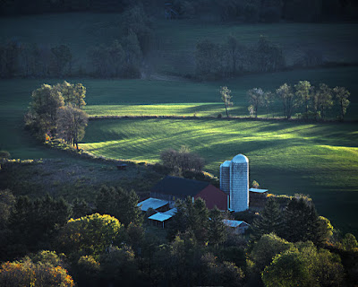
 We’re baaack! We were in the wilds of West Virginia (which wasn’t as “wild” as I had hoped) over a long weekend. I’d read the information on the web and believed (foolish boy) what they said about late September being the height of the foliage in northeastern West Virginia. Maybe it was just this year and the hotter than typical summer had pushed the foliage season back a couple of weeks, but it was midsummer type shooting everywhere we went. Today’s image is typical of what we saw, with rich, creamy greens and scenes backlit by the setting sun. This, fairly dramatic, scene was taken from a “scenic overlook” along Route 55 at one of the few times I hadn’t plugged the GPS into the camera. No matter, if you’re driving east from Moorefield on the newer highway you can’t miss it. As has been the case in the past several posts, I’ve included the Layers Panel for those who’d like to follow along. Today’s image is pretty straight forward. It started out in Adobe Photoshop Lightroom 3 and what we see is the “after” of the hop over to Adobe Photoshop CS5. To find out what makes today’s image different, hit the “read more”.
For the most part, today’s image is pretty standard. The first thing done doesn’t even show up in the Layers Panel. The typical aspect ratio we crop to is 4 x 5, 8 x 10, 16 x 20. Most images are cropped to 16 x 20 @ 150 ppi. Some may gasp, knowing that hundreds of articles have been written about using 300 ppi or at the minimum 240 ppi. The only thing that shows is that hundreds of writers don’t have a good grasp of the relationship between the screen and a printer. Every pixel on the screen can represent any one of 16,000,000 colors if the screen is set to 32 bit color depth. Every dot on a print is made up of five drops of ink. In the “old days”, when printers printed at 300 dpi you could actually see the dot pattern made by the printer. Today, with printers giving 1440 dpi to 2880 dpi, the dot pattern can’t be seen with anything less than a fairly good loop. The big thing to make note of is that we’re talking of ppi (pixels per inch) on the screen and dpi (dots per inch) on the printer. If each “dot” on the print is made up of five drops you can easily see that there’s more than enough information given by giving the image 150 ppi. So much for a rant on sharpness.
What’s listed on the Layer Panel as Layer 2 is a composite layer (Ctrl/Alt/Shift/E) of everything below it. The Blend Mode was changed to Screen to brighten the buildings and then masked to keep the rest of the scene at its proper color levels. Layer 3 is the Dodging and Burning Layer. Only dodging was used and only the tips of the sunlit crowns of the trees were hit. The settings for the dodging were “Protect Tones”, Highlights and the Strength set to about 25% The actual number was 27%, but it’s an analog world, so “about 25%” is “close enough”. You’re not going to see the difference between 25% and 27%.
Layer 4 puts a light in the only window of the barn. The Polygonal Lasso Tool (L) was used to select the window and then filled with a bright yellow. The Opacity was then lowered to “somewhere near 10%”, so as not to draw too much attention to the window. If you’re looking for details, the window now has a light in it. If you’re just generally looking at the image, it’s not going to jump out at you.


2 comments:
That is a great composition. I like the way the light falls in that scene.
I enjoyed sailing through your blog both photography and writing. Thanks and please have a wonderful day !
Post a Comment