Take your hand and cover the top one third of today's image. Without that third of the image it doesn't really "tell" the complete story, right? Without seeing where the water comes from it's sort of blah. Looking at it you can't tell if it's a lot of a very small stream or a little of a bigger stream. Today's image "almost" qualifies as a monochrome print. It wouldn't take much to suck the blues out of the shot and leave only black, shades of grey and green. One of the other things you've probably noticed is that it's pretty dark. The light "shines" down through the center of the image, drawing the eye through the image. One of the big things to watch out for is closing down the top of a shot like this. The overall image has a typical very light vignette, except...! The vignette has been removed from the top of the shot. Even though the vignette is pretty subtle on the lower half of the image it was too much for the top half. All along the top of the top, everything was lost. The rocks on the left side, the center flow of water and the sunlight on the right were just black. The "halo" along the top of the rock in front of the pool is just that. I looked at it and thought it was something I did while bringing out the texture of the moss on the rock. Nope! It's actually the mist from the water falling into the pool. I checked the original image, the finished image and several steps along the way. It's there all the way through. To find out about how today's image was "brought to life", hit the "read more".
Read more!
Wednesday, March 30, 2011
Monday, March 28, 2011
An Easy Way To Get A Pure White Background In Camera
Well, this is quite a shift from the previous post. The March 25, 2011 post's picture is just about as dark as today's image is white. To get the darkness in the older post the "Dave Hill" style was employed to create a moody, serious cast to the shot. It would be tough to get lighter, airier than today's image. We have a white flower on a white background, and yet there's detail throughout the white. Click on the image to see an enlargement. Only two things were done to modify the image in any way. Hue/Saturation Adjustment Layers were used to bring up the green in the leaves and the wrap on the bottle's neck. To bring up the Green a Yellow Hue/Saturation Adjustment Layer was used. Sounds a little strange, but in an RGB (Red, Green, Blue) color space Yellow has a huge effect on greens. More so than trying to bring up a Green Hue/Saturation Adjustment Layer. The Gold was a little more iffy, so the little hand with the double arrows found to the left of the word Master was used to bring up the gold selectively. Kind of a "happy accident" happened to get the deep blue for the Stroke (Select All [CTRL A] Edit/Stroke)around the image. There was a serious blue fringe in a couple places. The edges of the green had a noticeable, thin blue halo in spots. Using the Magic Wand Tool (W) (almost never used) with Contiguous turned off picked up all the blue areas. The selection was enlarged by a couple of pixels (Select/Modify/Expand) and brought up onto a separate Layer (CTRL J). The result was, what looked like, some thin pencil lines of deep blue. A Hue/Saturation Adjustment Layer was used in a slightly different way (adjusted Hue rather than Saturation) to convert the blue lines to green lines matching the leaves. All that is fine and good, but to find out how the stark white background was done in the camera, hit the "read more".
Read more!
Friday, March 25, 2011
Using A "Dave Hill" Effect To Give A Grittier Look
I'm not going to beat a dead horse (too much), but wanted to take the shoot at the firehouse the other day up a notch. In yesterday's image, the firefighter looks good. A handsome fellow who looks like he could pose for GQ or some other men's fashion magazine. After looking at the shot I wanted to make these guys look like the rugged heroes they are. While we were at the firehouse I kept telling the men to give me a serious, "I'm fighting a fire" type of look. For the most part, it didn't happen. Because I wasn't the only one shooting I couldn't shoot fifty shots of each firefighter, changing poses ever so slightly to zero in on an expression that would give the feel of them "at work". That's okay, they were all good sports about putting up with us while we were there. I explained to some of the shooters not familiar with Nikon's Creative Lighting System how to set their cameras to work with the configuration I had programmed in to the camera and flashes. Only problem with that was that, at one point, every time I clicked the shutter, someone had fired a split second before me and had stolen my light. The back lights had it easy, so I'd get the light skimming across the sides of the persons face, but nothing for a fill. It cut down on the number of keepers for the evening. I took about ten shots of one particular fellow but everyone of them wound up with zero fill. Guess I'll have to do another shoot to fill in the blanks. Today's image has a "Dave Hill" type effect put on it. I knew Scott Kelby did a post about his riff on Dave Hill's work a couple years ago. A Google search turned up the post I was looking for. To give Scott the credit he's due and to find out how it was done, hit the "read more".
Read more!
Wednesday, March 23, 2011
It Takes A Lot Of Lights To Make It Look Like You're Not Using A Flash
Last night a group of friends were invited to a local firehouse to shoot pretty much whatever we wanted (the sleeping quarters were off limits). People wandered in and out of the station, shooting inside shots, outside shots, shots from outside looking in, shots inside looking out and just about anything in between. A young friend (I'm talking teenager here) told me at one point that he didn't like shooting with flash and preferred "available light". Well, I brought a couple bags full of small lights. I carry twelve pairs of lights and one set of three matched speedlites. I told my young friend that it took a pretty good amount of gear to make it look like you're not using flashes. Today's image is typical of using flashes to create a reasonably dramatic lighting situation. I spent most of the time at the station working with people who had Nikons but were unfamiliar with Nikon's CLS (Creative Lighting System). One friend was using a 50mm lens and kept getting ahead of the softbox used as the fill light. She's quite a good shooter and her work can be seen as covers on local magazines and the pictorial portion of articles, menus, advertising, etc. She's used to working with her Radio Poppers and just couldn't get with the limitation (the need for a sightline to the sensor) of CLS. She got some god shots, but also got pretty frustrated. The Canon shooters kept asking if their on camera flash would set off the lights in the setup. Some got a little confused when I said they'd have no effect on the lights in the setup. To learn how the lights were set to get today's image, hit the "read more".
Read more!
Monday, March 21, 2011
Using Adobe Photoshop To Apply Makeup
If you've ever been to Disney's Epcot Center in Florida you might recognize the Venetian mask in today's image. She and several others wonder around the Italian Pavilion, not talking, but interacting with the guests. The mask worn by the character is very smooth, very white and have zero detail. Every once in a while I shoot a wedding as a gift for relatives or friends and do some makeup on the bride if her makeup isn't up to photographic quality. Nothing obvious, I'm not going to give a bride garish purple lipstick if she was wearing a light pink shade, but made bring the color up just a tad so it is visible. If an eyebrow looks a little strange I might "reshape" it to be more pleasing. I consider this to be a part of the retouching process. I wouldn't hand a bride a shot showing her with a big old zit on her cheek, so why would I give her something where it looks like she forgot to put on her makeup? In today's image I obviously had to go quite a bit further than goosing the colors. There was no color to start with, so everything had to be added, the face sculpted and restraint used. To find out more about how her makeup was applied and her face shaped, hit the "read more".
Read more!
Friday, March 18, 2011
Sometimes The Color Is Just There
Sure, something's been done to this image, but the one thing that hasn't been done (outside of the camera) is juice the colors of the sunset. The sun had just disappeared over the horizon and the scene was under exposed, deepening the colors. The boat was brought back a little using a Screen Blend Mode and a Layer Mask of the boat. The foreground seagull was added and hit with a Photo Filter Adjustment Layer, but the sunset is what it is. The silhouetted birds in the background were there. The image was cropped into a panorama, leaving lots of room for the ship to sail into.
As far as I'm concerned, today's image is about as straight as it gets. If you have a question about anything that was done, either leave a comment or send me a note at mailto:tom@kayviewgallery.com .
That's it for today. Read more!
As far as I'm concerned, today's image is about as straight as it gets. If you have a question about anything that was done, either leave a comment or send me a note at mailto:tom@kayviewgallery.com .
That's it for today. Read more!
Wednesday, March 16, 2011
Updating An Image With New Tools In Adobe Photoshop CS5
Everyone has old images that, when you look at them today, could benefit from Adobe Photoshop CS5's new tools. Today's image is one such case. The original image was made back in October 2002. The amount of work done to it at that time was extensive. The side of the bell tower facing the front entrance had, basically, no detail. Without some sort of detail the image wasn't worth printing. The front facade was rebuilt using copies of pieces of the side with detail. A Selection was made, copied, pasted to a new Layer, flipped horizontally, and fitted into place using Free Transform (Ctrl T). Since there was no one section that fit the facade, smaller pieces had to be "tacked" together to made a full board and batten. A stop sign down by the there the shot was taken had to be removed. Today, with CS5's Content Aware Fill that would be a ten second fix. Back in 2002, Photoshop 7, it was a lot of Clone Stamp (S) work, gently nudging shadow and light to make a believable grassy area. The sky, believe it or not, was as it appears in the original snap. There was work to do in CS5. To learn what was done with today's tools, hit the "read more".
Read more!
Monday, March 14, 2011
Using Adobe Photoshop To Add Really Subtle Details
Adobe Photoshop CS5 (or any version) can be used to make big, sweeping, sledgehammer changes to images or small, intimate, subtle changes. It's such a versatile tool. Today's image is a combination of the two. The bridge itself is an HDR image made from three exposures. The attempt was to keep it reasonably real. Then it was pushed and pulled with individual Hue/Saturation Adjustment Layers ( 1 Red, 1 Yellow, 1 Green, 2 Cyan, 1 Blue and 1 Magenta). I always find it easier to use multiple H/S Adjustment Layers rather than try to apply grades of gray to sculpt areas. My preference is to do the sculpting with either the Masks supplied with the Adjustment Layers or add a Layer Mask to the Adjustment Layer. It all depends on what the effect is supposed to be and what's to be changed. Today's image needed to have the Cyan brought up in the sky and sucked out of the bridge. You can't have it both ways on the same Adjustment Layer. Therefore you have to Mask the parts you want to work on and treat them separately. I always name the Hue/Saturation Adjustment Layers. I try to keep things simple, so I name them Red, Yellow, Green etc. When it comes to multiple Adjustment layers it goes Cyan, Cyan 2, Cyan 3, etc. It's easy enough to turn off and on the visibility of the A. L. to identify which one is being worked. The Masks are another giant clue. In today's image it's easy to see the outline of the bridge in one Mask and the sky in another. It does get a little dicey when the number of one colors Adjustment Masks gets beyond three or four. To find out about the subtlest change in today's image, hit the "read more".
Read more!
Friday, March 11, 2011
Content Aware Move The Guy Around The Corner
Every once in a while you'll get an idea for a shot and just plain miss it. The fellow in today's image, in the shot of the motorcycle is actually standing behind the bike. It was what it is. A vacation shot of my brother-in-law. We were walking around downtown Marigot , St Maarten. One of our favorite towns in the Caribbean and one we thought we had to share with the scruffy one and his wife. The shot of him trying to look menacing was around the corner from the bike. I say "trying to look menacing" because he's actually a big old teddy bear. One of the biggest problems with the shot of the biker was where he was sitting. He was under an awning and had a decided magenta cast to his face. When I sampled his face with the Eye Dropper Tool (i - eye) in a Hue/Saturation Adjustment layer with Red selected it actually registered as Magenta. To see what I had to do to push and pull his color into some facsimile of a skin tone, hit the "read more".
Read more!
Wednesday, March 9, 2011
Photoshop Even Makes A Bad Winter Look Better
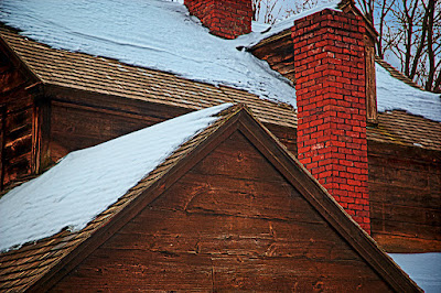
It's been a heck of a winter around here. First it was snow by the foot and last weekend it was flooding rains, almost 4.5" in a 36 hour period. But, there were photo opportunities throughout. Okay, not so much during the monsoon rain, but, other than that one day there were shots to be found. Today's image is not only representative of what the area looked like, but is kind of interesting because of all the angles. Other than in the trees, it pretty tough to find any curved lines in the entire composition. The boards of the house, the shingles on the roof, the bricks of the chimneys, and the outline of the house itself are all straight lines. Pushing this image over the edge to a highly graphic design element would be an easy take. On the other hand, getting some detail in the snow was trickier than it might look. To find out how the detail was retained, hit the "read more".
Read more!
Monday, March 7, 2011
Photoshop Makes Time Travel Possible - Sort Of
It's not often you get to see someone travel through time and distance. The gentleman in today's image is standing in the street in Colonial Williamsburg. If you've been to CW you may not recognize the location. That's because the location is an alleyway in Litchfield, Connecticut. Litchfield is a colonial era town in the beautiful hills of northwestern Connecticut. Several images that have appeared in these postings have been from Litchfield and the surrounding area. In fact, last Friday's post is from about two blocks away from today's. From the site of today's image you just walk up (literarily) West Street, turn right onto South Street past four or five houses and Friday's image is in the side yard of one of the stately homes that grace the wide boulevard there. Flipping back to the man in today's post, one of the nice things about Colonial Williamsburg is that the re-enactors will all stop and pose for anyone with a camera. While we were there, Thomas Jefferson, Martha Washington and other historical figures and "towns folks" obliged us as we snapped away. After returning home and visiting Litchfield again I thought it would be a great idea to have some re-enactors go up to celebrate its colonial heritage. I couldn't find a group who thought that was a good idea. So, we have a mashup of a fellow from Williamsburg "posing" in Litchfield. To find out how he got there, hit the "read more".
Read more!
Friday, March 4, 2011
The Case For HDR Toning Over Merge To HDR Pro
In Monet's Garden 2011 |
Okay, if you click on today's image you'll see that it's a couple steps beyond just plain HDR. The scene kind of reminded me of any of several Claude Monet paintings, so I "finished it" with a Pointillism Filter (Filters/Pixelate/Pointillize) with the minimum (3) Cell Size. I really didn't like what it did to the sky, so I popped on a Layer Mask I had already made (and used several times) to bring the sky back to a non-HDR, non-Pointillized state. If you follow this blog at all you've probably seen me say that I don't particularly like HDR'd skies. The final image (sans Pointillazation) looks just about exactly like the three shot Merge to HDR Pro version without the issues (I hate that expression, they're problems) I ran into with HDR Pro. If I wasn't fussy about the sky and could accept the sky pushed by HDR Pro there wouldn't be any problems. Then I took the shots with HDR in mind I set the camera to a five step (one stop per step)auto-bracket and fired away. Because of the scene, no tripod was used. The exposures were 1/2000, 1/1000, 1/500, 1/250, and 1/125 at F8 with a focal length of 57 mm at a 35 mm equivalent. With those spec hand holding was not a problem. I used the high, low and mid exposures to make a three shot HDR. The bench, which didn't move at all came out tack sharp. The trees on the other hand had some movement in them. With the Remove Ghosts checkbox ticked HDR Pro picked the middle exposure as the base of its selection. That was fine because I wanted to use the middle exposure to bring the sky back to a natural condition. That's when the stuff hit the fan. To find out about the trials and tribulations I ran into, hit the "read more".
Read more!
Wednesday, March 2, 2011
Adding Real Estate With Adobe Photoshop CS5
What happens when you've taken a reasonable shot and when you put it up on the computer screen and start to pick it apart? It's not often you can say "yup, that's it. It doesn't need anything else." Today's image began life with a few flaws. The edge of the water, with people on the shore, distracted the eye, bringing the center of interest to the people rather than the boat. The boat was too close to the right edge of the image, giving the boat nowhere to go. There was a round canister tucked under the side of the boat to keep it upright. The boat was pretty much centered in the frame. Any one of these problems could be the kiss of death to an image. Two of the problems were easy to take care of. Cropping removed the ocean's edge and the tourists walking there. The canister was also easy. Make a selection of the can, pick the Patch Tool (J), and move the offending canister down the line of sand a little. That'll cover the can and blend the sand under the side of the boat. "Moving" the boat a little further down the beach wound up not being too difficult either. To find out what the simple solution was, hit the "read more".
Read more!
Subscribe to:
Posts (Atom)