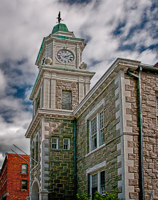
 I can't help it. I just have an aversion to HRD skies. Today's image, and the sky in particular looks to be straight HDR interpretation of an image of a clock tower. The buildings are, but the sky isn't. When the shots were taken I fired off a five shot burst giving me -2.3, -1.3, -0.3, +.6, and +1.6 EV steps. -.3 is my standard setting for the camera to give every shot just a little more saturation. From the five shots, the -1.3 is the sky you see in today's image. The sky was pretty dramatic in and of itself. No need to push it further. Matt Kloskowski of NAPP Photoshop Guys fame just (about a week ago) did a piece during a Photoshop TV show, showing how to amp up the sky using a High Pass Filter (Filter/Other/High Pass and don't forget to change the Blend Mode to some form of Overlay). It's just not my cup of tea. In fact, I typically go so far as to not sharpen the sky in most images. It's easy enough to do and will be one of the things we discuss today. The bigger deal with today's image is the pushing and pulling needed to make the buildings look like they would be standing for another ten minutes. Check out the details by hitting the "read more".
It's a wide angle shot. I'm pretty sure you could tell that by the residual leaning of the clock tower. On the tower itself, all the vertical lines are parallel. If you were to grab a copy of the image, drag it into Adobe Photoshop CS5 and pull a guide out from the ruler you could position the guide over the verts and see that they're straight up and down. The big deal is that they look wrong. The close edge of the building appears to be jutting out toward the street. You should have seen it as it started. It looks like it would merge with the back of the building and the roofline looked more like a shed roof than a flat roof.
The biggest fault in today's image is the it "looks" wrong. It can be fixed. In the next post we'll have it look proper, but I can assure you none of the vertical line will be parallel. In painted art there's a term called trompe l'oeil or to fool the eye. While today's image is technically correct, it doesn't look right. It doesn't "fool the eye". In the next post it won't be technically correct, but will look proper. It will "fool the eye". One of the things we, as photographers, have to do is give the viewer a pleasing image, even though those with slip sticks and calipers (if you get the reference you're pretty damn old - as am I) would rule it wrong.
Now, about the sky. Once all the pushing and pulling is done and before anything happens with Shadow and Highlights (Image/Adjustments/Shadow-Highlights) or HDR Toning (Image/Adjustments/HDR Toning) you have to make a duplicate of where you are (Image/Duplicate). This will give us an exact copy of the image before any color, tone, density adjustments are done. Once all the refinements are done and the image "finished" would be the time to bring the duplicate in as a Layer. Using the Quick Selection Tool (W) select the buildings (or the sky, it really doesn't matter which) and save the selection (rick click on the Layer name area and pick Save Selection) . Put a Layer Mask on the upper Layer and see what you've done. If the sky is sharp and the building unsharpened, Invert the Mask (Crtl I [eye]). Flip the visibility of the Layer on and off to see what your starting point is.
You'll now have an HDR enhanced (???) image with a soft, natural sky. Sharpen the image and throw a Layer Mask over the sky again, keeping the sky unsharpened. Then put your vignette on the image and you're done.


0 comments:
Post a Comment