 The trend this week seemed to be more than the typical number of people looking for information on Adobe Photoshop CS5's Puppet Warp. It appears it is getting the same rap the Liquefy Filter has gotten since it was introduced. The first thing the Liquefy Filter was used for was giving friends elongated noses and the like. It was a throwback to an old program for doing such playful thing named "Kai's Power Goo". Once the novelty wore off people started finding out how useful Liquefy could be. You probably can't find a cover of any fashion magazine that hasn't had the Liquefy Filter used to gently push a waist, some arm flab, a hip or two, or any other not so perfect body part into place. Today, Puppet Warp is an alternative to Liquefy. In some cases it provides more control over the tweaks being given. One of the keys to using almost any tool Photoshop has to offer is moderation. Don't use the Dodge and Burn Tools (O) at 100%. Use them at 10 - 15% and build up the effect you're looking for. Don't make big sweeps with the Liquefy Tool (Filters/Liquefy). Little tiny pushes with fairly big brushes (in the Blot Liquefy Tool) let's you find tune whatever needs fixing. To see how the Puppet Warp Tool was used on today's image, hit the "Read More".
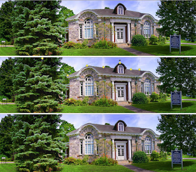
Today's image shows the before, during and after shots of how the image was corrected. The basic image is a four or five shot panorama taken at a pretty close range to the building. Not only did this produce a left to right bulge effect, but also "domed" the roof. The left to right displacement gives the sense that the building is longer than it really is. I really don't have a problem with that. I did find the roofline to be more of a distraction. You may want to click on the image to see an enlargement to make it easier to see what was done.
The first thing is to make a plan. I made an empty blank Layer (Add New Layer icon) and then selected the Pencil Tool (B). I set the foreground color to a bright red. With the Pencil Tool I clicked on the top of the roof just above the left "eyebrow". Then I Shift Clicked on the end of the roofline where it ends beyond the right "eyebrow". This created a bright Red line showing where the roofline "should" be. I also brought a guide in from the left (click on the Ruler and drag a guide out) and positioned it on the left vertical edge of the building facade. It was slightly askew and needed to be put vertical. The only reason for this Layer is to put control lines that can be later discarded.
The middle image shows the "Pins" set with the Puppet Warp Tool. Each of these "Pins" can be pushed or pulled in whatever direction is needed. A trick to give more control is to click on a Pin and use the Arrow Keys (left, right, up and down) to slowly (and accurately) move the Pin. Moving each Pin close to (but don't try to get it exact at this point) its final position gives you an idea of how much the next Pin needs to be moved. Remember, moving a Pin changes the relationship of the Pins on either side.
Making small adjustments several times is preferable to trying to make a gross adjustment all at once. Keep going from Pin to Pin to get the maximum accuracy.
Keep in mind that "most" tools in CS5 produce better results when a gentle approach is taken. Being "ham handed" creates a mess and will lead to doing the same adjustment over and over again.


0 comments:
Post a Comment