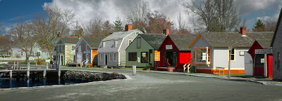
 Today's image is a mashup of four (actually three) images. The street scene is a two shot panorama and the clouds in the background come from one cloud image, duplicated, flipped, joined and tilted. If you think there was a fancy, intricate mask involved here you be pretty far off base. I did use a knew trick I just thought of (at least I haven't seen it discussed anywhere) to make placing the clouds a snap. At the start of the making of today's image there had to be a little Adobe Photoshop CS5 trickery applied. The two images making up the street scene were two totally separate shots. Two different focal lengths and probably ten minutes apart. I noticed that the two images had one building in common, so I had a midpoint to start from. One set of building was half again larger than the other set, so I wanted to see how clever CS5 would be trying to decipher the data being thrown at it. I have to say, it did a darn nice job of figuring out what was what and how it would piece together. The sky was pretty blah, with the palest of blues for the entire stretch. Not much to look at. The street scene came along fairly nicely, but with as bald a sky as there was the image was nothing special. To learn how the cloud filled sky got there without a Mask, hit the "Read More".
A couple things had to be done to the image before adding the sky. The gray building just left of center had the side facing the sun blown out. The easiest place to fix it was in Adobe Photoshop Lightroom 3, so back it went. At first glance it appeared that there was no detail on the sunny side. I used the Adjustment Brush and cranked the Exposure all the way down. Pulling the exposure either all the way up (on dark segments) or all the way down (on light segments) is an easy way to see what you're painting. If the final adjustment were to be a couple of tenths of a stop and anyone were to try to apply that small an adjustment they wouldn't be able to see if the change was made. By raising or lowering the exposure all the way you can see what's going on. Since anything done in LR3 is nondestructive the change can be modified after knowing that you've covered the entire area that needs to be dealt with.
After all the adjustments were made the image took another trip over to CS5. The cloud image was brought in. It really doesn't make any difference which Layer is in front. Changing the Blend Mode to Darker Color brings all the fine detail in the trees forward. It also over painted the lighter buildings. A really non-fancy Layer Mask was applied and any spill onto the buildings taken away using a Black Press Tool (B).
The secret was that the only place with any blue was in the sky. Using a Hue/Saturation Adjustment Layer to make only the Cyan and Blue components very light (maxing out the Luminance) allowed the clouds and sky to show through.
Big thing is to not make things any harder than they have to be.


0 comments:
Post a Comment