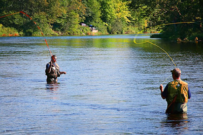
I don't typically come up with fishing when I think of "action" photography. Horse racing, bicycling and badminton tend to come in much higher up on the list. But, for every activity, there has to be some defining moment where you can nod your head and say "that was cool". Even couch potatoes must have their moment. When he/she settles into the couch in just the right position to be able to have a great view of the television and be able to reach both the remote and a beverage with minimum expenditure of energy. Ah, the glory of perfection. Today's image doesn't, itself, approach perfection, but that fellow on the right seems to have a mighty fine arc on the line as he's casting. Okay, he is flyfishing, so his line might be a couple of millimeters in diameter. The most important element in today's image (other than the people themselves) is that thin line slicing through the air. It defines the "peak of action". If either line lay limp, hanging from the tip of the rod to the water, there would be no "action". To get an idea of how the line takes on so much emphasis in this shot, hit the "read more".
I've done a couple of posts on my basic workflow (link). How I use the saturation portion of Photoshop's Hue/Saturation Adjustment layers to control the intensity of each of the additive and subtractive colors (Red, Green, Blue and Yellow, Cyan , Magenta). Today's image needed an expansion of the basic workflow to include two Red Adjustment Layers, 3 Yellow and 2 Green ALs. Two of the layers are probably pretty obvious. One of the Red ALs is dedicated to the red fishing line and one of the Yellow ALs is the basis of the yellow line. The second Red AL is a "standard" adjustment of the overall image. There are two additional Yellow ALs. The second AL brings the reflection of the trees up in the water. The first pass showed that the amount of saturation that was good for the trees was too much for the water. The water would have looked slightly electric. So, for the Yellow ALs we have the line, the reflection and the trees. Each is a separate Adjustment Layer in order to have the masks for each on. Each mask had to have "holes" punched in them to let the lower adaption show through. The masks end up looking fairly strange.
.
By breaking down an image and addressing each color separately, and possibly with multiple iterations, an almost infinite amount of control can be exercised over the force a color brings to an image.
Read more!
Monday, August 31, 2009
Friday, August 28, 2009
Paths, Roads, Roads, Paths - When Is One The Other?
Walking down a path in a park can often lead to an interesting photo opportunity. Walking down a road can also, but gives a different type of vibe. A path is friendly, a road is hard, A path is there for a slow meander, a road takes you somewhere. You might even pay to have the privilege of walking on a path (Longwood Gardens in Pennsylvania comes to mind) where a road is utilitarian, it's there for purpose rather than pleasure. Years ago, at a company I was working at, we had a visitor from the west coast out to inspect a machine the company was building. Being the sales/quality control/field installation guy, it was my duty to babysit the fellow. The second day he was at the building I had to run out for an emergency service call on a piece of equipment at a hospital in northwestern Connecticut. I invited the visitor to accompany me. The company was in Woodbury, the hospital was in Sharon. You can use a mapping application to see what the most direct route would probably be. About half way along the route the visitor said "this is Connecticut?". I assured him it was and questioned why he had asked. His response was that west coasters always thought Connecticut looked sort of like an extension of Manhattan. Building after building and the only tress would be sequestered in pocket parks. As we drove along the Housatonic River has said the drive was more like going through one of the national parks rather than what he had imagined driving through Connecticut might be. Thinking about his comment later made me consider how fortunate the people of Connecticut, and the northeast in general, are to have such natural beauty all around us once someone takes the time to get off the highways. We are truly blessed. To check out where I'm going with this in relationship to today's image, hit the "read more" and I'll explain.
Today's image is a combination of a road and a path. The road is Rockwell Road in Bethel. There's a nice bend with a small barn/garage at the vanishing point of the bend. As a side note, just beyond the small building is a full sized barn. The "path" portion of today's image comes from Sturbridge Village in Massachusetts. The paved road just wasn't working for me and I thought a dirt road or trail might look better in the shot. . The question I'll pose today is does the substitution of the dirt path change "the truth" of the image? The building, and the barn behind it, were there before the road was paved. So, did I alter the scene or did I create an image of what the area might have looked like 75 or 100 years ago? If the purpose was to document the road for an article in the newspaper of a magazine about the town today, yes, it would have altered the truth of the image. If a painted had his/her easel set at the same location as the camera and painted a dirt road rather than a paved road would anyone wag a finger at the artist? No! To many people get too hung up on things when the intent of the image is entertainment or visual interest. . Once I got into the image today I noticed a distraction along the bridge abutment. It was a tiny portion of the image, but it was white and red where white and red should not have been. Zooming in revealed a drink cup someone had tossed along the roadside. Had I noticed it, I could have moved it out of frame before taking the shot. I didn't, so I removed it with Photoshop. Again, it didn't alter the "truth" of the image, it just cleaned it up. In that case I would even have a problem it the intent of the image was photojournalism. Unless the article was about trash on the side of the road it was not a critical part of the story being told. The is a point that can't be crossed in photojournalism, but getting rid of the drink cup wouldn't be anywhere close to that line. Read more!
Wednesday, August 26, 2009
Finding Mysterious Places
I can't remember how many times, even with high gas prices, we've jumped in the car and driven hundreds of miles looking for a shot. It used to be just something to do. Today it takes a little more planning, what with the increasing price of almost everything. Flickr is a great resource for checking out images of places you might want to put on your itinerary. The state tourism sites can give you an idea what's going on in either your local area or wherever you're traveling. You can always drive around aimlessly thinking some spectacular vista will jump out in front of you (I wouldn't count on it). Or, you can get meticulous GPS coordinates to known locations of surefire shots. In order to find out what exotic location and fiendish technique was used to come up with today's image, hit the "read more" and I'll let you know.
Yesterday was the first day of school around here. Our beautiful granddaughter, who absolutely hates to have her picture taken, was starting the seventh grade, so we had to go over to see her off. Much to her chagrin, I had my camera with me. (Notice there's never been a shot of her on this blog???? I've been banned from that activity.) Once the pix were taken and everyone went their separate ways I started my walk home. It's not that great a trek (only 2 miles) but it does help with the "get back in some kind of shape" kick I'm on. About two thirds of the way home I passed an old quarry I've known about since my high school days. Guys I knew in school used to talk about swimming in the quarry and claimed it was a hundred feet deep and had a steam shovel at the bottom. Nice story, but no where near verified. It's not like the quarry was a big detour or required tromping through some vast forest. Truth is that today's image was taken about ten steps off the road. It's not a picture that's going to hang in MOMA anytime soon, but it does illustrate a point. If our son's house is about 2 miles away and I was 2/3s of the way to the gallery, that means the shot was taken about 3500 feet from the gallery.
.
Now, let's think about this for just a moment. We'll apply just a little bit of reasoning to this problem. We've driven hundreds of miles looking for "the shot" of the day and have been skunked more often than not. Today's quick "study" of a possible location looks to have possibilities and is "in the neighborhood". Therefore, the conclusion would be... leave the car in the garage and explore the area around where you live. Great shots aren't measured by distance travelled, they're valued by the impact they have on the viewer. A great image, shot in your backyard, will have far more personal value years from now than the drive you went on looking for an elusive vista. Think globally, act locally applies to photography and just happens to help the environment as well.
.
I've been thinking about doing some bird photography lately. I thought if I could only find a broken tree branch or trunk I could set something up off the deck at the house. I've been keeping an eye peeled for possibilities along side the road as I've walked and biked. The other day, while brushing my teeth, I glanced out the window toward the treeline behind the house. An old tree had recently fallen and looks like it was sent as a gift for the bird project. Today's mission is to pull the broken shard of the tree down and set it up as a perch for birds to land on before dropping down to a feeder. Hopefully I'll be able to share some bird shots by this time next week. Read more!
Monday, August 24, 2009
I Must Be Thick, or Something???
People seem to be curious about some of the images created here at the gallery. They ask about how they were done and then tell me it can't be done (whatever it is that was done) like that. I find that a tad strange, because they, typically, are holding the print in their hands while they're saying "you can't do that".
.
A good example is a print by "the better half". She had this beautiful 16 x 20 print of a corn field, a set of three silos and a cloud filled sky. With the print in hand, a self announced professional gushed over the image, noting that individual kernels of corn could be seen. He commented on the sharpness, the detail, the subtle coloring, gush, gush gush. He asked how many megapixels the camera had. When told the print he had in his hands was from a 4 megapixel point and shoot his immediate reaction was that you couldn't make a 16 x 20 print from a 4 megapixel file. News flash, if you're willing to pay for something, someone will be willing to produce it. I'm pretty sure he would have quit photography all together if he knew the image had been sent out for printing at 150 PPI. Too many people are confused by PPI versus DPI and don't understand the relationship (note to self: subject for another post). To hear about how this all relates to today's image, follow the "read more".
This is the third post on the blog about infrared imaging. When I show an infrared image, people ask if it's from a digital or an analog (film) camera, ask if I had the digital camera modified and then tell me I can't make an infrared image from an unmodified digital camera. I don't get it. They have a print in hand, I give them the lowdown and they tell me I can't do it that way. Am I missing something? Do people think I spend my nights dreaming up fanciful stories to trick them? Do they think I should be writing fiction? Maybe I could be the next JK Rawlings or Clive Cussler. Actually, I'd probably wind up being more like Michael Tougias, making true stories sound like high adventures. Whatever pipedreams I may have, I'm a photographer, not a writer. I'll keep buying Tougias' books and maybe one day he'll buy one of my prints. (Another pipedream I guess.)
.
Today's image was taken with a unmodified digital camera. The trade off between a modified and an unmodified camera, for infrared use is time. With a modified camera, on a sunny day you can handhold the camera. With the unmodified camera you haven't a prayer of handholding a shot. If you have a camera that has a B&W setting, you can go directly to a B&W infrared shot. If the camera doesn't have a B&W setting you'll end up with a R&W (red and white) image. In that case you can use any method you like to go to B&W. (There must be a dozen ways to do it.)
.
One giveaway for a lot of the digital B&W infrared I see is the lack of grain. Film infrared is, typically, pretty grainy. Luckily, Photoshop has an "Add Noise" filter. One of the effects of the "Add Noise" filter in today's image is to bring out the grass in the lower portion of the shot. Bonus!
.
I don't know. There's an old Irish blessing that talks about putting a smile on the faces of our friends and breaking the ankles of those who aren't friends so we'll know them by their limping when they're coming. Would make things easier. Read more!
.
A good example is a print by "the better half". She had this beautiful 16 x 20 print of a corn field, a set of three silos and a cloud filled sky. With the print in hand, a self announced professional gushed over the image, noting that individual kernels of corn could be seen. He commented on the sharpness, the detail, the subtle coloring, gush, gush gush. He asked how many megapixels the camera had. When told the print he had in his hands was from a 4 megapixel point and shoot his immediate reaction was that you couldn't make a 16 x 20 print from a 4 megapixel file. News flash, if you're willing to pay for something, someone will be willing to produce it. I'm pretty sure he would have quit photography all together if he knew the image had been sent out for printing at 150 PPI. Too many people are confused by PPI versus DPI and don't understand the relationship (note to self: subject for another post). To hear about how this all relates to today's image, follow the "read more".
This is the third post on the blog about infrared imaging. When I show an infrared image, people ask if it's from a digital or an analog (film) camera, ask if I had the digital camera modified and then tell me I can't make an infrared image from an unmodified digital camera. I don't get it. They have a print in hand, I give them the lowdown and they tell me I can't do it that way. Am I missing something? Do people think I spend my nights dreaming up fanciful stories to trick them? Do they think I should be writing fiction? Maybe I could be the next JK Rawlings or Clive Cussler. Actually, I'd probably wind up being more like Michael Tougias, making true stories sound like high adventures. Whatever pipedreams I may have, I'm a photographer, not a writer. I'll keep buying Tougias' books and maybe one day he'll buy one of my prints. (Another pipedream I guess.)
.
Today's image was taken with a unmodified digital camera. The trade off between a modified and an unmodified camera, for infrared use is time. With a modified camera, on a sunny day you can handhold the camera. With the unmodified camera you haven't a prayer of handholding a shot. If you have a camera that has a B&W setting, you can go directly to a B&W infrared shot. If the camera doesn't have a B&W setting you'll end up with a R&W (red and white) image. In that case you can use any method you like to go to B&W. (There must be a dozen ways to do it.)
.
One giveaway for a lot of the digital B&W infrared I see is the lack of grain. Film infrared is, typically, pretty grainy. Luckily, Photoshop has an "Add Noise" filter. One of the effects of the "Add Noise" filter in today's image is to bring out the grass in the lower portion of the shot. Bonus!
.
I don't know. There's an old Irish blessing that talks about putting a smile on the faces of our friends and breaking the ankles of those who aren't friends so we'll know them by their limping when they're coming. Would make things easier. Read more!
Friday, August 21, 2009
Icons In The Parking Lots
No one ever said you have to put 100 pounds of gear on your back and trek miles and miles to get "the" shot. Maybe Ansel Adams had to in order to get the iconic shot of Yosemite Valley, with El Captain to the left, Half Dome all the way down the valley and Bridal Vail Falls pouring down on the right, but we don't. For Adams it was more a matter of timing rather than placement. I'm not sure if the "Tunnel Parking Lot" was in Yosemite when he took his shots of the valley. If it was (and I'm sure it was before his death) you can put your tripod legs on the exact spot Ansel Adams had his tripod set up and click away. I have "my version" of the shot, but it was taken back in the analog days and (to tell you the truth) I haven't the foggiest idea where it might be. We visited Yosemite in March (1995???) and had to get in using the south entrance. The north entrance access road had been blocked by a rock slide. We passed the outer marker for the park and were getting excited to see the valley. We hadn't done due diligence about what to expect on the roads into the park, so when we came upon the tunnel we didn't think too much of it. Once through the tunnel everything changed. We then understood what the fuss was about with the line of cars stacked up waiting to get through the tunnel. Pull off to the left and you're, literally, in a parking lot overlooking the entire valley. You can practically throw a camera up in the air and get a good shot. What's that got to do with today's images? Hit the "read more" and we'll talk about it.
Read more!
It's kind of obvious that today's images aren't from Yosemite. The pano is a shot of a set of bridges in the Newburyport, New Hampshire area. It's not from a parking lot, but pretty close. The smaller image is a blowup of the far left side of the pano. It shows the bridge abutment on Route 95 as it passes this area. I drove past on the highway many times thinking to myself that there had to be a shot there, somewhere. The "somewhere" was a small park just over the south bridge. I had no idea it was there and, from looking at the north shore with it's private homes, didn't hold much hope of finding access to the waterfront. The "distance" between the parking lot and the riverbank probably wasn't more than 50 feet.
.
The image of Pemiquid Light in the banner of this blog is a "standard" shot that's been taken thousands of times. The extreme colors of the scene put my spin on the image. I gave a gallery print of the "straight" version of the image to a couple of friends who had been interested in my work. They ooh'd and aah'd when I gave the prints to them and Googled Maine Lighthouses after I had gone. Next time I ran into one of the pair I got a finger wagged in my face and the basic question was "is that really you're shot?". Googling images of lighthouses had resulted of a large quantity of shots of Pemiquid taken from the exact same spot. I had to explain that it wasn't a unique angle to shoot from, but it was "my" version of the scene.
.
There's something to be said about the photographer's determination (and physical fitness) about getting shots of the sunrise at Mesa Arch in Canyonland National Park (I don't have any). Getting up early (like 3:00 AM), hiking in the dark (I understand it's a couple miles) with a camera bag and a tripod slung over the shoulder (and a head lamp lighting the away) to be in the same position thousands of others have trekked to? Good for you, way to go, suffer for your art and craft. Okay, maybe??? There will always be shots in places away from the roads, but that doesn't mean the "parking lot" shots shouldn't be taken. It's up to the photographic "artist" to do something, to be there at the right moment, to have the best lens on the camera, to find a different angle, to shoot in infrared, to have the weather gods smile on them, anything to make the cliche shot her/his own. If you drive past a place that has potential, explore it. There might just be a parking lot nearby.
Wednesday, August 19, 2009
SOP for My Workflow
The other day I said I had to deviate from my "standard" workflow to take care of some noise that had come from shooting at an ISO 800 level. I've had several questions about how I wound up at 800 and what my "standard" workflow is. As far as the nice, even number of ISO 800 goes, it just falls back on being an old school film photographer. I shoot with a Nikon D300. The "normal" ISO is 200. Here's one place that the decisions the camera might make aren't wrong, but they drive me nuts. I've tried Auto ISO, but when I see things like ISO 631 I can't help but wonder what the camera was "thinking". Why not 650, or 635, or 599. Just in case you're not familiar with how ISO works I'll take a moment and explain. ISO, shutter speed and F-stop are all tied in together. Double or half any of them and you've changed the exposure by one exposure value. That sounds a little strange because primary F-stops are 1.4, 2, 2.4, 4, 5.6, 8, 11, 16, 22, 32. It appears that doubling the F-stop number (2 to 4 as an example) would be a two EV steps. Close, but you have to think of the physics of how the opening works. It's called the inverse square law, and it is a "law" of physics. Basically it means you have to square the F-stop number to actually see what's happening. If we do we end up with 2, 4, 8, 16, 32, 64, 128 (close - it would really be 121), etc. Therefore, every F-stop number changes the exposure by one EV. Sooo, the difference between an ISO of 631 and 635 or 650 is so slight that (while instruments would be able to measure it) it becomes meaningless. That's why I elect to make the decision and change ISO values by complete exposure values. 200, 400, 800, 1600, etc. The camera will adapt and split hairs using either shutter speed or aperture. Just a quirk.
The image of the layer panel is the base line for every image I work on. From the bottom, the first couple layers zero out any color cast. The next set are put into a group and are to adjust individual colors and saturate the image. Notice, in this particular example there are two Red Adjustment Layers. The house and the leaves need different amounts of red. One AL could be used and shades of grey could be used to get the different shading, but individual ALs gives more flexibility going back in to make minor twicks.
.
After making all the color adjustments necessary I'll commit (but not lose) them, using the "left side of the keyboard" plus E. That gives a composite of everything below the top (if that's what is highlighted) layer. For this discussion I showed that layer and the sharpening layer. Typically those are one and the same. Before sharpening I'll copy the composite layer to have a layer for the vignette. The sharpening I use is a High Pass sharpening and the vignetting is a feathered marquee with the center deleted and the blend mode change to Multiply.
Like I said, this is the start point of each image I work on. This part of the workflow tales a couple of minutes and then any creative work starts. Hope this gives a glimpse of my prep work. Read more!
Monday, August 17, 2009
Oops, The Guy Is Floating.
Every once in a while you have a good effort that falls a wee bit short. Today's image is a pretty good example of almost, but not quite. Things look pretty good until you check out the man in the doorway. His hands are a little funky and he's walking into the corner of the barn, but the big deal is that he's floating. He appears to be in full flight, just above his shadow. The image is made up of five different shots, so maybe some slack could be granted on the finer details, but wrong is wrong. It looks like something that could wind up on the "Photoshop Disasters" site. It is an entertaining site that points out grievous errors made by photographers and Photoshoppers. Some are pretty funny. If someone is going to try to pull a fast one they'd better be fairly meticulous about getting things right. Today's image is from a few years ago, back when I was doing a lot of head scratching about how to do things in PS. When I explained that the image was made up of several pieces, people almost stood in line guessing what the five pieces were. As far as I remember, no one got it right. People guessed that the blue wagon was inserted. Nope, it was there. Some said "something was removed from the farmer's hands". Nope, he must have been moving his hands and I just happened to get them in an awkward position. I remember everyone getting the farmer himself being added, but that was too easy. If you'd already taken your guesses, here's the list. The barn itself is two exposures, one for the general shape and one for the inside detail. The sky was put in to eliminate the bald sky of the day. The farmer was another piece and his "shadow" was a complete build in Photoshop. I look at this image today and have a chuckle about the time it took and the execution problems I had. If you're new to Photoshop (probably using it for three years or less on a reasonably consistent basis) take heart, things become easier the more you learn. I show composites (hopefully better than this one) to people who make a living with Photoshop and they haven't the foggiest idea how things are done. One thing to remember is that you don't have to be good to make a living using PS. You just have to be gutsy.
Read more!
Friday, August 14, 2009
It's Wabbit Season, We Got To Be Bery, Bery Quiet.
The first thing I noticed about today's image was the amount of noise it had in the shadows. A quick check of the metadata showed I had shot it on 800 ISO. That shouldn't have been too bad with a D300, but it was more than I wanted in an image with a whimsical feel to it. The first stop in the workflow was my "normal" "first stop" of neutralizing the color balance. I've gone through that exercise before, so I won't repeat myself here. With step one down I just had to deviate from the norm and get rid of the bulk of the noise. Now, being the cheap SOB I am, I don't have one of the noise reduction plugins that are out on the market. I'm also not crazy enough to think Photoshop's "Reduce Noise" filter works worth a damn. So, what's the "easy, cheap, effective" method of getting rid of noise and keeping edge detail? Hit the "read more" and I'll let you know.
And here is the rest of it. Becoming reasonable at Photoshop is a series of hand-me-downs of techniques that increase your knowledge. It's sort of like the old game of "telephone" where you line up a group of people and whisper something into person number one's ear. What comes out the other end (given enough players) typically sounds nothing like what was originally said. I've seen the same type of thing in "real life" when I was an engineer in a green sand foundry. (another story) The technique I used on today's image is one I heard from Felix Nelson of NAPP who heard it from Corey Barker (also of NAPP). If Corey came up with it originally I don't know, but it works pretty darn good.
.
Noise, in a color image capture is made up of Red, Green and Blue (RGB) random dots on the sensor. The higher the ISO setting the greater the noise. Well, if the noise is RGB and the image is made up of a Red Channel, a Green Channel and a Blue Channel it would appear we can isolate each source of noise. Typically the Blue Channel is most heavily effected by noise, with the Green Channel and Red Channel having lessor amounts. In more recent versions of PhotoShop we also have something called Surface Blur. Surface Blur's function is to blur surfaces and leave edges alone. The Wizards over at Adobe know "how" it works. I just care "that" it works. So, if we know where the noise comes from, and we have a method of smoothing out large "flat" areas we have something to work with. Just the same as my using individual Hue/Saturation Adjustment Layers to control the density of each color (Red, Yellow, Green, Cyan, Blue and Magenta), this method uses individual color channels to control the reduction of noise. The big difference is that we have to go with Image Adjustments rather than Adjustment Layers. That means everything is applied to a single layer. Not the worst thing in the world to happen, but not the best either. To "get" that single layer we can use what's known as "the left side of the keyboard" plus E. That's CTRL, ALT, Shift E. That'll preserve the underlying layers (just in case) and give us a composite of all the layers below. Think of it as basically your "new background" layer.
.
Here comes the easy part. Open your Channels Panel and select a channel (let's start with red, as it comes first in the stack). Select Filter/Blur/Surface Blur. I've never used the preview more than when I'm clearing up noise using this technique. From wherever you start, click off and on the preview to see what's going on at the current settings. Where we need to end up is at the lowest values that produce good edges and the least noise. Too much of either Radius or Threshold will destroy the edges. Too little won't remove enough noise. Experiment. (Use low numbers) Once the Red Channel looks good, move on to the Green Channel. When you like what you see in the Green Channel, head over to Blue. Once you have the noise under control, hit the RGB Channel and go back to your "normal" processing.
.
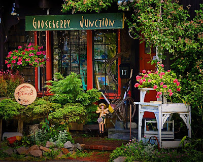
This is another one of those deals that takes longer to read the explanation than it does to do the work. Until I find an image that is so far out of whack on the noise scale that this method doesn't work, I'll keep using this freebie method. If you'd like to check out the lack of noise because of this method, click on the image. That'll open a larger view in another window. You should be able to use the CTRL and "+" keys to increase the apparent screen size. Look at the wood above the number eleven in the center of the shot. At 500% you can see the image starting to fall apart (it is a low resolution copy of the image), but it's tough to pick up any noise. Read more!
Wednesday, August 12, 2009
Yet Another Lighthouse
With the number of times I go back to a lighthouse image you'd think I lived on the Maine coast. Unfortunately, I don't. The nearest lighthouse on the Maine coast is about a four hour ride. Not exactly close enough to check the forecast and decide to run out and grab a few shots. Shooting in Maine typically means at least a weekend, which means some planning at least. We pick the place, we pick the season, we pick the date, but there's no way we can pick the weather when pre-planning is involved. That's the case with today's image. We had planned a long weekend about a third of way up the coast, about Boothbay Harbor or so. As we drove toward Maine the weather basically sucked. All the way through Connecticut and Massachusetts the sky was a zero. New Hampshire is only about a twenty mile stretch and then it's into Maine. Things didn't look good, but that would put us up the coast early enough to check in and head out for some sunsets. As we neared the bridge on the NH/ME line the edge of the weatherline sat right over the border and Maine looked a lot better than anything we'd seen all day. It got to looking so good that we jumped off the highway and headed over to Cape Natick (Nubble) Light.
.
Once at the parking area (the "standard" place for the shot of Nubble) the cloud formations were the best of the day. So, does that mean today's image is (other than "developing" the digital negative) straight out of the camera? Close, but no cigar. A 50mm lens would probably give a pretty reasonable shot of the lighthouse and island (it's that close). But, that wouldn't give you much of the sky and the sky is at least as much the star of the shot as is the lighthouse. That meant going wide. Making the lighthouse look small in the great expanse of sea and sky was the picture in my mind's eye. The lens was set on 18mm. Several shots were taken, varying the exposure. On the 3" screen of the camera it looked just about right. There was only one problem that couldn't be seen on the camera's LCD. Oops!
.
Once back at the studio the shots were looked at and the one you see was slected. Studying it, the flaw became apparent. Because of the wide angle lens and the horizon being so low in the frame there was a reverse curvature of the earth. At first glance it loooked like a simple case of the horizon being off and the waterline on the right angled down toward the center of the image. Straightening the water resulted in the lighthouse and building to the left of the image now being angled severly to the northeast. It looked more like a cannon than a lighthouse. I finally decided the lighthouse was the "most important" object in the shot and straightened it up to vertical. (You can still see a slight pitch of the building on the far left.) Now the water was back to being angled. The simple solution was to make a selection, using the Marquee Tool. It was just a simple rectangle starting at the waterline on the rocks and included the sea/sky horizon line. It took about five seconds to clone out the angled sea. Solutions don't have to be complex, they just have to be believeable. Read more!
.
Once at the parking area (the "standard" place for the shot of Nubble) the cloud formations were the best of the day. So, does that mean today's image is (other than "developing" the digital negative) straight out of the camera? Close, but no cigar. A 50mm lens would probably give a pretty reasonable shot of the lighthouse and island (it's that close). But, that wouldn't give you much of the sky and the sky is at least as much the star of the shot as is the lighthouse. That meant going wide. Making the lighthouse look small in the great expanse of sea and sky was the picture in my mind's eye. The lens was set on 18mm. Several shots were taken, varying the exposure. On the 3" screen of the camera it looked just about right. There was only one problem that couldn't be seen on the camera's LCD. Oops!
.
Once back at the studio the shots were looked at and the one you see was slected. Studying it, the flaw became apparent. Because of the wide angle lens and the horizon being so low in the frame there was a reverse curvature of the earth. At first glance it loooked like a simple case of the horizon being off and the waterline on the right angled down toward the center of the image. Straightening the water resulted in the lighthouse and building to the left of the image now being angled severly to the northeast. It looked more like a cannon than a lighthouse. I finally decided the lighthouse was the "most important" object in the shot and straightened it up to vertical. (You can still see a slight pitch of the building on the far left.) Now the water was back to being angled. The simple solution was to make a selection, using the Marquee Tool. It was just a simple rectangle starting at the waterline on the rocks and included the sea/sky horizon line. It took about five seconds to clone out the angled sea. Solutions don't have to be complex, they just have to be believeable. Read more!
Monday, August 10, 2009
Betcha You've Never Shot This Lighthouse
Okay, it's a sucker bet, 'cause there is no such place. It might look strangely familiar, sort of like the bizarro version of Bass Harbor Head Light in Maine. Problem is that the building at BHHL is white stucco, not red brick. It opens onto the sea and there isn't an inlet anywhere near the light. Below the light is the rock bound coast that Maine is famous for, not a tree lined rocky coastline. It's close to Bass Harbor, but there's too many things that don't belong to be right.
.
Well, it's all in Maine, all at parts of Acadia National Park, but the pieces that make up this image aren't within miles of each other. In addition to changing the stucco to brick on the actual Bass Harbor Head Light, the coastline is over near Otter Cliffs and the spit of land on the left is part of one of the ponds on Park Loop Road. It's kind of what is commonly referred to as a "mashup" in today's speak. Createing places that exist only in your mind is something to do with shots that don't quite make it on their own. I did another composite from Acadia, but made the mistake of using three of the better half's shots. You probably won't be seeing that one any time soon, as I've been roundly chastised for messing with her shots. But it was pretty cool. She had a shot of one of the Carriage Road bridges. The road or path under the bridge had gone into disuse and was overgrown with vegetation. The second was aa shot of the road we'd parked the car on when taking a couple of shots. The third was a lake (pond) side shot that showed the tree lind bank. When I was finished playing with the three images the road under the store bridge was back open for traffic and the unattractive growth had been replaced with a line of trees. Pretty believeable it I do say so.
.
There's nothing wrong with playing with pictures. As I've said in past posts, your intent is what makes an image art verses something else. Trying to past off the composite of either today's lighthouse shot or the road under the bridge as factual would be wrong and an unneccessary fraud. When a painter creates his/her artwork, they are free to add, subtract or change parts of what they see. No one accuses a painter of fraud when they paint "what they see". If the artist doesn't "see" the trashcan by the pier, no one shakes a finger for not being true to the reality in their line of sight. If "art" is the intention of the photographer the same "rules" should apply. If the trashcan is the one thing that ruins an otherwise beautiful image there's two choices. Post-production or pre-production. If the object (the trashcan in this case) isn't chained down and can easily be moved, move it before taking the shot. (Put it back when you're finished.) If the object is too large or too heavy or whatever, remove it in post. After all, it's "art" Read more!
.
Well, it's all in Maine, all at parts of Acadia National Park, but the pieces that make up this image aren't within miles of each other. In addition to changing the stucco to brick on the actual Bass Harbor Head Light, the coastline is over near Otter Cliffs and the spit of land on the left is part of one of the ponds on Park Loop Road. It's kind of what is commonly referred to as a "mashup" in today's speak. Createing places that exist only in your mind is something to do with shots that don't quite make it on their own. I did another composite from Acadia, but made the mistake of using three of the better half's shots. You probably won't be seeing that one any time soon, as I've been roundly chastised for messing with her shots. But it was pretty cool. She had a shot of one of the Carriage Road bridges. The road or path under the bridge had gone into disuse and was overgrown with vegetation. The second was aa shot of the road we'd parked the car on when taking a couple of shots. The third was a lake (pond) side shot that showed the tree lind bank. When I was finished playing with the three images the road under the store bridge was back open for traffic and the unattractive growth had been replaced with a line of trees. Pretty believeable it I do say so.
.
There's nothing wrong with playing with pictures. As I've said in past posts, your intent is what makes an image art verses something else. Trying to past off the composite of either today's lighthouse shot or the road under the bridge as factual would be wrong and an unneccessary fraud. When a painter creates his/her artwork, they are free to add, subtract or change parts of what they see. No one accuses a painter of fraud when they paint "what they see". If the artist doesn't "see" the trashcan by the pier, no one shakes a finger for not being true to the reality in their line of sight. If "art" is the intention of the photographer the same "rules" should apply. If the trashcan is the one thing that ruins an otherwise beautiful image there's two choices. Post-production or pre-production. If the object (the trashcan in this case) isn't chained down and can easily be moved, move it before taking the shot. (Put it back when you're finished.) If the object is too large or too heavy or whatever, remove it in post. After all, it's "art" Read more!
Friday, August 7, 2009
To HDR or Not To HDR
It seems I'm getting asked more and more if one of my images is HDR (High Dynamic Range). Typically the answer is no. In a couple of posts in the past couple of weeks I took a look at the HDR craze that's going around. It is a very cool technique, it takes a little planning to do it with multiple images and it lends itself to static objects. Today's "Interesting Blog of the Day" (link) is a faux HDR effect by Adobe's Russel Brown. He has an interesting method of giving moving objects (in his primary example a Parrot) an HDR look. He goes for the illustrative look rather than the photo realistic genre, but it is a technique that should be put in your "toolbox" of methods of doing things. The image featured here today looks like it could be HDR in the photo realistic realm, but it's not. Each color has been individually adjusted to maximize it's saturation. This image has been taken a step beyond what I typically do in that there are multiple adjustment layers for "most" of the colors.
.
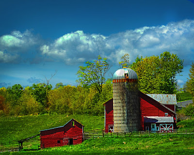
The "normal" workflow I go through includes having a Hue/Saturation Adjustment Layer for each available color (Red, Yellow, Green, Cyan, Blue and Magenta). The reason behind this is not so much the colors as it is the masks that go along with each adjustment layer. Today's image has two red adjustment layers (two of each color except Magenta). Again, it's the masks I'm interested in, not the color so much. The reason for two red adjustment layers is that I want to control the saturation of red in two different places. One in the barns and another in the band around the top of the silo. One way to do that with one adjustment layer is to use some shade of grey to reduce the intensity of the reds on the silo. The problem with that approach is getting the right choice of shade of grey. Since there is a mask, it is possible to select a shade and paint on the mask. If it's the wrong shade you can repaint with white (or black, depending on which way you go) and try another shade. This can be time consuming and every time you change your mind you start over. By having two separate red Hue/Saturation Layers you can focus your attention on the area of concern. Set the red of the barn and don't worry about the band on the silo. Mask it out and make another Hue/Saturation Layer to take care of that. Mask out the barns and work on the silo, etc. The nice things about this technique is the fact that you have complete control over what's going on in the individual areas. If you were to put the image away for an hour, a day, a week or whatever, you never have to begin at the beginning to make a change. If, a week from now you sold the image for use in a magazine and the editor says the barn is too bright red, you can go to the barn H/S Adjustment Layer use the Saturation slider to increase or decrease the intensity of the red in the barn without effecting the red in the silo. If the editor decided he/she needed a green barn with the red band around the silo, move the Hue slider.
.
Control is the name of the game. A subset of "control" would be flexibility. There's no point to having one "copy layer" with all your "development" decisions locked in to that layer. That would give you absolutely zero flexibility. Your only choice, if changes had to be made, would be to start over at the beginning. Not good! Today's image wound up with nineteen layers, probably thirteen or fourteen being Adjustment Layers. The image, even though it is one shot, is treated as a series of "pieces". Each piece is given the attention it needs.
.
So, in the end, break out the impportant areas within an image and work on them as though they were a complete (but still homogenous) piece of the puzzle. Read more!
.
The "normal" workflow I go through includes having a Hue/Saturation Adjustment Layer for each available color (Red, Yellow, Green, Cyan, Blue and Magenta). The reason behind this is not so much the colors as it is the masks that go along with each adjustment layer. Today's image has two red adjustment layers (two of each color except Magenta). Again, it's the masks I'm interested in, not the color so much. The reason for two red adjustment layers is that I want to control the saturation of red in two different places. One in the barns and another in the band around the top of the silo. One way to do that with one adjustment layer is to use some shade of grey to reduce the intensity of the reds on the silo. The problem with that approach is getting the right choice of shade of grey. Since there is a mask, it is possible to select a shade and paint on the mask. If it's the wrong shade you can repaint with white (or black, depending on which way you go) and try another shade. This can be time consuming and every time you change your mind you start over. By having two separate red Hue/Saturation Layers you can focus your attention on the area of concern. Set the red of the barn and don't worry about the band on the silo. Mask it out and make another Hue/Saturation Layer to take care of that. Mask out the barns and work on the silo, etc. The nice things about this technique is the fact that you have complete control over what's going on in the individual areas. If you were to put the image away for an hour, a day, a week or whatever, you never have to begin at the beginning to make a change. If, a week from now you sold the image for use in a magazine and the editor says the barn is too bright red, you can go to the barn H/S Adjustment Layer use the Saturation slider to increase or decrease the intensity of the red in the barn without effecting the red in the silo. If the editor decided he/she needed a green barn with the red band around the silo, move the Hue slider.
.
Control is the name of the game. A subset of "control" would be flexibility. There's no point to having one "copy layer" with all your "development" decisions locked in to that layer. That would give you absolutely zero flexibility. Your only choice, if changes had to be made, would be to start over at the beginning. Not good! Today's image wound up with nineteen layers, probably thirteen or fourteen being Adjustment Layers. The image, even though it is one shot, is treated as a series of "pieces". Each piece is given the attention it needs.
.
So, in the end, break out the impportant areas within an image and work on them as though they were a complete (but still homogenous) piece of the puzzle. Read more!
Wednesday, August 5, 2009
How Would I "Make" an Image.
Last week a post was put up showing a before and after (link)of an image I did quite a bit of Photoshop(r) work on. It was a shot of an old pump that started out with the top and left hand side cut off. I added space and recreated the missing pieces of the pump and tossed some ominous clouds behind it to increase the drama. (Pronounced in the Sam Malone of Cheers way of "dram a".) This morning I was reading Scott Kelby's blog (link) and he had a quest "blogger" writing about how his shop "makes" pictures by compositing sets of different shots. The final images are believable in an overly hyper way. If you follow the link to Scott's blog you'll probably recognize the style from many of the album covers or advertisements you see lately. It kind of takes the image beyond the photographic realm and bends it toward the illustrative end of the spectrum. What does that have to do with the mundane shot of a rock we have along with today's post? Follow the "read more" and hear where I plan on taking this shot.
As I was thinking about something for today's post I was influenced by what I read on Kelby's "Guest Blog Wednesday" post. I was interested in how "something" was "made" out of a set of "nothing" shots. It got the wheels turning and I figured it was time for another project, another challenge, to see how far I can push the limits of my Photoshop knowledge. Literally, I took one step off the front steps to the stone path between the steps going down to the driveway. I looked around and came up with three stones that looked like they might have potential. I brought the stones back into the studio portion of the gallery and dug out the staging table, speedlites, stands, and other gear to shoot the stones. Now, these stones are about an inch and a quarter tall, three quarters wide and not very thick. Between the three stones I took about fifty shots, using Nikon's CLS (Creative Lighting System) (link), varying the power of the three lights to get different modeling on each piece. Each light was in a TTL mode. I trust my "artistic" vision to get the look I'm after, but also trust Nikon to do the heavy lifting of the math needed to define my vision. If you're going to pay a lot of money for the camera, the lights, the studio, the light modifiers, etc. you might as well get what you paid for. Understanding the theory about what's going on is important, but once you have a handle on that, let the equipment do what you shelled out that money for.
.
So, what's the plan? The three rocks (or some combination of them) will become a mountain scene. So, why show the raw, unfinished (un-anything) shot? To show the starting point. As I work on this image I'll show some of the progress that's happening. I don't believe this will be something that'll be completed today, or this week, or next week. This project is going to be like a painter getting so far on a canvas and taking a break. Looking at what's on the canvas and seeing where "something" needs to be added, or changed, or covered up. Each component will start off as a photograph. It may be a piece of a shot, or something shot specifically for this project, but each piece will begin life in the camera. I have some clouds that will probably end up in the image, some tree, or tree parts, that I can see being included, maybe some water, I don't know. The rock in today's post will most definitely be a component. You might not recognize it by the time we get to the completed image, but it'll be in there. There'll probably be things I'll have to shoot, either in the studio, or in the field to add to the image, but it'll get there.
.
I hope everyone gets a kick out of the journey we're about to embark on. I catch you as we go down the road together. Read more!
Monday, August 3, 2009
What The Heck is a Triptych?
Sometimes you hear a term and say "what is that?". Well, according to Wikipedia (link), a triptych (pronounced trip-tik) is a work of art that is divided into three sections. I've always thought it sounds like something you'd get from AAA describing your route from point A to point B. I'm pretty sure, although they sound the same, Triple A didn't have works of art in mind when they named their routing booklets. If the "artwork" has more than three panels it would be known as a polytych. I discussed using a "polytych" (although I didn't use it's formal name) early on this blog (link). I went through how having a small set of images hung on the wall could be a reminder of an occasion or trip or just about anything worth being reminded of. That's one way to use a triptych/polytych. Another is as Wikipedia explains it and use it as a "work of art". You have to remember that art is in the eye of the beholder, so if today's image looks like art to you, fine. If not, it's just an example of what might be.
Rather than going for several images building a feeling, today's is a different way to show one continous image broken up as though you're looking through a window. It makes for an interesting way to have the viewer become a voyeur, seeing a scene through your eyes rather than an open expanse. It holds you in and acts as a control to limit your attention to the piece of the scene being presented. You get to search out details in every panel. You can see how each panel can make it's own image.
.
It's actually kind of amazing how well these things sell. With the gallery tag on the bottom it's not going to sell for large amounts, but it's not unusual to get $40.00 to $50.00 per print. Seeing as these are "gallery prints" and not signed and numbered limited edition prints there is no cap on the quantity that can be printed. Although the profit per print is small, the number of sales is greatly expanded. If your objective is to make a sustainable income based on your photography you have to look at any possible avenue to get your work out to the public. If you have the idea that you can only do "fine art" prints and make a living, you're name better be Vincent Versace, or John Paul Caponigro or Fay Sirkis. If you're not on that level of notice, don't limit yourself (until you get there, of course). Read more!
Subscribe to:
Posts (Atom)