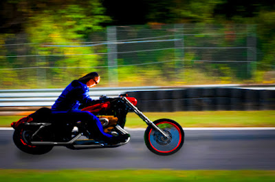
 Ever wonder what a straight, staid businessman who rides a straight, staid motorcycle does on the weekends? Well, based on today’s image, he trades in the staid motorcycle and goes cruising on his “chopper”. Instead of sitting upright, he leans into the wind, puts on flashier colors and lets his wild side show through. Actually, if you take a close look at the smaller image you’ll find it’s the same image. Today’s image started life as that thumbnail on the right. I’ve never taken a shot at using Adobe Photoshop CS5’s Puppet Warp applet, until today. I saw the clips about what it could do in the teaser videos before CS5 was released and thought “that’s kinda neat”, but never came across a reason to do something serious with it. I guess the holiday break was a good time to tax my brain and look at a couple features in Photoshop that aren’t exactly mainstream. Between Wednesday’s messing with the Liquefy Filter applet and today’s playing with its Puppet Warp I’ve been able to add a couple more arrows to the quiver. Today’s image is about Puppet Warp, but there’s several other techniques that were used to get the end result. To find the list (and short explanations) of what was used, hit the “read more”.
An Alpha Chanel Mask was created to pull the bike and rider out of the city streets and permit replacing the background. I’ve been asked several times “why Alpha Channels rather than just a selection or erasing the unwanted areas”. That answer is easy. Once a selection is used and the worker moves on to something else, that Selection is gone. Once something is erased (yuck) its unrecoverable. A Selection (however you get it), once saved as an Alpha Channel, can to refined, adjusted back and forth, using over and over again on other Layers, uncoupled from what’s being Masked and either the image or the Mask moved independent of each other to do things like reposition clouds within a scene and anything else you can think of to do with a Mask. An Alpha Channel Mask is just so much more flexible than a straight Selection or erasing anything. Biggest tip of 2010, never use the Eraser Tool.
The background came from a trip to Lime Rock Park racetrack. It had a little red Porsche 914 zipping along, but also had about the right amount of (in camera) motion blur to make it right. As brought in, the bike looked like Bikezilla. The background had to be enlarged using the Free Transform (Ctrl T) applet. The Porsche sort of showed through around the bike, so some Clone Stamp (S) work was need to get rid of the car.
A little shadow was put under the bike and rider and they were both “colored” to make them a little more interesting. A soft Brush (B) and colors chosen from the Swatch Panel were “painted” on the various bits and pieces needing a splash of color. Each color was applied on its own Layer and the Bland Mode changed to Color to place the colors over the detail below.
With the faux colors applied, Hue/Saturation Adjustment Layers were applied for each color (in this case: Red, Yellow, Green, Cyan, Blue, and Magenta). Extraneous color splashes were Masked out on the Adjustment Layer’s built in Mask.
Save it, close it, go to it in Adobe Photoshop Lightroom 3, put a vignette on it and reduce any noise and we were done. Hope you get a kick out of it.


0 comments:
Post a Comment