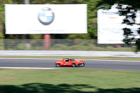
I’ve included the two components that make up the final image to demonstrate how a so-so shot can be “rescued” with a simple cut and paste. A buddy of mine and I were up at Lime Rock Park in northwestern Connecticut back in early October. I did a post about getting the shot right out of the camera with zero processing. It was a discussion of shooting styles and just that two shooters can arrive at the same end and use two different routes (methods) to get there. Today’s image goes toward the other extreme. I liked the little red 914 Porsche, but as you can see, it had a horrendous background. I had several shots with proper backgrounds but uninteresting action. The cars in the “background shot” were pretty dull and really didn’t grab my eye. The panning speed remained fairly constant from shot to shot staying in that particular spot. The difference is shooting about fifteen degrees to the right of the car’s image was shot. Just that much, fifteen degrees is all it takes sometimes to make the difference between a good background and something that’s messed up. Making the composite image was pretty easy thanks to the fence running through both shots. To find out what the details were, hit the “read more”.
The first thing you can see is that the Porsche is on a flat and the other cars are on a slight rise. The good thing about both images is that they contain a fence line. That’s going to make thing easy. Select either image (CTRL A) and bring it over to the other images Layer stack. You can drag and drop or Copy (CTRL C) and Paste (CTRL V) or do whatever you done to bring one image into another’s space.
Once both images are in one Layer stack, reduce the Opacity of the top image to about 50%. You’ll be able to see through the upper image to the lower image. Put the upper image into Free Transform (CTRL T) and start sliding the image to align the fences. By moving the cursor just outside the bounding box of the image in Free Transform you’ll get a curved handle that can be used to spin the image on its axis. Once you get the fence close to being aligned, zoom in (CTRL Space Bar and roll the Mouse’s Scroll Wheel to zoom). Now you can use the Left, Right, Up, and Down cursor keys to nudge the edges of the fences to direct alignment.
Bring the Opacity back up to 100%. You can do the next step any of several ways (don’t use the eraser). You can make a Selection of the section of the upper image that needs to be eliminated and hit the Add New Layer Mask icon found at the bottom of the Layers Panel. Or, you could add the Layer Mask first and paint out the area hiding the piece that needs to be shown. The reason for not specifying what to Mask is that it would depend on which Layer you chose to be the top Layer.
One the proper Mask is made its all clear sailing from there. Do the typical Hue/Saturation Adjustment Layer tweaking of each separate color (Red, Yellow, Green, Cyan, Blue, and Magenta), sharpen the image using a High Pass Filter (Filter/Other/High Pass) and darken the edges using a vignette. You're home free.


0 comments:
Post a Comment