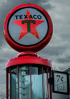
Here's where we left off on Monday. It's a complete image, but it still needs some work. The pump is sort of lifeless and can use a little spark. The ominous clouds in the background do add some drama, but it would be better if the storm was just past and the pump had a little sunshine on it. It's an old pump, so we can make the assumption that, other than the glass, it's all metal or some sort. The bezel looks like a stamping and the crown of the body appears to be a casting. Each would react to sun shining on it differently. Getting the appearance of directional light is as hard as you might think. Hit the "read more to find out how to "light" the pump.
Here's the same image that's been lit using Adobe Photoshop CS5's lighting effects (Filter/Render/Lighting Effects). First thing to do would be to break the image into the parks we want to work with. In this case that's the bezel, the casting and the face of the shield. Using the Quick Selection Tool (W) it's easy to pick up each piece. In this case, rather than duplicating the Background Layer and using a Layer Mask it was just easier to put the pieces up on their own Layers. (The problem using this technique is WYSIWYG (what you see is what you get). If your selection is off at all you'll end up with miscellaneous bits that can't be added easily. The safer method would be to use Layer Masks. When "lighting" each piece the Lighting Effects dialog box presents a wealth of options. There's more than a dozen types of lights, you can make the surface dull or reflective, you can make the beam wide or narrow, you can adjust the ambience of the area not directly hit by the light, and a half dozen other features of the light. The same type of light was used for all three pieces. The bezel made Shiny and Metallic, the crown not quite as Shiny and slightly less Metallic, the star in the face is generally brighter and Shiner. The Lights were all set to be coming from the upper left.
The coloring looked pretty good, so individual colors (Red, Yellow, Green, Cyan, Blue, and Magenta) didn't need to be adjusted using individual Adjustment Layers. So, the next steps were finishing the image. By "finishing" I mean cropping, sharpening and vignetting. Step one is Cropping. What I do (and there are a hundred possibilities on this step) is chose the size and resolution of the final print. In most cases (for me) this is 16 x 20 @150 ppi. This will give plenty of detail and lower the overall file size to be sent out to a service.

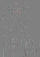
 Here's an interesting version of the image. This is the sharpening step we use here at the gallery. It a High Pass filter (Filter/Other/High Pass) and it makes any image look like some sort of weird, gray scale line drawing. What's going on is that it's picking up the sharp edges. We use a Radius of about 10 on most images. Once you're satisfied with the edges, click OK. Then change the Blend Mode to Overlay. If that looks too far gone, try Soft Light. With either choice the Opacity slider can be used to "fine tune" the level of Sharpening. Clouds appear unreal when sharpened. Go back to the Alpha Channel Mask called Sky (Channels Panel then Ctrl click on the Sky icon) and add it as a Layer Mask. As is it's the opposite of what we're looking for, so tap Ctrl I (eye) to Invert the Mask. We end up with the pump sharpened and the sky as it was.
Every print needs some vignetting. Typically not enough to call attention to the vignette, but an amount to just tint the edges to hold the view in the shot. The easiest method of doing this is to use a Layer Mask. Select the upper most Layer. You can see that the entire image goes back to its unsharpened state. Hit the New Layer Mask icon at the bottom of the Layers Panel to add a Layer Mask. Using the Rectangular Marquee Tool (M) select the center of the image. Leave an equal space around the image. Feather the selection (Shift F6) to about 200 pixels. Fill the selection with Black and change the Blanding Mode to Multiply. Adjust the vignette to taste by sliding the Opacity slider lower.
Here's the final image, ready to hang.


0 comments:
Post a Comment