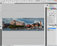
One caveat before we start with part two of the Baltimore Harbor tutorial. I was so concentrated on making sure I had the individual JPG images of each set that I forgot to save the PSD file. So, I had to rebuild it from scratch. One of the things that surprised me was that it took less than ten minutes to not only get to where we were on Wednesday, but to complete the image completely. This may look like a complex build of an image, but it's really not that many steps.

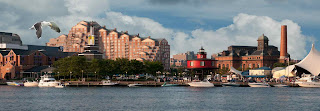
Here's the closest I found to our end point from Wednesday's "part one". There's no gull in the image yet, no working of the "hot" areas, no sharpening and no vignette. These will be the steps we'll go through today. The first thing to do is add our friendly little gull. Gulls, or any flying birds in range are another database I've built over time. You need to thing in pieces of possible images. Would birds look realistic in the scene you're trying to build. Having sets of files of "pieces" comes in very handy. The gull doesn't take up much of the original shot. That's okay, we don't need the gull to be particularly big. It's an accent, not a feature of the scene. In the case of the gull I used the rectangular Marquee Tool (M) and isolated the bird. I copied (Ctrl C) and pasted (Ctrl V) the selection into the scene. Using the Move Tool (V) the gull was positioned in the approximate location I thought it would look good. Using the Quick Selection Tool (W) the sky was selected. Right clicking in the sky brought up a dialog box. In the dialog box the Save Selection option was chosen. It really doesn't matter if the Alpha Channel Mask is of the sky or of the gull. Once it's used, the Mask can be flipped using CTRL I (eye) to get to the Mask needed. You can either use Refine Edge as you make the selection or use Refine Mask once the selection is converted to the Alpha Channel Mask to clean up the edges. Here's what we have with the gull inserted into the scene.


We now have the image "assembled", so it's time to tweak it to make it easier to view. That is, to tone down the bright areas and, if needed, bring up the areas we'd want the eye to go to. A friend of mine once said there's twenty ways to do anything in Photoshop. I agreed, but added that of the twenty ways, nineteen were hard and one was easy. To tone down the hot spots we can use the Dodge and Burn Tool (O) in Photoshop CS5. I say in CS5 because D&B has been greatly improved there. Make sure you have the "Protect Tones" check box clicked on. It works very well and infinitely better than previous version. If you're "old school" you can use a Layer filled with 50% grey, with the Blend Mode changed to Overlay. In either case you need to set the Range to what you're working on (Shadows, Midtones, or Highlights) and bring the Exposure of the Brush way down and build up the dodging or burning. Another, easier technique was used on today's image. A copy was made (Ctrl J) of the base scene Layer and a Black Layer Mask was applied. The Blend Mode was switched to Multiply. The Quick Selection Tool (W) was used to pick the areas needing adjustment, such as the tent on the right, the boats, areas of a couple buildings, etc. Once the areas were selected (and they can either be selected all at once or in individual steps) they were filled with White. That allowed the multiplied Layer to show through. If the effect is to much the Opacity Slider can be use to make any needed adjustment. Compare the image above the paragraph with the image below. You can see the shading in the tent on the right and in other places.
That's it for adjustments on this image. I didn't think it was necessary to adjust the individual colors. The overall tone and tenor of the image looked about right. Therefore, all the Layers were selected and made into a Smart Object (right click on any Layer and pick from the dialog box). Two copies of the Smart Object were made and the upper on was turned off (click on the eyeball). With the middle Layer selected a High Pass Filter (Filter/Other/High Pass) was applied and the Blend Mode changed to Overlay. The Radius setting on the High Pass Filter was about 10 pixels. This sharpened up the entire image. I really don't like "sharp" clouds, so the sky Alpha Channel was selected (open Channels panel, Ctrl click on the "Sky" Alpha Channel) and a Layer Mask applied. This resulted in sharp clouds and no sharpening in the buildings and harbor. With the Layer Mask selected it was inverted (Ctrl i) to produce a sharp foreground and soft clouds.
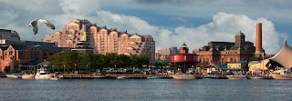
The last step was to put a vignette around the image. With the top Layer turned back on a Layer Mask was applied. With the rectangular Marquee Tool (M) a selection was made leaving a border about 1/8 in from all sides. The selection was feathered (Shift F6) by about 200 pixels and filled with black. The selection was deselected (Ctrl D) and the Opacity adjusted to taste. Here's the final image. Hope you enjoyed this tutorial.
The last step was to put a vignette around the image. With the top Layer turned back on a Layer Mask was applied. With the rectangular Marquee Tool (M) a selection was made leaving a border about 1/8 in from all sides. The selection was feathered (Shift F6) by about 200 pixels and filled with black. The selection was deselected (Ctrl D) and the Opacity adjusted to taste. Here's the final image. Hope you enjoyed this tutorial.


0 comments:
Post a Comment