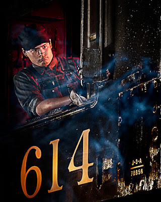
 Recently, about six weeks ago, a couple friends and I ran down (some of us more than once) to Roanoke, Virginia to shoot night shots of trains at the Virginia Museum of Transportation. It was a great opportunity to get a few images we wouldn't normally have. If we were to compare the shots we got we could probably sit around saying things like "oh, I must have been about ten feet further down the track than you were for that shot". So, we all had our own interpretations of the scenes in front of us. I had a chance to see the finished shots of one of the photographers who is exceptionally talented and creative. One of the images was her interpretation of today's image. I had basically the same shot but hers was a far better rendering of the tableau. Mine was way too red. Rather than looking like the glow of the fire from the door of the stoking box of the steam engine it looked more like the cab was on fire. Way too far over the top. I asked what kind of technique she had used and she gave me a brief rundown of what she'd done. I find out what the technique was and what my slant on it is, hit the "read more".
The basic technique was to create a copy of the original image, change it to black and white, overlay the color copy with the B&W Layer and reduce the Opacity to bring back "some" of the glow. Brilliant! I tried it and it did create the glow effect rather than the house afire starting point. From there I wanted to bring out more detail and sculpt the image a little more than what was there at that point.
First thing I did is a Bert Monroy technique (I'll steal techniques from just about anyone) to bring out more of the folds in the Engineer's clothing. I took a nice soft Brush (B), changed the Brush Mode (Not the Layer Mode) to Overlay and lowered the Opacity of the Brush (again, not the Opacity of the Layer) to somewhere near 30% and set the Brush Foreground Color to White. If you look at the sleeve, you can see what I did. At every fold you can see a highlight, a mid-tone and a shadow. For every highlight I hit (on a New Layer, with the Blend Mode set to Overlay) the top of the fold with White and then flipped the color to Black (X) and swiped the shadow side. This increased the apparent contrast and added depth to the folds. The same thing was done to any changes (highlight to shadow) on the bib, the shirt collar and the hat. That gave more "life" to the engineer's uniform.
The same basic technique (on another Layer) was used to "sculpt" the face and the forearm. The left (as you look at the image) side of the face was toned down and the upper and lower curves of the arm brought down to give a sense of roundness.
The "missing element" of the image was steam coming into the image. After all, it is a steam train. I have a set of images from some incense I burned just to have "smoke" for just such a situation as this. I dug out what I thought was a shot that would work and added it as a new Layer. The smoke was white (or light grey) and the background was black. Changing the Layer Blend Mode to Screen dropped out any black, leaving the smoke only. The Layer was copied (Ctrl J) to add some depth to the smoke.
The last "trick" (before finishing [Sharpening and applying a Vignette]) was to paint on the Black filled Layer Mask with a White Brush to reveal the 614 logo on the cab.
I think this is a huge improvement over the first attempt (back on April 13th) and I have to give credit where credit is due. Without seeing my friends version of basically the same shot I wouldn't have gone back to give it another shot. Thanks to LF for the inspiration.


0 comments:
Post a Comment