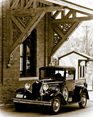
 How many times have you talked to a fellow shooter and heard him/her say they needed to bring a shot into Adobe Photoshop CS5 from Adobe Photoshop Lightroom 3 to add detail. I typically try to bite my tongue and not ask "why?". As long as you have a "straight" shot it isn't really necessary to go to CS5 (or any CS for that matter). Today's image isn't quite a "straight shot". I wanted to make it look more like an old picture found in a shoebox in the back of the closet. While I was at the train station where today's shot was taken and saw a railroad tie laying all by itself. I shot it just for the texture and tossed a faded copy on the car shot. That's the only thing done is PS. Everything else is Lightroom. The basic "tone" of the image is just one of the presets that comes with LR3. It tinted the image and faded the edges. The card, at that point, was pretty black and lacked a lot of detail. To find out how more detail was brought out, hit the "read more".
The car is black. Might as well say that up front. It's also in the shade, so that didn't help add any detail to an already black car. The Adjustment Brush got quite a workout bringing up the details. In the original image there must be twenty individual "pins" denoting areas that were worked. The obvious ones start with the side of the engine cover. One thing to keep in mind as you play with an image like today's is that there's more detail than you can see at first glance. It's a little unfortunate the reader of the blog can't see all the detail in the original.
The way I work, and the easiest way I've come up with, is to make gross adjustments and then back off to the final tone. The Exposure slider was brought as far to the right as possible to start. A soft brush was used for the biggest area and a progressively smaller brush to get the edges. Once the area is as bright as it can possibly get and the coverage is where I want it I'll go back to the Exposure slider and either back it down or zero it out and bring it up to the amount necessary to give the tone I'm looking for.
Areas that got that same treatment (to differing degrees) include the top of the hood, the fenders, the bezel around the radiator, the highlights, the driving lights, the horn the running board and the front of the tires.
Another version of the same technique was done using the Sharpness slider. The wheels, along with the spokes were sharpened. The headlights gained detail by sharpening them before doing an overall Sharpen.
Just like some things being Sharpened, other things had some of the Clarity removed. This eliminated most of the scratch marks that could be seen on the back fender.
I can see a couple things I may go back and play with a little. The frame of the building's window could be opened up a little. same with the shadow under the car. You might see another version of this car at some point. I'll have to see if it moves me (bad pun) to do it.


0 comments:
Post a Comment