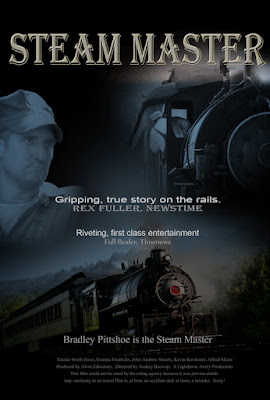
 This was the summer of trains for recreational shooting for me and I figured I might like to try something a little different from the typical image. What are you going to do when you have hundreds of images and want to play. In the old movies you might find Mickey Rooney saying "hey gang, let's put on a show". Well, it's a little hard to put on a show on a blog that doesn't do video. Maybe one day... For right now we'll have to be satisfied with doing a movie poster. We're a couple who adds to the coffers of the movie companies several times a month. We always checkout the posters on the way down to the auditorium showing our choice of the week. The comedies are light and airy, the shoot 'em up blockbusters are bright and super colorful and the serious dramatic movies are very dark and make you come closer to see all the detail. One thing they have in common is that they seem to want to give you multiple vignettes of what's going on in the film. If there's a big name star involved he/she will be featured on the poster. If, like in today's image, the featured player is an unknown or slight star, the face will recede into the background. To find out how today's image was created, hit the "read more".
The first things is to select the images. Today's all come from the same outing. There have been several "straight" posts about the Roanoke Virginia night shoot and the Thomaston Connecticut steam shoot. All of today's images come from the Thomaston shoot. They were shot at three different locations. The "star" was shot from the station platform. The close up was shot down the track and the bottom image came from a little road trip down along the tracks.
The "star" image was converted using a Black & White Adjustment Layer. To add just a touch of drama a Brightness/Contrast Adjustment Layer and the brightness and the contrast were both increased. This made the image look much more like a graphic rather than a photograph. A Layer Mask was put on the Layer and a Foreground to Transparent Gradient applied. Foreground to Transparent was used because multiple gradients can be applied to a single image. Other softening techniques could be used, but I find the Background to Transparent to be very easy to control. Try a gradient, step back (CTRL Z), try another one, keep cycling until you're happy with the result and go on to the next area to be softened. All three major areas of the poster were treated in this manner.
A couple different types of Type Layers were used. Both spot text and paragraph text layers were applied. For the movie title a nice large font size was selected. You can start with any font. Once the text is nearly in place, the font name can be highlighted and you can see how individual fonts will look on your specific text by using the Up and Down Arrow Keys. With the font name highlighted your text will change with every Arrow Key click. Once the font is found it can be "enhanced" by double clicking on the Layer box (not the thumbnail). This open the Layer Effects Panel. Today's title has a Drop Shadow, an Inner Glow and a Bevel and Emboss addition. The Layer Effects Panel has so many choices that it gets hard to limit the playing around you can do.
At the bottom of the image a Paragraph Text box was opened. It's a little surprising how many people I run into who don't know "the trick" to the Paragraph Text box. Simply select the Text Tool (T) and drag out a box rather than clicking on a point in the image. You can either start typing or do a cut and paste of text from another source. Paragraph text is easy to control to limit the text to conform to shapes around pictorial pieces. The outline can be effected by any on the "normal" Selection Tools.


0 comments:
Post a Comment