I was giving my sister-in-law a ride down to one of the New
York airports this morning and she was telling me this story about how she had
gotten in trouble taking some pictures over at the local mall. Now, mind you, she was taking pictures of the
swans swimming around in the retention ponds outside the mall, beyond the
parking lots. A security guard (???)
went over to her and said she couldn’t take pictures, it was against the
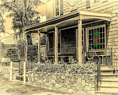
law. Yeah, right. Today’s image presents sort of the two sides
to that story. It is a photograph, taken
with a digital camera and “photoshopped” to look like a sketch. The house is the Mark Twain House at Nook
Farm in Hartford Connecticut. It’s on
private property as is the mall in this discussion. If today’s image were a “real” sketch, the
artist could have sat at the same spot, put up an easel and sketched away. (Would have been a really nice pencil sketch,
but you can probably find a hundred artists who could do it justice.) At times, the (whatever it is) Nook Farm
Association or Mark Twain Society or something invites/sponsors/encourages
artists to do “en plein air” work in the yards.
I don’t know that the mall does the same type of thing, but it’s
certainly something they “could” do. So,
the question is: Canvas? Yes. Camera?
No. Hit the “Read More” to find out
what’s up.
Monday, April 29, 2013
Friday, April 26, 2013
A Rant On Using Manual Exposure Mode On Your Camera
Raw images are notoriously dull. Straight out of the camera there’s no
sharpening, no contrast or color adjustment, no here’s Nikon’s (or Canon or
Sony or whoever) best guess as to what the finished image should look
like. Take a look at this past Monday’s
post. It has a before (right out of the
camera) and after (the lead image) and demonstrates where an image can be taken
to by developing a RAW image. Typically
photographers fall into a few categories.
Those who shoot exclusively RAW and will develop an image. Those who shoot exclusively JPG and let the
camera make the decisions. Those who consider
what they’re shooting and why and decide either to shoot RAW or JPG. If they’re shooting personal stuff that might
become a portfolio piece, they shoot RAW.
If they’re shooting a local high school baseball game, they shoot JPGs
to get the shots to the newspaper or school without needing to do additional
work. Then there’s another, rather odd
duck, sort of shooter. He/she will shoot
everything in RAW. If the images will be
developed or printed as is, they still shoot RAW. It’s rather bizarre. Another case would be something that I came
across the other night. I was out doing
some test shooting with some friends. We
have a night shoot coming up and were trying to get the parameters down. Somehow the subject came up and one of the
women said she only shoots in Manual mode.
She was very proud of that fact.
Now, she has one of the more expensive cameras out there. I don’t understand why someone would buy an
expensive computer (the camera) and then use it as if it was a shoebox. Knowing her, she’s just not that capable
enough to determine exposure just by looking at a scene. It appears she’ll take a shot, say “oops, it’s
too dark (or light)”, fiddle with the settings, try another shot and keep
going. Again, another bizarre thing to
do to get an image. I understand why she
doesn’t shoot sports. As we were shooting
she would make comments like “I was at F10, but it was too dark. I’ll switch to F 9 and try again”. Really, was she so close to a great exposure
that she was changing by 1/3 stops to get the absolute perfect exposure? No, she was closed to 3 stops off than 1/3 of
a stop. I suggested she change it by a
full stop. She said she had, from F 10
to F9. Where’s a rim shot when you need
it? (Music term, not photography.) To find out my thoughts on using manual
settings on a camera, hit the “Read More”.
Read more!
Labels:
acknowledgement,
general interest,
rambling,
rant,
recommendation,
technique
Wednesday, April 24, 2013
Wednesday Q&A: Import Issue In Lightroom For A Friend
I was out with a group of photographers last night and a
friend asked me a question about importing images into Adobe Photoshop
Lightroom 4. (I believe he said he hadn’t gone up to LR5 Beta yet.) His file system is a date system, where the
first level folder is the year. The next
level down is the month. He said he was
very faithful to Keywording. If you’re
absolutely on top of Keywording you could dump all your images into one giant
folder and depend on Keywords to find any images you want. Trick is you’d have to be 100% true to
Keywording every image. Naturally you
can do it by the batch. Highlight
everything that has to do with the same subject and add the keywords to all of
them at once. You can also use the Paint
spray can found at the bottom of the Grid View to apply Keywords just by “spraying”
over images. As with almost anything
coming from Adobe, there’s a dozen different ways to accomplish a task. The issue this friend had was ending up with
a duplicate year folder filled with the same thing he puts in the folder he
created. To learn what the problem might
be, hit the “Read More”.
Read more!
Read more!
Monday, April 22, 2013
Using Lightroom 5 Beta Radial Filter All Over The Place
How do you get two weeks ahead in three plus hours? You drive back from Cooperstown New York to
Connecticut. The foliage was two weeks
behind up there. We had snow (just a
little) on the car as we were leaving Sunday morning and the temperature was
just above freezing. Brrr, for April 20th. We went to Cooperstown, home of the Baseball
Hall of Fame. You’d think that was the
reason for our visit. Nope. Cooperstown is also the home of the Farmer’s
Museum. We’re not farmers by any stretch
of the imagine. In fact, we don’t even
like doing yard work, let alone farm something.
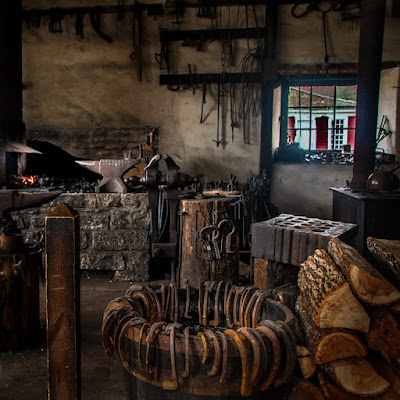
Today’s image was taken in the blacksmith’s shop at the museum. Needless to say, it was pretty dark in
there. You can see the building next
door through the window. You can also
see there’s another window off to the left.
Today’s image “could have been done” without Adobe Photoshop Lightroom 5
Beta, but it would have been harder to control.
The Adjustment Brush could have been used. The nice thing about the Radial Filter in
LR5B is the control it offers. Once you
get to the second paragraph of today’s post you’ll see how many times the
Radial Filter was used on today’s image.
Go ahead, hit the “Read More” and check it out.
Read more!
Friday, April 19, 2013
Antiquing With Photoshop & Lightroom & Nik & Topaz, Oh My
Can today’s image pass as an old photograph? Perhaps a pencil sketch? I don’t see why not. It’s neither.
It’s a typical image, shot with a digital camera. I don’t have a GPS fix on the location, but I’ve
been past it often enough that I know exactly where it is. It’s at the last crossroad going north on the
Taconic Parkway in New York. You can’t
miss it. There’s a gas station and a
diner on the east side and this barn on the west side. The funny thing about today’s image is that
it took a lot of “high tech” work to get it to look old and pencil
sketchy. There must be a half dozen
modified copies in Adobe Photoshop Lightroom 5 Beta from where I took a copy
over to Adobe Photoshop CS6, messed with it and did a File/Save – File Close
back to LR5B. With every iteration something
was done in each program. To find out
what a couple of the flip-flops entailed, hit the “Read More”.
Read more!
Labels:
Adobe,
CS6,
Lightroom,
LR5B,
Nik Software,
Photoshop,
technique,
Topaz Labs
Wednesday, April 17, 2013
Wednesday Q&A Adobe Lightroom 5 Best Guesses
A friend just bought Adobe Photoshop Lightroom 4 less than a
month ago. When the public Beta of
Lightroom 5 was announced the other day I sent him an email with a link to a
sneak preview and a review. I was on the
fence as to if I was going to download the Beta or wait for the RTM (release to
manufacturing) version. It took me two
days to decide I needed/wanted the features of LR5. Today’s image doesn’t look like it would have
much to do with LR5, but it wouldn’t be possible without it. At least not easily. It’s not that today’s image didn’t take a
couple trips over to Adobe Photoshop CS6, it certainly did. It’s a partial digital painting. I been slightly fixated on making
photographic images look like painting/photograph hybrid. Today it was taken to a wee bit of an
extreme. To find out was due to LR5 and
what was because of CS6, Hit the “Read More”
Labels:
acknowledgement,
Adobe,
CS6,
general interest,
Lightroom,
LR5,
make over,
painting,
Photoshop,
technique
Monday, April 15, 2013
Photoshop Brushes And Hue/Saturation Adjustment Layers
 |
| Face blurred because I don't have parental permission yet. |
Read more!
Friday, April 12, 2013
Would Rockwell Use Photoshop To Do His Stockbridge Main Street?
Norman Rockwell was (is) one of America’s greatest visual
story tellers. A flat out statement. That’s my opinion of his value to the interpretation
of American life in the twentieth century.
One of his most famous works is titled “Home for Christmas” or,
alternately “Stockbridge Main Street at Christmas”. There are several differences between today’s
image and Rockwell’s masterpiece. The
most obvious is probably the fact that his truly is a “masterpiece” and mine is
not. Take a look at today’s image and
Rockwell’s painting and you will see the same buildings. They’re really there (at least they’re
somewhere) along Main Street in Stockbridge Massachusetts. Today’s image doesn’t carry as far down the
street and doesn’t include the venerable Red Lion Inn, but it captures (I
think) the spirit of his painting. There
is one thing the two do have in common.
You can’t see the scene as presented in either the painting or today’s
image. The backdrop of Main Street
Stockbridge is the neighborhood behind the stores, not a vista of the hills to
the south. Basically, there are no hills
behind the buildings. It just falls off
looking like many Main Streets. In the
image you’re looking south. The hills
(they ain’t mountains by any stretch of the imagination) run north south, with
one set not too far to the east and the western set being a good distance
away. To learn where those mountains are
and how they got into today’s image, hit the “Read More”.
Wednesday, April 10, 2013
Wednesday Q & A: When To Use Photoshop's Eraser Tool --- Never!
I look through a lot of tutorials. Some have some interesting tricks that I’ll
incorporate into my workflow. But! I’ll tell you where I lose my curiosity. As soon as the mention of the Adobe Photoshop
CS6 (and before)’s Eraser Tool (E) comes up, I’m out of there. I might flip through to see how the
tutorialist (hey, somebody has to make up new words) gets to their finished
product, but as far as thinking I might learn a trick or two, no thanks. I haven’t used the Eraser Tool in at least a
half dozen years. As far as I’m
concerned, there’s just no use for it.
My recommendation, for anyone trying to learn something from internet
tutorials, is to have a red flag/fireworks/a distress signal of any stripe go
off at the point where the “educator” first mentions the Erase Tool. Take a look at today’s image. Obviously I’m not trying to impress anyone
with a wonderful work of art. It’s
strictly there as a means of explaining my advice to anyone using the Eraser
Tool in Photoshop. It’s a one word
suggestion/recommendation/nudge/command/shout/warning. STOP.
TO see my explanation and why I’m saying it, hit the “Read More”.
Labels:
Adobe,
CS6,
general interest,
Photoshop,
Question,
recommendation,
technique
Wednesday, April 3, 2013
Wednesday Q&A: How Do You Reset "Color" In The Lightroom Adjustment Brush?
 Today’s image is just eye candy. It has nothing to do with the question at
hand. I’ve been asked this same question
twice in the past two weeks and have recently seen erroneous answers to it from
(of all people) “The Photoshop Guys”. Specifically, both Scott Kelby and Matt Kloskowski. Today’s post is going to be one of the
shortest ever. Don’t even bother hitting
the “Read More” down at the bottom of the post.
There won’t be anything more to read.
For the proper answer (and I know there are a dozen different ways to do
something in Lightroom or Photoshop), let’s make it a little bit of a
quiz. Or maybe it’s better stated as an
exercise in deduction. Let’s go.
·
If you have the Adjustment Brush selected in
Adobe Lightroom 4 and the Exposure is set to some increased value, how can you
reset it to exactly zero? Answer: Double click on the word Exposure.
·
Still using the Adjustment Brush, how might you
reset the Clarity slider to zero?
Answer: Double click on the word
Clarity.
·
Here it comes!!!
Even still with the Adjustment Brush active, what might you do to zero
out the Color Picker? Hmmm, let me think
about that one. Ya wanna guess what you
would do to reset the Color to a zero value.
You guessed it. Double click on
the word Color.
Now that wasn’t so hard to deduce, was it? (Apologies to Scott and Matt for picking on them.)
Monday, April 1, 2013
My Thoughts On Windows 8
 Today’s image is just a different take on a vintage baseball
shot I did a few weeks ago. Rather than color I went for a sepia tone and put a
texture on the image. But, today’s post
is my thoughts and opinions about my experience with Microsoft Windows 8. Daily I have people visiting the Gallery from
Microsoft. It started as a trickle
(visits from Microsoft in Hialeah, Florida) and has grown so there are now
visits from Microsofties from coast to coast
and as far away as Japan. I’m happy for
the support, love to see you “guys” taking an interest in The Kayview Gallery
and hope you’re enjoying what you’ve been reading. Something tells me you won’t be quite as
enamored with my experience with MS Windows 8.
Hit the “Read More” to checkout my opinions of Win 8 "on my machine".
Subscribe to:
Posts (Atom)


