Friday, May 29, 2009

Start to Finish

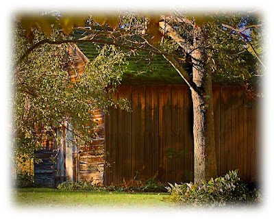
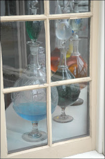
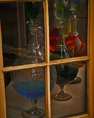
It's important to understand that what comes out of the camera is only the starting point of an image. On the right is the "right out of the camera shot", as taken, no frills, no finishing. It's the "undeveloped negative" of what would become the print shown on the left. There is nothing in the finished image that wasn't there in the digital "negative".

I once had the opportunity to talk to Bill Eppridge. If you're not familiar with the name, he's the photographer who took the famous picture of Bobby Kennedy lying, shot, on the floor of the hotel in California. There are many other iconic images by Bill, but that's probably his most famous (infamous). He was talking about just starting out, just out of school, trying to make a mark so his name would get out to editors of magazines. He entered a professional photographers competition. He won. The shot was of a white horse running in a field. The horse was a small part of the overall scene, but it was the "center of interest". It's a B&W print of pretty good size. Bill said he spent hours in the darkroom making print after print, dodging and burning specific sections, each time getting closer to get the image he originally saw in his minds eye.

The point is that what you originally see, straight out of the camera, isn't at an image's full potential. It's up to the photographer (or post production finisher) to bring out the information contained in the original file. The power we have today, with Photoshop, means we don't have to make "print after print" as Bill did back in the days of film and chemicals. We can try several options by using layers and groups, making "comps" either at certain points along the way or at decision points that might take the image in one direction or another. Same as Bill Eppridge dodging and burning one print after another.

We do have it easier than those before us, in that we can sit in a comfortable chair, lights on (low), people walking in and out and generally carrying on with our life rather than being imprisoned, alone, in a smelly darkroom. That doesn't mean we should pay any less attention to detail than Bill did with his competition print. If it takes more than five minutes to get the idea that an image has potential, you should probably move on. But if, after the initial exploration, you do see potential you should be willing to spend whatever time necessary to fashion the image you originally saw in your mind's eye.
Read more!

Wednesday, May 27, 2009

The Whole Story, Not Necessarily the Whole Picture

A friend chided me the other day saying he thought this was supposed to be a photography blog, but it looks more like an Adobe(r) Photoshop(tm) blog. Another said, in my Memorial Day tribute, that there wasn't "all" of anything in my images. To one I'd say this isn't supposed to be a "photography blog" or a "Photoshop blog", it's a personal blog that I invite anyone to visit and discuss. To the second friend I'd explain that I try to tell a "whole story", not necessarily show a "whole picture" of anything.

As a story teller using photography as a medium to tell the story I believe the feeling presented by the image is the thing. The Memorial Day image is a composite of several different shots taken at different times in different places. Today's image is one shot with, basically, the same components as the "made" shot from Monday. We have a flag, "enough" of a person and something tying the story together. Rather than a set of solo shots used to make one image, here we have Depth of Field used to create separation between the foreground, the central focus and the background. It achieves the same story telling device. The flag (in the lower left) is totally out of focus, but recognizable. The cannon in back is also out of focus. Together they explain who the person in the shot is. Another device is the (in camera) cropping of the fellow. If you're going to cut off a body part, cut deep. If you just nick the top of the head or cut someone off at the knees it's pretty obvious you made a mistake. If you crop like today's image just about anyone will be able to see that it was an "artistic" decision. As an "aside", if the shot took in any more of the area it would have had a couple hundred people standing around in twenty first century clothes.

Is today's image saleable or something that would win awards? No for a couple of reasons. Primary is that I don't know who the person is and have no way to get a model release, so, no making money off it. Although it wouldn't win any awards, it and a hundred other images from the day would make a good segment of a show when combined with some music and a voice over. The state park where the shot was taken might want to use a couple of minute show to let people know what happened on this spot many years ago.
Read more!

Tuesday, May 26, 2009

Hello Intel People

This will be the first posting without a picture to accompany it. I'd just like to say hello to the Intel folks checking out the blog. In the past couple of weeks (since I put the info out that I have a blog) I've had 16 Intel individuals look at the site a total of 22 times. I can narrow it down to those coming through Oregon and those reaching the blog from Folsom. If you're not aware, all Intel internet traffic seems to be going through one of those two portals.

If you're getting a kick out of the blog, feel free to visit often. Leave a comment (thanks Lenny) so I'll get an idea of what you think of it. I'd be happy to stay in touch and get any critiques (constructive confrontation) you might want to give.

Just in case you're wondering, there is undoubtedly a "cookie" on your computer letting me know that you're a returning visitor. Read more!

Monday, May 25, 2009

"A Grateful Nation"

Happy Memorial Day. Today we have a composite image that's from a of couple years ago. I was thinking about 9-11 and asked a friend to pose for a couple of shots. In small town's across the country fire fighting is done by volunteers. John is a volunteer. I had John stand on a bridge over a fairly still pond. The distance between the landing of the bridge and the water was just a few feet. The concept was John standing on the bridge dressed in street clothes and his reflection in his fire fighting gear. Even the two feet of disconnect wound up being too much. Just before we left the area I asked John to put his hat on a rock wall and I took a few shots.

With the original idea a bust I turned to his hat. The accompanying image is a composite of three shots. Obviously John's hat is from the arranged shoot. The flag was flying in the parking lot of a shopping mall and the clouds came from a drive through the Catskills in New York. It's a pretty straight job of putting three images together, except for the visor of the fire helmet. The visor is made of clear plastic. If I had left it, to block the flag, the shot would have had a weird "piece of something" in the lower quarter. The visor would not have been apparent as a part of the gear. The visor is actually a fourth layer with the opacity reduced. The visor is still clearly visible and the flag can be seen behind. Attention to detail is important when the final image is a composite.

The image has resonated where it's been shown and has won several awards. The title, "A Grateful Nation" is a tribute to all who serve our great nation. Read more!

Friday, May 22, 2009

A Very Simple in Camera Technique

The image that goes along with this post is a straight shot. (It'll be used as a component of a composite image one of these days.) The branch of the tree wasn't removed from a background to isolate it. The shot was taken along the Blue Ridge Parkway, at a roadside turnout. The turnout was right on the top of a ridgeline with fairly steep valleys on either side. Cloud cover was low enough to be hugging the ridge. The wind that day was coming from the east, where the lower clouds were. You could actually see the clouds race up the hillside and crest over the ridge at a pretty good clip. This branch was on a tree on the east side.

That's the setup. Here's how the image was taken to get the detail and color in the branch. One thing to keep in mind is that cameras, like computers, are dumb as a stump. Either will only react to what you "tell" them. If the exposure was left zeroed out as the meter "read" the scene it would have come out with the cloud being grey and the branch being in silhouette. The meter would have been fooled, wanting to average out the scene to a neutral grey. With as much white as in this scene you need to use the "Exposure Value" (EV) compensation adjustment available in just about all DSLR and some higher end point and shoot cameras. If you're not familiar with this type of situation, the first thought would be to go negative with the EV because the scene is so bright. Actually, you want to go counter intuitive. The meter is trying to make the scene grey. In order to "fool" the meter (actually, to make the meter do what you want) you'll want to go to the plus side of the EV scale. In the case of the branch the EV was increased by two full F stops. What happens is the meter now reads the scene as two F stops above the neutral grey it wants and exposes the scene properly.

The same adjustments need to be made if the scene were 90% dark. The meter still would want to render the overall scene as a neutral grey. To get the rich blacks you'd look for in a night scene you would go the opposite way and take the EV down a couple of F stops to get a correct exposure.

Today's cameras have amazing meters in them. On a nice day (sunny or not) the meter will do an accurate job of setting the proper exposure. You can have the camera on AUTO (don't do it), or P (does that mean professional?? I think not.), or Shutter Priority (know if you looking to freeze motion or show motion), or Aperture Priority (know what sort of Depth of Field you're interested in) and get a decent photograph. When you're faced with something on the fringe is when you have to do the thinking and just let the cameras meter do the mathematics. Read more!

Wednesday, May 20, 2009

Matching Composited Shadows

One "gothca" that's often seen in outdoor pictures that are composited is a mismatch of shadow directions. By paying attention to details, such as the shadows, a merged image can be made to be believable. It doesn't take much to figure out, based on the subject of this post, that the picture here is a result of compositing. If you guessed that the truck was put in over the image of the barn you'd only be half way home. The grass in front of the bumper was also added.

Take a look at the shadow cast by the eave of the barn. It's fairly easy to see the sunlight coming in from high left. Look at the shadow cast by the headlight of the truck on the fender. Again, high left. If you're really into nitpicking you'll see a very slight discrepancy between the angles of the shadows. The light on the truck comes from a little bit more toward the front compared to the light on the barn.

The barn is in Sherman Connecticut, the truck was in an antique restorer's parking lot in Arundle, Maine. The tall grass in the foreground is from almost anywhere. It's a good idea to take shots of ordinary things that can serve as components of a final image. To get the grass to appear to be in front of the bumper a simple mask was used, A very small brush, making random upward strokes from bottom to top, was used to create the overlaying grass.

One thing to remember, as you play with compositing multiple images, is it has to look real to be convincing. Mismatched shadows have tripped up more than one final image. Read more!

Monday, May 18, 2009

Everything Old is New Again

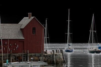
Thirty five years ago, the image with this post would have been a sign of a photographer who likes to add "something" to a slide to make it just a little different. Today, the first thing someone would say is "that's obviously Photoshopped". It was a little trickier back in the film/slide days. It involved buying a very specialized type of film called Kodalith. A slide would be sandwiched with the unexposed Kodalith film, then exposed under an enlarger light and developed. Once dry, the Kodalith image would again be sandwiched with the original and put into a slide mount. It was thought to be "oh so artsy". "Motif #1" shown in a new and different way. The reason for the Kodalith was typically to salvage a slide with some blown out areas. The exposure on the building is fine, the rock wharf looks good, but the sky and the water had, basically, no detail.

Today, a similar effect can be done in less than thirty seconds. The image of "Motif #1" was brought up in Photoshop. Holding the ALT key and double clicking in the layer representation made the "Background" into "Layer 0". Holding the CTRL key and clicking on the new layer icon produces a new layer (layer 1) under the original. Press the "D" key to set the foreground and background color to their black and white defaults. Holding the ALT key, press the Backspace key to fill "layer 1" with Black. Select layer "0" (the original image) and double click in its layer stripe. Toward the bottom of the dialog box will be the "Blend If" sliders. The top slider says "This layer". Move the white (right side) slider to the left to bring the black up through the blown out sky. If necessary, hold the ALT key and "split" the slider by clicking and dragging the left hand side of the slider pointer. Adjust until you get the desired effect. It actually took you longer to read this posting than it'll take you to make a pseudo "Kodalith". Read more!

Friday, May 15, 2009

How to Get Saturated Colors in the Dry Darkroom

In the wet darkroom, to adjust colors to get maximum saturation, there are (were) either sets of filters or a set a dials to adjust to get the color you were looking for. In today's dry darkroom we have the same ability to individually adjust colors to get the most, least , best or artistic saturation we're looking for. The image accompanying this post has some serious saturation. If we try to get the saturation in one shot we'll have to compromise. By breaking the colors down we can control what's going on in the computer.

What we're going to do is use (strangely enough) Hue/Saturation adjustment layers. Note that the previous sentence says "layers". When the Hue/Saturation adjustment layer is first opened (in Photoshop) it's set to "Master". Forget about "Master". The drop down gives you access to the individual color pallet. Red, Yellow, Green, Cyan, Blue and Magenta. You'll want to create an separate adjustment layer for each color. There's a reason for doing it this way. Adjustment layer one should be the red and it's reasonably important to label it as such, just to be able to keep track of which layer is what. The reason for the half dozen individual Adj. layers is because you get a layer mask with each one.

Determine what area of the photo is the most important for the color you're working on. Slide the Saturation slider to 100%. Don't mess with the Hue or Lightness sliders. Make sure the numeric value is 100%. Whatever color you're working with at the time probably looking about neon at 100%. Highlight the value (the +100). Hold down the Shift Key and tap the down arrow on your keyboard. This will reduce the saturation value down in 10 point increments (going down one point at a time gives too little variation to notice from point to point). When you get the "important area" to where you like it, stop. If other areas of the picture are still too brightly colored, use the Adjustment Layer's built-in mask and paint out the too bright area. Repeat this for each color. You'll end up with masks for each color.

Other things you can do is reduce the "blackness" of your brush to moderate the level of increased color you're applying to specific areas. Also, nothing says you can't have multiple Adjustment Layers for the same color and work specific areas of the image. Once you've got as many Adjustment Layers as you need, highlight all the Hue/Saturation layers and hit CTRL G (on a Windows machine). This will group the highlighted layers into a group and keep the number of layers visible from getting out of hand. Give it a try. I think you'll get a kick out of the amount of control you have over the saturation of the colors in your photo. Read more!

Wednesday, May 13, 2009

When is a Picture Not a Photograph?

Okay, this shouldn't be too hard. Paintings can be pictures and they're certainly not photographs. The image that goes along with this post isn't a painting, drawing or sketch and wasn't taken using a camera. At least not one we typically think of as being a camera. It's a scanograph. It was "taken" using a scanner. It's easy enough to do. A scanner has a huge lens, short Depth of Field, and uses long exposures.

The image is made up of three scans, the flower, the fern (?) and the branch of buds. The three are then composited to create the composition. You really don't have to worry about crushing the flower because you can leave the top of the scanner off (or open). Due to the laws of physics we have the inverse square law about how light acts. (The amount of light that falls on a subject is inversely proportional to the square of the distance between the source and the subject.)

The source (light) is the lamp that transverses the scanner. The subject (the flower in this case) is sitting on the glass plate of the scanner, about one inch from the source. Therefore, with your scanner sitting on a table, or desk of almost any height, the amount of light hitting, even a white ceiling, is so ridiculously small as to eliminated. The white ceiling is rendered black.

The exposure is pretty much fixed. It's the amount of time it takes the lamp to traverse the scanner. Every portion of the subject will get the same illumination. Shadows, such as on the flower, come from the position of the light compared to the pedals of the flower. It's an interesting style of "photography" that's well worth exploring. Read more!

Monday, May 11, 2009

Not Always What it Appears

Sometimes things "look" okay, but, if studied, have flaws. I needed an image of a simple machine. There are categories of "simple machines" such as a lever, an inclined plane, a wedge and a screw (or helix). The simple machine shown here is an example of a screw.

The "machine" is simple, but the image is a bit more complex, and flawed. The proper name of the tool shown is a Stilson wrench. A picture of a single wrench would probably been pretty boring. Unfortunately, I didn't have multiple wrenches. Even if I did, having two that were identical was, most likely, not going to happen.
The answer would be to composite one image to look like two tools. If you know what you're doing this shouldn't be a problem. Only problem was, at the time, I didn't know what I was doing. This image goes back to the first year I was using Photoshop in a serious manner. The drop shadow between the wrenches? Today, piece of cake. A layer style. Then, a copy of the wrench, converted to B&W and colored black. It's a third layer, between the two layers of the wrenches. It worked, but compared to the techniques I know today, pretty wacked.

What I'm trying to get to is the fact that the learning curve for Photoshop is extremely steep, and methods of accomplishing a look or effect evolve as we (all of us) become more proficient. No one should be discouraged by what they see others doing. We need to learn and grow. The greatest impetus for learning is charging someone for the work we do. If it takes four times longer than the next person to finish a job, that doesn't mean we can charge four times as much. The work is worth a finite amount and your skill determines what you are paid per hour. If it's a $100.00 job and it takes 10 minutes to do, it's reasonable money. If that job takes 4 hours to do, either improve your skills or look for a new line of work.

BTW: The shot of the wrenches is impossible. The knurled rings intersect each other. Two things cannot occupy the same space at the same time. Read more!

Thursday, May 7, 2009

Simple Memories

Almost everyone takes pictures while on vacation. People say they're trying to save memories. In the days of film photography the resulting photos would end up in a drawer, a shoe box or, if the person was very organized, an album. Only problem with albums is that they end up in a drawer, a shoebox, ... In today's digital era the "shoebox" is a harddrive, a CD-ROM or DVD. Basically, nothing has changed. The images are looked at right after they're shot and then go into a black hole, almost never to be seen again.

Let's face it, vacation pictures are typically recordings of events in our lives, not showroom class photography. If you cull through the vacation's pictures you may come out with a couple that capture the essence of the places visited. Such is the case of the shots shown with this post. All taken on Bear Skin Neck in Rockport, MA. None would be able to stand on it's own to give the feeling of the time spent on the Neck between rain drops. But, together they give a sense of the things to be found in a tourist area without appearing to be the typical "tourist shots".

The bottom (the anchor) sets the tone, identifying place. The other three shots are little tiny "pieces" of Bear Skin Neck on the day we were there. This type of print, framed or made into a calendar or just tacked up on a corkboard, can be a frequent peek at a very special weekend spent away from home and studio. It also serves as a reminder that it's the small things that matter. If you have a larger format printer, print large. If you don't have a printer capable of larger than 8.5 x 11, take a look at Costco or other discount photo outlets. A 12 x 18, at Costco, is less than $3.00.


Read more!

Wednesday, May 6, 2009

The Only Place to Shoot Flowers

Okay, not the "only place" but probably the ideal place to shoot flowers is in the studio. It just eliminates so many of the distractions and problems of shooting flowers in the field. There's a lot of things that can be done in studio that will give the look of being shot in the wide open spaces.

Have you ever seen the shots of the underside of a flower with the blue sky just as pretty as, well..., a picture? Where do you figure the photographer was? In a hole? Go to the florist, pick through a hundred flowers, get the one that's perfect and bring it home. That blue sky you see is probably a piece of kid's construction paper. Control is the name of the game when shooting flowers. In the field you could hardly call it "still life". Even on the calmest days you will most likely have some breeze blowing ever so gently. In the studio you can lock that sucker down to the point where it wouldn't move if you had a high CFM blower going across the stage. In order to get decent DOF you'll need a small F-Stop, which means a slow shutter speed.

The shot accompanying this post was shot using daylight corrected CFLs through a softbox. The shutter speed was about 1.3 seconds. The background appears to have "something" going on , perhaps additional flowers. Actually, I was trying to kick a little light up under the flower to produce a more translucent quality. I used the gold surface of a 5 in 1 reflector and wound up getting the moving reflector in the shot. My first reaction was "you dummy", but once viewed on a monitor I saw the possibilities in the error. Rather than being a detriment to the image, it added depth.

One of the best things about shooting in the studio is you have all the time in the world. You don't have be worried about the sun getting to high in the sky. If you want a sunrise quality to the light, knock yourself out. Just past sunset, go for it. You're in control, and being "in control" of the light is a key to interesting photography, in the studio or in the field. Read more!

Tuesday, May 5, 2009

The Case for Geo-tagging

While shooting some sports pictures the other day, my son saw me attaching "something" to the camera. When he asked what it was I explained that it was a GPS unit. His (and others) response was "you're kidding". I get that a lot. The first reaction from most of the people who have seen the unit has been why in the world would you want to tag each picture with longitude and latitude. As evidence I present the attached picture. I know in general terms the area the picture comes from. It's in Vermont, I can find the same dirt road we were on and know it was the western slope of the hill. What I don't know is which of the turnouts we were at when I shot this series. We've been back, but the spot eludes me. Makes me nuts.

Now, whenever we go out shooting I take, at least, a couple of shots with the GPS attached. I'm not all that interested in the direction the camera was pointed. I'm pretty sure I can figure that out (i.e. it's the side of the road with the stream on it) What I do is take the coiled cord and wrap a couple of loops around the camera strap. That way it's unobtrusive. I can also attach a couple of cords that way. If we're shooting early morning (like this shot) and at sunset I'll typically have the camera on a tripod (can you say photography 101). I'll also be using a remote shutter control. Wrap the coiled cord of the remote receiver on the strap and we're off to the races.

So, with a couple of shots taken with the GPS data included, hopefully we'll be able to get back to the "sweet spots" we once enjoyed.
Read more!

Monday, May 4, 2009

Panos Really Aren't That Hard

Any time you read articles about doing panoramas you typically see a long rant about needing a special attachment for your tripod. Rubbish. Another misconception is that you need to fix your F-stop and shutter speed to get a good exposure for the highlights. Bull! The pano that goes along with this post was taken along the Blue Ridge Parkway, handheld, aperture priority and made by twisting my body. I picked out "set points" to insure enough overlap for Adobe(r) Photoshop(tm) CS4 to do it's thing, but the key is to "see" the shot before hitting the shutter release. I've got a half dozen different tripods and a remote release for the shutter. With this sort of shot, neither is needed. The "Photomerge" function in PS CS 3 - 4 or in PS Elements 7 does an absolutely phenomenal job piecing images together, creating masks for each layer and blending the shading together.
Very often you'll see authors saying the "best" results come from using a specific piece of software. Photoshop is the only piece of software needed. You can do a straight pano, like the one on this post. You can also do a matrix type of pano, where you take a series of shots both across and up and down. As long as you have enough overlap you're home free.
The files created for any pano can be huge. This image started out as RAW files, merged into the pano, cropped to the final size, "finished" in PS and saved as both a PSD and JPEG files. The JPEG was 46 MB. The PSD was a couple hundred MB.
The biggest thing preventing most folks from doing panos is not trying. Next time you're out shooting, twist your body and take a couple of snaps. There's a couple of tricks for remembering where your pano sequence starts and stops. Shooting a shot of one finger before the start and two after the last shot (Scott Kelby) or shooting a pointed finger to the right before and to the left after (Moose Peterson) are two common methods.
Read more!