skip to main |
skip to sidebar
 Everything I do, basically, starts out in Adobe Photoshop Lightroom 3 and then goes (if needed) to Adobe Photoshop CS5 for any pixel bending that might be needed. If it's a straight image, the time spent in CS% (if any) is pretty minimal. The way it works out, about 90% of my images spend time in CS5. I guess that's because, like Jessica Rabbit, I'm drawn that way (oblique reference to a 1988 film titled "Who Framed Roger Rabbit"). I don't seem to be able to leave well enough (read that "good enough") alone. I guess some purists would say the 25 MPH Speed Limit sign that was the nearest object in the frame should have remained. "It was there in real life, so it should be there in the shot". To them I say BS. I don't create documental or historical imagery. In my own small way I create art. If someone working in oils on canvas were to paint the scene and, for aesthetic value, left out the sign, no one would bat an eye. If I were doing photojournalism I'd have to work with a set of fairly strict rules. I'm not. Again, I'm creating (in my mind) art. If you were standing across the street from this sidewalk park (as I was) and you were checking out the park (as I was), you'd look at it and never even notice the sign. It's incidental and of no importance to the scene. Therefore, it's outa here. As I said above, about 90% of my images get tampered with. If I did photojournalism, the stuff I shot would fall into the category of "spot news". Why? Because I took the shot when I was there. We typically go to the Maine coast each fall to do some shooting. We're there when we're there. We can't make the sky have beautiful clouds. It's Tuesday and the sky is bald. Do you put the camera in the bag and say "oh well, not today?". It's not like we live there and can walk out tomorrow and check if Wednesday is a great cloud day. We're there one week a year, take it or leave it. So, popping in a sky or taking out a speed limit sign, is not a problem to me. It's art! To see what else was removed from today's image, hit the "read more".
Read more!
 Okay, I really didn't move the building, I moved the neighborhood. This restaurant is on a short street with another restaurant to the left and a house (turned office building) to the right. The fence and chair in the lower left belongs to the other restaurant, but the entire house to the right is gone. It wasn't like you could see it through the trees. There were no trees blocking view. The tees that area there now came from the upper right corner of the shot. The wood shingles up on the third floor were nowhere near as new as they appear to be in today's image. Just as a little background about this style of building. At one point, in some US cities, there were regulations about the building only being two stories high. Here in the northeast, steep roofs were the norm to be able to shed snow during the winters. The reason for the wood shingles was to be able to call it a part of the roof. That way the builder could skirt the regulations concerning the number of stories in a building. Pretty clever, those old Swamp Yankees. The house actually does date back to the early days of our town and gets its current name from General Israel Putnam, of Revolutionary War fame. There's no direct connection that I know of, but Putnam did spend the winter of 1778-1779 camped, with his troops, in town. To find out how the neighborhood was moved, hit the "read more".
Read more!
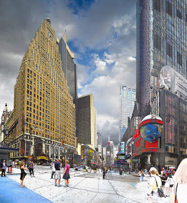
 What! How bizarre a statement is the title of today's post? To tell the truth? Not at all. I was looking at the third (and last) times Square scene in this trilogy and was trying to decide if I liked the way it looked or if one of the older iterations looked better. By using Smart Objects I was able to pick the image apart, going back to the base Layers of the four shot pano. I was able to take a look at each of the five nested Smart Object Layers and turn on and off each Layer at each interval. I had total freedom to move in any direction I wanted. Up, down, left, right, just as if I was SCUBA diving. When you're SCUBA diving you're not restricted by the typical forces we find on land. If a diver is properly buoyant he/she can move vertically just as easily as she/he can move in a horizontal plane . The same holds true for working in Smart Objects. One of the demonstrations I typically do when discussing the use of Smart Objects is to start a panorama with four or five shots. Once Adobe Photoshop CS5 does its magic I add a Layer and write the word "MISTAKE" in big red letters across the image. From there I make the whole set of Layers into a Smart Object. I'll go through any color correction and color saturation I think works with the image and make a Smart Object of all those Layers. From there, as in today's image I'll create an Alpha Channel Mask and drop in a pleasing sky. I'll adjust the sky (using Adjustment Layers and a Clipping Mask) to make it look reasonable with the rest of the image and make a Smart Object of that whole shooting match. I'll make two copies of that Smart Object and use the lower copy to Sharpen the image and the upper to put a Vignette around the edges to "finish" the image. Mind you, I still have the word "MISTAKE" across the image. The reason for having the word in large type is so no one forgets that a "mistake" was made on the original pano. In real life it wouldn't be a large, typed word, but this is only to make a point. To find out what the magic is about using Smart Objects, hit the "read more".
Read more!
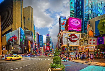 Here's one more view of the Times Square area in New York City. It, like Monday's post (below), is an eight shot panorama of NYC. The shots were taken with a Nikon 3000, held in a vertical position, and is four shots wide by two rows of shots high. The Times Square area is so bright with color that it's almost Las Vegasesque and lends itself to pushing colors past the limit of normal. As is usual with my images that are either HDR or exaggerated, a "normal" sky was popped in to try to do a little trompe l'oeil (fool of eye) action and make the viewer wonder just what is real and what's over the edge. To most people who have seen today's image, the first thing that comes to mind is HDR (High Dynamic Range). There is no HDR applied to this image. The illustrative look it the image comes from a completely different technique. To find out how the effect was achieved and how the bright colors pulled out of the image, hit the "read more".
Read more!
 At first glance you might think you're seeing "just another HDR image", but there's no HDR involved with today's image at all. We were wondering around the Times Square area in NYC on Saturday and I had my little 12 MP Nikon S3000 in my pocket "just in case". I thought we had gotten to and "interesting" area, so I whipped out the camera and took eight shots of the intersection. You read right, today's image is the result of eight shots. Four each in two rows. One of the really neat things about Adobe Photoshop CS5's Merge to Panorama is that it really doesn't care if you shoot a half dozen shots across a horizontal or four or five in a vertical or any combination of both. The computer will sit there and play jigsaw puzzle routines until it figures out what goes where and then assemble a coherent image. You can see the building on the left, looking like a space shuttle that just took off and is heading down range due to the wide angle used to take the shots. The buildings to the left look somewhat exaggerated and those to the right look fairly normal. To find out where the "HDRness" comes from and how we just happened to be there on such a beautiful day, hit the "read more".
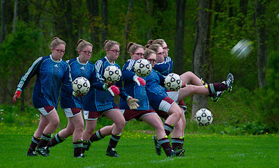 I've talked about Smart Objects in other posts, but this is about nesting multiple Smart Objects . Here's a super easy explanation why I use (and you should use) Smart Objects. I had the image completed and was looking it over for any flaws, omissions, extra bits, missing bits or whatever. The thing I noticed was that the ball, in flight, had shrunk from soccer ball size to softball size. It looked like she really kicked the air right out of the ball. Remember, this was just before I was about to pull the trigger on making a print. I typically print off the top set of Smart Objects. The top set of Smart Objects contains Sharpening and Vignetting only. Everything else has been done and work on the image is over. What a time to discover you have to make a correction two sets of Smart Objects down. But, because of Smart Objects, it's not a problem. It's actually an easy fix (and it would up being the second trip back to the base set) because of the flexibility of using Smart Objects. To find out why I'm so high on Smart Objects and to get an idea of the magic of Smart Objects, hit the "read more".
Read more!
 I was at a show the other day and had seven or eight gallery prints of some of the railroad/train images that have been on the blog recently. One fellow was checking them out, seemed to be interested and decided to comment on a couple. He picked up the one of the station, train and old car from June 3rd and said "this would have been good if you had done it as HDR". It's an opinion, so I thanked him for his comments and went along my way. I didn't bother telling him that HDR was part of the processing of the image. When I was developing the image I did take a look at going to the dark side of HDR and making it look more like an illustration than a photograph, but didn't like where it was headed. You can read the story of the image by following this link. The big deal of the image is that you don't see the processing that was done. You don't see the hose that was removed. You don't see the bright yellow paint on the curbing by the car. You don't see the modern license plate on the car. You don't see three or four people who added nothing to the scene. You don't see the handbill taped to the far right window of the building. You don't see the trappings that give away the fact that the shot was taken two weeks ago rather than fifty years ago. Beware of people making pronouncements without checking the facts. I've always run the other way when I hear someone making flat statements. That's enough of a rant. To find out how today's image relates to the train image and the misguided statement made by a semi-stranger, hit the "read more".
Read more!
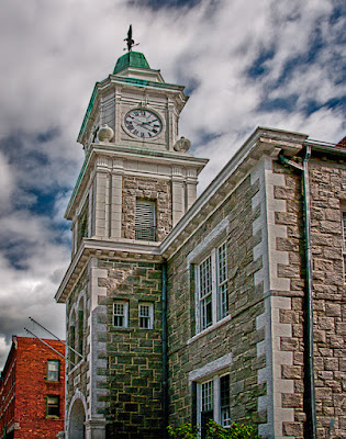 I can't help it. I just have an aversion to HRD skies. Today's image, and the sky in particular looks to be straight HDR interpretation of an image of a clock tower. The buildings are, but the sky isn't. When the shots were taken I fired off a five shot burst giving me -2.3, -1.3, -0.3, +.6, and +1.6 EV steps. -.3 is my standard setting for the camera to give every shot just a little more saturation. From the five shots, the -1.3 is the sky you see in today's image. The sky was pretty dramatic in and of itself. No need to push it further. Matt Kloskowski of NAPP Photoshop Guys fame just (about a week ago) did a piece during a Photoshop TV show, showing how to amp up the sky using a High Pass Filter (Filter/Other/High Pass and don't forget to change the Blend Mode to some form of Overlay). It's just not my cup of tea. In fact, I typically go so far as to not sharpen the sky in most images. It's easy enough to do and will be one of the things we discuss today. The bigger deal with today's image is the pushing and pulling needed to make the buildings look like they would be standing for another ten minutes. Check out the details by hitting the "read more".
Read more!
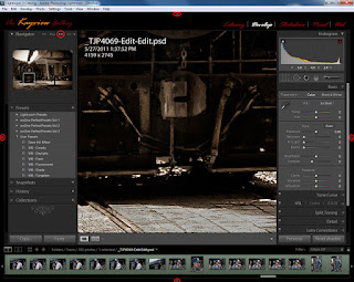
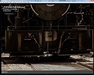 This seems to be the image that won't go away. After the last post I got several questions (feel free to send me an email with any questions) about how I got down to the fine detail level on the front of the train in the image. To see what sparked the questions, click here. To see the original post with the full image, click here. The email questions along with questions asked at a presentation I gave last week at a local camera club showed me that further explanation was necessary. Today we have two screen shots showing Adobe Photoshop Lightroom 3 in two configurations. The one on the left is as LR3 is presented when first opened (right out of the box) with an image open. The right side shows the screen as I work. All of the panels have been retracted using the arrows on the outside of each panel. (If you click on the images you'll see a larger view of each.) To understand my thinking about each of the panels, hit the "read more".
Read more!
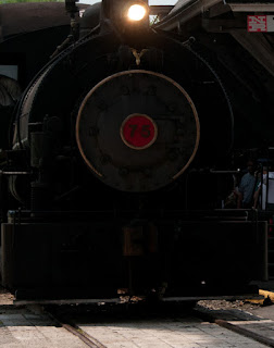
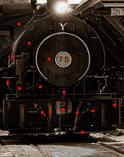 Last Friday I did a posting about "Revealing Detail Using Adobe Photoshop Lightroom 3". A couple people who saw the image basically said "I don't understand. What detail did you pull out of where?" I suppose that's a compliment, because it was done with a light touch and the image was "the star" and not the work. Today we have two images. The one to the right is what was recorded by the sensor. To the left is a "detail" of the finished image. I made sure they were both the same size and resolution to be able to do an apples to apples comparison. The left image has been toned as a sepia to give the impression of being an old print. The toning added nothing to the detail, but I thought I'd mention it before someone asked. The red "Pins" represent the individual Adjustment Brush areas that were worked. I'll save time for anyone curious enough to count the Pins and say that there are fifteen Pins. In the case of a matching left and right side, only one Pin was laid down to show the area being worked. As an example, the far right Pin is there to lighten a bracket of some sort. The same bracket, lightened the same amount, also appears on the left side of the locomotive. Since it was done using the same Pin, there was no reason to drop a Pin on the left side. That would only serve to run up the count. To find out about some of the other Pins, hit the "read more".
Read more!
 One of these days I'll get over my new interest in shooting trains, but I'm not sure when. Taking a raw (in several senses of the word), working it in Adobe Photoshop Lightroom 3 and going to Adobe Photoshop CS5 only to put it out for the web is, probably, the ideal way to treat a straight image. Photoshop is an amazing application, but 99% of what needs to be done to a straight image can be done in LR3. I'm going to have to play with the Export dialog box in Lightroom to see if it's as convenient as the Save For Web And Devices (in the File dropdown). My biggest issue is that LR3 doesn't give as much information as does CS5. In Lightroom you make the same basic decisions as is done in CS5, but there isn't a mechanism to see the effect of those decisions. The dialog box for the Save for Web and Devices in Photoshop (or Adobe Photoshop Elements 9) changes the other parameters depending on the change you make. Let's say you have a full size image (no cropping) and bring it into Save for W&D. It'll show you the dimensions in pixels, and probably tell you it exceeds what's typical. If you plan on entering it any competitions you probably want to have the horizontal size no more than 1024 pixels and the vertical size no more than 768. In CS5 you can see that changing the governing dimension changes the file size. If it doesn't fit the file size requirement, it can be adjusted using the numerical Quality number. Quality is given with a physical number, not just a slider. You can watch the file size go down as the Quality is lowered. In Lightroom, you can make all the same changes. You just can't tell what the effect of your decisions are. Something has to "float", and not knowing what's floating can lead to strange things happening. To find out about the non-strange things happening in today's image, hit the "read more".
Read more!
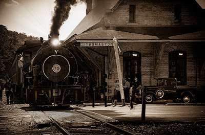 Take a look at the direction of the shadows in today's image. The easiest place is on the roof of the overhang. You can see that the sun is just about directly in front of me as I took the shot. Take a look at the front of the steam locomotive (don't call it a steam engine in front of a railroad enthusiast. They'll ask if you're referring to a teapot.). There's a lot of detail in the front. Take a look at the 1930 Ford sitting in the shadow of the building. You can see a lot of detail there too. A couple of things about today's image. 1) It is a five shot HDR. 2) The HDR was done to get maximum realism in the image, not to go to the extreme of HDR and make it look like an illustration. 3) The initial detail in the shadow wasn't visible. The locomotive and the truck still looked pretty much like black blobs. I'd say 90% of what was done to the image came out of Adobe Photoshop Lightroom 3. The other 10% was a quick trip over to Adobe Photoshop CS5. I needed to take it to CS5 because there was a second (legal) license plate on the radiator and a flyer in the window to the right. I also balanced out the lighting in the building by putting a light on in the right window. (Copy the base Layer, put a Layer Mask over the upper right window pane, detach the Mask from the Layer [click on the chain to "break" the link], and use the Move Tool (V) to slide the light to the masked area. [Sounds more complicated than it is.]). To find out how the detail was brought out in LR3, hit the "read more".
Read more!
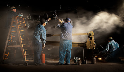
 You have to start somewhere. How's that for a philosophical statement to start a discussion of today's image. A couple months ago a buddy and I saw a photo charter in Roanoke Virginia being run by Peter Lerro. The cost was great for the photo shoot. Something like $65.00 for two nights shooting setups of a couple trains. Being from Connecticut, and the shoot being in Virginia, the cost of the shoot was a minor piece of the expense. What it did was to pique our interest in a niche of the photographic world neither of us had wandered through before. Since then we've talked about the possibility of doing a nighttime shoot in the local railway museum. We also did a Google search about what sort of train "things" were going on in our area. Over this past weekend, the Railroad Museum of New England in Thomaston Connecticut had an event (it's also continuing this coming weekend) with Hank the Tank Engine. A couple things as words of advice would be: 1) if the excursion is an out and back, bring a lunch. 2) Checkout the route for possible shooting locations before the event. 3) Ask someone (the Conductor, the Engineer, the Station Master, anyone) what the plan is. So, we did the Roanoke trek, we've run up to do a quickie locally and now we're talking to the local train enthusiasts about doing a night shoot with them. That's all well and good, but to find out about today's image, hit the "read more".
Read more!

 Everything I do, basically, starts out in Adobe Photoshop Lightroom 3 and then goes (if needed) to Adobe Photoshop CS5 for any pixel bending that might be needed. If it's a straight image, the time spent in CS% (if any) is pretty minimal. The way it works out, about 90% of my images spend time in CS5. I guess that's because, like Jessica Rabbit, I'm drawn that way (oblique reference to a 1988 film titled "Who Framed Roger Rabbit"). I don't seem to be able to leave well enough (read that "good enough") alone. I guess some purists would say the 25 MPH Speed Limit sign that was the nearest object in the frame should have remained. "It was there in real life, so it should be there in the shot". To them I say BS. I don't create documental or historical imagery. In my own small way I create art. If someone working in oils on canvas were to paint the scene and, for aesthetic value, left out the sign, no one would bat an eye. If I were doing photojournalism I'd have to work with a set of fairly strict rules. I'm not. Again, I'm creating (in my mind) art. If you were standing across the street from this sidewalk park (as I was) and you were checking out the park (as I was), you'd look at it and never even notice the sign. It's incidental and of no importance to the scene. Therefore, it's outa here. As I said above, about 90% of my images get tampered with. If I did photojournalism, the stuff I shot would fall into the category of "spot news". Why? Because I took the shot when I was there. We typically go to the Maine coast each fall to do some shooting. We're there when we're there. We can't make the sky have beautiful clouds. It's Tuesday and the sky is bald. Do you put the camera in the bag and say "oh well, not today?". It's not like we live there and can walk out tomorrow and check if Wednesday is a great cloud day. We're there one week a year, take it or leave it. So, popping in a sky or taking out a speed limit sign, is not a problem to me. It's art! To see what else was removed from today's image, hit the "read more".


