Wednesday, December 30, 2009

"Developing" The Image

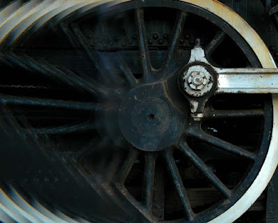
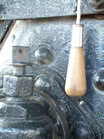
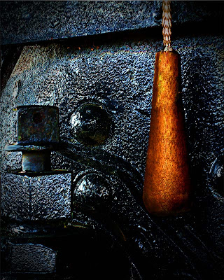
Today's image (the large shot on the right) started with the small image on the left. I can think of a dozen things that needed to be done to get from one to the other. The first thing that is quite evident is "how" a camera's meter reads a scene. You can see the proper color in the finished image. The inside of the cab of the old steam train is painted black. The camera's sensor was pointed directly at a large black mass. It did a great job of trying to produce an 18% grey. Lately I've seen a lot of ink talking about "exposing to the right". Well, that's exactly what the camera's meter did in this case. It really had no choice. It has no intelligence, it's there to "record" what's in front of it, period. It did a fine job doing what it was asked to do. Is the original a "work of art"? No, it's a place to start, it's the negative from which we can start the image making process. The first thing that needed to be done was to straighten up the image. In the original you can see the handle cord hanging on a slight angle. It's unnatural, so we can use that to square up the image. To learn about a couple of the other things this image needed to fully develop, hit the "read more".
Read more!

Monday, December 28, 2009

Improving On Nature

Every once in a while you come upon the scene that's 90% there. there's just something missing. Today's image is just such a scene. The tranquil stream in the southern US, during the fall was too much to pass up. It drags you deep down the stream and lets you explore all the nooks and crannies along the shore. The problem, the issue, the thing that draws your attention in the original, as shot version of the image is a dominate sky. The top quarter of the image was a pale to white patch of pretty dull sky. Being bright it drew your eye like a magnet. The strange thing is the fact that the reflection gave the sky a much richer appearance. It didn't need to be "fixed". In fact, messing with it would have wrecked the shot by not giving you the "pathway" into image. So, what to do with the sky that wouldn't show up in the reflection? If you've followed the blog from the early days you might remember the foreground bough that creates the "frame" of the image. I did an article about it called "A Very Simple in Camera Technique" back on May 22, 2009. It discusses "how" the pine bough was taken on a completely white background and "how" to properly expose for the "white out" conditions. Today's image uses that image to fill in or cover the fairly uninteresting sky. One that was in place the sky showing through was still a little too white. It didn't match up with the reflection in the water. It still needed more texture than what was apparent. Easiest fix was to toss a cloudy sky in back. If you'd like to see how easy it is to add the bough and the sky as components, hit the "read more".
Read more!

Friday, December 25, 2009

Happy Holidays Around The World

It's Christmas Day in the Christian world, Chanukah has just passed. The Muslim holiday of Eid ul-Fitr was celebrated in September. Every religion in the world has a time of celebration set aside to consider some major point. On this day, in the religion I follow, I'd like to wish everyone peace on world and good will toward man. I believe our commonality far outweighs our differences. I hope everyone has a good day, free of strife, anger and fear. May your chosen God bless you and shine the light of hope on all.


Thanks.

Tom Read more!

Wednesday, December 23, 2009

It's Cold Outside, So Why Not In Maine


Today's image, Portland Head Light in Maine, was cold the day the shot was taken. It was October rather than December, but the wind coming off the water made it necessary to bundle up as if it were year's end. What is it you can do to one of the most iconic images of Maine to make it stand out from the thousands of other images taken from the same place. Get hold of almost any calendar featuring either Maine or lighthouses and one month will be a shot of Portland Head Light. It is that big a deal. Why? The biggest point I can think of is that it's accessible. If you're going to fly into Maine, chances are you'll fly into Portland International. If you go to Maine by car it's the second iconic lighthouse you'll go past (Nubble Light of Cape Natick would be the first). From the time you hit the border on Route 95 you can have your tripod setup on Cape Elizabeth within an hour. Other "must see" stops for photographers are two plus hours (Pemiquid Light), five hours (Acadia National Park) and about a day's drive (Quoddy Light) away. So, ease of access is one of Portland Head's "selling" points. Beauty is obviously high on any checklist of why a shooter heads to the "rock bound coast". Time of year, time of day and weather are other draws. These factors are probably more important to the locals. It's a little tough to head up on a whim because there's a coastal storm (winter or summer) going through tonight and the dawn should be spectacular tomorrow. So, most of us have to take the conditions nature gives us and try to make the best of the hand we're dealt. To find out what was done to today's image to try to make it stand out, hit the "read more".
Read more!

Monday, December 21, 2009

Not All "Gimmick Shots" Come From Photoshop

Today's image is an exercise in previsualization. If you have an idea of the end result you're looking for, you can do the work in the camera rather than "creating" the image in Photoshop. That's what's happened with today's shot. The assignment was to present an image that implied motion for the local railroad. Enough negative space had to be left have the article start over the shot. One of the things a photographer has to keep in mind is the intended use of the image you're shooting. If you're on assignment for something to be published or you're shooting for stock photography "space" has to be a consideration. When you have an assignment you know what the end use will be. In most cases you have an Editor or Art Director with a concept of what he/she is looking for and it's up to the photographer to execute. It's sort of like Star Trek, The Next Generation, when the Captain says to his second in command, "make it so, number one". The Captain, Editor or Art Director really doesn't give a rats ... about the "how" of the shot, just that the "mission" accomplishes the objective. One the other hand, if you're shooting for a stock photography house, you don't know what the end use will be. You're shooting "on spec". You're hoping an image is going to sell and, most likely, you'll never see what the use was. Every once in a while you'll open a magazine and see one of your shots in some interesting (or not so interesting) advertisement. A little searching of the internet (check out "This Looks Shopped") can typically come up with the same image being used for totally different campaigns. One of the more "famous" (or infamous) shots that was used to illustrate a point is of O. J. Simpson. Both Newsweek and Time used the exact same "mug shot" image on the cover when O. J. made the headlines back in 1994. Newsweek ran a fairly straight version of the image and Time used a heavily burned in treatment. The editorial difference was very obvious. To find out if today's image is "real" or if it's "Photoshopped", hit the "read more".

Read more!

Friday, December 18, 2009

A Good Model and A Really Good Photographer


Actually, I'm not really blowing my own horn. The model and the "really good photographer" are the same person. Today's subject is a friend's teenage daughter. The friend is a professional photographer and some of her talent has rubbed off on her daughter. A group of friends went to a reasonably local park for some shooting and a picnic. Small groups went every which way, shooting various subjects. This young lady was the "gear guard". I was talking to one of the folks attending the shoot about rapid fire shooting in a bracketing mode to obtain a series of images that could be used for HDR work. He had a Nikon D3 and I had a Nikon D300. He had heard my camera during the shooting of a sequence and commented on the fact that he could hear the camera "bog down", or so he thought. He bragged that his camera could shoot a sustained 7 or 8 frames per second. I suggested he might want to try the same shot I had just taken. He set his camera to shoot a seven shot sequence, ranging from -3 to +3 EV in one stop increments. He raised his camera and fired. To his surprise, his camera "bogged down" just as mine had. He looked confused and asked if I knew what had happened. Here's the explanation. The "normal" exposed in the shade was 1/60th of a second in aperture priority mode. Therefore, his sequence was 1/500 (+2 stops), 1/250 (+2stops), 1/125 (+1 stop), 1/60 (normal exposure), 1/30 (-1 stop), 1/15 (-2 stops) and 1/8 (-3 stops). You can't hear the difference between 1/500, 1/250 or 1/125 second exposures. You'd be hard pressed to differentiate between 1/60 and 1/30. But, when you start getting down to 1/15 or 1/8 second shutter speeds your "click" becomes "clliicck" and the change becomes noticeable. He forgot that the sustained firing rate was dependent on the shutter speed. To find out how today's image came about, hit the "read more".

Read more!

Wednesday, December 16, 2009

I Should Probably Get Into HDR, Or Have I already Been?

I guess I might as well commit. People keep on asking if this image or that is HDR (High Dynamic Range). Truth is, I've only dabbled in HDR, making two or three attempts and saying, "hmmm, that's kind of nice" and dropping it. Today's image is a good example of a shot that provokes the type of question that puzzles people who think it's HDR. Looking at it you can see that the bridge is backlit. The face of the bridge "should be" in deep shadow, yet both the background and the bridge are both well exposed. If there ever was a shot that cries out for HDR, this is it. As a side note, this bridge is not located in Central Park in NYC and not a Carriage Path bridge in Acadia NP (guesses people have made). I live on a street that once was the rail bed for the Shepaug Railroad. The trains would come out of the station in downtown Bethel, Connecticut, go up the middle of Maine Street and pass right in front of what is now my driveway. The bridge is about two blocks away. You can walk past it today and never even notice it's there. Today's image was shot a couple of years ago, just after a Boy Scout cleared the area in front of the bridge to create a small park. It's overgrown now and lost as a park. A shame. Back to today's image. Why would I hesitate about jumping into HDR? I can think of a couple of reasons, but the biggest is not in my control. Camera manufacturers are working to build HDR into cameras. Therefore, in a couple of years, HDR will be available to everyman. Another reason might be that HDR is "another" old technique being "discovered" in the digital darkroom. Gustave Le Gray is probably the first photographer credited with using HDR to enhance his images. Le Gray was a seascape photographer who made one exposure for the sea and one for the sky and combined them to produce a final image. The trick is, he did it in the 1850s. To find out more about how today's image was made, hit the "read more".

Read more!

Monday, December 14, 2009

Ode To Otto Litzel's "Darkroom Magic"

Early on in my exploration of photography I sat through a lecture by a blind photographer. Sort of sounds like an oxymoron doesn't it. The thing is he wasn't always blind. Blindness struck him fairly late in life. If I had to guess I'd say it was probably a result of diabetes. Otto Litzel was pushing seventy by the time I went to a daylong seminar on different aspects of photography. He was one of the featured speakers and had a couple of books out at the time. His friend, who served as his chauffeur for the day, sold the books in the lobby between speakers. Book sales were Otto's primary income source by then. He occasionally sold a print, but with no new work coming out sales were pretty rare. He was a gifted speaker, creating images with his stories as well as he had with a camera. It was obvious he had given this lectures many times. The sequence memorized and he didn't skip a beat with each slide transition. Otto's anecdotal stories of the how, where and why of each shot had the audience members laughing for his entire time. The modern equivalent would be Joe McNally. Book sales were brisk and I found myself in line to buy one called "Darkroom Magic". At some point I lost my signed copy, but a couple years ago I saw it on EBay for a couple of bucks and bought it. Why did I buy a book about wet darkroom techniques in the age of the digital darkroom? There's a couple of reasons. Nostalgia for one. The fact that the techniques demonstrated in the book are now considered to be manipulation only available due to the invention of Photoshop. Many people I run into feel any sort of "tampering" with the reality of "the negative" is cheating somehow. The second thing invented for photography, right after the camera, was some method of changing what the image looked like when it was shot. To find out about today's image (what it is for one thing) and how it would have been done in the wet darkroom, hit the "read more".

Read more!

Friday, December 11, 2009

Number 101 And Counting

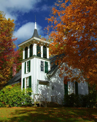
We're starting on the "next" one hundred postings with at the gallery. Since the blog was started back in April we've posted one hundred articles about different facets of photography. In flipping through the archives I see we have enough to talk about to take us well toward the anniversary of the blog in April. I'll tell you what, going through some of the older folders brings back memories. Today's image is a case in point about thinking back on the day, location or reason for taking a specific shot. Kicking around the back roads of the Berkshires in northwestern Connecticut and western Massachusetts we came upon the church in today's image. Great location, great saturation on the trees in their full fall grandeur, wonderful sky and a couple of problems that would have to be tackled in post production. There's at least a half dozen modification that had to be made to produce the image shown. Some were easy fixes that someone with the slightest knowledge of Photoshop would be able to handle. A couple required a little planning and one ended up being sort of a bear. To find out what the six modifications are and how they were accomplished, hit the "read more".

Read more!

Wednesday, December 9, 2009

I Swear, It's A Straight Image, Almost

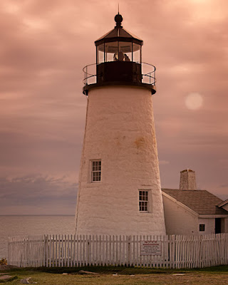
Dang, look what I found, a lighthouse on Mars. Not quite and this is one of the straightest images I've ever put on the blog. The only things that have been done are cropping, sharpening and applying a vignette. Other than that, and that "should be" done on every image that you process, everything came out of the camera the way you see it. I will admit that there are a couple things that look a little hokie, but they can be explained. Not made excuses for, but rationalized. The elephant in the living room is obviously the colorcast. It looks like I must have been on Mars to get that pink tint to the overall image. Actually, what was going on was a little lunacy on my part. For those who may not know, this is a shot of Pemiquid Light in Maine, USA, not on Mars. We've been to Maine dozens of times and for the past few years we seem to wind up there in October. We've been to Pemiquid several times, we've been to Acadia NP several times and tend to wander along the coast year after year. After a while, even iconic places to shoot become tired. This year I went nuts with my Cokin filters. Hey, I've got 'em, I might as well use 'em. The color comes from a Cokin P 197 filter held in front of the lens when the shot was taken. One of the things that happens when you use something like this is that you commit to the shot having a colorcast, even shooting in RAW. One of the things I see people doing when they use Cokin filters is use the filter holder attached to the lens. Cokin "P" filters are square (or rectangular) and need a filter holder that gets slid onto the lens adaptor. That means you have to lug around an adaptor ring for every size lens you have. I have my own "filter holder" . It's called my left hand. Seeing as the filters are square, there's an area in the corners that extend past the edge of the lens. Just hold it up in front and shoot. The time between shots is reduced, governed by how fast I can move my hand. Much quicker than using the holder. To find out more about how this "straight" shot came about, hit the "read more".

Read more!

Monday, December 7, 2009

Baby, It's Cold Outside

It's getting to be that time of the year, you know, when outdoor photography gets to be the realm of the intrepid. Those who aren't afraid of a little frostbite, who have invested in hunter's mittens. The ones with the trigger finger hole, so you can stick that all important digit out just enough to have a good feel on the shutter release. One of the funny things about winter photography is how fickle it can be. One day it's great, a brisk but not bone chilling cold morning and another day when the tears streaming down your cheeks freeze in place because you're so cold. Those miserable days are the days that you get some of your best shots. They don't have to be in January or February. One of the coldest evenings I've ever spent was in October a few years ago. Even being dressed properly for the cold, the wind just blew the chill through every layer I wore and got right down to the bone. I thought the night would never end. That's why a lot of photographers head inside and shoot setups. But, there are times when the heavens align, when a shot presents itself that you have to say "cold be damned", I've got to get this image. Such was the case of today's image. To find out "what" about the image made it worth stopping on cold, late fall afternoon, hit the "read more"

Read more!

Friday, December 4, 2009

Movement

Seems like everyone and their brother is blogging about golf lately. Figured I might as well hop on the bandwagon, but not on the subject you may be thinking of. Today's image is an action shot. There no "swinging blades of death" type action, but there is enough to show a finer point of the game. It's a case of what's real and what the mind sees. As you can probably see from the sharp shadow beneath the ball, it was a pretty sunny day when the shot was taken. You can see the hairs on my friend's leg and the ribs of his socks, so we can safely say the shutter speed was relatively high. Now take a look at the putter. There's motion blur in the movement of the putter toward the ball. The two statements don't really go together. High shutter speed and motion blur, unless you're talking Space Shuttle speeds, don't happen in the same frame without some messin' around. All you have to done is isolate the putter head and shaft and add just a little motion blur, making sure you have the blur going in the direction of the swing. It would be just a wee bit dumb to have the blur running on a 45 degree angle if the putter is just skimming along the ground. Adding a mask and making sure the front edge is sharp and all the "motion" is in back of the plane of the stick adds to the realism of the shot. If you think of it beforehand, set the ball close to the cup. If you don't think to do that, create your own hole. Just make an oval at the edge of the image and fill it with black. Add one more layer and hit the top of the cup with a dark brown, curved swipe. Change the Blend Mode to Color and reduce the Opacity to taste. To find out about my thinking of "how" to tell the story, hit the "read more".


Read more!

Wednesday, December 2, 2009

The Importance Of Our Photography

Okay, it's not world peace or feeding the hungry, but what we do as photographers can be important to someone. Today's image is the last "portrait" of my aunt ever taken. She was eighty plus years old and within the last years of her life. We had a family reunion and I just happened to catch her with a nice smile and a brightness to her eyes. When she died I went back, grabbed the image and changed the background to make it a little more "formal". I gave each of my cousins (her four children) an 8 x 10 and a picture package with some wallets. I've been to a couple of their homes and the framed shot is displayed for all to see. That simple portrait is important to them. There an effort coming up on December 12th that we should all think about supporting. It's called "Help-Portrait" and it's about doing something with the gift we've been given with our enthusiasm for photography. Consider the aged, sitting in assisted care facilities, away from family. Sometimes distance is a barrier between visits and having a remembrance of a loved one while they were still vibrant just isn't possible by a family member. The cost of a sitting may be a burden to the family and the last image of their loved one may be as they lay dying. That's sad and we can do something about it. The "Help-Portrait" activity is a great start. It's focused on doing "something for someone" on December 12th. December 12th will come and go, just as the day in October that the company I worked for dedicates time to "Feed the Homeless". Both are great "events", but giving back is not about "events". It's about a consistent presence in being helpful. A fellow I went to high school with has been an unsung volunteer at the local homeless shelter for more than 25 years. He doesn't wear it on his sleeve or bring it up in conversation, he just does it, quietly. As photographers we have the ability to do something for someone with just a little bit of effort on our part. To find out what the plan is, hit the "read more".

Read more!

Monday, November 30, 2009

Off Season Is No Reason To Give Up On Flowers

Some things are seasonal and some things can be year round opportunities. It's a wee bit tough to get good (or any) baseball shots at this time of the year. There's probably not a whole lot going on down at the old swimming hole either. Unless you're a lot further south than Connecticut there's not many leaves left of the trees to get lush shots of long vistas. That doesn't mean you have to give up on all the things you think of when you get that summer sort of feeling. Flowers are a good example of something that can be shot all year round. Rather than a walk out in the back yard, you might need a trip down to your local florist. There are good points to needing to buy flowers and bad points. The primary bad point is that summer flowers are free, winter flowers aren't. On the other hand, you get to select flowers at the flower shop and reject any that don't meet with your "standards". The florist has some level of control over what he/she gets in, so you have a minimum level of beauty to start with. Damaged flowers just are not accepted by the florist, so you can cancel that off your list of things to look for. You don't have to limited to the type of image you get by shooting in the comfort of your home. You can create realistic environments and have a whole different method of "taking the shot" from what's available with outdoor photography. A friend of mine used to take incredible shots of flower arrangements and didn't even use a camera. To find out how you can "take incredible shots" and not use a camera, hit the "read more".

Read more!

Friday, November 27, 2009

Simple Friday Tutorial - Adding Clouds To A Bald Sky

I either read or view a lot of tutorials online with the hope of picking up a new tidbit of information. If I could just learn one thing from each tutorial about Photoshop techniques I see, I'd be a PS genius. Instead, I'm a slightly better than typical fiddler with it. I do run into things that crack me up. Saw one the other day. I'm a sucker for tutorials about masks. If I could find, develop, figure out , or be some sort of alchemic sorcerer and come up with the ultimate mask technique I'd be a happy camper. Instead, I'm a searcher, seeking new and better ways to create masks. I've used masks in a couple of recent posts. In the October 26th post I show the mask used to enhance the tonal values of the sky. I used a mask in the November 16th tutorial about how to darken a weak sky. What happens if you have no sky? I've been asked this several times recently. The first piece of advice I'd give is, if you're stuck shooting on a day with a bald sky is "don't shoot the sky". That's about the easiest way I can think of to not have to deal with a bald sky. If the sky is dead bald, no detail at all, don't include it in the shot. If the sky is that flat you probably have great, even light that maximizes the saturation in almost anything on the ground. Point your camera down rather than up. Done! Let's face it, that's not always possible. I ran across a tutorial the other days and the "teacher" explained how to make an elaborate mask and replace the sky. After a long dissertation, in the last step of the sequence, he gave the one thing that he could have used (should have used) to eliminate the entire rest of the work. To find out what this magic step is, hit the "read more".

Read more!

Wednesday, November 25, 2009

Sometimes You Can Get There From Here

Sometimes you get some "unusual" assignments. Like design a wallpaper pattern that's bright, uses pink extensively and is very graphic. Now, being a photographer of sorts, that's sort of a weird request. I'm not an "artist", computer or otherwise, so what can I come up with to fulfill the requirement. There's, undoubtedly, images that have pink in them in the archives, but the "graphical" ones are probably of recognizable buildings or structures. I thought this assignment would have to involve some kind of OOB (Out Of Box) thinking. So, given the requirements of it being a graphic, being predominately pink, and having a repeatable pattern, what do we start with and where do we take it. To find out how today's image came out of the shot of the flowers on the river, hit the "read more".

Read more!

Monday, November 23, 2009

Riders On The Road

Every once a in a while you come across something that you think has some potential, so you shoot it. You file it away and come across it from time to time and think "where's something where", but you can't quite put your finger on it. It finally dawned on me what it reminded me of. An image made by famed photographer Eugene Smith of his children walking from a shaded path into a clearing. It's titled "The Walk to Paradise Garden". The tunnel like darkness and the people framed in the only bright area of the image. Now, I'm not saying one of my images is likely to wind up in MOMA, and I'm not saying today's image is of the same caliber as Smith's, but it does give me the same type of feeling. Just from looking at Smith's image, I'd say there's a lot of blood, sweat and toil that went into nudging the final print out of the negative. That I can also say that about today's image. It looks pretty straight forward but, at the time I made the image it took a lot more work than it would take today. To get an idea of what's changed in the past eighteen months or so, hit the "read more".

Read more!

Friday, November 20, 2009

Thirteen Speedlites And I Used A Flashlight, Go Figure.

I have all my flashes in pairs. One reason would be for backups, but who in the world needs redundancy that goes ten deep. NASA doesn't even have that many backup systems on the Space Shuttle. So, backups is probably not the reason for so many flashes. Okay, five do work with Nikon's CLS (Creative Lighting System), but that's broken into two distinct groups. Three are general purpose and are used with softboxes (bigger boxes than you might think), umbrellas, grids, snoots and all the usual suspects when it comes to light modifiers. The other two are part of the Nikon R1 Wireless Close-up Speedlight System. The November 6th post, with the pool balls, used all five Nikon lights. There's two 360 degree slaves, two mini slaves (for when you need just a little pop for a rim light), and two Sunpack FP-38 Flat Panel (great for situations where you'd like to use a softbox but can't). Best term I can come up with for justification is that they're for "situational lighting". A buddy of mine, after seeing my lighting store, said he was a purest and only shot with available light. I told him "me too, that why I have a whole bag of lights that are available". You have to be pretty darn lucky to be able to have every shot with the light God gives you. Okay, so why, if I have all these lights (and that's just the flash variety) did I use a Miraclebeam nine LED flashlight to make today's image? To find out, hit the "read more".

Read more!

Wednesday, November 18, 2009

Makeover Wednesday - Adding Pop With Spot Color

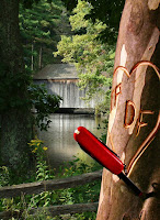
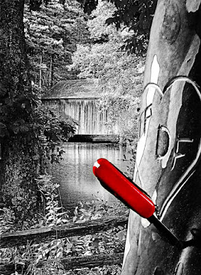
Today we're revisiting an image we discussed back on July 1st. At that time the post talked about the impossible Depth of Field in the shot. What we're doing today is responding to a question asked about creating Pop in a shot by using spot color. Unfortunately, the question came without an accompanying image to work on. I went through some of the things we'd already looked at and decided the pocket knife in today's image could be made the center piece for using spot color. An additional reason for playing with a spot color situation was an offer for a tutorial and a Photoshop Action being sold online. The write up for the Action said it would take the complexity out of doing spot color. My question was "what complexity?". Lately I've seen things for sale as Actions or Plug-ins for PS that are as close to scams as I've ever seen. One was an "Action" being sold to give a "Rule of Thirds" grid on your image to check placement of points of interest. What's so hard that someone would spend money on that? Set your grid spacing to 33% (yep, you can call out percentage for grid spacing) and then use Ctrl comma to toggle your "Rule of Thirds" grid on and off. I can't see charging someone money for a setting. There's actually a secondary issue we'll tackle before we ever get to trying to make the knife sing. The plastic trim pieces on a knife like the one shown typically has a smooth finish. In the original image it appears to have a texture of some sort. We'll take less than one minute and "fix" that inconsistency.   Hit the "read more" to fiinsh today's makeover.

Read more!

Monday, November 16, 2009

Tutorial Monday - Darkening the Sky


I've been asked for some help on how to darken the sky in an image without leaving a telltale halo in the area between the sky and whatever the scene might be. It's actually a reasonably easy fix. If you compare today's finished image (the larger image on the left) with the original (smaller in the middle) you can see that the sky in the end image has more detail and is considerably darker than what we started with. BTW: Clicking on any of the images (including the Layer Panel image) will provide you with a larger view of what we're talking about. There's actually three sections to the correction of this image and it's just about typical of what could be done to any shot. Section one would be to get the shot setup to work on. It's the first four lines of the panel (starting from the bottom). The second is making the color saturation adjustments to "develop" the image from the starting RAW file. The third is finishing the with sharpening and adding a vignette. To follow the sequence, hit the "read more".

Read more!

Saturday, November 14, 2009

The Season's Over

We've come to the turn of a season again. The leaves, for the most part, are off the trees in New England and we're headed into the cold, "sticks as trees" period of the year. That means the "vista" shots are winding down as we await the snow to put a fresh face on the landscape. That doesn't mean we hang up the camera and wait. There's a height adjustable table and some props, along with enough flash units to light up a cave is around the room wanting to be useful. They'll get their chance in the days to come. Lately we've taken a run up to Maine and went to specific "events" to shoot anything from lighthouses to commissioned assignments. We'll be headed to the Caribbean in a few weeks, bringing along enough camera gear so people will think there's a third person along with us. We've gone to the islands every year for the past fifteen years and I can honestly say we have some tourist pictures to show for it. The intent of the trips is vacation, not getting the next calendar shot or six shot travel article with a double truck opener. Lately the trips have been by boat, sailing out of New York City. The nice thing about going that way is the two days plus of sailing before you get anywhere. It's a great time to unwind before getting into the hustle of being in the islands. It used to be that we'd leave NYC at 4:00 PM and be in St. Thomas or San Juan at 9:00 AM a couple days later. Then it got to getting in at 1:00 PM and now it's 3:00 PM. Sounds like the cruise line is trying to find the optimum "gas mileage" speed. Oh well, guess they do have to maximize the use of every dollar they take in. What's this rambling got to do with today's image? Not much, but if you want to find out about the shot, hit the "read more".

Read more!

Wednesday, November 11, 2009

We're Starting A Course For Those New To Photoshop


We've been asked several times if the gallery could teach a course in Photoshop. The simplest way to do a class would be to do it online. So, that's what we're going to do. This will be a free class and will start with the most basic things to know about Photoshop. We'll try to make all the assignments "doable" in either Photoshop or Photoshop Elements. One of the better things we'll try to do is to make each post a complete tutorial on how to accomplish "something". We'll go through the tools that are important to understand to get something done. We'll go through the workarounds and pitfalls that a tool might present. When we discuss something like layer masks we'll explain how to do it in Photoshop and how to workaround masks in Elements. The classes will be once a week. We'll start next week, on Wednesday and continue once a week, every Wednesday. That way, anyone interested taking part will have some time to work through the assignment. Once you've finished you interpretation of the week's assignment you can email you solution as a PSD file. It's the old "show your work" thing we all went through in any number of math classes. Everyone will get an individual response and one solution will be featured in the discussion once the lesson is closed.


The first assignment is right here. Take three objects and make a collage. It can be three letters, as shown here, or three pictures, or three pieces of clip art. Any three objects. The premise is to make them overlap. Send your solutions (in the full PSD file format) to tom@kayviewgallery.com . This first assignment is only to gage the level of those interested in the class. Thanks, it should be fun. Read more!

Monday, November 9, 2009

Monochromatic Detail


When someone hears the word monochrome the thing that , typically, comes to mind is Black & White. It 'ain't necessarily so. Monochrome only means one color. Today's image is pretty much B&W. That would be Blue & White rather than Black & White. The only other color is a small hint of red in the helmet and along the legs. It's sort amazing what happens when you point a camera up into a crystal blue sky with a polarizer on it. The blueness of the sky is as it was when we were there. This is one of the few times when an aimless ramble resulted in a couple of good shots. We just happened to come across an intersection that looked somewhat familiar. Using that innate radar that is built in to each of us (some more than others) we turned to the north and within minutes spotted some parachutes. We were within punting distance of the field where I did my one and only jump. We stopped in, asked permission and started shooting. Within the first five minutes we ran into a problem. My shooting mate's (wife) camera died. A quick check showed that the battery was dead. The camera was fairly new at that time and she didn't have a backup battery (until an hour later). We watched two jumps and left to find a Best Buy with a proper battery. There's an expression about shooting fish in a barrel. Shooting skydivers under canopy is very similar. They just hang there and you can pop away. It's not like they can hide behind something. Just make sure their feet are pointing down compared to where you're standing and you've got a shot. There's not a whole lot to say about today's image, so there is nothing after the "read more". Have a good Monday.. Read more!

Friday, November 6, 2009

Bring Out The Bling


Bling doesn't have to mean gold. I think of it as bright colors or objects, like the billiard balls in today's image. It's a simple shot, right? Not quite. One, I don't have a pool table. Two, I had to go out and buy a set of billiard balls. The "felt" is a red blanket. That nice "catch light", looking like it comes from an umbrella or maybe a softbox, is about the only highlight that wasn't there. I actually needed five speedlites using Nikon's CLS (Creative Lighting System) to get enough light on all the balls at the aperture small enough (F 22) to be able to hold focus from front to back. The focus point was the number five on the center ball. I needed to take the hyperfocal focusing distance into consideration when deciding where to focus. A "rule of thumb" for focus is that "acceptably sharp focus" happens one third in front of the focus point and two thirds behind. That meant that the front of the five ball, at a very small aperture was about the right spot. I tried several variations on the shot. A couple with very short "selective focus, some with the long focus, a few from the top and side, and using glass rather than the felt. That takes care of the photography. If you'd like to know more about the post processing, hit the "read more".

Read more!

Wednesday, November 4, 2009

Getting In Close


Scott Kelby had Tyler Stableford as a quest blogger on his "Photoshop Insider" blog today. Tyler is putting his money where his mouth is and his eye where his art is. He's trying to do something for the Wide Horizons For Children program in Ethiopia. The gist of his post was that we, as photographers, can do more with our cameras than we could ever do with our wallets. We're in November now. In the U.S. it's the time when we have a holiday called Thanksgiving. It's based on being a time to have a feast to celebrate the harvest. The crops are in and this would be the time of the year when the larders were their fullest. Life was good and the settlers could kickback a little and get ready for the onslaught of winter. Stableford's message is that there is no such time in a country like Ethiopia. There are very few pantries that are stocked at any time of the year. It doesn't matter if you have a $6,000.00 D3s or a Canon 7D or a hundred dollar point and shoot. There are things that you can do with a camera pressed to your eye that can help the less fortunate. You also don't have to travel to find a noble cause. Don't get me wrong, I highly admire what Stableford has done. All I'm saying is that you can look anywhere and find a way to help. Money's good, deeds are better. What's this got to do with today's image? Only that Stableford said one of the key points someone told him was that people won't donate to sweeping landscapes. You have to get in close and show the character of someone in need. That's where the money comes from. To learn a little bit about today's image, hit the "read more".

Read more!

Monday, November 2, 2009

Motion Blur In Camera


One of the filters available in Photoshop (any semi-recent version) is Motion Blur. The typical use for the filter is to impart a sense of motion in a scene. If you've taken a set of shots at an automobile race in the bright sunlight it might be tricky it get good wheel spin and panning at the same time. If the shutter speed is high enough to stop the action you might as well have not gone to the race in the first place. You can get the same shot in a parking lot, next to that low barrier type fence. Cock the camera on a slightly jaunty angle, snap the shutter and head for the digital darkroom. Everything can be fixed in post. It "can be", but should you have to rely on Photoshop to create the excitement of the race? Probably not. Races should be exciting enough on their own. It's easy enough to fake something on the computer for racing. The car and driver should be pretty sharp. You'd want to put in "some" motion blur in the direction of travel. The background "should" have more blur in the same direction to give the impression of high speed. The wheel would be in need of a combination of motion and rotational blurs to have the viewer believe the car was going forward and the wheels were turning. No sweat, just a couple of tweaks in Photoshop and, instead of being in the parking lot at the mall, you're on the Autobahn, tearing up the road at 200 KPH (getting passed by someone doing 250). The image might be just as exciting (well, almost), but would the joy of getting the image be anywhere near is exciting? I doubt it. It's the old "no risk, no reward" thought. To figure out how that relates to today's image, hit the "read more".

Read more!

Friday, October 30, 2009

Shoot Raw But Make A Copy? Why?


I look at more and more demos and tutorials where the person says the first thing to do once you've opened an image is hit CRTL J and make a copy of your background layer. Some will tell you to save the file under a new name. That's fine if you shoot in JPEG format, but is a waste of time if you shoot in RAW. One of the first things you learn about RAW files is that you can't make permanent changes to them. If you look in an application like Adobe Lightroom you can see that you have a "history list" of everything you've done to the image. You can get back to square one during this session, tomorrow, next week, or next year. Any changes are still there. Press CRTL "E" and bring the modified image into Adobe Photoshop. It's still a RAW file. You still cannot permanently change the base file. Do whatever you want to it. Crop, swap heads, change colors, add text or clipart, warp, skew or scale using Free Transform, screw it up until it's unrecognizable. It's okay. Once you're finished doing what you're going to do, just "Save" it. Don't worry about "Save As", just a plan vanilla "Save". Before your head explodes, remember one thing. Say it with me " You cannot change the base RAW file". That's RAW files 101. No changes allowed. So, what happens when you hit the "Save" button? If you use Lightroom, switch over to it and watch your original RAW file. Poof, right next to it another file is magically created and populated with your changes. Hover your cursor over the new image and whichever setting you've selected (PSD or layered TIFF) shows up as the name of the new file. Something like "Tom 267 PSD Edit". Just remember, a RAW file is a RAW file IS a RAW file. It never changes. Enough of a rant, if you'd like to learn a little about today's image, hit the "read more".

Read more!
Wednesday, October 28, 2009

No Jedi Zen Here

There's nothing like falling back into what's comfortable. The other day (Monday in fact) I said I wanted to lean toward the subtle colorations found in the images over at Landscapes 2.0. Today I'm feeling a little bit like an addict who's fallen off the wagon, slightly. While the overall effect of today's image is a little more restrained than a typical, full out, in your face, image that the gallery is known for, it certainly can't be called delicate. It does have several elements that "should" please the eye. There's the tree taking up the entire right side of the image, holding the viewer into the shot. There's the strong leading line that brings the eye down to the lower right hand corner with the rocks bright enough to arrest the eye. The "white spot" in the top center of the image isn't white at all in the original, but gives that impression in the less than 200 kB thumbnail used here. The Red Channel pushes up pretty close at about 250. but the Green and Blue Channels run down at the 215 plus or minus level. The net effect is a, sort of, beige tone. To find out about some of the "extras" that made this the image that it is, hit the "read more".

Read more!

Tuesday, October 27, 2009

Just A Quick Update


Longer posts come out on Monday, Wednesday and Friday.  Today is just a little note about some news we received at the gallery yesterday.  We've been a member of the NAPP (National Association of Photoshop Professionals) for a couple of years now.  Last month we started putting some of the gallery's work up on their portfolio page.  Each week NAPP chooses an "Image of the Week" along with five "Editor's Choice" selections.  This week the image shown here (and discussed in a September 18th post) received an "Editor's Choice".  Not bad for only contributing for a month.  We've gotten many favorable comments since the week's picks were announced yesterday.  It does encourage our continually striving to produce the best possible images. Read more!

Monday, October 26, 2009

I Feel Like Luke Skywalker


Yes, I'm starting a quest, just the same as the Star Wars hero. Mine isn't quite as noble as Luke's, and I don't have Yoda or Obi-Wan Kenobi to guide me, but a quest never the less. Today's image is the initial salvo in trying to step away from being a blatant, in your face, highly saturated color type of image developer. The goal is to try to find some "kinder, gentler" colors in images, but produce images with just as much feeling as I have in the past. At least once a week I go over to the Landscapes 2.0 site and take a look at some of the marvelous work displayed there. One thing I've noticed is that my "normal" style of developing an image just wouldn't fly over there. Flip through a couple of pages or try their "Top 10" or "Random 5" buttons and see the beautiful work shown there. Something you will probably notice is the gentle touch on "most" of the images. I just hit the "Top 10" button to see what's high on the site's list lately and every one of the images have these soft, muted tones. I compare them to my "in your face" images and think there must be some kind of a Jedi force working. Sort of makes me feel like Jaba the Hutt. Some big "ham handed" slug who does things way to heavily. To find out more about this "trial balloon" image, hit the "read more".
Read more!
Friday, October 23, 2009

It's A Big Day At The Gallery


It's not that today's image is the big deal. Last night we installed Windows 7 on the primary computer. So far it's just to test it out, and so far, it looks good. The one gotcha I've seen is in the area of networking. As I tried to get online the computer said there wasn't a network cable connected. (Duh, ya, dar is.) It's been connected since last November when we installed the Intel Core i7 based machine. I've been fussing with the settings for about an hour this morning and couldn't figure out what was going on. Finally I disconnected the computer from the router and plugged it directly into the cable modem. It's pretty obvious that it worked, 'cause you're reading this. It went online with no problem once the router was bypassed. That's not any sort of permanent solution, but it works for now. From the looks of the license plate on today's image you can probably tell it's from our weekend in Maine. If you want to know anything about the image, hit the "read more".
Read more!

Wednesday, October 21, 2009

You'd Never Guess Where We Were Over The Weekend


Okay, maybe you would, if you've ever seen a picture of Bass Harbor Head Light in Maine. We take a few days each October to do a little shooting someplace where the leaves should be good and we know there are shots to be made. The unfortunate thing about doing a whirlwind tour is that you get to a place when you get there. We'd put a (metaphorical) thumbtack on the place we wanted to end up for sunsets, but the places between where we woke up and where we wound up each day was sort of catch as catch can. We had a couple days of great weather for shooting (such as today's image), sort of over cast with layered cloud cover and a couple of days of very harsh light. We tended to point the cameras up on the cloudy days and down (into the shadows) on the sunny days. There's not a whole lot of interest in a blue, cloudless sky. Luckily, one of those days we were in Bar Harbor and had a chance to wonder around the downtown area. There's always good shot to be had down some alley or with the sun bouncing around providing some fill light. Today's image isn't as easy as it seems. To find out more about why, hit the "read more".

Read more!

Wednesday, October 14, 2009

The Cast Of A New Buddy Movie? Why Not.


Couldn't these guys be the new cast for something like Wild Hogs III? You've got the four pals hanging out, each with his own attitude. You can see the one on the left just isn't quite a part of the group. He's the loner who could just as easily go off on his own. That is unless you understand that he probably needs to group more than the other three. Without his buddies he'd end up in a corner in a fetal position babbling to himself. You've got the curmudgeon, the fellow second from the left. No matter what's going on he'll give a downer of a commentary about the state of the world in general. The only problem is that he secretly wants to push the boundaries. He'd hold it in with great reserve but be tickled with each step toward the more outrageous. He wants to have fun, he just doesn't want people to see him enjoying himself. The haughty one is the third chap in. The one with the chin up. He could be walking around not knowing his zipper is undone, but having an air of confidence that neither man nor beast can shake. His deal is the fact that he would shrink, for about two seconds, when he learned about that zipper but bounce back to the peacock role just as fast. The last of the teammates is the planner. He looks for signals that the group is headed in the direction he's set. He probably won't have as much fun as the other three because he too busy coordinating things. He needs to lighten up. To find out what this motley crew has in common, hit the "read more".
Read more!

Monday, October 12, 2009

On The Road Again


Today's image is one of the "gallery prints" available at The Kayview Gallery. It depicts a working harbor at daybreak. It's overcast and the sun is peeking through some breaks in the clouds. We're heading out to do some shooting at the end of the week to an area we frequent a lot. So much so that I just made a book at My Publisher for the better half and about half of the images came from sojourns to this general (by general I mean state) area. One of the things to note about this image is that the bright area where the sun is isn't blown out. There not a lot of detail there, in fact if Ansel Adams were to look at it he'd say the area is totally in "zone" nine plus. When I ran the cursor over the spot it registered about 245, 245, 246. That's close enough so you and I can't see the information there, but if I were to split the picture for an HDR (High Dynamic Range) version there would be detail available to work with. I'd think it would wind up with some sort of hybrid combination of exposures. With HDR, most of the representations I've seen have been even splits of exposure. Typical might be -2, 0, +2 for a three exposure run or a -3, -1, 0, +1, +3 track. With today's image I'd think we'd end up with something closer to -1, 0, +3 in order not to block up the shadows and to give some life to that sun area. If you're interested in finding out where we're going this weekend, hit the "read more".
Read more!

Friday, October 9, 2009

Just A Hint

How many times do we see a shot where you've got the subject and way too much of the surrounding environment? Why is it that some photographers are too shy or unsure of their ability to get in close on a subject. This is especially true of people shots. People who don't have a good grasp of what their camera can do often stand back and don't get the intimate shot. Today's image shows how a powerful image can be taken by getting in on a subject. Before I started shooting I asked the cowboys who were giving the presentation about ranch life if I could shoot them. Both were agreeable and went along their way, doing what they do each day a tour comes through the range. They knew, and had probably gone through, the exercise of people taking their pictures on a daily basis. The day we were there was no different than a hundred other days. I have pictures of them riding, roping, cutting cattle out of a herd and just plain talking to the group. The only "crop" on today's image was to put the image into a 4 x 5, 8 x 10, or 16 x 20 aspect ratio. (It's all the same ratio.) Other than that it's pretty much full frame. To understand what sets this image apart from a hundred other shoots that day, hit the "read more".
Read more!

Wednesday, October 7, 2009

Don't Play With Mud


Back in the days of film and B&W printing the way to control contrast was by paper grade. You'd be in your wet darkroom and have box after box of exactly the same paper (except for grade). Kodak did develop a variable grade paper at one point, but I never saw it used by the top quality photographers. It was the $49.00 photo editing package of its day. If the furthest you wanted to go was to develop your own B&W prints and give copies to family members, the variable grade papers were fine. If you wanted to do "fine art" work you'd invest in graded paper. Papers were available in six contrast grades, numbered from zero to five. Zero had the least contrast and you'd better have an extremely contrasty negative if you wanted to use that. Five was the other end of the scale and you'd have, what was called, a "soft" negative to use it. I don't know of any quality photographer who had all six grades stocked in the darkroom. Most would have grades two through four and that would serve about 99% of the need. Photographers knew how to expose a negative to fall somewhere in the mid-range of contrast. To listen (read) to a tirade about people printing muddy images today, hit the "read more".
Read more!

Monday, October 5, 2009

General Grievous And The Wrong Light Saber

The fellow in today's image sort of reminds me of one of the villains in the Star Wars films. From what I understand, General Grievous was a prototype of what became Darth Vader. A part "being" (not sure if he started out human), part robot that didn't quite work out right. The Turkey Vulture in today's post hasn't suffered the same fate as Grievous, but the shape of his head and the way his feathers make his head look sunken makes him look kind of like the Star Wars baddie. We had a chance to go out and shoot some raptors over the weekend and this guy was one of the stars of the show. The opportunity was set up specifically for a group of friends by one of the people in our photographic troupe. We try to get together as often as possible to go out, have a few laughs, take a few pictures and generally enjoy each others company. It's a pretty good group. One of the local Audubon Society Centers was contacted and one of their raptor handlers brought out a variety of birds being rehabilitated. They have a Bald Eagle, with about a six foot wingspan, but the naturalist we had said the bird was too big and too powerful for her to handle (not to mention too heavy). An owl, a falcon and a red tailed hawk rounded out the cast of characters on a Sunday morning outing. To find out about the reference to the "wrong light saber, hit the "read more".

What's a camera, but a reverse acting light saber. The Star Wars version emits light and a camera takes in light. So why did I have the wrong equipment during this opportunity? Just wanted to try something different. A couple of years ago I bought a cheap lens for a one shot deal. I couldn't see blowing big bucks for a one off. Got the shot and the lens paid for itself in spades. The lens has been sitting on a shelf for the past four or five years and I thought this might be a chance to give it another go. Nope! The lens is a 500mm mirror lens. It's a fixed F8, with no capability of feeding exposure information into the camera and manual focus. One more "gotcha" is that the DOF at the minimum focusing distance of eleven feet is a quarter inch. How many things can you have going backwards for you in one shooting situation.
.
The morning was looking great at the meeting spot (except for ten million noseeum bugs). Up on the top of the hill it was another story. The fog hadn't lifted at that elevation yet and it was pretty dark for shooting, so the F8 didn't help at all. The shutter speed wound up being kind of low even with having the camera steadied on a monopod. A 500mm film lens on a DSLR (750mm equivalent) and a 60th of a second shutter just doesn't make it. Add to that the fact that the birds were real troupers and turned toward each photographer and you end up with camera movement plus bird movement plus a slow shutter speed and that adds up to a mess. Well, luckily, it's "free film" these days and all that was wasted was time.
.
In the aftermath of this outing some lessons have been gleaned. First one would be that my eyes are getting bad and not to trust visual focus. Stay with the autofocus lenses. If you're going to pay for technology you might as well take advantage of it. When the light's too low, don't think you can out smart the laws of physics. Light acts in a specific way and you can't change it. And finally, make sure you understand the phrase "oh well". Part of the purpose of going out with a group is to get great images. A bigger part is going out with a group to have some fun. . Read more!

Friday, October 2, 2009

Don't Forget The Detail Shots

Often, when we go out shooting, we "see" the big picture and forget to look at the details. Today's image is a detail. It's a big detail in the scheme of things, probably fifty square feet or so, but a detail none the less. A detail is a piece of something. It can be as big as one side of the top of a lighthouse, or as small as the hinge on an antique music box. The reason for taking a detail shot can be as simple as recording something. It can also be a reasonably strong image on it's own. With today's image, I'm pretty sure anyone looking at it (who might be familiar with lighthouses) can identify what the subject is. I suppose someone could be baffled if they were from the midwest or a country that is landlocked and had never been exposed to any images of the famous lighthouses of America. Lighthouses have been around for thousands of years. The Lighthouse at Alexandria is one of the "Seven Wonders of the Ancient World". Every state that has a seacoast probably has postcards of the lighthouses that dot the coastline. One of the "wonders" of detail shots is the "story" they tell. In today's image you can see a crack in the mortar between the blocks. Do the authorities know about this flaw? Will it cause damage to the structure that leads to it's destruction at some point? The gutter appears to be made of copper, as witnessed by the patina starting to show on it's surface. The windows are discolored with sea salt just because of where the lighthouse sits. Does it affect the light? There have been several lighthouses features as images on the blog. To find out where this one is, hit the "read more".

The lighthouse used for today's image is in the aptly named "Lighthouse Park" in New Haven Connecticut. It's visible in the distance as people cruise Route 95 along the Connecticut coast. From the highway it looks to be a toy out on the end of a spit of land. It's only there for a moment or two, and you have to know when to look to see it, but it draws visitors just as any lighthouse attracts the curious. Lighthouse Park, once you get there, is a busy place on a summer's afternoon. There's a beach area, a carousel, pavilions and a rocky piece of coast favored by fishermen. We've been there a couple of times on Saturday afternoons and typically a wedding was going on. One appeared to be quite formal, taking place under one of the pavilions and another seemed to be more ad hoc. The one under the pavilion had the bride in a white gown and the groom an a tux. The "ad hoc" version featured brightly colored parasols.
.
On the opposite side of the lighthouse from the parasol wedding was another party, of people fishing. One in particular caught my eye. An older man and his wife, standing on the rocks, casting into the oncoming surf. He, in a white shirt and fedora. She with a scarf and wide brimmed hat. She, sitting and relaxing, her pole lightly held, waiting patiently. He, casting and reeling at a full tilt. It was obvious the couple had been together for quite some time. He, the fading go getter. She, the calming influence that has kept the "boat" of their lives on an even keel.
.
Was the last paragraph accurate? Who knows, but every time I flip through the images of a day at Lighthouse Point it makes me smile. It's a story. Told in the details of the time spent there. Without the detail shots there's just be another lighthouse and no cause to linger over the shots. .
Read more!

Wednesday, September 30, 2009

The Case For Developing An Image


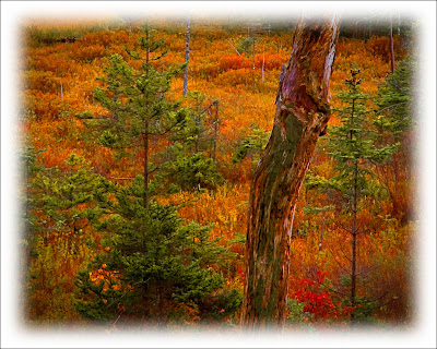
Why shoot in RAW? Well, here's an example of why. The original shot (the smaller, vertical shot) has all the color information found in the finished (developed) image. The first, and most obvious change from the original to the completed image is that it was cropped from a vertical to a horizontal representation of the scene. To make the absolute best image from the shot there "should have been" a horizontal to start with. But, there wasn't, so cropping was needed. The second thing that's highly noticeable is that the negative was flipped. It used to be slightly trickier in the film days because you had the side of the film with the actual image on the opposite side as it should have been. It resulted in a minute degradation in image quality, but typically not enough to notice. I think it was more psychological on the part of the photographer than it was physical to the viewer. Today, "flipping the negative" is simply a matter of moving ones and zeros. No loss of quality. To join the discussion of printing images right out of the camera versus developing an image, hit the "read more".

Anyone who thinks they should "get it right in the camera" to a printable condition shouldn't be shooting in a RAW format. If you want to pop the memory card out of the camera and plug it into a printer, shoot in Fine JPEG. You do want to be able to make the best quality available to you, and you can always reduce the quality to get something for a 4 x 6 print of for the web. You just can't make a good, large print from a highly compressed file. The other thing to keep in mind is that a JPEG image is "developed" in the camera. Rather than making the development decisions on your own, you're allowing the camera to make a set of assumptions about "how" the picture should look. Don't get me wrong, the algorithms set by Nikon, or Canon, or Sony, or Fuji are pretty darn good. Each time I shoot a wedding I shoot in JPEG just to avoid needing to develop the images in Lightroom. It's a minor thing, but a time saver. Sorry, but the typical bride or bride's mother isn't going to know that the image quality isn't the absolute best it can be. They'll be thrilled that they have good a good wedding album.
.
You can read in a thousand posts on the web that RAW images are flat, they're not sharp, they lack punch and need to be worked. It's true. The camera serves as a recording device and takes in all the detail that hits the sensor. It's sort of like the ultimate unbiased reporter. There's a television news outlet that says "we give you the fact, you decide". Yea, right. There's a bias in there somewhere. The equivalent of a RAW file would be to air the raw footage of a news event. Once something is edited, someone's bias is introduced. Based on that theory, we apply our own biases to whatever image we develop. Some people do incredibly sensitive developing, coming up with very subtle tonal differences. My "editorializing" is more of a "hit you over the head" style. I don't think I've ever heard anyone say "how sensitive" or "how subtle" when referring to one of my finished images. That just doesn't happen.
.
Whatever your "style" is, RAW images need to be developed. It's the same in the dry darkroom as it was in the wet darkrooms of the past. The decisions make by the photographer are what determines the final image, not the camera. Read more!