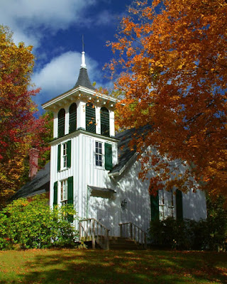
 We're starting on the "next" one hundred postings with at the gallery. Since the blog was started back in April we've posted one hundred articles about different facets of photography. In flipping through the archives I see we have enough to talk about to take us well toward the anniversary of the blog in April. I'll tell you what, going through some of the older folders brings back memories. Today's image is a case in point about thinking back on the day, location or reason for taking a specific shot. Kicking around the back roads of the Berkshires in northwestern Connecticut and western Massachusetts we came upon the church in today's image. Great location, great saturation on the trees in their full fall grandeur, wonderful sky and a couple of problems that would have to be tackled in post production. There's at least a half dozen modification that had to be made to produce the image shown. Some were easy fixes that someone with the slightest knowledge of Photoshop would be able to handle. A couple required a little planning and one ended up being sort of a bear. To find out what the six modifications are and how they were accomplished, hit the "read more".
1. The church was tipping back further into the frame and had to be straighten up a little. I didn't want to go crazy and bring it fully up and give it a phony looking correction. Using Photoshop's Free Transform and the Perspective tool brought the building to a more upright position.
2. The contrast range from light to shadow was too great for the camera to handle (this was taken before HDR became popular). The vertical clapboards on the front of the church were blown out. The clapboards that had detail were copied, moved around the corner, warped and set in place to avoid having a blown out wall. The missing shutter was actually missing on the building, so I left it off the correction.
3. Just to the left of the stairs there was some distraction. The bush was extended using the Clone Stamp to obscure offending article.
4. A traffic sign was in the lower left quadrant and begged for removal. Again the Clone Stamp was employed and the sign removed. The problem here was the fact that the shadow pattern had to be made to be believable. Extreme magnification was used to make the area large enough to be worked without a lot of discomfort.
5. A sign on the door was removed to avoid having the red lettering be a eye magnet, drawing the viewer to details that really didn't add to the interest of the image.
6. The sky was darkened independent of the rest of the image. This wound up being a simple fix. The blue in the sky was isolated using a Hue/Saturation Adjustment layer. Adjusting only the blue color brought the sky to a more dramatic point.
There you have it. A half dozen small "fixes" that changed the shot from being a picture to being an image. Trying to imagine the finished image helps when you're looking at a scene you might want to shoot. Ask yourself "can I do what needs to be done to get the image my mind's eye sees?"


0 comments:
Post a Comment