Wednesday, September 30, 2009

The Case For Developing An Image


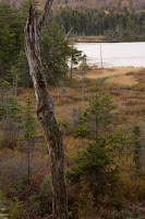
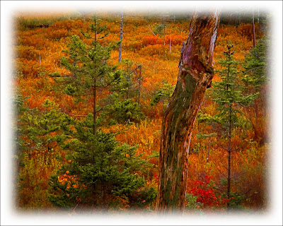
Why shoot in RAW? Well, here's an example of why. The original shot (the smaller, vertical shot) has all the color information found in the finished (developed) image. The first, and most obvious change from the original to the completed image is that it was cropped from a vertical to a horizontal representation of the scene. To make the absolute best image from the shot there "should have been" a horizontal to start with. But, there wasn't, so cropping was needed. The second thing that's highly noticeable is that the negative was flipped. It used to be slightly trickier in the film days because you had the side of the film with the actual image on the opposite side as it should have been. It resulted in a minute degradation in image quality, but typically not enough to notice. I think it was more psychological on the part of the photographer than it was physical to the viewer. Today, "flipping the negative" is simply a matter of moving ones and zeros. No loss of quality. To join the discussion of printing images right out of the camera versus developing an image, hit the "read more".

Anyone who thinks they should "get it right in the camera" to a printable condition shouldn't be shooting in a RAW format. If you want to pop the memory card out of the camera and plug it into a printer, shoot in Fine JPEG. You do want to be able to make the best quality available to you, and you can always reduce the quality to get something for a 4 x 6 print of for the web. You just can't make a good, large print from a highly compressed file. The other thing to keep in mind is that a JPEG image is "developed" in the camera. Rather than making the development decisions on your own, you're allowing the camera to make a set of assumptions about "how" the picture should look. Don't get me wrong, the algorithms set by Nikon, or Canon, or Sony, or Fuji are pretty darn good. Each time I shoot a wedding I shoot in JPEG just to avoid needing to develop the images in Lightroom. It's a minor thing, but a time saver. Sorry, but the typical bride or bride's mother isn't going to know that the image quality isn't the absolute best it can be. They'll be thrilled that they have good a good wedding album.
.
You can read in a thousand posts on the web that RAW images are flat, they're not sharp, they lack punch and need to be worked. It's true. The camera serves as a recording device and takes in all the detail that hits the sensor. It's sort of like the ultimate unbiased reporter. There's a television news outlet that says "we give you the fact, you decide". Yea, right. There's a bias in there somewhere. The equivalent of a RAW file would be to air the raw footage of a news event. Once something is edited, someone's bias is introduced. Based on that theory, we apply our own biases to whatever image we develop. Some people do incredibly sensitive developing, coming up with very subtle tonal differences. My "editorializing" is more of a "hit you over the head" style. I don't think I've ever heard anyone say "how sensitive" or "how subtle" when referring to one of my finished images. That just doesn't happen.
.
Whatever your "style" is, RAW images need to be developed. It's the same in the dry darkroom as it was in the wet darkrooms of the past. The decisions make by the photographer are what determines the final image, not the camera. Read more!

Monday, September 28, 2009

It's Not HDR, It's EDR

Scott Kelby had a post about EDR (Extended Dynamic Range) developing of images, so I figured I'd try it. His interpretation of "where" to use this technique was more toward the portrait end of photography. Me? Being willing to push anything in different directions, I figured I'd try it on a landscape image and see where it would go. Let me know what you think, but I sort of like it. It gives an HDR (High Dynamic Range) feel to the final image, but doesn't use any of the HDR software that's available. No Photomatix, no Photoshop HDR blend, no Qtpfsgui, or Picturenaut 3, just either Lightroom or ACR (Adobe Camera Raw). One of the best things about this technique is that it's "real time" and just a couple of slider movements. First thing that happens is you make your image look really crappy and then, with one more slider, it comes to life. To find out more about the technique, and how easy it actually is, hit the "read more".


This is going to be quick. Another of those things I've explained that takes longer to read about than to do. Open the image in either Lightroom's Develop Module or the ACR module of Adobe Photoshop or Photoshop Elements. Both have the same basic programming, with LR having the advantage for cataloging and output. ACR has no cataloging or output functions. The only way to get something out of ACR is to bring it to another program (about any other program that will read the ACR raw format). The controls are all the same between the two programs, with only different placement of where you find a particular control.
.
Take the Recovery slider and bring it to 100%. Same with the Fill Light slider. Move the Clarity and Vibrance sliders to about +50. The image will now look pretty washed out. The magic happens when you start taking the Blacks slider up. You'll see the richness return to the image. For a landscape you can play around with the Contrast slider if you wish. The Blacks and Contrast sliders are like salt and pepper. Use both "to taste".
.
Once you have the image looking the way you like, bring it into Photoshop or Photoshop Elements and go through your normal workflow. In my case I use every step I've outlined in earlier posts. One way to think of this technique is like doing any prep work for developing your image. Just as you would do any dust removal, or blemish correction, or whatever you do before you start developing your image, this is a way to get an image "to" a starting point.
.
Read more!

Friday, September 25, 2009

It's The Hap, Hap, Happiest Time Of The Year

It's late September. The time of the year when photographers go crazy. I'm sure the road to the "Jenny Farm" will be mobbed during the next couple of weekends with hordes of shutter clicking shooters hoping to prove the definitive shot is still within their camera. They'll put their tripod right next to the other hundred photographers on the road and think they have the magic formula to "get it right". Chances are good, no chances are extreme that they will get a shot that looks pretty much like the one the person standing there last year, or yesterday or tomorrow will get. There will be days with better skys and overcast days when the colors explode, but the farm is the farm is the farm. Do a Google image search on Jenny Farm and you'll see that most of the shots are basically the same. Up the road, down the road, with the tree included, without the tree in the shot, but the same old, same old. Today's image is not of the Jenny Farm or of any of the iconic shots of northern New England. To find out a little more about the shot, hit the "read more".

Today's image was taken at a highway overlook in the White Mountains. Exactly where? I don't know. (Another case for geo-tagging.) Too many photographers zoom past a hundred opportunities for a unique shot of some of New England's fall color to get to the iconic shot that "everyone" has shot. It certainly doesn't hurt to ask, Google or read about area you'll be traveling to for photography. I've definitely been an advocate of shooting close to home, but I do have to say, if you're going to be in a "target rich environment" like New England in the foliage season, there's nothing wrong with getting lost. Specially today, with "almost" everybody having a GPS unit in the car to get you "unlost".
.
Fall in New England is the one time of the year when I do recommend driving aimlessly around. I've stumbled across some of the nicest scene and vistas I've ever shot by driving down some nameless road and slamming on the braking. Another benefit of rural back roads is that you're not likely to cause an accident by "slamming on the brakes". We've found barns and fields, fences and stonewalls, trees ablaze with color and leaves piled up along the sides of roads (dirt and paved) and all sort of other things on "the roads less traveled".
.
If you happen to live along the New York, Connecticut border, go find Route 22. It runs due north just inside the New York side of the border. Don't bother with Route 22. Less than a half mile to the east is a road that runs parallel to Route 22. That's the one to take. It goes past farms that rival those you find in Hew Hampshire and Vermont. A couple of places crest a hill and down the flank is a quintessential "Jenny Farm" type scene. The farm is in the dale, the tress beyond are on fire with color and the foreground trees provide a great frame. Another area on that road is a tunnel of maple trees with a distance view down the road. Either wait for a car to pass or have your companions walk up and down the road ("costumes don't hurt) to get some human interest shots.
.
Whatever you do, get lost, get found, use Dave Middleton's book, use a GPS or visit Jenny Farm, get out and shoot. This is the season in the northeast.
Read more!

Wednesday, September 23, 2009

Paying Homage to Bert

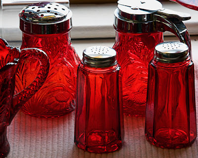
Every once in a while you find something that reminds you of something you've seen or have been touched by. Today's image is along those lines. We were out shooting in Rockport Massachusetts, walking up Bear Skin Neck and came across this display. I like the simple composition and the repeating colors in each piece. There's "enough" detail in the tops of each shaker and the cruet. The tops are all metal and should be very reflective. The slide on the cruet provides interest and keeps the lid from being just a big blank spot in the image. The colored shadows give some depth and bring attention to the textured mat. Each time I flip through the set from this trip I find myself pausing for a step at this shot. This is, obviously, a photograph. There's an artist out there who routinely makes photo realistic scenes with much more detail than you see here. To find out a little about him, hit the "read more".

If you haven't checked out Bert Monroy's work, you're really missing something. You've probably seen Bert's work on magazine covers or in some clever piece of advertising, but, he also does fine art, electronically produced pieces. The inspiration for today's image is Bert's piece, "Lunch at Tiburon". It has several of the same elements, like the shakers, a table covering and the reflections. The one big difference is that the gallery's image is a photograph and Bert's comes from his imagination. No part of the piece was there before Bert put stylus to electronic "paper". (Bert works on a Wacom Cintiq interactive pen display.) If you do a side by side comparison of today's image versus Bert's art piece you'll be amazed how photo realistic his image is.
.
While you're on Bert's site, check out every piece there. Each demonstrates what can be done in Adobe's CS4 Suite (and before). You can also find tutorials by Bert over on the Revision 3 website, under the heading of "Pixel Perfect". The ease that Bert has with Photoshop and Illustrator is shown in each episode. Things that would take hours for someone at my level are done by Bert in minutes. He routinely demonstrates the limitless possibilities available with the Adobe applications.
.
One thing to keep in mind as you look at Bert's work is that he is unencumbered by any "depth of field" limitations we find using cameras to create out images. Do a Google search on Bert and find out how he's coming on his latest work, a panorama of Times Square in New York City. Take a look at what the finished size will be. You'll be astonished. Read more!

Monday, September 21, 2009

Oh, The Dreaded Highlight Blowout

Seems like everywhere you read you see pundits saying you have to preserve the highlights. I'll go along with that to a point. Those more knowledgeable than the self proclaimed authorities get it right. Saying you have to maintain the highlights is sort of like several other bastardizations of semi-well known quotes or phrases. On the early morning news program on ABC over the weekend the male host said the "computers get twice as fast and cost half as much every two years". The only part of that statement he got right was the part about "two years", and that's a modification of the original statement by Gordon Moore. Before Gordon got together with Bob Noyce to found Intel he was quoted as saying 'transistor density doubles every eighteen months (later modified to two years) with no increase in cost'. Computers get more capable, but not twice as fast. Things tend to get altered with use. Have you ever heard anyone say he(she) doesn't "cut the mustard"? Now, just how hard can that be? Mustard is typically a cream condiment. There's not much to cut. The actual term would be he(she) doesn't "cut muster". Muster, in this context, refers to a gathering of a military group for the purpose of inspection. If someone misses a muster, or fails a muster (doesn't pass the inspection) he/she might wind up in some serious trouble. The same alteration of the idea of not blowing out highlights is today topic. To find out if today's image has blown out highlights, hit the "read more".

The easy answer is yes, it does have some blown out highlights. Just not as many as you might think. You'll have to sort of take my word for it because I'm looking at the full sized image while you're looking at a "for the web" version. There's three distinct spots that have blown out pixels (pixels that register at 255, 255, 255). One is in the vertical line just below the glass in the lighthouse. There are eight pixels in that line with no detail. Another area is just beside the upper windows in the front of the house. That one has thirty six empty pixels. I blew the original image up to pixels level and counted them. The third area is on the right arch above the porch and has about six offending pixels. The image is as shot as far as cropping goes, so we have a twelve megapixel image with fewer than fifty pixels blown out. That's got to be a pretty good ratio.
.
The thing about not blowing out the highlights that some of the pontificators seem to miss is that they have to be "important" pixels. On the lighthouse, the glint is supposed to be white. If eight pixels go over the edge and have zero detail, oh well. You would need scientific instruments to be able to figure out which pixels have detail and which do not. I'm a lot more interested in looking at an image than I am doing a forensic analysis of it.
.
There's a saying, "all things in moderation". There has to be a limit on what the boundaries are in the images we look at. Is today's image a great shot? I've seen better, but it's one of the best I took at the time we were there. We'll be back up on the Maine coast in a couple of weeks. I don't know if we'll shoot Portland Head Light on this trip or not. Hopefully there will be some good skys wherever we shoot and we'll get a few decent shots. What we get will be what we print, that's about all you can do. If you're there on a good day, it's up to your skill to get a good shot. If you're there on a crappy day, aim your camera lower or at smaller details. There will still be good shots, just not the sweeping panoramas. Read more!

Friday, September 18, 2009

Easy as RGB


I bought some food coloring the other day and decided this morning would be a good time to play a little bit. Pulled down a few wine flutes and started playing mad scientist. Somehow, if adding food coloring to water is my idea of being a "mad scientist" I really have to start getting out more. Photographing glassware is trickier than I had given it credit for. Each time I added another light it seemed like I added another problem. What started out as a table, a piece of glass and three pieces of stemware wound up being two speedlites, a couple of gobos, a couple of negative (black) reflectors, a wireless trigger, some cards, adjustments to the speedlites and upping the EV on the camera and a lot more involvement than I was planning. The colors recorded great. I liked the way each color was represented. The glassware, on the other hand, was a bear. Reflections where they should be, highlights in places that looked sort of dumb and gave away the locations of the lights. What was supposed to be a ten minute exercise ended up being a master class in light placement. To discover what trials I went through, hit the "read more".

First thing that came up was that my white wall wasn't. Under the speedlites it came out bluish. Note to self. Buy a more neutral white paint. The next thing was the spread of the light. First try was a one light setup. That resulted in a very nice spot and a dramatic fall off of light. Not what I was going for. Next was two lights positioned under the table the stemware was on. Now I had two spots instead of one. I could see that controlling light falloff was going to be "an issue". The big thing the two light setup resulted in was sort of a Joker smile slash of light on the wall. Brought the lights out from under the table and set them to each side of the table. Plan was to skim them across the wall and mathematically even themselves out. What I wound up with was light spilling into the camera. Not good.
.
Time to break out some gobos. Set them to get rid of the extraneous light flying into the camera. It was then I noticed a couple of red highlights in the glass. After trying several things to either eliminate the red or, at least, find out what was producing it, it came down to the speedlite's red "I'm ready to go" light. Grabbed a black flag and the red spots were toast.
.
The whole episode was an exercise in chasing down one little thing after another. Once I finally got a selection into Photoshop it was pretty straight forward by comparison. Hey, live and learn. If you're not constantly learning new things you might as well sign up for that lobotomy every one's been suggesting.
Read more!

Wednesday, September 16, 2009

Those Were The Days My Friend


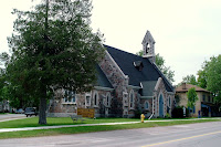
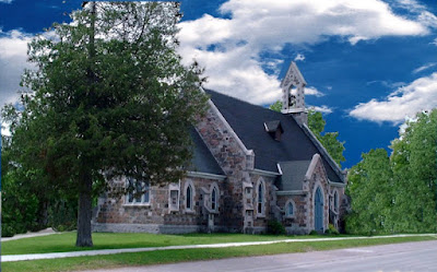
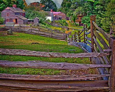
Here's an "oldie but goodie". It's one of the first images where I tried to do a major revamp. Just to go through the litany of what was done is sort of fun. You might want to click on the smaller, before image as we go through. Things that have been removed, going from left to right we have the road and car that appear under the tree. Then there's the bench under the right hand side of the tree. The sign announcing the church's name and information. The fire hydrant by the sidewalk. The downspout at the corner of the front door foyer. The sign with the church's schedule on the right side of the front door. The man walking along the sidewalk and finally the entire house beyond the church itself. Seeing as the sky was completely blown out I really don't consider that to be a removal as much as an exchange, or maybe a replacement. To get an idea of the difference in time between what it took me then and what it might take me now, hit the "read more".

Being that this image was one of the first images I played with extensively, it must date back to 1999 or 2000. To give you an idea just how old it is I took a look at the exif data. Let's put it this way, it's old enough that the exif data doesn't show a date. That's pretty old. I'm sure it was worked in Photoshop 7, the the time frame is about there. I don't think I understood layers at that time, so all changes were made on the background layer. Maybe the sky was brought in as a layer, but I'd guess I didn't have the layers pallet open and didn't understand how the sky got there.
.
If I remember correctly I attempted the transformation about a half dozen times. Without knowing about layers, if I screwed up, I'd scrape the whole thing and start over. It was almost like game play on a computer. You go until you get killed, or whatever signals you've used up all your attempts and then start over. After a while you figure out that you should save your work before trying something new. Same type of thing. Remember, I was really, really new to Photoshop. Just like being new to gaming. I spent hours and hours working on it and every time I'd hide "something" I'd call my wife over and point out my accomplishment with great excitement (on my part, not hers).
.
So, as far as the time comparison goes, what took hours and hours back then would probably be done within 15 to 20 minutes, if that. The sky is less than 30 seconds using the Blend If sliders and splitting the sliders to have more control over the fringing. With CS4 having the "preview" function of the Clone Tool getting rid of things like the downspout is very easy. Same with the signs or fire hydrant. I'd probably keep the house beyond the church. I'm thinking it might have been a parsonage and the pastor might have wanted it in the shot. Who knows???
.
Today I have to have, at least, a smirk on my face when I think of the time spent on the image. Was it wasted time? Absolutely not. It was learning. I'm still learning and I'm sure if I look at one of today's images in five or seven or nine years I'll probably have just as big a smirk as I do today. Read more!

Monday, September 14, 2009

Deeper And Deeper

Occasionally you get a picture that keeps needing you to dig deeper and deeper into the refinements to finish the image. Today's image is one such case. I kept backing out of the finishing touches to make little tweaks to the image that had to be done before the final two finishing steps. At the very top of the image there were two leaves from the tree I was standing under when I took the shot. The original intent was to provide a frame over the top of the image. The leaves were too far out of focus to make a good frame and would have been a distraction if they were kept in. When I say there were two leaves, I mean (after the crop) the very tips of the leaves hung down into the image by millimeters. It was one of those things where you say "is it worth it" to take two steps backward to make such a small correction. Obviously I came to the conclusion that it was. The big thing is that if you're not willing to make the small nitpicking corrections you're not going to get to that next level. That's one of the reasons finishing your work is a solitary endeavor. If you're teaching a class you have to keep the class going and maintain a pace. Ninety percent of the people in a class wouldn't even see the spot I spent several minutes going back and forth on. If you're interested in what the "last two steps" in my workflow are, hit the "read more".

With every print I make there's the "last two steps". Those two steps change only on very rare occasions. The first thing is to make a composite of what you've been working on without messing with all the layers. Easy enough to do with the keyboard shortcut Ctrl Alt Shift E. It's joking referred to as "the left side of the keyboard". It's easy enough to get the Crtl Alt Shift portion with one hand, but getting to that E typically (at least for me) involves the other hand. I just haven't figured out a comfortable way to get all four with the single paw. The next step is a Ctrl J to make another copy of the composite image. So, now I have two copies of the image with all the crops and corrections made.
.
First thing to do would be to turn off the visibility of the top layer (click on the eyeball and turn it off). That layer will be used in the final "final step". The lower layer is for sharpening and the top layer is for vignetting. With the lower of the two layer selected in the layers panel make it available for "Smart Filters". Smart Filters (or Smart Objects) are available in Photoshop CS3 and CS4. Each version treats it slightly different, so check out how to make a Smart Object in the version you're using. Now, rather than using USM (Unsharp Mask), select Filters/Other/High Pass. This brings up the High Pass Filter dialog panel. Typically I'll set the value to 10.5. One thing to watch out for would be halos. You might see them when in the Normal Blend Mode. Change the Blend Mode to Overlay to see the effect of this method of sharpening. Click the layers eyeball on and off to see the effect of this type of sharpening. After you've changed the blend is the time to look for halos. The ground or object to sky line is where you might see a halo. First thing to try to eliminate the halo is switching the Blend Mode from Overlay to Softlight. Many times this will take care of the halo issue. If that doesn't work you can always go back into the High Pass Filter dialog box and adjust the value down a little bit. That's the beauty of using Smart Objects. They make Filters adjustable nondestructively. Once you have the sharpening where you want it, go on to the last step.
.
Select the top layer and turn on its visibility. Get the Marquee Tool (keyboard shortcut M) and set the feathering to some level. There's no way to specify an exact number since we haven't talked about the resolution that you're working at. A general "rule of thumb" would be about 1.3 to 1.5 times the resolution you're working at. Drag out the Marquee from about 10% of the longest dimension of the image to the diagonal opposite corner at about the same distance from the edges. You "should have" a rounded rectangle of "marching ants". Click your delete key. If you look at the thumbnail of the layer. You should see your image with a big hole in it. Click Ctrl D to deselect. the marching ants go away. Looks great, right? No!!! One more step. Change the Blend Mode to Multiply. The image will have a serious vignette. If it's too serious, use the Opacity Slider to set a point where the vignette is there, but not smacking you up along side your head.
.
The sharpening method gives far greater control than using USM. The vignetting technique gives you infinite control over how dark or light the vignette is. The reason for using an unsharpened layer to make the vignette is to, obviously, darken the edges and also reduce the sharpness of the edges. The viewers eye will go to the brightest and sharpest area of the image. If your vignetted area is darker and softer than the center of the image you automatically draw the viewers eye to the center of the image. You can shift the vignette it highlight the center of interest. Read more!

Friday, September 11, 2009

Burn and Dodge without Using The Burn and Dodge Tool

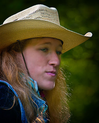
Sometimes, even with a little pop of flash, you wind up with shadows above the eyes. This was the case with today's image. You can see the face is shaded because of the western hat. You expect the eyes to have the same shadow. Problem is that the ridge of the upper eye brow puts and additional shadow above the eyes. So, we have a compound shadow just where we want the viewer's gaze to go. Hats of any sort tend to present problems. The hat in today's shot isn't as bad as some would be. It's a straw hat and transmits "some" light. With a felt western hat the shadows would be much more pronounced. Still, what has to be done to bring out the eyes to make them the center of attention. To learn about the technique used to bring out the eyes, hit the "read more".

The technique used gives just about absolute control over making adjustments like what's needed for today's image. If you have Adobe Photoshop CS4 you have no issue. The Dodge and Burn tools have been reworked and they now maintain the color characteristics of the image. In anything older than CS4 the Dodge and Burn tools probably should have been burned. They threw a color cast on whatever they touched. For anyone using a version of Photoshop older than CS4 or Adobe Photoshop Elements here's a work around to be able to "Dodge and Burn".
.
First thing to do would be to make a new layer. That's probably a no brainer, since you should make a new layer for just about everything you do. Hit a Shift F5 to bring up the fill dialog box. Under "Contents" select 50% Gray. Leave the Blending Mode at Normal and the Opacity at 100% in this dialog box. Hit enter. Now, in the Layers Panel, change the Blend Mode to Soft Light. Make sure your foreground and background colors are at their defaults (keyboard shortcut is D ). Select a nice soft round Brush (keyboard short is B ). To bring the size of the Brush up or down, use the right and left square bracket keys. To bring the hardness of the Brush up or down, use Alt and the right and left square bracket keys. Set the opacity of the Brush (that would be up on the horizontal bar) to a very low number (between 10% and 20%). Now, on your 50% gray layer, use black to Burn and white to Dodge. You can switch back and forth from black to white by using the X key as a shortcut. You will buildup the effect by going over the same area several times.
.
You may want to use separate layers for Dodge and Burn. This way you will be able to use the Opacity slider to fine tune. If you have several areas you wish to control you could even have several layers of burns and several layers of dodges. In order not to drive yourself nuts, I'd recommend putting all your burn and dodge layers in a Group (keyboard shortcut Ctrl G ).
.
Control is the name of the game. You don't want to be ham handed with any tool you use for adjustment. Just because a tool is set to 100% right out of the box, doesn't mean you should use it that way. That's what the sliders are for. Read more!

Wednesday, September 9, 2009

It Never Hurts To Cheat The Rain

Foul weather might sink a faint hearted photographer, but it can be the intrepid shooters best friend. Today's image is an example of being Winnie the Pooh like and saying "tut, tut, looks like rain". Chances were that we'd be sitting in the car, looking at Roaring Brook, wishing we weren't there in the middle of a downpour. As luck would have it, the rain held off until we were safely in a diner having breakfast. You can talk to fellow photographers and they'll tell, in loose terms, where a particular shot was taken. It might be because the best they can remember is the general location or there may be a more sinister motive. It's sort of like buried treasure or the location of the end of the rainbow. Some photographers want to keep their "sure fire", great places to shoot to themselves. That's not really in the spirit of being a good person, a nice guy, a pillar of the community, or possibly an author of travel guide books. If you're interested in finding out more about the location of this shot or where to find information about great places to put your tripod in the northeast, hit the "read more".

Today's image is a small tributary of a small stream called Roaring Brook in Arlington, Vermont. You get to the brook by driving down Kelly Stand Road. I typically go east to west, but there certainly isn't anything stopping anyone from going west to east. On either end you leave the paved portion of the road and head up across a ridge on a well maintained (other than in winter) dirt road. There's no need for a four wheel vehicle or other similar, tank like, conveyance. The family sedan will do nicely. There has to be thirty places to stop and get a dynamite shot. There's ponds, dirt roads, paths, and the star of the ride, Roaring Brook. It's not like you have to search for this gem. If you pull more than fifteen feet off the road you're libel to be parking the car in the middle of the stream. That could mess up the aesthetic quality of the shot, but, hey, shoot what you like. I'd guess, in peak fall foliage, Kelly Stand Road could be like a five mile long parking lot, but it's typically a nice, casual ride with little traffic.
.
It certainly wouldn't be fair to give the impression that we discovered this font of photographic opportunities. That title would have to go to David Middleton (link). At least as far as popularizing it for photography. Dave has several books in print, but the two that would be most important to anyone thinking of shooting in New England would be his guides to the Maine coast and Vermont. Both are excellent sources of detailed information that would take someone exploring on their own years to find. Combining his books with a GPS and you aren't wasting an ounce of gas finding the shots you're looking for.
.
If you read this blog with any regularity you know I'm a big believer in going to where you know the shots are. We got skunked again this past weekend. We went to "The Gunks" (link) on Sunday to see if we could find any rock climbers. Something went a little wide of the mark. We were either too late and all the climbers had already gone, or we were in the wrong spot. Further investigation is in order. I'm sure there are good opportunities there. Just have to find the key.

Read more!

Monday, September 7, 2009

Nostalgia or Fine Art?

If you look around on the web and do a search for "fine art photography", more likely than not you'll come up with B&W images. Somebody has got to tell me why people seem to think Black & White equates to "fine art". Is it just because there's less of it today. There was a time (actually there were two times) when there was no such thing as color photography. One was an absolute, there just wasn't any color images. The technical side of color photography hadn't been invented yet. The other time of "no color photography" is more subjective. It was too expensive and too hard for most amateurs to do. B&W printing was easy by comparison. A "darkroom" just had to be dark. Getting the film on the reel for developing could be accomplished in a light proof "changing bag". Paper wasn't as sensitive as film, so a little light leakage was okay. Developing temperatures, for the chemicals, had a couple of degree tolerance. With color everything was taken up a notch. Dark meant black. Temperature meant a half degree. No loosey goosey stuff here. Now, with everything being digital and people working in a dry darkroom (computer), it seems that pushing the Greyscale button makes something "fine art". Can't see it. Crap is crap, weather it's in color or black and white. And too much of what people call "fine art" is crap. To fine out my opinion of today's image, hit the "read more".
This shot isn't "fine art". It's a vacation shot that I thought might be interesting in B&W. Maybe, since I've done B&W in a wet darkroom, I know just how much easier it is to do B&W in today's electronic darkrooms. I saw a shot the other day of a pile of laundry, shot from a standing position, that had the contrast of mud and was being sold as fine art. What I saw was a shot of a boring subject, shot from a lazy position, that was poorly "developed".

.

Each spring the local college has an open house art show with the work of the senior arts majors. These kids are studying Graphic Arts, or Design, or Illustration or even a Photography option. What I see is the inane work of those who haven't been properly taught what makes a good B&W image. The teachers should be pimp slapped for allowing students to display such immature work. In some case these kids are going for a degree in a field the relies on photography for it's fodder. I have to wonder if the "professors" have any idea what a good B&W image looks like. Maybe they've never seen "Moonrise Hernandez", "Clearing Winter Storm", "Lake Tenaya" or any other prints by Ansel Adams. In the contemporary, have they ever seen the stunning work by Vincent Varsace or Jay Maisel or Katrin Eismann? Absolutely stunning.

.

The quality of the photography shown at the college is just a symptom of what I call the stone in the pond. If you toss a small stone into a still pond you'll get a series of ripples. Those closer to the point of impact have greater amplitude. Each succeeding ripple is smaller until the pond appears flat again. Education, in the broad sense, is the same. The scientist who makes a discovery is intimately engaged in the minutiae of the find. As more and more people are educated by more and more people, the minutiae is diminished more and more until the subject is mis-taught by well meaning people. At some point, those teaching need to re-educate themselves by going back to the initial source. To get the misconceptions out of their way. To learn the right and unlearn the wrong. To teach as purely as possible. We owe it to those who follow.
Read more!

Friday, September 4, 2009

A Tale of Two Adjustments

The only thing that makes this shot remotely interesting is the background. The "hikers" aren't really hiking, and they're not someone I know, so the only purpose they serve is to give some scale to the image. As I went through the normal adjustments in my workflow I saw something in what was coming up that surprised me a little. Of the minimum of six Hue/Saturation Adjustment layers I use (Red, Yellow, Green, Cyan, Blue and Magenta), three effected the foreground and two the background. (Magenta didn't do much on either side.) It wasn't so much that there was a difference. It was more about how pronounced the difference was. There are things I've come to expect about how the colors react in an image and this shot ends up being "the exception that proves the rule" (link). To discover what this "exception" might be, hit the "read more".

A couple things hold true in images being saturated in Photoshop. Yellow effects foliage more than green. Cyan and blue have a very minor effect on grass, leaves, trees, growing things (plants) in general. In today's image that axiom holds sway over the foreground. Saturating the yellow popped up the grasses and plants in the lower portion of the shot. The thing that struck me was that there was no effect on the plant life in the valley. I thought the reds in the valley might come up a little based on the time of year and the changing of the colors. Nothing, zero movement in the reds down in the valley (ho, ho, ho - green giant).
.
When I got to adjusting the cyan and blue I thought, "no sky, no water, probably no change". Wow, big shifts from both the cyan and blue. A much greater shift than I thought would happen. It was like I was adjusting a deep blue sky or some water, but not grass and trees. Where red, yellow and green showed up saturating the foreground, cyan and blue made major changes to the valley in the background. After saying "hmmmm" I got to thinking. What was it that I was seeing? The shot is your basic tourist shot from the top of Mount Greylock in Lanesborough, Massachusetts. The summit is at about 3,500'. The town of Lanesborough is probably lower than 500' or 600'. So there a 3,000' differential between where I was and where the town is. That's 3,000' of "blue" sky. I don't think I was making changes to the grass, trees and foliage, I was saturating the atmospheric haze that hung in the air. The UV filter cut the haze, but the brought back the color of the haze and not the distortion.
.
Just goes to show you, everything is not as it appears.
Read more!

Wednesday, September 2, 2009

Planning is Key

I've ranted a couple of times about driving hundreds of miles "looking" for some great shot. We must have done it a hundred times. It's far more productive to know where you're going and that, at least the opportunity for, shots are at the end of the road. In July, in the southeastern portion of Connecticut a farm does a very nice thing. They sell sunflower bouquets. This might not sound too unusual when you consider that it's a sunflower farm, but why they do it is the key. They do a thing they call "Sunflowers for Wishes" (link) and donate the proceeds of the sale of the bouquets to the "Make a Wish" Foundation of Connecticut. It's a nice thing they do. A side benefit to photographers is that the dates are published in newspapers in the form of a human interest article. Knowing the dates the sunflowers will be in bloom is sort of handy if you are interested in shots among acres and acres of sunflowers. You might have noticed, today's image is not of the wide angle, broad scope variety. It's focused, quite literally, on a single flower. We've made the pilgrimage to Buttonwood Farm for the past couple of years. If you think you might go in July 2010, here's a couple things to keep in mind. They plant fields on a rotating basis. The peak time for the blooms varies a little. Photographers are very welcome, but as with anywhere you go, remember that you're a guest. Don't litter or be obnoxious, don't "pick your own", don't trample the flowers (they have trails), and buy a bouquet. They're about $5.00 each. A small price to pay for such a surefire photo op. What's the deal with today's shot? Hit the "read more" and we'll discuss it.

Today's image is probably one of the simplest I've done in a while. Every couple of posts I talk about how I've gone beyond my "normal" workflow, adding multiple Adjustment Layers per color to bring out certain aspects of the shot. Today it's just the opposite. The color in the flower was pretty well saturated to start with and after a quick check of the individual colors I saw that there wasn't a whole lot to change. So, I skipped it. That's a major departure for me. The total "adjustments" to this shot were blurring the background, dropping it's exposure, sharpening the flower and pulling the leaf on the left out of the vignetting to provide a lead in line.
.
One of the aspects of the image that attracted me was the out of focus sunflower in the background. It gives a certain sense of tension to the shot. In focus versus out of focus, face front versus face backward, size versus (similar) size. Even with the similar sizes there is no doubt which flower is dominate and which is subordinate. It's negative space, but not an empty negative space. There's "something" there, but the eye slides right by to get to the "focus" of the image.
.
Knowing where you're going before you walk out the door makes the odds of getting good shots much higher than rolling the tires in some random direction. Check the newspaper, the evening news, the internet and friends past experiences. Have a target in mind and you'll be much more productive. Read more!