Wednesday, December 30, 2009

"Developing" The Image

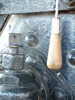
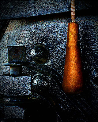
Today's image (the large shot on the right) started with the small image on the left. I can think of a dozen things that needed to be done to get from one to the other. The first thing that is quite evident is "how" a camera's meter reads a scene. You can see the proper color in the finished image. The inside of the cab of the old steam train is painted black. The camera's sensor was pointed directly at a large black mass. It did a great job of trying to produce an 18% grey. Lately I've seen a lot of ink talking about "exposing to the right". Well, that's exactly what the camera's meter did in this case. It really had no choice. It has no intelligence, it's there to "record" what's in front of it, period. It did a fine job doing what it was asked to do. Is the original a "work of art"? No, it's a place to start, it's the negative from which we can start the image making process. The first thing that needed to be done was to straighten up the image. In the original you can see the handle cord hanging on a slight angle. It's unnatural, so we can use that to square up the image. To learn about a couple of the other things this image needed to fully develop, hit the "read more".
Read more!

Monday, December 28, 2009

Improving On Nature

Every once in a while you come upon the scene that's 90% there. there's just something missing. Today's image is just such a scene. The tranquil stream in the southern US, during the fall was too much to pass up. It drags you deep down the stream and lets you explore all the nooks and crannies along the shore. The problem, the issue, the thing that draws your attention in the original, as shot version of the image is a dominate sky. The top quarter of the image was a pale to white patch of pretty dull sky. Being bright it drew your eye like a magnet. The strange thing is the fact that the reflection gave the sky a much richer appearance. It didn't need to be "fixed". In fact, messing with it would have wrecked the shot by not giving you the "pathway" into image. So, what to do with the sky that wouldn't show up in the reflection? If you've followed the blog from the early days you might remember the foreground bough that creates the "frame" of the image. I did an article about it called "A Very Simple in Camera Technique" back on May 22, 2009. It discusses "how" the pine bough was taken on a completely white background and "how" to properly expose for the "white out" conditions. Today's image uses that image to fill in or cover the fairly uninteresting sky. One that was in place the sky showing through was still a little too white. It didn't match up with the reflection in the water. It still needed more texture than what was apparent. Easiest fix was to toss a cloudy sky in back. If you'd like to see how easy it is to add the bough and the sky as components, hit the "read more".
Read more!

Friday, December 25, 2009

Happy Holidays Around The World

It's Christmas Day in the Christian world, Chanukah has just passed. The Muslim holiday of Eid ul-Fitr was celebrated in September. Every religion in the world has a time of celebration set aside to consider some major point. On this day, in the religion I follow, I'd like to wish everyone peace on world and good will toward man. I believe our commonality far outweighs our differences. I hope everyone has a good day, free of strife, anger and fear. May your chosen God bless you and shine the light of hope on all.


Thanks.

Tom Read more!

Wednesday, December 23, 2009

It's Cold Outside, So Why Not In Maine


Today's image, Portland Head Light in Maine, was cold the day the shot was taken. It was October rather than December, but the wind coming off the water made it necessary to bundle up as if it were year's end. What is it you can do to one of the most iconic images of Maine to make it stand out from the thousands of other images taken from the same place. Get hold of almost any calendar featuring either Maine or lighthouses and one month will be a shot of Portland Head Light. It is that big a deal. Why? The biggest point I can think of is that it's accessible. If you're going to fly into Maine, chances are you'll fly into Portland International. If you go to Maine by car it's the second iconic lighthouse you'll go past (Nubble Light of Cape Natick would be the first). From the time you hit the border on Route 95 you can have your tripod setup on Cape Elizabeth within an hour. Other "must see" stops for photographers are two plus hours (Pemiquid Light), five hours (Acadia National Park) and about a day's drive (Quoddy Light) away. So, ease of access is one of Portland Head's "selling" points. Beauty is obviously high on any checklist of why a shooter heads to the "rock bound coast". Time of year, time of day and weather are other draws. These factors are probably more important to the locals. It's a little tough to head up on a whim because there's a coastal storm (winter or summer) going through tonight and the dawn should be spectacular tomorrow. So, most of us have to take the conditions nature gives us and try to make the best of the hand we're dealt. To find out what was done to today's image to try to make it stand out, hit the "read more".
Read more!

Monday, December 21, 2009

Not All "Gimmick Shots" Come From Photoshop

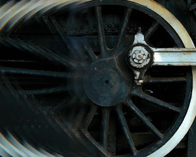
Today's image is an exercise in previsualization. If you have an idea of the end result you're looking for, you can do the work in the camera rather than "creating" the image in Photoshop. That's what's happened with today's shot. The assignment was to present an image that implied motion for the local railroad. Enough negative space had to be left have the article start over the shot. One of the things a photographer has to keep in mind is the intended use of the image you're shooting. If you're on assignment for something to be published or you're shooting for stock photography "space" has to be a consideration. When you have an assignment you know what the end use will be. In most cases you have an Editor or Art Director with a concept of what he/she is looking for and it's up to the photographer to execute. It's sort of like Star Trek, The Next Generation, when the Captain says to his second in command, "make it so, number one". The Captain, Editor or Art Director really doesn't give a rats ... about the "how" of the shot, just that the "mission" accomplishes the objective. One the other hand, if you're shooting for a stock photography house, you don't know what the end use will be. You're shooting "on spec". You're hoping an image is going to sell and, most likely, you'll never see what the use was. Every once in a while you'll open a magazine and see one of your shots in some interesting (or not so interesting) advertisement. A little searching of the internet (check out "This Looks Shopped") can typically come up with the same image being used for totally different campaigns. One of the more "famous" (or infamous) shots that was used to illustrate a point is of O. J. Simpson. Both Newsweek and Time used the exact same "mug shot" image on the cover when O. J. made the headlines back in 1994. Newsweek ran a fairly straight version of the image and Time used a heavily burned in treatment. The editorial difference was very obvious. To find out if today's image is "real" or if it's "Photoshopped", hit the "read more".

Read more!

Friday, December 18, 2009

A Good Model and A Really Good Photographer


Actually, I'm not really blowing my own horn. The model and the "really good photographer" are the same person. Today's subject is a friend's teenage daughter. The friend is a professional photographer and some of her talent has rubbed off on her daughter. A group of friends went to a reasonably local park for some shooting and a picnic. Small groups went every which way, shooting various subjects. This young lady was the "gear guard". I was talking to one of the folks attending the shoot about rapid fire shooting in a bracketing mode to obtain a series of images that could be used for HDR work. He had a Nikon D3 and I had a Nikon D300. He had heard my camera during the shooting of a sequence and commented on the fact that he could hear the camera "bog down", or so he thought. He bragged that his camera could shoot a sustained 7 or 8 frames per second. I suggested he might want to try the same shot I had just taken. He set his camera to shoot a seven shot sequence, ranging from -3 to +3 EV in one stop increments. He raised his camera and fired. To his surprise, his camera "bogged down" just as mine had. He looked confused and asked if I knew what had happened. Here's the explanation. The "normal" exposed in the shade was 1/60th of a second in aperture priority mode. Therefore, his sequence was 1/500 (+2 stops), 1/250 (+2stops), 1/125 (+1 stop), 1/60 (normal exposure), 1/30 (-1 stop), 1/15 (-2 stops) and 1/8 (-3 stops). You can't hear the difference between 1/500, 1/250 or 1/125 second exposures. You'd be hard pressed to differentiate between 1/60 and 1/30. But, when you start getting down to 1/15 or 1/8 second shutter speeds your "click" becomes "clliicck" and the change becomes noticeable. He forgot that the sustained firing rate was dependent on the shutter speed. To find out how today's image came about, hit the "read more".

Read more!
Wednesday, December 16, 2009

I Should Probably Get Into HDR, Or Have I already Been?

I guess I might as well commit. People keep on asking if this image or that is HDR (High Dynamic Range). Truth is, I've only dabbled in HDR, making two or three attempts and saying, "hmmm, that's kind of nice" and dropping it. Today's image is a good example of a shot that provokes the type of question that puzzles people who think it's HDR. Looking at it you can see that the bridge is backlit. The face of the bridge "should be" in deep shadow, yet both the background and the bridge are both well exposed. If there ever was a shot that cries out for HDR, this is it. As a side note, this bridge is not located in Central Park in NYC and not a Carriage Path bridge in Acadia NP (guesses people have made). I live on a street that once was the rail bed for the Shepaug Railroad. The trains would come out of the station in downtown Bethel, Connecticut, go up the middle of Maine Street and pass right in front of what is now my driveway. The bridge is about two blocks away. You can walk past it today and never even notice it's there. Today's image was shot a couple of years ago, just after a Boy Scout cleared the area in front of the bridge to create a small park. It's overgrown now and lost as a park. A shame. Back to today's image. Why would I hesitate about jumping into HDR? I can think of a couple of reasons, but the biggest is not in my control. Camera manufacturers are working to build HDR into cameras. Therefore, in a couple of years, HDR will be available to everyman. Another reason might be that HDR is "another" old technique being "discovered" in the digital darkroom. Gustave Le Gray is probably the first photographer credited with using HDR to enhance his images. Le Gray was a seascape photographer who made one exposure for the sea and one for the sky and combined them to produce a final image. The trick is, he did it in the 1850s. To find out more about how today's image was made, hit the "read more".

Read more!

Monday, December 14, 2009

Ode To Otto Litzel's "Darkroom Magic"

Early on in my exploration of photography I sat through a lecture by a blind photographer. Sort of sounds like an oxymoron doesn't it. The thing is he wasn't always blind. Blindness struck him fairly late in life. If I had to guess I'd say it was probably a result of diabetes. Otto Litzel was pushing seventy by the time I went to a daylong seminar on different aspects of photography. He was one of the featured speakers and had a couple of books out at the time. His friend, who served as his chauffeur for the day, sold the books in the lobby between speakers. Book sales were Otto's primary income source by then. He occasionally sold a print, but with no new work coming out sales were pretty rare. He was a gifted speaker, creating images with his stories as well as he had with a camera. It was obvious he had given this lectures many times. The sequence memorized and he didn't skip a beat with each slide transition. Otto's anecdotal stories of the how, where and why of each shot had the audience members laughing for his entire time. The modern equivalent would be Joe McNally. Book sales were brisk and I found myself in line to buy one called "Darkroom Magic". At some point I lost my signed copy, but a couple years ago I saw it on EBay for a couple of bucks and bought it. Why did I buy a book about wet darkroom techniques in the age of the digital darkroom? There's a couple of reasons. Nostalgia for one. The fact that the techniques demonstrated in the book are now considered to be manipulation only available due to the invention of Photoshop. Many people I run into feel any sort of "tampering" with the reality of "the negative" is cheating somehow. The second thing invented for photography, right after the camera, was some method of changing what the image looked like when it was shot. To find out about today's image (what it is for one thing) and how it would have been done in the wet darkroom, hit the "read more".

Read more!

Friday, December 11, 2009

Number 101 And Counting

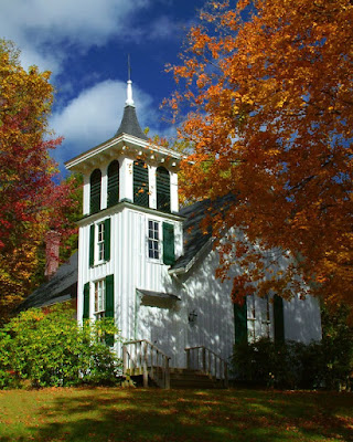
We're starting on the "next" one hundred postings with at the gallery. Since the blog was started back in April we've posted one hundred articles about different facets of photography. In flipping through the archives I see we have enough to talk about to take us well toward the anniversary of the blog in April. I'll tell you what, going through some of the older folders brings back memories. Today's image is a case in point about thinking back on the day, location or reason for taking a specific shot. Kicking around the back roads of the Berkshires in northwestern Connecticut and western Massachusetts we came upon the church in today's image. Great location, great saturation on the trees in their full fall grandeur, wonderful sky and a couple of problems that would have to be tackled in post production. There's at least a half dozen modification that had to be made to produce the image shown. Some were easy fixes that someone with the slightest knowledge of Photoshop would be able to handle. A couple required a little planning and one ended up being sort of a bear. To find out what the six modifications are and how they were accomplished, hit the "read more".

Read more!

Wednesday, December 9, 2009

I Swear, It's A Straight Image, Almost

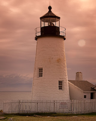
Dang, look what I found, a lighthouse on Mars. Not quite and this is one of the straightest images I've ever put on the blog. The only things that have been done are cropping, sharpening and applying a vignette. Other than that, and that "should be" done on every image that you process, everything came out of the camera the way you see it. I will admit that there are a couple things that look a little hokie, but they can be explained. Not made excuses for, but rationalized. The elephant in the living room is obviously the colorcast. It looks like I must have been on Mars to get that pink tint to the overall image. Actually, what was going on was a little lunacy on my part. For those who may not know, this is a shot of Pemiquid Light in Maine, USA, not on Mars. We've been to Maine dozens of times and for the past few years we seem to wind up there in October. We've been to Pemiquid several times, we've been to Acadia NP several times and tend to wander along the coast year after year. After a while, even iconic places to shoot become tired. This year I went nuts with my Cokin filters. Hey, I've got 'em, I might as well use 'em. The color comes from a Cokin P 197 filter held in front of the lens when the shot was taken. One of the things that happens when you use something like this is that you commit to the shot having a colorcast, even shooting in RAW. One of the things I see people doing when they use Cokin filters is use the filter holder attached to the lens. Cokin "P" filters are square (or rectangular) and need a filter holder that gets slid onto the lens adaptor. That means you have to lug around an adaptor ring for every size lens you have. I have my own "filter holder" . It's called my left hand. Seeing as the filters are square, there's an area in the corners that extend past the edge of the lens. Just hold it up in front and shoot. The time between shots is reduced, governed by how fast I can move my hand. Much quicker than using the holder. To find out more about how this "straight" shot came about, hit the "read more".

Read more!
Monday, December 7, 2009

Baby, It's Cold Outside

It's getting to be that time of the year, you know, when outdoor photography gets to be the realm of the intrepid. Those who aren't afraid of a little frostbite, who have invested in hunter's mittens. The ones with the trigger finger hole, so you can stick that all important digit out just enough to have a good feel on the shutter release. One of the funny things about winter photography is how fickle it can be. One day it's great, a brisk but not bone chilling cold morning and another day when the tears streaming down your cheeks freeze in place because you're so cold. Those miserable days are the days that you get some of your best shots. They don't have to be in January or February. One of the coldest evenings I've ever spent was in October a few years ago. Even being dressed properly for the cold, the wind just blew the chill through every layer I wore and got right down to the bone. I thought the night would never end. That's why a lot of photographers head inside and shoot setups. But, there are times when the heavens align, when a shot presents itself that you have to say "cold be damned", I've got to get this image. Such was the case of today's image. To find out "what" about the image made it worth stopping on cold, late fall afternoon, hit the "read more"

Read more!

Friday, December 4, 2009

Movement

Seems like everyone and their brother is blogging about golf lately. Figured I might as well hop on the bandwagon, but not on the subject you may be thinking of. Today's image is an action shot. There no "swinging blades of death" type action, but there is enough to show a finer point of the game. It's a case of what's real and what the mind sees. As you can probably see from the sharp shadow beneath the ball, it was a pretty sunny day when the shot was taken. You can see the hairs on my friend's leg and the ribs of his socks, so we can safely say the shutter speed was relatively high. Now take a look at the putter. There's motion blur in the movement of the putter toward the ball. The two statements don't really go together. High shutter speed and motion blur, unless you're talking Space Shuttle speeds, don't happen in the same frame without some messin' around. All you have to done is isolate the putter head and shaft and add just a little motion blur, making sure you have the blur going in the direction of the swing. It would be just a wee bit dumb to have the blur running on a 45 degree angle if the putter is just skimming along the ground. Adding a mask and making sure the front edge is sharp and all the "motion" is in back of the plane of the stick adds to the realism of the shot. If you think of it beforehand, set the ball close to the cup. If you don't think to do that, create your own hole. Just make an oval at the edge of the image and fill it with black. Add one more layer and hit the top of the cup with a dark brown, curved swipe. Change the Blend Mode to Color and reduce the Opacity to taste. To find out about my thinking of "how" to tell the story, hit the "read more".


Read more!

Wednesday, December 2, 2009

The Importance Of Our Photography

Okay, it's not world peace or feeding the hungry, but what we do as photographers can be important to someone. Today's image is the last "portrait" of my aunt ever taken. She was eighty plus years old and within the last years of her life. We had a family reunion and I just happened to catch her with a nice smile and a brightness to her eyes. When she died I went back, grabbed the image and changed the background to make it a little more "formal". I gave each of my cousins (her four children) an 8 x 10 and a picture package with some wallets. I've been to a couple of their homes and the framed shot is displayed for all to see. That simple portrait is important to them. There an effort coming up on December 12th that we should all think about supporting. It's called "Help-Portrait" and it's about doing something with the gift we've been given with our enthusiasm for photography. Consider the aged, sitting in assisted care facilities, away from family. Sometimes distance is a barrier between visits and having a remembrance of a loved one while they were still vibrant just isn't possible by a family member. The cost of a sitting may be a burden to the family and the last image of their loved one may be as they lay dying. That's sad and we can do something about it. The "Help-Portrait" activity is a great start. It's focused on doing "something for someone" on December 12th. December 12th will come and go, just as the day in October that the company I worked for dedicates time to "Feed the Homeless". Both are great "events", but giving back is not about "events". It's about a consistent presence in being helpful. A fellow I went to high school with has been an unsung volunteer at the local homeless shelter for more than 25 years. He doesn't wear it on his sleeve or bring it up in conversation, he just does it, quietly. As photographers we have the ability to do something for someone with just a little bit of effort on our part. To find out what the plan is, hit the "read more".

Read more!