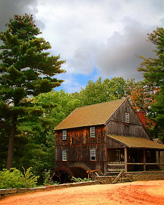
 First things first. Happy New Year everyone. I hope the year, for you, is spectacular. The first image of the new year started out with another bald sky. I'm sure every photographer has a pretty good supply of shots with bald skies. There's not a whole lot that could be done "in camera" to avoid having the sky show up as a big fat white blob in the data. The trees on either side of the building are what makes the shot. They basically have to be there to show the old store/tavern in its context of being along the road to somewhere. Eliminate the dirt road and the setting and the building could have been on a road today. Having the break in the clouds helps with the "believability" of the image. You can see that the weather is changing and the clouds may be gone shortly. Therefore, it is plausible that the area in front of the building is in sunlight while the sky has some drama. I didn't want to crop the image down to the top of the trees because it would have cramped them too much. Like having some room in front of a running animal or speeding car, boat or plane, the trees need a little "room to grow". To find out "what" was done to the shot to make the image, hit the "read more".
The first step was to create the composite. Once the shots were selected the sky was brought over into the scene. It could have gone either way, it just happened that I pulled the sky to scene rather than the scene to the sky. The sky used today had its own scene in the lower portion of the shot. I was only interested in the sky itself. If you use a sky with a lower image in it you can handle it in any of several ways. CTRL T will bring up Free Transform and the sky can be pushed or pulled to fit. Today's sky came in at the right size and had enough sky showing that it just plain fit. As it happened, the sky would be easier to work on if it were the lower layer. Holding the ALT key and double clicking the word "Background" converted the background layer to an editable layer. The sky layer was then dragged below the scene layer. The Blend Mode for the scene layer was changed to Darker Color. The lower portion of the composite ended up being a mash up of the two ground images. A Layer Mask was added to the sky layer and a black Brush was used to remove the lower area of the sky image.
The tips of the uppermost branches of the trees needed a little cleaning up because the branches weren't always the "Darker Color". On a new layer the Clone Stamp (with Sample All Layers checked) was used to pick off any orphan leaves. There weren't many, but they did annoy me. The Clone Stamp was used rather than the Healing Brush because the Healing Brush tends to get soft when doing close in work, blurring one edge to another.
After the compositing and clean up it was just a case of following my "standard" workflow. A Threshold Adjustment Layer to find black, white and grey. Curves to correct any color cast. Individual Hue/Saturation Layers to saturate the colors. Sharpening using the High Pass filter, and finally a vignette. All of the steps in my workflow have been discussed at length in older posts.


0 comments:
Post a Comment