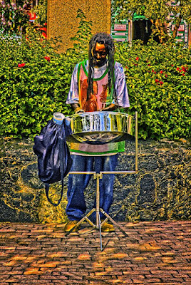
 I’m pretty sure that has to be the longest title I’ve used here on the blog, but it only sums up what was done to this image to get it where it is. It looks like I’ve been sort of stuck on a tropical theme for the past week of so, but images from the tropics lend themselves to using eye popping colors. Today’s image kept leading me forward begging for more and more work to be done on it. I probably spent more time on this image than anything I’ve done in the past six months. Before I was happy with the results a half hour had flown by. Just to list the major steps used to “develop” the image makes me laugh.
• HDR Pro used to work three hand held images to one starting image
• Use HDR Pro’s Remove Ghosts checkbox to isolate one version of the drummer
• Straighten up image using upright on the drum stand as a reference
• Use Content Aware Fill to fill in triangular areas produced by straightening
• Use HDR Toning to increase the HDR effect
• Find Black, White and 50% grey using Threshold Adjustment Layer for markers
• Neutralize any colorcast using a Curves Adjustment Layer
• Use Dodge and Burn Tools (O) to create emphasis on folds in the shirt, pants and bag
• Use the Loop Tool (L) to make a loose selection around the drummer
• Feather, then delete selection to create an outline around the drummer
• Change Blend Mode to Multiply to make a vignette close to the drummer
• Sharpen the overall image using a High Pass Filter and Overlay Blend Mode change
• Repeat vignette using a feathered Rectangular Marquee Tool selection
The one thing you don’t see that’s a deviation from my “normal workflow” is that you don’t see individual Hue/Saturation Adjustment Layers for each color. The colors seemed to “pop” enough without going through that sequence. Another thing you don’t see is the false trails that were attempted. To find out how the Dodge and Burn Tools (O) were used to create the emphasis, hit the “read more”.
The folds of the shirt, pants and bag really didn’t stand out, even after converting to a double HDR image (HDR Pro and then HDR Toning). Many photographers talk about highlight and shadow, none more so than David Ziser. He’s always stressing putting a shadow next to a highlight to create depth and dimension. Follow the link (his name) to checkout his blog. Well, what happens if there isn’t enough contrast between the highlight and the shadow? In Adobe Photoshop CS4 or CS5 the Dodge and Burn Tools (O) do a great job of preserving the color of what you’re dodging or burning and is a very effective set of tools. In today’s image the crest of each fold, the part that would catch the sunlight, was struck with the Dodge Tool. Next to each crest is an area that ends up in shadow. Each of these was marked with the Burn Tool. With these tools you select what you want to work on. You have Highlights, Mid Tones and Shadows. It’s reasonable to think that, if you want to work the bright areas, you’d use Highlights on the sun struck area. Same with going for the opposite condition. Shadows for the dark parts. The biggest “trick” to using the Dodge and Burn Tools is to lower the Exposure in the context aware options bar at the top of the screen. It’s much better (in fact it’s as close to a “must” as it comes) to build the effects rather than be “ham handed” and attack an image at 100%.
The Dodge and Burn Tool is also used on the steel drum. Vertical highlight next to vertical shadow on the outside surface and on the bottom each curve was accentuated. Don’t forget the Dodge and Burn Tool (O) when “finishing” an image.


0 comments:
Post a Comment