Wednesday, August 31, 2011

Wednesday Photoshop Q&A - How Many Times Can You Go Back & Forth Between Photoshop and Lightroom?

Today's question came from two sources.  A friend asked, basically, the question as written.  The other source is a variety of tutorials I've seen lately.  Many times I see the tutorialist (? - hey, someone has to make up new words) go through a complex operation on a RAW file and then do a Save As when they've finished.  That's actually a little bizarre and totally unnecessary.  If you start with a RAW file, one of the big tenets in using RAW files is that you can't do anything to them.  Short of burning down your computer, a RAW file is always going to be a RAW file.  My normal (constant) workflow is to pull the NEF (Nikon's RAW format) into the computer, do whatever I can in Adobe Photoshop Lightroom 3 and, if necessary skip over to Adobe Photoshop CS5 to mess with some pixels.  Anything that was done in LR3 is nondestructive.  It keeps the original file and adds a list of things that are done to it.  You can go back to As Shot today, tomorrow, next week or next year.  The RAW file remains.  Everything done to the image in LR3 is a set of instructions that are applied to the As Shot RAW file.  The reason for sending the image over to CS5 is because there's something you can't do in LR3.  If you have to do anything to the actual pixels you have to go to an image editor.  CS5 or Adobe Photoshop Elements 9 change pixels.  What they do is very destructive.  If you erase something, it's gone.  Once you close out the image you're working on, the History goes.  You can't backtrack like you can in LR3.  So, why is doing a Save As a dumb (or at least unnecessary) step?  Find out once you hit the "Read More" .
Read more!

Tuesday, August 30, 2011

Sorry About Having No Post On Monday. We Had A Bit Of Rain Over The Weekend

We'll be back on schedule tomorrow.  Hurricane Irene buzzed through over the weekend and we've had no power since Sunday morning.  Back on track tomorrow.

Thanks

Tom Read more!

Friday, August 26, 2011

Has Photoshop Met It's End?

I saw a note about a software App for the iPad the other day and had to download it to give it a shake.  It's a version 1.0, so there might be a couple of "gotchas" floating around, but I haven't seen any yet.  I figure it was a free App, so what's the worst it could?  Blow up the iPad?  (figuratively) Since it was software , either Apple or the software writer would put up a fix pretty quickly, so why not play.  Today's image comes from playing with just a couple sliders, after choosing what I wanted to work on.  It was free, I was playing and I was impressed.  Today's image was a finished image, having gone through Adobe Photoshop Lightroom 3 and a trip over to Adobe Photoshop CS5 and back, but there's always something more that can be done to an image.  In this case it was taking a fully saturated image, with real good greens and some nice, plugged in clouds and antiquing it.  Sort of takes it out of the modern day New York/Pennsylvania border area and puts in kind of a rural Appalachia locale.  Makes the sturdy barns look a little more weather beaten and the foreground building a share croppers cabin.  It just changes the mood of the image.  To find out what this magical, free, iPad App is, hit the "read more".

Read more!

Wednesday, August 24, 2011

Wednesday Photoshop Q&A - What Are Calculations All About?

There were a lot of searches bringing people to the blog this week asking various questions about Adobe Photoshop CS5 (and earlier) Calculations.  But, before we get into it, the most interesting phrasing of a search was "Smart Object rubbish".  I'm not quite sure if the searcher had some extraneous detail within a Smart Object or if he/she thought of Smart Objects as "rubbish".  In either case, the landing page she/he wound up on was one of the several posts I've done about Smart Objects.  Hope it helped.  So what are Calculations in CS5?  First let's get a handle on what it isn't.  It's not CS5's version of a spreadsheet.  Calculations were one of the "go to" methods of extracting a piece of an overall image from, typically, the background.  If you're trying to do something like separate a headshot of a woman with long hair being blown by the wind (a fan) where a new tool that'll do that much easier.  It's the Quick Selection Tool (W).  The woman's head is a solid object and the flyaway hair is usually wispy strands.  Between the Quick Selection Tool and the Refine Edge dialog box short work is made of that type of selection.  The type of selection shown in today's image is a little trickier.  There's a lot of internal structure that makes it more difficult for the Quick Selection/Refine Edge to make an accurate selection.  To find out how Calculations comes to the rescue in this situation, hit the "read more".

Read more!

Monday, August 22, 2011

The Trouble With Plug-ins In Adobe Photoshop CS5

I was watching the latest episode of Scott Kelby's talk show, "The Grid" late last week and was real interested in the topic.  Basically it was "is it alright to use plug-ins with Adobe Photoshop CS5"?  Scott's sidekick, Matt Kloskowski and guest Rich Harrington had a lively discussion about the topic, with lots of tweets coming in either defending the use of plug-ins or saying it was cheating.  Scott and Matt both said, when they're out teaching, they show the step by step "how to do it in CS5" method and then say "but here's how I really do it using plug-ins".  Let me make sure I say upfront that "I have nothing against plug-ins".  As Rich Harrington said on the show, "if they save you time and make you money they're fair game".    I absolutely agree, but there is a telling point in what Scott and Matt said.  They said they first demonstrate the straight out of the box method before going into plug-ins.  To find out why that statement is so important, hit the "read more".

Read more!

Thursday, August 18, 2011

Wednesday Photoshop Q&A - Printing From Lightroom 3

Today's question comes from several keyword searches I've seen bringing people to the blog asking about printing from Adobe Photoshop Lightroom 3.  I have to admit, since I use both Adobe Photoshop CS5 and Adobe Photoshop Lightroom 3, I print, almost exclusively, from LR3.  I find I get more control from LR3 than I do from CS5.  It may be a psychological thing and there may be no real benefit of one over the other, but I just print from LR3.  Today's image is a "Print to File" image directly out of LR3 showing the base image in a Fine Art Matt mode.   Printing in CS5 gives you one dialog box and says here are the four or five options you have.  You can click a button that'll take you out to the printer setting, but that's about it.  The print module in LR3 gives six different Panels, plus a Page Setup dialog box and another Panel with more than twenty five presets.  To go through each of the panels, hit the "read more".

Read more!

Monday, August 15, 2011

Make Your Own Poster With Adobe Photoshop CS5

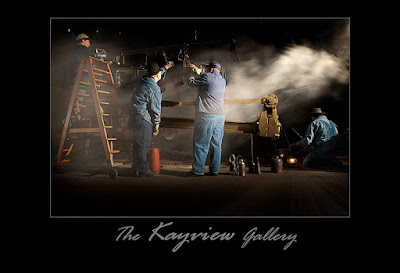
This was the summer of trains for recreational shooting for me and I figured I might like to try something a little different from the typical image.  What are you going to do when you have hundreds of images and want to play.  In the old movies you might find Mickey Rooney saying "hey gang, let's put on a show".  Well, it's a little hard to put on a show on a blog that doesn't do video.  Maybe one day...  For right now we'll have to be satisfied with doing a movie poster.  We're a couple who adds to the coffers of the movie companies several times a month.  We always checkout the posters on the way down to the auditorium showing our choice of the week.  The comedies are light and airy, the shoot 'em up blockbusters are bright and super colorful and the serious dramatic movies are very dark and make you come closer to see all the detail.  One thing they have in common is that they seem to want to give you multiple vignettes of what's going on in the film.  If there's a big name star involved he/she will be featured on the poster.  If, like in today's image, the featured player is an unknown or slight star, the face will recede into the background.  To find out how today's image was created, hit the "read more".
Read more!

Friday, August 12, 2011

Playing in Adobe Photoshop CS5

Old trains, if you ask the folks who work on them, are living, breathing beasts that require constant tweaking, touching, twiddling, poking and prodding.  Also, if you ask, they'll tell you that that's nothing new.  It's not that they're old and breaking down.  Steam trains needed the same tender (bad pun) loving care in their heyday.  I wanted to show some of that care in today's image.  The train probably doesn't look quite as bad in reality as it does in the HDR enhanced (??) version depicted today, but the color, although exaggerated, were all there.  No color has been added on the train itself, only maximized.   The one place the color was changed was on the dumpster to the left of the engine.  It was originally sort of a bright blue and grabbed the eye as soon as you looked at the shot.  A simple Hue/Saturation Adjustment Layer that changed the Hue from blue to a rusty looking brown subdued the glare of the out of place color.  I don't mean to say that was the only modification made to the image.  To learn what the other changes are and how they were done, hit the "read more".

Read more!

Wednesday, August 10, 2011

Wednesday Q&A - The "Dave Hill" Effect

The Wednesday Q&A is a response to keyword searches that bring people to The Kayview Gallery.  In the past couple of months, not a day has gone by without one (or several) entry point to the gallery being something to do with "the Dave Hill Effect".   I've done a couple of posts about it in the past and there are photographers (or finishers) who do it much better than, but one thing I've noticed is that everyone has their own spin on it.  A simple search on YouTube comes up with more than 100 videos that refer to the effect.  Looking down through the list I see "my version", "slightly modified", "similar to", "my way" and on and on.  Seems like everyone has their version of what Dave Hill has made "famous".  If you're unfamiliar with Dave's work - follow this link to his site.  You won't be disappointed and you may just catch the Dave Hill bug yourself.  To get an idea of what I did to get "my version" of the Dave Hill Effect, hit the "read more".
Read more!

Monday, August 8, 2011

No Flowers For Fred

We were out on Sunday, walking around with cameras in hand and came across an almost abandoned cemetery.  It appeared that it was semi maintained by a nearby church.  The grass, although mowed, looked like that was the only thing it had going for it.  It was patchy and burnt mostly, with a island of green every once in a while.  The stone in today's image is that of Frederick and Mary Callendar.  It was a little strange.  Mary's "dash" dates were 1865 and 1948.  Fred's were 1873 and a blank.  Now, either Fred is still alive and kicking at the ripe old age of 138, or there must be some sort of story about the blank.  Three quarters into the 19th century families were typically still fairly large.  The first thought that came to mind about Fred was that he may have been the youngest or near youngest child in the family.  He certainly outlived Mary.  He was most likely the one responsible for seeing to the headstone and proper dates of Mary's birth and death.  But what about Fred.  He was 75 when he buried Mary, a reasonable long life for the times.  Perhaps they never had children or might have lost sons in the war.  At 75, Fred might have been the last surviving of his brothers and sisters and had fallen out of contact with any nieces or nephews.  So Fred died with no one to have his rest date put on the stone and no one to put flowers by the grave.  Think of Fred and read the poem "The Dash" by Linda Ellis.

Today image is pretty straight, with no tricks or gimmicks.  It stands on its own, so today the only "read more" is to follow this link and read the poem.
Read more!

Friday, August 5, 2011

Adobe Photoshop CS5 Content Aware Fill and Pulling Color Out Of A NEF

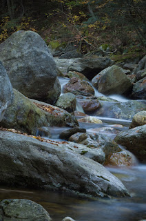
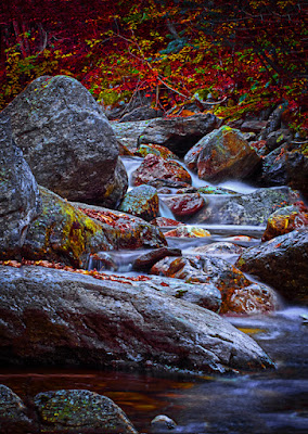
Today we have a before and after (actually, for folks who typically read English, an after and before) of a stream in Vermont.  I invite everyone to take a close at the two images. The one on the right is (hopefully obviously) the before.  There's a couple things about it.  One is that it has a different aspect ratio than the finished image, yet nothing has been cropped away.  The second thing to looked at is the angle of the water flowing through the scene.  The white falls drop in just about the center of the image was used to correct the unfortunate tilt of the camera when the shot was taken.  To find out how the image was straightened without anything being cropped away, hit the "read more".

Read more!

Wednesday, August 3, 2011

Wednesday Photoshop Q&A - Dramatic Skies

 A lot of keyword searches that have brought people to the gallery in the past month have been about skies.  Typical searches were "how to replace a bald sky", "how to create a dramatic sky", some asked about "HDR skies" and a few just wanted to be able to get better skies in their shots.  Today we have two images being used as examples.  Both can be considered "dramatic" skies, depending on the image they're paired with.  I'd guess they are pretty much mutually exclusive.  I can't see both being choices for the same picture.  We'll go through the four basic questions after the "read more".

Read more!

Monday, August 1, 2011

Isolating The Subject With Adobe Photoshop CS5

You've got three similar objects in the frame.  One has to be more dominate than the others.  Today's image shows one way to put the emphasis on the one element you want to draw the viewer's eye toward.  One way might be to fade the back two riders into either a ghost style or drain them of color.  Both have been done before.  They work, but are so obvious that it would be expected.  Today's image has something that's not as cliché as other methods and as a little harder to do effectively.  The colors have been brightened up on all three riders, but the focus has been heightened on the lead rider and toned down on the followers.  The placement of the lead rider also adds impact due to his position in the frame rather than his position on the track.  Since today's image is in a basically square format it's easy to guess that there's been some cropping.  It find out about the three things that were done to finish today's image, hit the "read more".

Read more!