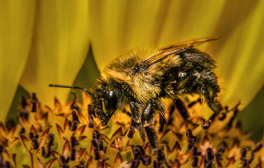
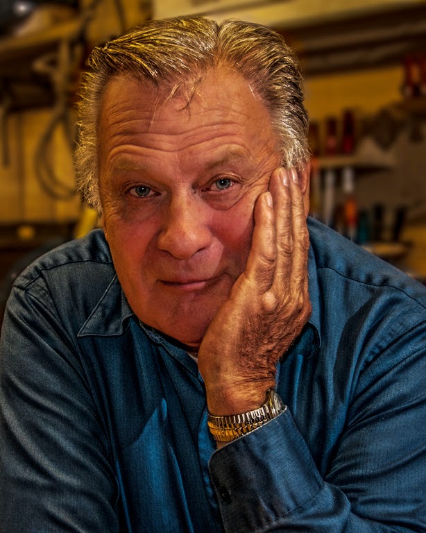
"O frabjous day! Callooh! Callay! He chortled in his joy." Or so says Lewis Carroll in Jabberwocky about happening on something that gave some measure of pleasure. What photographer hasn't smiled when he/she comes across a scene where all the pieces just fall into place. An interesting foreground, something to rest an eye on in the middle range and a non-boring distant view. Something to look at in each part of an image. Such is the case in today's image. Or is it? To find out, hit the "Read More".
Read more!
Monday, September 29, 2014
Monday, September 22, 2014
Getting Rid Of The Hot Bits
We went out shooting with some friends a couple weeks ago. One of the things I tend to do when in that type of setting is take a couple shots of the people I'm with. The fellow in today's image is a very good photog and becoming a pretty good friend. (Hi Ed.) There are two different types of lighting and, obviously, Ed wasn't shooting giant, mutant flowers. I was shooting using a Nikon 85mm Micro with a Nikon R1 close up rig attached. So, the flower, although shot in bright sunlight did have a bit of controlled lighting on it. You can see, in the lower left, that the area behind the flower is fairly dark for being shot in broad daylight. That's the beauty of using speedlights to over power the sun. To find out how I tamed the light falling on Ed, hit the "Read More".
Read more!
Read more!
Friday, September 19, 2014
Does Anyone Know What They're Talking About Anymore?
I was going to start the heading with a more sever version of an acronym for "What The Heck". Seems like no one has any idea what they're talking about concerning photography today. A friend of mine was judging a camera club photo competition the other day, so I went over to say hello and see what people had to offer. There was an "assigned subject" of macro photography. Of about fifty images, maybe three or four qualified as macro. The rest were close up at best and some were just plain snapshots of nearby things. My friend kept pointing out (correctly) that this or that image really didn't qualify as macro. At one point one of the competitors (I'm guessing he had something entered) began loudly complaining about the judge not fairly judging the quality of the image. The judge tried to explain that the first consideration was if the image was a macro shot. It wound up with one of the club's officers reading a definition of macro photography. My "rant" will continue after the "Read More".
Read more!
Read more!
Monday, September 15, 2014
Emphasizing The Details
Today's image is obviously of a white flower (and a bee). White can get blown out fairly easily and losing detail can happen in a heartbeat. Today we have wonderful tools to recover a little, some or most of what an original scene has going for it. In today's image the detail is there. It's a question of finding and exploiting it. My first attempt wound up with an image that showed every vein, and shade in each petal. Unfortunately it was just too dark overall. This second attempt version strikes a better balance. The detail is still there, just not as blatant. Rather than starting over, I switched to another "trick" to make things a little more right. The difference between the first and second methods can be found by hitting the "Read More".
The first method is one I've written about on a semi-regular basis. From Adobe Photoshop Lightroom (LR) the image was sent over to Adobe Photoshop (PS). There a couple of Curves Adjustment Layers were applied. One for the highlights and the other for the shadows. The highlights were jacked up and the shadows pushed down. The included Layer Masks were Inverted (CTRL I [eye]) to black to hide the overall effect. A small (10 pixel) relatively hard (95%) Brush (B) was then used to define each light and dark area. The Masks were then given a Gaussian Blur (Filter/Blur/Gaussian Blur) strong enough to make the individual lines disappear. Flipping the Visibility Icon (the eyeball) on and off showed what had been done.
The second round was after seeing the image on an iPad. It was just too dark. I use the iPad as a reference tool to check what others might see looking at an image. When I saw what it looked like I checked it on an HP Slate and two smart phones. Yep, too dark.
I didn't think another trip from LR to PS was necessary, so the whole "correction" was done in LR. The overall brightness was brought up about a half a stop. Then the image was enlarged to 1:1 and the visible area brought over the rear petals. The Adjustment Brush was made very small with a very large feather. The preset for Burning was set and each shaded (ya can't even call it a shadow) area darkened. This added some apparent "depth" to the petals. Anything darker seems to be deeper and anything lighter tends to look closer. By placing a "shadow" next to a highlight a flow of light and dark can be made. This gives contour to an object.
Not that it was done on today's image, but adding light and dark can add contour even when there is none. Try it. Take a solid colored screen and do the PS technique. You'll see that you can put ripples onto a flat sheet of paper.
Read more!
Monday, September 8, 2014
A Little Joel Grimes - A little Glyn Dewis In My Soup Ala Mambo #5
As it says in the Billy Joel song "John at the bar is a friend of mine". In this case the bar might be a bar of steel or aluminum. We sort of went for an environmental portrait in the shot. The head of a combined wood working and metal working shop asked me to take a few shots of some of the fellows. For most it was a case of lighting the person against a green screen and shooting the shop totally separate from the person. John was the exception. The shot is pretty straight forward. I'd set up three speedlights around his playground. The metal working portion of the shop. The plan was the same as other places, but this just popped into the viewfinder. John is what's known as a raconteur, a storyteller, a conversationalist, a wit. He was just there, holding court, with me sitting across his bench. I'd just set up three lights, gave them a quick glance and thought "we might have something here". I (and others) think it's a pretty good likeness of a fine character. The "trick" to today's image is what happened after the shutter clicked (oh good, now I sound like I'm channeling Joe McNally). To find out about the finishing of today's image, hit the "Read More".
Read more!
Read more!
Thursday, September 4, 2014
Just A Little Silliness
Most of the work on today's image was done in Adobe Photoshop Lightroom (LR). It was over Sharpened and given way too much Clarity using the Adjustment Brush to bump up the grittiness.
It then took a trip over to Adobe Photoshop CC (PS) it get even more definition using two Curves Adjustment Layers. One with the curve brought to a hyper brightness range. (About one quarter in from the right brought up about 90% up to the top of the curve.) and the other brought to a very low shadow depth. (About one quarter in from the left brought down about 90% to the bottom of the curve.) Both masks were inverted (CTRL I [eye]) to hide the effects.
Every highlight and every shadow was then traced using a white Brush (B) set to about 10 pixels width and ninety five percent hardness. Once drawn, both Masks were Blurred until the only thing left was the enhanced brightness or darkness. (about twenty to thirty percent) Flipping on and off the Layer (clicking on and off the eyeball to the left of the Layer Thumbnail) shows the changes. Too much, reduce the Blur. Too little, increase the Blur.
It was just an exercise in being a little silly with an image. Read more!
Subscribe to:
Comments (Atom)


