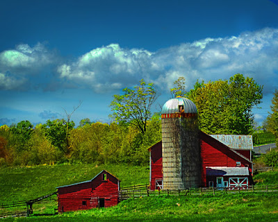
 It seems I'm getting asked more and more if one of my images is HDR (High Dynamic Range). Typically the answer is no. In a couple of posts in the past couple of weeks I took a look at the HDR craze that's going around. It is a very cool technique, it takes a little planning to do it with multiple images and it lends itself to static objects. Today's "Interesting Blog of the Day" (link) is a faux HDR effect by Adobe's Russel Brown. He has an interesting method of giving moving objects (in his primary example a Parrot) an HDR look. He goes for the illustrative look rather than the photo realistic genre, but it is a technique that should be put in your "toolbox" of methods of doing things. The image featured here today looks like it could be HDR in the photo realistic realm, but it's not. Each color has been individually adjusted to maximize it's saturation. This image has been taken a step beyond what I typically do in that there are multiple adjustment layers for "most" of the colors.
.
The "normal" workflow I go through includes having a Hue/Saturation Adjustment Layer for each available color (Red, Yellow, Green, Cyan, Blue and Magenta). The reason behind this is not so much the colors as it is the masks that go along with each adjustment layer. Today's image has two red adjustment layers (two of each color except Magenta). Again, it's the masks I'm interested in, not the color so much. The reason for two red adjustment layers is that I want to control the saturation of red in two different places. One in the barns and another in the band around the top of the silo. One way to do that with one adjustment layer is to use some shade of grey to reduce the intensity of the reds on the silo. The problem with that approach is getting the right choice of shade of grey. Since there is a mask, it is possible to select a shade and paint on the mask. If it's the wrong shade you can repaint with white (or black, depending on which way you go) and try another shade. This can be time consuming and every time you change your mind you start over. By having two separate red Hue/Saturation Layers you can focus your attention on the area of concern. Set the red of the barn and don't worry about the band on the silo. Mask it out and make another Hue/Saturation Layer to take care of that. Mask out the barns and work on the silo, etc. The nice things about this technique is the fact that you have complete control over what's going on in the individual areas. If you were to put the image away for an hour, a day, a week or whatever, you never have to begin at the beginning to make a change. If, a week from now you sold the image for use in a magazine and the editor says the barn is too bright red, you can go to the barn H/S Adjustment Layer use the Saturation slider to increase or decrease the intensity of the red in the barn without effecting the red in the silo. If the editor decided he/she needed a green barn with the red band around the silo, move the Hue slider.
.
Control is the name of the game. A subset of "control" would be flexibility. There's no point to having one "copy layer" with all your "development" decisions locked in to that layer. That would give you absolutely zero flexibility. Your only choice, if changes had to be made, would be to start over at the beginning. Not good! Today's image wound up with nineteen layers, probably thirteen or fourteen being Adjustment Layers. The image, even though it is one shot, is treated as a series of "pieces". Each piece is given the attention it needs.
.
So, in the end, break out the impportant areas within an image and work on them as though they were a complete (but still homogenous) piece of the puzzle.


0 comments:
Post a Comment