Friday, December 31, 2010

Pull My Strings, I'm Your Puppet (Warp)

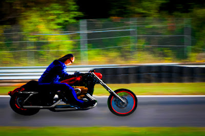
Ever wonder what a straight, staid businessman who rides a straight, staid motorcycle does on the weekends?  Well, based on today’s image, he trades in the staid motorcycle and goes cruising on his “chopper”.  Instead of sitting upright, he leans into the wind, puts on flashier colors and lets his wild side show through.  Actually, if you take a close look at the smaller image you’ll find it’s the same image.  Today’s image started life as that thumbnail on the right.  I’ve never taken a shot at using Adobe Photoshop CS5’s Puppet Warp applet, until today.  I saw the clips about what it could do in the teaser videos before CS5 was released and thought “that’s kinda neat”, but never came across a reason to do something serious with it.  I guess the holiday break was a good time to tax my brain and look at a couple features in Photoshop that aren’t exactly mainstream.  Between Wednesday’s messing with the Liquefy Filter applet and today’s playing with its Puppet Warp I’ve been able to add a couple more arrows to the quiver.  Today’s image is about Puppet Warp, but there’s several other techniques that were used to get the end result.  To find the list (and short explanations) of what was used, hit the “read more”.
Read more!

Wednesday, December 29, 2010

Following A Magazine Tutorial

I was at a newsstand the other day and saw a magazine called “Advanced Photoshop – The magazine for Photoshop Professionals”.  Notice that it does make any claim to be about Photoshop for photographers.  I thought it looked interesting and it dealt with a part of Photoshop I don’t typically play in.  The artsy part.  The part where a photographic image is just a starting point.  The cover art was of a model who had had a Manga-style treatment applied.  I thought it might be something to play with to follow the twenty step tutorial.  A couple things make a portrait “Manga style”.  The pointy chin, lots of hair, the large eyes, the flawless skin and a tiny nose and mouth.  The resemblance between the starting point of today’s image and the end result is pretty slight.  I’m not sure the subject would recognize herself.  The number of things that had to be done just to get the image to the starting point of the tutorial was fairly extensive.  You might be able to check out the tutorial for the technique on the magazine’s website http://www.advancedphotoshop.co.uk/index.php or do a Google search and, I’m sure, you can find similar versions of the same technique.  What I’ll do is explain the steps involved in getting to the starting point.  If you’d like to check out the gyrations needed, hit the “read more”.
Read more!

Tuesday, December 28, 2010

What Happens When A Ghost Shows Up In Your Image?

Actually, I’m not kidding.  Take a look at the original of today’s image (click on it to expand).  On the far left you can see a guy walking into the frame.  I was there, along a road in West Virginia, when I saw this old gas station and thought it might make an interesting image.  We stopped the car, backed up to a more advantageous spot, got out and started shooting.  For all the time I was there, no one came by.  This was such a remote oasis that, for the twenty minutes or so that I was shooting, not one car came down the road.  No one walked by, no one went up to the store, no one was anywhere near while we were happily snapping away.  Yet, there’s a man walking into the shot on one image.  Only one.  Nothing was said, no one nodded or waved or smiled, nada, zip and yet he’s there.  I have no idea how to explain it, but it does make a great case for geotagging shots.  This was taken prior to getting the GPS unit for the camera, so I don’t think I’d be able to find this place again in a hundred trips through WV.  If I did know where it was I’d be tempted to take a ride down to WV just to investigate who this fellow is.  It sounds like one of those stories where the traveler picks up a hitchhiker, drops him/her off at the destination, discovers something left behind and goes to return it only to find out the hitchhiker has been dead for X number of years.  Pretty weird, but nothing to do with today’s image.  To find out about today’s image, hit the “read more”.

Read more!

Friday, December 24, 2010

Taking It One Step Further

I got a kick out of what I did the other day with the Rectangular to Polar Filter (Filter/Distort/Polar Coordinates) so I thought I’d try another one and take it up a notch.  Rather than an orb floating in the blackness of space I thought I might “put it somewhere”.  I didn’t have any “file photo” I could tap into, so I had to find something to shoot.  The list on components that make up today’s image would be a long one.  It started out as a five shot panorama that got spun around into a rather oval polar Image of the original pano.  Some Free Transform (Ctrl T) action pushed it into a round configuration.  In order to get a perfect circle the Elliptical Marquee Tool (M) was used holding the Shift key down to constrain it to a circular configuration.  The Space Bar was added to move the selection around before committing it.  The Selection was then Inversed (Ctrl Shift I) and the outside Filled (Shift F5) with black.  The Free Transform applet was used again to turn the circle so the church wound up at a twelve o’clock position.  In order to spin it, more real estate had to be added around the circle using Canvas Size (Image/Canvas Size) with the Relative check box selected.  The result was Saved (File/Save) and the image Closed (File/Close).  It automatically saved an edited copy in Adobe Photoshop Lightroom 3.3.  The blue in the sky was adjusted in the HSL (Hue/Saturation/Luminance) Panel in the Develop Module.  The adjusted image was brought back into Adobe Photoshop CS5 for further “enhancements”.  An Inner Glow (double click on the Layer indicator in the Layers Panel) was applied to the globe to give the appearance of glass.  All that was for the globe only.  To learn what else was added to complete the image. Hit the “read more”.
Read more!

Wednesday, December 22, 2010

No HDR, Just Playing

It’s true, despite the garish colors and the heavy patterns, no HDR work was done to today’s image.  The colors were pumped up, a Divide Blend Mode was used on a Layer, filters were used to push and pull the image into an oval shape, Smart Objects were put in Layer upon Layer to keep everything editable, but no HDR.  It looks HDRish, but no HDR applet, plugin or application was used.  It started out as just another shot of Bearskin Neck on Cape Ann, Massachusetts.  The idea was to straighten it up a little (it’s a wide angle shot so it showed a little barrel distortion), adjust the colors and be done with it.  Then I got to playing.  I went down a couple rat holes and had to back out a few times, but each wrong turn took me further down a rabbit hole until I felt like Alice.  Since I already was in a “Wonderland” of my own making I decided to explore a little.  I went left, I went right, I stumbled a couple times and finally got to where I thought I was at an end.  It was pretty much an extreme posterization of the image and looked reasonable.  I thought, what’s another step I could add seeing as, by that time, I was fairly deep in the woods anyway.  Decided to play with Polar Coordinates (Filter/Distort/Polar Coordinates) to see if I could come up with something circular.  To find out how I got “the town square circle” , hit the “read more”

Read more!

Monday, December 20, 2010

Still Looking

Does anyone know this guy and his son.  I asked that question in about the forth post ever to be put up on the blog.  I’m still looking.  I found this fellow sitting just inside the performance tent at the Festival of Green Corn held at Foxwoods casino a few years ago.  After creating today’s image the intent was to give him a copy.  We couldn’t get to the pow-wow the following year and by the time the third year came along the festival was put on what has become a permanent hold.  The boy has to be in school now and I’d still enjoy giving the family a print of the image.  The day the image was taken was miserably hot.  How his makeup stayed as fresh looking as it is I have no idea.  I asked for permission to take a single shot as he sat in the entryway of the tent trying to catch a little breeze in the only shade to be had.  I’m guessing that, as he grabbed his son over and then okayed the shot that he thought having the boy included would ruin the imagery.  I’m guessing it was what made the shot for me.  They were sitting with the side of the tent as a backdrop.  Just the plain canvas as the tent, with the sun lighting it very evenly.  Later in the day, just about the time the heat had gotten to us and we were  heading for the exit we passed a vendor selling clothing and jewelry.  The buffalo skull was on display, laid out on a skin draped over a frame.  I almost past right by.  I saw the skull, didn’t even bother squatting to get a more direct angle on it and hit the shutter.  Just a record shot.  To get an idea of the “happy accident” that made today’s image possible, hit the “read more”.
Read more!

Friday, December 17, 2010

A Reprise Of An Early Image


Today’s image was one of the earlier postings on the blog.  It’s up at Acadia National Park in Maine.  If you’re looking for a vacation place in the north eastern US, to go have a good time, to commune with nature and get some really iconic shots, Acadia is a place to go.  The whole area is packed with places to get good shots.  You can find Puffins one peninsula away.  Maine has to have fifty lighthouses along the coast.  Every time you wonder down one of the fingers jutting out into the sea there’s a lighthouse at the end of the road.   There are harbors you’ve undoubtedly seen on calendars, posters, advertisements, artwork, and probably in your aunt Millie’s postcards about her trip to Maine.  Acadia has water: lakes, the ocean, a fjord and streams, carriage roads with stone bridges and wooded lanes.  Many of the shots are either right outside your car or a very short walk down a path.  Today’s image came about on the side of the road.  We were driving along Park Loop Road and came to a fork.  Left led back down into Bar Harbor and right continued on the loop road.  We sailed down the left fork, only to slam on the brakes and back up back to the fork.  Today’s image is a result of pulling the car off the road and stepping out the door.  You can’t tell if we were on the side of the road or deep along one of the many hiking trails.  It’s like that all over the island.  If you like shots of quaint little towns, Bar Harbor is great.  If you like harbors filled with pleasure boats, Southwest Harbor is nice.  If working harbors are your thing, complete with fishing boats, Northeast Harbor will beckon you.  I made a real nice pano of the golf course there.  You’ve got the “rock bound coast”, a sandy beach, thundering waves and sunrises/sunsets like you wouldn’t believe.  You can probably tell that the coast of Maine is one of our favorite places to visit.  Today’s image is so straight forward you can ignore the “read more” at the bottom of the posting.  Today’s image is a straight shot.  The colors are bumped up, the image sharpened and a vignette applied. Other than that it’s as is.  Hope you enjoy the shot and let me know what you think after you visit America’s first National Park east of the Mississippi.  It is a special place.  You might want to bounce back a few pages and checkout some of the earlier work from the Kayview Gallery.  Thanks for the read.
Read more!

Wednesday, December 15, 2010

Celebrating 250 Posts About Adobe Photoshop Today

Of the 250 posts that have appeared on this blog I believe 248 or 249 have been accompanied by an image and some explanation about what was done to it.  I thought it was about time to take a look at today’s image.  After all, it’s been the “bookends” of the banner from day one.  It’s an old shot, taken with an old camera on an outing with my granddaughter.  She’ll be entering high school in September and the image comes from a time before she had started school.  So, it’s an oldie.  It has been updated, so you might want to check out the explanation of what was done.  I’d like to thank everyone who has been reading the blog for any length of time.  I’m surprised by where in the world it’s popular, but it has been read in 85 countries and every state in the US except South Dakota, Wyoming and Alaska (where are the Palins when you need them ;-) ).  There’s only been one visitor from Delaware (guess Biden’s been busy too), but, in general there is a “following” in almost every state.  If you’ve enjoyed the postings here at “The Kayview Gallery” how about either leaving a comment or sending an email telling me what you like or asking for information on some Photoshop subject.  One of the things I’m most gratified by is the sites that refer people to the blog.  The sixth, seventh and ninth most common sites that people come from are those written by Dave Cross, Scott Kelby and David Ziser.  Joe McNally’s comes in at number thirteen.  The blog has been picked up by www.alltop.com and http://www.blogsurfer.us/ .  It’s been “tweeted” about, it’s shown up on people’s Facebook pages and has enjoyed pretty good “word of mouth” distribution.  Knowing people are reading and sending emails make continued writing a pleasure.   Now, back to today’s image.  If you’d like to know what was done to “update” the image, hit the read more.

Read more!

Monday, December 13, 2010

Adding Implied Motion With Adobe Photoshop CS5

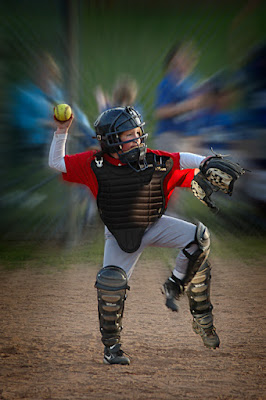
Okay, I’ll admit it.  Not too many people have two left arms and two left legs, including the subject of today’s post.  As I was shooting a girls softball game I noticed that the catcher threw the ball back to the pitcher with almost the exact same motion every time.  The same motion of the arm.  The same cock of the leg.  Everything about the delivery shows that she had been taught and had practiced throwing the ball.  Interpreting that motion in a still image has to be done with a trick.  Maybe some motion blur or duplicating the image and ratcheting it forward slightly for faux multiple exposures.   Seeing as I had a couple of shots with the same motion over the span of a couple of games it became fairly easy decide that overlaying one image over another might be an interesting way to portray movement.  The first decision was which image should be the top, or front, shot. A close examination of the face confirmed which image had the best intensity of expression.  That would be the top image.  Therefore, it was the one that needed the first mask.  The Quick Selection Tool (W) got us 90% of the way there.  The Refine Edge applet took us another six or seven percent.  To find out what got us the “last mile”, hit the “read more”.

Read more!

Friday, December 10, 2010

Four Shots To Makeup One Image

There’s been all sorts of composite images here on the Gallery, but most are made up of two images put together.  There’s been skies replaced, people either put in or taken out, a flag put in a window a bird put in a sky and all manner of things added for one reason or another.  Today’s image is make up of four distinct images.  At least two, and possibly three, images are pretty obvious.  The flower, with its stem and branches is one.  The butterfly is another and the blurred background result in two more.  The one you wouldn’t guess, unless I told you, is a shot of a cloud formation.  Its only purpose is to break up the symmetry of the blur.  One thing to say is that each element of the image was born from the camera.  Nothing was fully made in Adobe Photoshop CS5.  Getting the silhouettes wasn’t as easy as it might seem.  It wasn’t “hard”, but involved more steps than I had anticipated.  One of the biggest things that had to be dealt with is using restraint, not letting it get crazy.  I do have to give a lot of credit to Richard Gaffney.  I was “thumbing” through the images on the NAPP (National Association of Photoshop Professionals) portfolio site and came across his image of (I think) a snowy egret.  It caught my eye and I opened his portfolio.  He has a couple of silhouette images there that I thought were very good in their simplicity.  One is of a butterfly on a flower.  I said to myself, “self, you have images of flowers and images of butterflies; surely you can come up with a rift on his theme”.   I actually like Richard’s better than mine, but thought mine was “successful”.  I figured putting on the same type of framing as he did would be too much, but I do think it helps “make” the image.  That’s enough gushing about Richard’s work.  To find out how today’s image was made, hit the “read more”.

Read more!

Wednesday, December 8, 2010

Seventeen Screened Layers And One Layer Mask

There’s a reason for saving a selection as an Alpha Channel rather than making the Selection, using it and moving on.  If you haven’t saved your Selection and you’ve gone on to your next step and then need that Selection again, the only option is to remake the Selection.  What a pain.  If you have any version of Adobe Photoshop that isn’t creaking with old age, you have the ability to Save Selections as Alpha Channels.  If you use Adobe Photoshop Elements of any version you don’t have Alpha Channels available.  That’s one of the shortcomings of Elements as of yet.  If you get into compositing images or dissecting an images and adjusting individual pieces of the image it is a great benefit to be able to have a list of Selections to reactivate at will.  A whole series of choices had to be made to “make” today’s image.  One, it started out as two shots.  I was flipping through some folders in Adobe Photoshop Lightroom 3.3 and came across a visit to Mystic Seaport in southeastern Connecticut.  I noticed I had an image of the whaling ship Charles Morgan out the window of one of the shops.  I also had an image of the apothecary’s bottles and a wash basin in front of the window.  I brought that shot into the Develop Module of LR3 and cranked up the Exposure to see if there was any detail in the dark shadows on the table and along the frame of the window.  No problem.  That’s where the key to today’s tutorial comes from.  To find out more about the transformation from dark into the light, hit the “read more”.
Read more!

Monday, December 6, 2010

Not All Panoramas Are HorizontalPanos Today's image

The word panorama brings to mind shots of wide expanses and grand landscapes.  That’s not necessarily the only way to think.  Panos can go left/right, up/down and any combination of the two.  Check out the World’s largest circular panorama.  According to the site it took three days just to do the shooting.  It’s 80 GP and the detail is spectacular.  You can drill down to individuals on the streets and in the gondolas of the London Eye.  The folks behind the project took more than ten thousand shots and used a wee bit more than a PC to do the stitching.  In their thank you section they give a nod to Fujitsu for providing the hardware.  They used dual six core CPUs, 192 GB of RAM and 4 GB Graphics card.  That’s not a Super Computer, not even as big as those used to play chess against some of the Grand Masters of Chess.  It’s a work station that you might find in any number of shops along Madison Avenue.  They did put in a disclaimer and said using that setup “allowed this record breaking photo to be created a few weeks faster than would have been possible on any other available PC.”   The underlining is my addition to the quote.  They bring up two questions.  If they had access to a Super Computer like the top ranked Tianhe-1A located at the Notional Supercomputing Center in Tianjin, China they probably would have finished the pano over a coffee break.  While the Fujitsu machine used to make the pano probably doesn’t hit a GFlop (1 Billion Floating Point Operations per Second [that’s doing the mathematics for graphics]), the Tianhe-1A runs at 2,566,000 GFLops.  That’s quick.  Neither system would be available to the casual home user, but doing a four shot pano like today’s image will tax the typical (fast) home computer.  By tax I mean it will take a moment to assemble a four shot panorama.  To find out more about today’s panorama, hit the “read more”.

Read more!

Friday, December 3, 2010

A Simple Fix

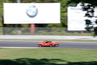
I’ve included the two components that make up the final image to demonstrate how a so-so shot can be “rescued” with a simple cut and paste.  A buddy of mine and I were up at Lime Rock Park in northwestern Connecticut back in early October.  I did a post about getting the shot right out of the camera with zero processing.  It was a discussion of shooting styles and just that two shooters can arrive at the same end and use two different routes (methods) to get there.  Today’s image goes toward the other extreme.  I liked the little red 914 Porsche, but as you can see, it had a horrendous background.  I had several shots with proper backgrounds but uninteresting action.  The cars in the “background shot” were pretty dull and really didn’t grab my eye.  The panning speed remained fairly constant from shot to shot staying in that particular spot.  The difference is shooting about fifteen degrees to the right of the car’s image was shot.  Just that much, fifteen degrees is all it takes sometimes to make the difference between a good background and something that’s messed up.  Making the composite image was pretty easy thanks to the fence running through both shots.  To find out what the details were, hit the “read more”.
Read more!

Wednesday, December 1, 2010

Testing A New Camera

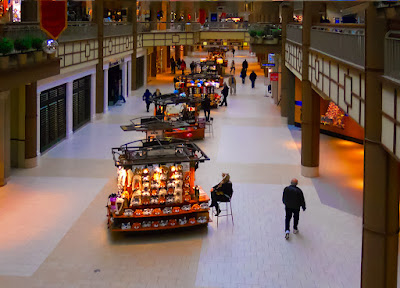
A new camera?  Ah, visions of more pixels, maybe a full frame, better glass to go with it, and more weight to lug around.  Well, actually, no, no, no, and no.  Chase Jarvis has a book out that with a title every photographer should memorize.  It’s “The Best Camera” with the subtext of “Is The One You Have With You”.  The entire book is shots Chase has taken using his iPhone, and it isn’t even the latest iPhone.  The book was published about or before the latest iteration was introduced.  Here’s a professional photographer with tons of equipment and his thought goes back to lyrics from a 1970 Crosby, Stills & Nash song.  “If you can’t be with the one you love, love the one you’re with.”  When we go out doing some casual shooting we have two camera bags, a bag of just lights, two gear bags, a selection of different size reflectors, a couple tripods and a pretty full trunk.  Just in case.  And yet, we miss a at least as many shots as we get.  We miss them because they pop up as life goes by.  As a result, we ordered a couple Nikon S3000 Point and Shoot cameras two weeks ago.  They’re tiny, they’re 12 MP, they have a 4x zoom and one of them took today’s image.  Are we going to chuck the big guns?  No!  But I’ve been popping mine in my pants pocket when I dress in the morning.  Doris bought a case and carries her camera in her pocketbook.  Does it compare to the bigger cameras?  Only in the fact that each tales pictures.  Are there things that make me nuts?  You bet!  The shutter lag is something I thought manufacturers had minimized long ago.  Not so.  With 12 MPs will I be able to make 20 x 30 prints?  So far I don’t think so.  The JPG compression appears to be too great.  There seems to be a pretty high noise level with the Auto ISO turned on.  Will I not carry it?  No, I’ll keep it in my pocket so I’ll have a better chance at getting those shots as life goes by.  To find out what “tricks” were done to today’s image in post, hit the “read more”.

Read more!

Monday, November 29, 2010

Fully Editable HDR Toning In Adobe Photoshop CS5

One of the much ballyhooed features of Adobe Photoshop CS5 is the ability to take one image and create an image showing some HDR (High Dynamic Range) attributes.  Typically, HDR Toning is a one and done technique.  It can only be done on a single layer image and once the effect has been applied it’s over.  I’m not going to take create for coming up with this “amazing” workaround for this limitation of HDR Toning.  For that I’ll differ to Dave Cross, one of the Photoshop Guys from NAPP.  His blog of November 26th brought it to my attention and in it he credits his fellow PS Guy Matt Kloskowski for coming up with the idea.  Once I saw it I couldn’t wait to give it a shot.  I opened Adobe Photoshop Lightroom 3 and picked a folder almost at random.  I was looking for something with both bold shapes and defined areas.  I chose today’s image because it’s something that is a fairly drab record shot and thought it could use some HDR Toning.  Funny thing is that it was shot as a bracketed group with the idea that it might be a candidate for running through CS5’s HDR Pro.  Cross/Kloskowski’s method of making HDR Toning flexible is one of those “why didn’t I think of that” type of techniques.  It’s an arrow every pixel pusher should have in his/her quiver.  To find out about my take on the subject, hit the “read more”.
Read more!

Friday, November 26, 2010

You Don't Have To Go Far In New England

I can’t even think about how many times we’ve jumped in the car, driven a couple hundred miles and not snapped the shutter once.  It used to be just a fun afternoon, a lark, some exploration, an excuse to get out of the house.  Now days there are other considerations.  The price of gas, the ecological effect, the waste of time and, with some folks, the social stigma of not being environmentally friendly.  On the other hand, the travel for today’s image was a walk down to the end of the driveway.  That’s the view we’d had since moving here more than thirty five years ago.  The big difference between then and now is the size of the trees.  We used to be able to see that hillside just barely visible through the trees.  The road we live on used to be the rail bed for the Shepaug Railroad.  The tracks began in the middle of our little town, go up the center of Main Street, down our road, over a trestle and out into the woods heading north for something over thirty miles.  One of these days, probably in spring, I’m going to walk the length and document what the route looks like today.  It’s people’s backyards, it gets lost for stretches and meanders through a couple of parks.  Most people don’t even know why there a berm cutting across their land.  Hopefully I can shed a little light (bad pun) on what is a part of the region’s history.  There’s a simple explanation about how today’s image was made.  It find out what it is, hit the “read more”.
Read more!

Wednesday, November 24, 2010

Shhhh, Don't Tell Anyone This Is A Composite.

Ya know, you could stand in front of a scene like today’s image and snap away and have a very nice shot of a marina.  You’d have to be at a different marina, ‘cause the sign and the docks don’t line up at Deep River Landing the way it appears in the shot.  The sign is over by the entrance, a couple hundred yards to the right of the mooring area and the line of sight is such that you could get a lovely shot of the maintenance buildings just inside the gate.  The basic idea behind doing a convincing composite is to make it look like it’s not a composite.  It would be the photographic equivalent of trompe l’oeil in the art world.  Trompe l’oeil is a French term meaning “deceive the eye”.  There are all sorts of examples of the technique that can be found by doing a “Google” search.  Some are very clever, totally impossible scenes, some are so realistic you think the artwork is actually three dimensional and some just make you ask yourself the question “is that real?”  The people running Deep River Landing could take today’s image and put it on their business cards.  People would think it was a great spot and possibly visit.  They’d be scratching their heads when they arrived and find things not as they appeared, but that’s what might be called poetic license rather than an attempt at deception.  There’s more than meets the eye in what had to be done to create today’s image.  To find out what, hit the “read more”.
Read more!

Monday, November 22, 2010

Back And Forth Between CS5 And LR3

It’s often nice to get out with some friends and do a little shooting.  We had a chance to do that a while back and today’s image of a friend is one of the results.  One of the things I notice every time we do a group shoot is that no two photographers come back with the same shots.  A few of the people out shooting that day were taking shots from across the street in the same general direction the women in the image was aiming at.  She was the only person to cross the road and get a unique perspective on whatever was up there.  The reasoning behind today’s image is that, just like a group of photographers out shooting bounce back and forth between views of a subject, Adobe Photoshop CS5 and Adobe Photoshop Lightroom 3 bounce back and forth between what they’re good at.  I couldn’t have “finished” today’s image “easily” by using only one program or the other.  Today’s image started out in LR3, bounced other to CS5 and then back to LR3.  The seamlessness of going to and fro is so clear that even if an image needed only one little tweak in CS5 it would be worth it to me to make the jump.  Lately, three fellow photographers have asked for my advice about getting LR3.  Two use CS5 and one uses Adobe Photoshop Elements 9.  One does a combination of “fine art”, editorial and product shots.  The other two do fine art and a little wedding photography.  So, we actually have three different photographers, each with a different set of needs.  To find out what my recommendations are to each friend, hit the “read more”.
Read more!

Friday, November 19, 2010

A New Sharpening Technique in Adobe Photoshop CS5

There has to be at least a half dozen generally accepted methods of sharpening between Adobe Photoshop CS5 and Adobe Photoshop Lightroom 3.  There’s the “ordinary” way, using the Unsharp Mask (Filter/Sharpen/Unsharp Mask), but it doesn’t provide a lot of control over what’s happening to the image.  You can go pretty exotic and switch to LAB Mode (Image/Mode/LAB Mode) and sharpen only the Luminance Channel  (The L in LAB).  You can use a High Pass Filter technique (Filter/Other/High Pass) and that’ll provide more control over the finished sharpening.  One thing about every sharpening technique either already mentioned or that will be mentioned should be done on a Smart Object (Filter/Convert for Smart Filters or right click on the Layer icon and select Convert to Smart Object. – Same thing either way.)  If you use Lightroom 3 you can crank up the Sharpening in the Detail Panel and control any Noise in the same panel.  Very slick.  One of the newest sharpening strategies I’ve seen is using the Find Edge Filter (Filter/Stylize/Find Edges) and changing the Blend Mode to CS5’s new Divide Blend Mode.  That’s kind of interesting, since the edges are what you want to sharpen anyway.  To find out what one step was added to the Find Edges sharpening technique to give the #D like quality of today’s image, hit the “read more”.
Read more!

Wednesday, November 17, 2010

Panos The Wrong Way

I can’t imagine a whole lot more being wrong with the way a panorama can be made than what went into today’s image.  It started in the camera and continued from there.  Every issue was my fault, some by commission and others by omission.  The final image came out alright, but it was a lot more work than it had to be.  We live, we learn.  The original sequence of shots was taken a couple cameras ago.  Which is another way to say I wasn’t doing photography at the level I’m at today.  I still have a lot to learn, buut I have learned a couple things since the shots for this pano’s time.  I listen to my confessions about the errors in today’s image, hit the “read more”.
Read more!

Monday, November 15, 2010

Along A Foggy Stream

Early morning photography isn’t quite as convenient as it was a couple weeks ago.  Daylight Saving Time is gone and we’re back to “Standard Time”.  Seeing as the saying is “Spring Ahead, Fall Back” dawn now comes an hour earlier around here.  That means, instead of getting up at 5:00 AM to get in place for sunrise at about 7:30 we have a couple of choices to make.  It’s either get up at 4:30 or pick someplace a lot closer.  With the mornings being crisp and cool, any time we get around water we’ll have some fog.  Fog is great for making a stream moody and sometimes a little spooky.  Before dawn the time still belongs to the animals, so every once in a while you meet something rather than someone on the trails.  That was the case on the trail to today’s image.  I’m not really sure what might have been my company, but it grunted and broke twigs as it moved.  I might have been up wind of my companion and he/she might have gotten a sniff of me and chose to avoid an encounter, but whatever the reason I’ll glad for the way it worked out.  I really didn’t want my last image to be of a large animal in pursuit of my backside.  There’s an old adage about how fast do you have to run to outrun a bear?  One step faster than the person next to you.  Only problem is not having someone with you.  Once you’ve thrown your tripod, camera bag and camera your pretty much toast.  So, my thanks to whatever was walking the trail the other morning.  Today’s image was all about getting some depth to the scene.  Fog and mist suck up light and cause a scene to get very soft very quick.  To find out how depth was introduced into today’s image, hit the “read more”.
Read more!

Friday, November 12, 2010

This Image Needed A Partial Layer Mask

At first glance I knew the “town” portion of the image would only need a mask to be able to sharpen the lower third.  The town and the water would definitely benefit from some sharpening, but I think puffy clouds in the sky area of most images suffer when sharpened.  They get an artificial, edgy look that just doesn’t sit well in my eye.  So, mask number one that I knew would be needed was all the sky.  Starting to work on the foreground showed another area that would get a boost from being “developed” different from the town.  The island on the left was just plain dull.  Everything was in shadow and had no spark, no life, no drama.  The island had to be brought closer to having a range similar to the town.  Therefore it needed some localized work before the entire scene could be worked.  After mulling it over for a couple of minutes I decided to go “old school” on the island mask.  The fine details of the bare tree needed to be there to give more weight to the firs.  To get an explanation of how the Masks were made, hit the “read more”.

Read more!

Thursday, November 11, 2010

Reprise and Explanation

Like all blogs, this one has access to some information about visitors.  Nothing personal, but things like where a visitor is from, how many pages were viewed by all the people from a particular city and how long the person spent on the blog.  No names, IP addresses or other identifying information is ever given.  We use Google Analytics and check the numbers every day to see if a post was popular and if interest in The Kayview Gallery is growing.  Thankfully it is.  One of the things I notice is that readers seem to check out two pages the most, occasionally three and sometimes a whopping four pages.  The two page readers are easy to figure out.  They “hit the “read more”” and check out the tutorial portion of the day’s post.  The blog has seven posts per page and more than thirty pages.  It winds up being more than 230 individual posts.  So, obviously, most people have never seen the earlier posts.  Today’s main image comes from post number four, back on April 30 2009. Only the earliest and most diehard followers have seen today’s image.  The original post (here) only had the finished “cartoon” style image, not the source.  Today you get a look at the source to see where it started and what it became.  To find out how it got from the source to the final, hit the “read more”.

Read more!

Monday, November 8, 2010

And Now, For Something Totally Different...

If you’re a frequent reader of The Kayview Gallery you know that most of the images have the color saturation maxed out.  Big, bright, bold colors that make use of Adobe Photoshop CS5’s Hue/Saturation Adjustment Layers in a reasonably unique way  At least I haven’t done the way we do it being used by others.  Making a separate Adjustment Layer for each of the possible colors.  (Red, Yellow, Green, Cyan, Blue , and Magenta.)  The reason for using the ALs in this manner is not so each color can be adjusted independently, but to have a mask available for each color.  One part of an image might need a high amount of blue saturation, while other parts go neon with the same amount.  Having a mask specifically for the blue adjustment gives the ability to take away the neon blue areas.  If the blues in other areas need a different amount of saturation additional blue Adjustment Layers can be added.  This gives better control over the results.  Better than using shades of gray on a single mask.  Several images here on the gallery have had multiple Hue/Saturation Adjustment layers for one or more colors.  Today’s image takes the control of the colors through the use of the Hue/Saturation Adjustment Layers in the opposite direction.  Today’s image bounced back and forth between Adobe Photoshop CS5 and Adobe Photoshop Lightroom 3 several times.  Some things are better done in CS5 and others in LR3.  To find out what was done where, hit the “read more”.
Read more!

Friday, November 5, 2010

Just Being Silly With Adobe Photoshop CS5 And Clipping Masks

Today’s image has to be considered one of the sillier things done lately at the gallery.  It started off with just flipping through a few folders of images looking for a specific shot.  I came across the folder with images of a carnival from back in the summer.  I was wondering how far I could push any of the shots and picked the full shot that became today’s image.  It wasn’t that much more than what you see, but enough to give me some ideas of what to do to keep my fingers nimble and go to places in Adobe Photoshop CS5 that I typically don’t wander into.  The shot wasn’t taken straight on as the image appears.  It was shot from “stage left”.  There are a couple of obvious visual cues that you probably can spot that explains step two.  The trickier part is what was step two.  With the shot taken from the left you can guess that there is an angular component to the image.  A little Free Transform (CRTL T) and a right click to bring up the options brings up (among others) Skew and Distort.  Guides were brought down from the top of the screen (with the Rulers turned on, just drag from the ruler down) to the left most top and bottom points of the left ironwork grills.  A little pushing and pulling resulted in a squared up walkway.  The left side was a little funky, so the right half of the scene was copied and put on a new Layer.  The Background Layer was then discarded.  The canvas area was doubled using Image/Canvas Size and a percentage value of 100% being added to the left.  The half with the image was selected using the Rectangular Marquee Tool (M) and copied to its own Layer.  Switching to the Move Tool (V) and using the left Cursor Key with the Shift Key held down moved the copied image to the empty half of the Canvas.  Again using the Free Transform (CTRL T) the Flip Horizontal option reversed the copy to make it face the original.  A little nudging with the cursor keys completed the match of the two halves.  To follow the other silliness going on with today’s image, hit the “read more”.

Read more!

Wednesday, November 3, 2010

Use Adobe Photoshop CS5 HDR Toning For Realism

You’ve undoubtedly seen the wild end of HDR.  Even some images here at the gallery.  Every once in a while I feel the need to go crazy and play with the fringe of HDR.  I think some come out interesting and other make it look like I’m on an acid trip (have never done that).  That “tip of the iceberg” of HDR is a fun place to play, but can’t be thought of as the serious side of HDR’s use.  Today’s image resides on the calmer side of the method.  It comes from one of the all time best places to get river/stream photography.  Kelley Stand Road in Vermont.  It’s in southern Vermont, only about 25 north of the Massachusetts border on Route 7 in Arlington.  I’d love to try getting some winter shots but the road is closed to vehicles during the cold months.  If you take a trip along the Kelley Stand when it’s open you’ll know why.  I may have to find a snowmobile and some hand warmers.  It’s something to think about.  Hmmm.  I started playing with today’s image with the thought of going to the dark side of HDR, but I’ve already gone nuts on another shot of KSR.  Plus it was coming out really bad.  The alternate was to try for a realistic image I couldn’t get with my “normal” processing techniques.  It was a bit of a fight, with green gremlins creeping in.  To find out how the gremlins were kept at bay, hit the “read more”.
Read more!

Monday, November 1, 2010

Sharing The View With A Painter, So Why Not Bend Some Pixels

As we go running around shooting the falls colors and trying to get the definitive image of the season, it occurs to me that we don’t run into too many others trying to do the same thing.  Unless we specifically go out with a group, we seem to have the run of whatever place we’re in to shoot ‘til our hearts content.  It seems a little bizarre.  We go to the prime places.  We go at the right times and dates.  We wait until the perfect clouds roll by or the shadows get to the ideal lengths, but still we shoot alone.  Just the two of us.  Any other type of thing we decide worthy of checking out and we’re always in the middle of throngs of people.  We hear about a performer doing something in some out of the way venue and it’s packed.  We read about some minor event happening at a park or alleyway or field and it’s jammed.  Is it just because someone didn’t put a notice in the paper or an announcement on the radio that photographers don’t show up at very public, very scenic, very photogenic spots on the ideal day at the ideal time?  All we have to do is look out the door and we get an idea if the day is going to be one of those special days when photographic magic happens, yet we don’t see masses of people jostling to get their tripod set into the worn Kodak picture moment holes.  The fellow in today’s image knows what I’m talking about.  We spotted him sitting by the side of a tarn at the top of a small mountain (east coast mountain, not a real mountain) and he was even just fifteen feet off the road.  A road with wide shoulders to accommodate plenty of cars whose drivers had looked over the scene and thought “I have to stop to take in this beautiful view”.   Yet, he sat in solitude.  At least until we showed up.  I asked if I could take a couple of pictures and he didn’t have a problem unless I was going to show his face.  No sweat, I was interested in the scene more than in the person.  To find out what’s become of this scene (photographically), hit the “read more”.
Read more!

Friday, October 29, 2010

Falls Last Gasp In Connecticut

It just keeps going on and on.  Yesterday was another spectacular autumn day in Connecticut.  Same spots are just maintaining their leaves and giving a show that ranks right up there with some of the best leave peeping seasons in recent memory.  Today’s image was shot yesterday, just after the sun had gone down past the hill to the west.  It’s strictly lit by the afterglow of the gathering twilight.  It was shot as a part of a nine shot sequence with the idea of playing with Adobe Photoshop CS5’s HDR Pro.  Nine shots were done at .3 stop intervals, so it gave me everything from -1.3 to +1.3 off the camera’s metered exposure.  Kind of minimal brackets for attempting any HDR.  But, it does give me another option by doing it this way.  If one exposure is just too good to pass up, I end up with a great start point to develop a straight image.  That’s what we have today.  I could have expanded the range a bit by changing the bracket from .3 stops per click to .5 stops per click.  This option is available in the menus of a Nikon D300.  So, it is possible to shoot a nine shot sequence that goes two up and two down.  Today’s image has to be one of the straightest shots ever to appear on the gallery.  To find out just how straight, hot the “read more”.
Read more!

Wednesday, October 27, 2010

Sometimes The On Camera Flash Works

Everyone says your little popup flash on your camera is about the most useless piece of gear.  In general, when used at full tilt with it firing at the start of the exposure, “they” are typically right.  There are ways to improve the results of that ridiculous point source, on axis blast of light.  Today’s image is an example of what “could be” the result of a couple of simple adjustments done in camera and some new finishing techniques available in Adobe Photoshop CS5.  The pup with the intent look on his face was sitting in the front seat of a car in Litchfield Connecticut last Saturday.  The window was open and the day was a beautiful, warm (not hot) fall afternoon.  He had his head just above the sill of the window and appeared to be looked for his master.  We had been walking around town with a couple of friends, shooting general interest shots and waiting for the sun to go down and the moon to rise.  As it happened, the two conditions were just about in sync with each other.  Sunset was a couple of minutes before 6:00 PM and moonrise was about 6:03 PM.  We spotted this little guy being as patient as could be as we were killing some time.  To get an idea what the camera settings were and what the “new” finishing technique is, hit the “read more”.
Read more!

Monday, October 25, 2010

Make Things Easy With Adobe Photoshop CS5

Some things are a little tough to do in any photo editing application.  Some things just appear to be hard to do.  Today’s image is one of the later.  It starts out as two separate images and ends up as a composite.  It would be easy to add the moon to the image of the church in any of several different ways.  You could use the Erase Tool (E) [yuck].  You could make a Mask and Mask out the moon.  Readers can probably come up with another twelve methods of getting the image of the moon onto the main image.  The rub comes when you try to put the moon into the image “and” behind the branches of the tree.  I can’t imagine the Eraser Tool (E) being successful.  I could go along with using a mask, but you’d probably be stuck with the moon in one spot.  It you decided you wanted to move the moon you’d unlock the Mask from the image Layer and have limited ability to shift the moon.  There is a method that’s incredibly easy that’s overlooked (or unknown) by 99% of Photoshop users.  It’s not available in Adobe Photoshop Elements of any version.  If you’re interested in finding out about this little used secret weapon, hit the “read more”.
Read more!

Friday, October 22, 2010

This Weekend Is The Max For Autumn Color Around Here

The calendar says it, the weather forecasters proclaim it as though it was the first day, the nip is in the air and the photographers are ready.  Today’s image comes from last week’s ride to northwestern Connecticut and Kent Falls State Park.  Today’s image is of a single tree along the walk up to the base of the falls.  As I crossed the covered foot bridge and started up the path, this tree wasn’t even on the radar.  Half way to the falls it emerged out of the early morning mist.  I didn’t have a choice, I had to stop and shoot the tree before the gathering light ruined the mood.  I plunked down the tripod and shot a couple dozen frames.  In order to get the optimum exposure I bracketed the exposure at one stop steps, two stops in either direction of what the camera thought was correct.  This also gives me the potential to do some Adobe Photoshop CS5 HDR Pro magic if the spirit strikes me.  Today’s image is one exposure, but it did benefit from a slight bump from CS5’s HDR Toning.  The dark area surrounding the tree is actually the mountainside (a Connecticut level “mountain”, not a real mountain) behind.  A daylight shot, with the fog burned off, would have revealed the hillside with no problem.  As it was, the F Stop really didn’t matter.  F 22 wouldn’t have provided more detail in the background.  Everything was sucked up by the mist.  If you’d like to know the surprising details of the finishing of today’s image, hit the “read more”.
Read more!