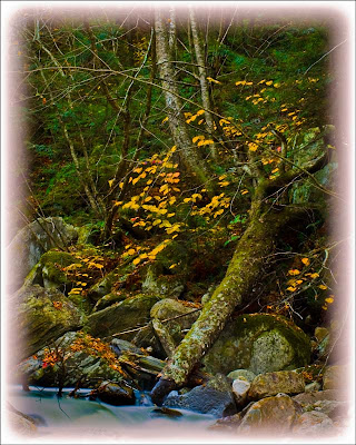
 Sometimes you want to set a mood with an image. That's the case with today's image. It has a couple things working for it. It's toned down to show the darkness of the forest in the early morning light for one. Another is the use of the reverse vignette. Not all vignettes have to be from a lighter center to a darker edge. Here we see the image fading off. The branches of some of the trees can be seen going out into the softening edge. There a few things to consider when you have this sort of image. Just the same as a properly produced music album (CD) has an ebb and flow to it, so should a gallery show. If every image is bright and cheery there becomes a sameness and the show quickly grows boring. Again, like a music album, you want to have a break in what's expected. A rock band with a ballad or two space out within the selections gets more attention than "just another" rock song. Broadway shows are the same. Take "Les Miz" as an example. A pretty sober story about redemption where the hero dies in the end. In both acts you find light moments with the innkeeper and his wife. They bring the mood up before going on with the morality play. The same thing, like the music album or the Broadway show, holds true for a gallery show. Today's image was the lead image as people entered the building. Further along they came across many of the images you can find here on the blog. Scattered about were images of total whimsy, meant to put a smile on the face of the viewer. What I consider to be the "best of show" image wasn't the last image in the walk through. It came just a couple positions before the end. If you'd like to find out more about how today's image was finished, hit the "read more".
This is yet another shot of the stream on Kelly Stand Road in lower Vermont. After shooting the heck out of the stream we looked around for other scenes. You can still see a hint of the stream in the extreme bottom of the shot.
The body of the image was handled much the same as many of the images here at the gallery and the techniques have been explained to death in past posts. The spotlight on this image is the method of getting the fade in the vignette. It's pretty obvious that this has a square vignette. Rather than using a copy of the image to build the vignette this has a white background layer. The shot was made just a little bit smaller than the full frame of the image, so the white layer was visible behind. The reverse vignette is actually an Outer Glow Layer Style (double click on the colored area of the layer to bring up the layer styles dialog box). Playing with the Size and Spread of the glow produced the fade. Changing the Blend Mode to Overlay allowed the detail to show up in the vignette.


0 comments:
Post a Comment