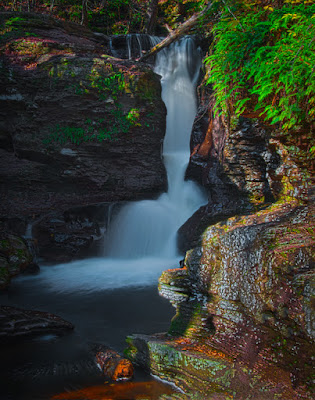
 Today's image is typical of what may be found on the
galleries first photo tour. I've been
asked by several people if I'd lead some sort of "domestic safari "
for the purpose of shooting "something". After looking at what's available and when to
go and where to shoot, we're ready to set up a trip. It's not meant to be a money making
enterprise. I'll just be the person
coordinating a few like minded photographers, making the housing arrangements,
figuring out a little Saturday night entertainment, setting up whatever needs
to be set up, and generally doing the detail work to have a good time. The place for the escapade is going to be Ricketts
Glen State Park and the Endless Mountains in Pennsylvania, USA. Today's image comes from the park, which has
twenty two named waterfalls. The trip
will be a two night (Friday and Saturday nights), three day shoot with
discussion and instruction about Adobe Photoshop and Adobe Photoshop Lightroom
3. We hope to have a couple instructors
and a panel for a round table discussion of photographic and Photoshop
techniques. Read future posts to find
for more about the trip. To learn more
about today's image, hit the "Read More".
Today's image is a seven shot HDR. It would almost impossible to get the tonal
range in one image. Extraneous flotsam
and jetsam has been removed using Adobe Photoshop CS5's Content Aware
Fill. Several twig sized branches were
in the lower right hand corner. It would
have been nice to remove them in the wild, before taking the shot, but that
would have involved a jump of about six feet over the outlet of the falls to a
perch about nine inches wide. Hey,
that's what they made CAF for, right?
The rock on the right was still too hot even with the HDR
treatment. It wasn't throw it away bad,
but bad enough to use a little work in Adobe Photoshop Lightroom 3. The Adjustment Brush was the tool of choice
for this work. The way I work with the
Adjustment Tools (Gradient and Brush) is to put the Exposure value down at
maximum underexposure for anything light and at maximum overexposure for things
that are dark and then work the area.
This lets me see what I'm doing without needing to go back to the
"Pin" repeatedly to see what I'm affecting. Once I've defined the area I'll double click
on the word Exposure, returning the value to zero. Then I'll highlight the value (0.00 for
Exposure, 0 for everything else) and move the value up or down using Shift and
the Arrow Keys. This will bring the
values up or down ten points at a time rather than one point. In the lower right corner the Brightness was
brought down and the Contrast, Clarity and Sharpness brought up. Everything is done "to taste", so
the exact numbers don't mean much.
On the left, the protruding rock got almost the opposite
treatment. Brightness up and the other
three up also.
The water wound up being pretty blue, so a Hue/Saturation
Adjustment Layer was used. The
individual color was targeted by first selecting what appeared to be the
closest color. In this case it was
Cyan. Then the Eye Dropper Tool in the
H/S Adjustment Layer was picked and the water color sampled. Then the Plus Symbol Eye Dropper was used to
refine the color selection. Once that
was done the Saturation was brought down until the water appeared more
white. Not completely white, but
something more realistic.
The Hue/Saturation Adjustment Layers were then used to
increase the Red, Yellow and Green colors.
As usual (for me) each color had a separate Layer to allow for
individual masks.
One last thing done to the water was back in LR3. The Adjustment Brush was used to
"paint" the water (same technique as detailed above). The Clarity and Sharpness of the water was
then brought up.
Remember, if you're interested in the Ricketts Glen trip,
let me know. Leave a comment, send me an
email or talk to me in person.


0 comments:
Post a Comment