 Oh boy, have I been getting questions about why I use
individual (Red, Yellow, Green, Cyan, Blue, and Magenta) Hue/Saturation Adjustment
Layer in Adobe Photoshop CS5. The gist
of the questions is why I'd bother using multiple H/S Adjustment Layers when it
would be easier to scroll down through the colors on one Layer. The answer is actually pretty simple. I really don't care about the colors of the
Adjustment Layers, I want the Layer Masks.
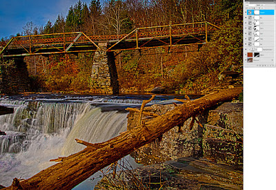
Do a double click on today's image to get to a larger view of the
image. Don't worry about the shot too
much. Look over to the right and
checkout the Layers Panel I have attached.
In the Panel, look at the Layer Masks that go along with the individual
colors of the Hue/Saturation Adjustment Layers.
You can see that each color (other than the Red) has a unique Mask. There's even two Cyan H/S Adjustment Layers,
each with a unique Mask. The Masks are
the key to the question of why I use the multiple Layers rather than adjusting
each color on one Layer. A secondary
explanation is needed for the two Cyan Layers.
I often see tutorials where the instructor uses either different shade
of gray with the brush Opacity at 100% or they'll bring the Brush Opacity down
to 15%- 20% and build up the masking.
The problem I see with that technique is that if you go too far with the
buildup it's almost impossible to paint over the area accurately. By using multiple copies of the same colored
H/S Adjustment Layer the area can be fine tuned and the amount of masking can
be held. So, the simple explanation of
why I use multiple Hue/Saturation Adjustment Layers is to have more (better)
control over what I'm getting more colors.
To find out how that effected today's image, hit the "Read
More".
The first thing I should explain is "Layer
1". It's the totally brown Layer
above the Background Layer. The major
fallen tree in the lower right was pretty gray.
Almost to the point where it looked like I removed the color saturation
from it. In order to blend into the rest
of the scene it "needed" a touch of color. I used the Quick Selection Tool (W) to select
the tree. Right clicking and picking
Save Selection gave me an Alpha Channel Mask of the tree. If you're using Adobe Photoshop Elements 9 or
10 and can't fine the Alpha Channels don't worry about it. You have Alpha Channels, you just can't see
them. Just go to Selection/Save
Selection and you've got an Alpha Channel.
To get it back, rather than doing a CTRL Click on the Alpha Channel
Thumbnail you'd just use Selection/Load Selection. Same thing, exactly.
Once the Layer Mask is applied the tree will look like
something out of a child's cartoon book.
The Blend Mode of the Layer needs to be changed to Color. It'll still look pretty funky, but bring the
Layer's Opacity down (use Shift/Down Arrow) until it looks good to you. If finer adjustment is needed, apply a
Brightness/Contrast Adjustment to bring the Brightness up or down to taste. To limit the change to the tree a Clipping
Mask was made by holding down the ALT Key while it hovers on the line between
the Layer and the Adjustment Layer.
Once the Layer Panel looked like the one shown today all
Layers were selected (top Layer is already selected. Shift Click on the bottom Layer to select
all). With the entire stack selected,
Right Click on any Layer and pick Convert to Smart Object. This collapses all the Layers into one Smart
Object. The image was then "finished"
in a "normal" manner.


0 comments:
Post a Comment