Wednesday, June 27, 2012

A Little Trick Scott Kelby Taught Me Using Adobe Photoshop Curves

Okay, so Scott Kelby didn't single me out and teach me this technique.  I saw him discuss it on one of his Photoshop based shows.  Probably on Photoshop User TV.  His demonstration involved using Curves to sculpt a model's face.  I watched, tucked in away in the back of my mind and thought I might be able to use it for other "stuff".

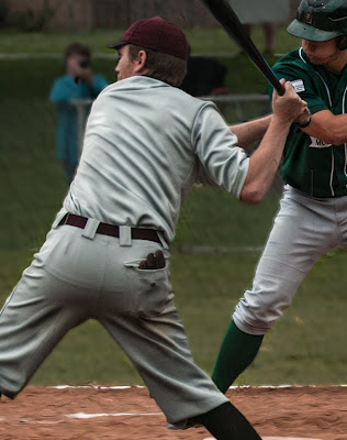
Today's image is an example of  an "other stuff" application.  Scott showed that by using Curves to increase the depth of the shadows and increase the heights of the highlights you could use the tones inherent in the image to add drama.  I took it and applied it to the folds and creases of the batter's shirt and pants.

It's really quite simple (and pretty foolproof).  Set up two Curves Adjustments Layers.  Tag one as Shadows and the other Highlights.  In the Shadows Curve bring the upper right end of the linear Curve (straight line) to the left until you just touch the edge of wherever the tone Curve ends.  Eyeball a point on the Curve about three quarters of the way "up" the straight line.  Drag it up so the Curve is now steep and almost to the top of the box.  Invert the Mask that goes with the Adjustment Layer.  The Mask should now be black.

Do just the opposite to the curve tagged as Highlights.  Bring the right side of the linear Curve to the tip of wherever the tone Curve ends.  About one quarter in from the left side of the Curve, drag the Curve down to brighten the image.  Invert that Mask to black.

Make the Foreground color White.  Select the Brush Tool (B).  Make it hard, at least 95% hard.  Make it small.  Depending on the resolution of the image, somewhere around 3 to 6.

Click on the Mask named Shadows.  Everywhere you see a shadow line, paint a line all the way down the shadow.  Click on the Mask named Highlights.  Everywhere  you see a highlight, paint a line all the way down the highlight.  As a hint, where's a highlight next to every shadow.  You'll see that, even though you painted the shadow with a white paint brush, every shadow becomes darker.  Not only does it become darker, but it gets darker by different amounts.  In the areas with lighter shadows you'll see "less dark" lines.  In the areas of darker shadows you'll see "darker" lines.  Same (just the opposite) goes for the highlights.  (One hint, highlights and shadows never cross.  They should be parallel to each other.)

Now you'll have all these lines all over your image.  In Adobe Photoshop CS6 you have a Properties dialog box that goes along with each Adjustment Layer.  Open it.  Move the Feather Slider to the right.  Keep an eye on your Shadow (or Highlights) and watch them spread out and become soft.  You can go as far as you feel is necessary.  At some point it will become too soft and you won't see the effect.

The idea is to emphasize the differences by putting a highlight next to a shadow.  It becomes rather Rockwellesque (Norman Rockwell like) and makes the details jump out of the frame.
Read more!

Monday, June 25, 2012

125 Years Of Baseball Thanks to Adobe Photoshop "Auto Align Layers"


Today's "trick" is pretty easy.  I went to two different baseball games a week or so ago.  One was a "vintage" game, played with rules from 1887 and the other was a game for the NECBL (New England Collegiate Baseball League). 

I stood in about the same spot for a portion of each game, shooting a combination of batter, catcher and umpire.  When I noticed the similarity between the shots of each game I knew I had to play.

Adobe Photoshop CS6's Auto Align Layers made the basic job easy.  From Adobe Photoshop Lightroom 4, Photo/Edit in/Load As Layers in Photoshop was used to get the two images over to CS6.  The next step was to select both Layers in the Layers Panel.  (Choose one and Shift Click the other Layer.)   Then it's a simple matter of using Edit/Auto-Align Layers to get everything squared up.

Once both Layers are aligned, put a Layer Mask on the uppermost Layer.  Then grab the Quick Selection Tool (W).  Click and hold while running the QST down the players of the top Layer.  Clean up the Selections in any way you're comfortable.  The most accurate method (IMHO) is using the Refine Selection dialog box.  What I did was Save Selection for each player on the top Layer.  Once the Selections are made, highlight the Layer Mask and add each selection to the Mask.  Invert the Mask if necessary to have the players show through.

Match up the colors in various parts of the scene and you're done (if you want to be).  I did one more step and took out all the fence poles and posts using Content Aware Fill.  Just as a note:  I've seen a lot of blogs and websites talk about the improvements in CS6.  I haven't seen anyone comment on the improvement made to Content Aware Fill.  In the CS5 version, if your selection was near something totally different from what you were trying to fill you'd end up with a strange fill.  In CS6, you can bring the edge of the selection right up to something with some contrast and CS6 figures out that the "foreign object " should not be included in the Fill.  Pretty amazing.
Read more!

Friday, June 22, 2012

Stretching The Truth With Adobe Photoshop CS6's "Content Aware Scale"


We're going to start a new format for the blog today.  Rather than giving the background about the day's shot we'll be giving a short explanation of what was done and anyone interested in specifics can leave a comment and I'll send along the details.  Let's get started.
The big deal with today's image is that it can't be.  A pitch leaves a pitcher's hand at slightly past the top of the rotation he goes through.  It can't be that low at that point in its flight.  The format of the shot isn't realistic either.  Believable, yes: real, no.

The first bit of playing around was to get the shot into a 1 x 3 ratio.  (The final print is 12 x 36.)  Canvas was added at a specific size (in this case 36") to the left side that gave more than enough room to produce the lengthened format.  A Rectangular Marquee (M) was use to enclose the right side of the image to just to the left of the pitcher.  This was saved as an Alpha Channel.  (If you're using Adobe Photoshop Elements, don't worry.  You do have access to Alpha Channels, they just don't tell you you do.  Use Select/Save Selection and you've just produced an Alpha Channel.)  Once saved, hit CTRL D to deselect.

Next, the entire image was selected (use the Marquee Tool (M)  to select only the portion of the canvas that has the actual image on it.  From the Edit dropdown, choose "Content Aware Scale".  On the Context Aware Options Bars you'll see an option that says Protect.  Click the dropdown and you'll see your saved Alpha Channel.  Select it.  The pitcher is now "protected".  Any stretching done along the left side will have no effect on the pitcher.  Grab the center handle on the left side of the image and stretch the non critical portion of the image over to the full width.  The dirt of the pitcher's mound stretched, but it still appears "real".

A baseball in motion was added.  Without it the image would have no context.  The ball was found in another shot from the same game.

I saw a comment on Jack Nack's blog where the commenter said McDonald's was "cheating" because they idealized a burger for an advertising shot.  All photography is "cheating" once the shutter is clicked.
Read more!