skip to main |
skip to sidebar
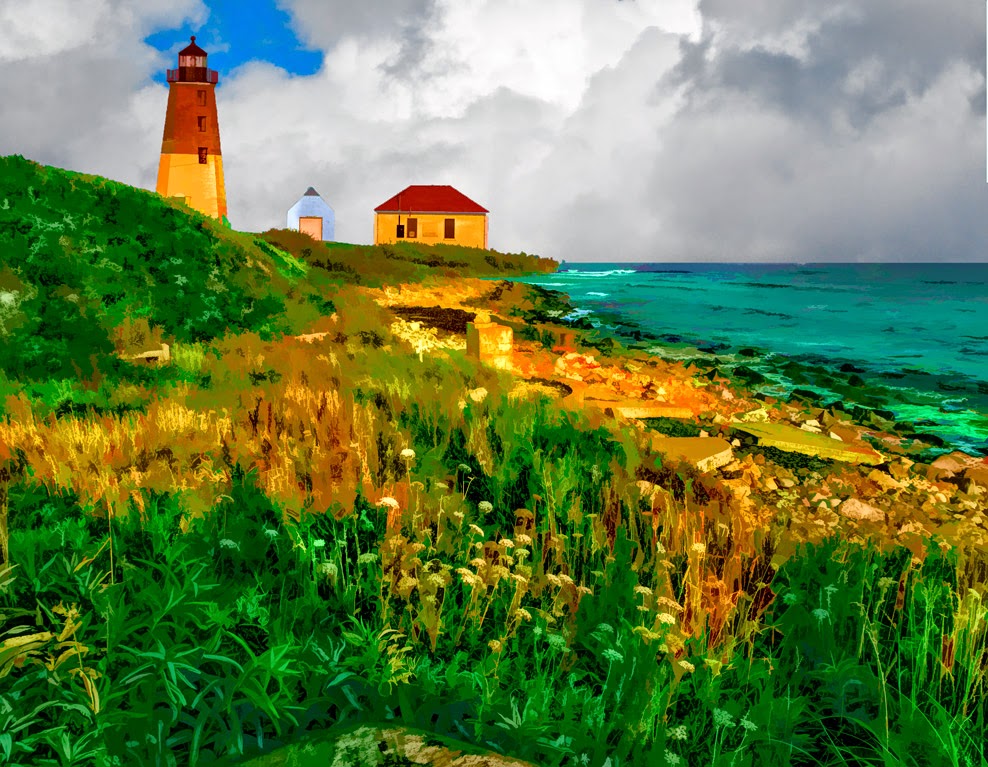
Topaz Labs (TL) just came out with a new version of it's Remask plugin. It's a free upgrade if you're already a Topaz Suite user and some minimal cost if you'd be interested in it as a stand alone. (With the suite pricing I can't imagine why anyone would pick and choose individual pieces.) I've really struggled with earlier versions of Remask, so I figured I'd download their newest and see what I thought. Not bad, much improved from what I've played with from them before. The caveat is that I can still do complex masks quicker using Adobe Photoshop (PS) Calculations if there's a lot of interior detail. (The sky showing through the leaves of a tree for example.) I tried a couple of "outline" only things (flowers, etc.) and the TL Remask does a very good job on those types of selections. While I was playing around with the Topaz Suite plugins I thought I'd take a look at a couple other pieces I've never played with. Today's image comes from TL's Simplify. I was pleasantly surprised, not that today's image is a simple as you might think. To find out why, hit the "Read More"
Read more!
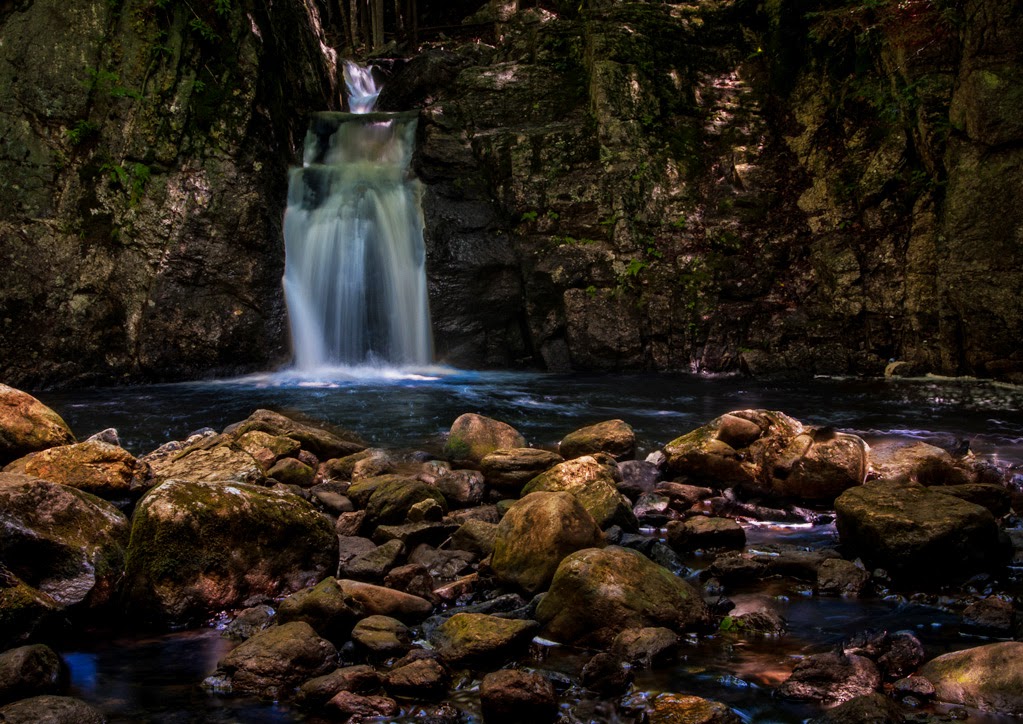
Today's image is a little down stream from the site of the previous post. It was taken on the way to the falls, not after the fall down the falls. (See previous post.) You can see that there is a definite uphill component to the stream. As with all flowing water, there are drops and there are quiet spots. You can see one of the "quiet spots" toward the top of the image. Had I scrambled about fifteen yards upstream this would have been a shot of the pool, filled with reflections. The power of the water would have been lost in the apparent stillness. All the way up to the falls I took five shot sequences with one stop bracketing. Between last week's image and today's image neither area a result of HDR. To find out what I did to both images, hit the "Read More".
The "specs" on the shot are ISO 200, F 22 @ 1/2 second. The "companion" shots for HDR ranged from 1/4 second to 4 seconds. As you can see, the image is based on the one stop above the darkest image of the set. The big reason for that is that it was dark in there. The camera's meter bases what it thinks is a "proper" exposure by trying create a neutral gray average to the shot. When it reads a scene that it calculates to really dark, the camera adjusts upward. Therefore, the darkest shot (the 1/4 second shot) is still fairly bright compared to what the eye would see. Using one of the images from the longer exposures would have left blown out highlights.
As is noticeable, there are some bright areas and some darker areas in today's images. For me, this is a pretty straight image. It never made the trip from Adobe Photoshop Lightroom (LR) to Adobe Photoshop (PS). Now, that is unusual for an image from me. I'm typically adding, subtracting, multiplying or dividing something in an image that can't be done in LR. Not today! 100% LR. The boulders on each side of the stream were brightened. The green moss deepened, The color of the rocks warmed up using the Color space in the Adjustment Brush. I've found an amazing amount of control can be developed using that Color box. Once you get a shade of color that's semi close to what you're looking for you have all the "tools" (sliders) of the Adjustment Brush available to you. Not exactly the color you were thinking of? Use the Temperature and Tint sliders. Not a deep enough shade? Use Exposure, Highlights, Shadows, or Clarity to zero in on what you feel is ideal.
The water also took a hit using the Color block of the Adjustment Brush. The water was a nondescript sort of gray. No life to it at all. Giving it a little blue cooled the water off and made it look a slight bit more translucent. (Even though it isn't.) The quiet pool was hit with another Adjustment Brush pin and made a little greener to accent the reflection of the trees.
All told, about fifteen to twenty individual Adjustment Brush pins were dropped in various parts of the image. Getting a good digital negative, in camera, should be the goal of every photographer. Developing that digital negative into a useable image is what one section of post processing is all about. If Ansel Adams or Alfred Stieglitz, or Matthew Brady had had access to LR they would have embraced it in order to "develop" their images.
Read more!
Every once in a while it gets a little tricky to "get the shot". That was the case this past weekend. I'd read about a waterfall in Keene, New Hampshire. We were staying there after attending a conference in the area. Only problem was that no one in town seemed to know where this waterfall was. Asked the grizzled old timer at the gas station that was right out of the movie Deliverance. Even he didn't know what the heck I was talking about. Asked a cop. "No such place." I was told. Of course he looked like a high school kid, so tromping around the woods probably took a backseat to video games as he was growing up. We finally tracked it down. The access was at the end of a residential road. There was a trail marker with some information. The falls was about three quarters of a mile up an abandoned section of the road. So off we went with a pair of cargo shorts stuffed to the gills with filters, accessories, a cable release, $3.86 worth of change, packets of powdered lemonade (no water) and assorted items designed to weigh me down. To learn what today's title refers to, hit the "Read More".
Read more!

Some friends ask me that all the time. They assume (naturally or not) that I must have messed with the original image in some way. Often they can see that I've done "something" because it's pretty darn obvious. Flip back through a few posts and you'll see several examples. But! Sometimes an image looks pretty straight and it's been worked to death. I get a kick out of those who say "I like to get it right in the camera". I like to get a well exposed digital negative. Today's digital negative is a digital positive, but what I'm getting at is that I like to get all the information I need on a properly exposed NEF file. (If I'm going for a straight image and not some HDR thing.) If you go to the "absolute" people who want the image to magically come out of the camera ready to go, do you know who you'd be eliminating? How about Ansel Adams? Bill Eppridge. Alfred Stieglitz. Any of the masters of film photography. Adams is quoted as saying "thee negative is comparable to the composer's score and the print to its performance. Each performance differs in subtle ways. Read more at http://www.brainyquote.com/quotes/quotes/a/anseladams110426.html#8dAkmOgKBFwVpJoy.99 . I was at a talk by Bill Eppridge (look him up) and he explained that he spent the entire day in the darkroom one time making print after print until he got the image he saw in his head. He wasn't just clicking the enlarger's light on and off. He was "creating" his final image by burning and dodging small areas of the print. He mapped out what tone should be in what exact tones he knew were there. There's more to today's image than there is in many of my more obvious manipulations. To find out more about today's image, hit the "Read More".
Read more!

"Aim to the right"? Sounds like I'm coaching somebody at a rifle
range. I typically use two methods when
I'm out shooting (photographically) for my personal use. If I see something that might make a good
(interesting) HDR image I'll set the camera to take five, seven or nine shots
one F-stop apart. I "always"
(99% of the time) have my camera set to -.3 EV (Exposure Value), so the images
come out on 1/3 increments. (-.3, -1.3,
-2.3...) That way I have choices as to
what exposures to select. If I'm
shooting something that probably wouldn't lend itself to HDR I'll switch up the
settings. I'll go no more than five
shots and set the F-stops to .3 separation.
That way I'll have one exposure that I think will give me the optimum
density. Today's image is one of those
that probably would not be "enhanced" by HDR. It was shot with option two, the .3 stop
steps. It was taken in bright sunlight
at the absolute worst time of the day.
My choices were very dense, where I'd have to bring back the shadows or
pretty light, where I'd have to tone down the wildly overexposed areas. To find out which option I chose and why, hit
the Read More.
Read more!

Well, the easy answer is "go to more interesting
places". It's an old truism, but it
is something that works. About a month
ago Doris (wife) said she wanted to go to the Lancaster Pennsylvania area over
Memorial Day weekend. Okay, Lancaster
equals Amish. Amish farms. Amish buggies. Flat brimmed straw hats. Buttoned up (sometimes not) white (also
sometimes not) shirts. Beards and
bonnets and horses along the highways (not the interstates). Some things are contradictory. The Amish won't ride a car or use a tractor
to till the fields, but a weed whacker with a motor is okay. There's no electricity to the house or farm,
but that doesn't mean all the houses are old farm houses. Some were absolutely modern in
appearance. Imagine a couple coming at
you in a horse drawn buggy and the driver and passenger are wearing the latest
in Oakley sunglasses. One thing all
these opposites do is mess up a "vintage" look images. We noticed the thoroughly modern juxtaposed
against the eighteenth century. If
nothing else, it was entertaining.
Read more!

I guess it's time to start getting "serious" about
making some images. Those who know me
will understand why the word "serious" is in quotes. Today's image is a result of a "Fun
Trail Ride and Obstacle Course" at the 2nd Governor's Horse Guard in
Newtown Connecticut over the past weekend.
I'm not sure if there was a fee for the riders, but
"spectators" were welcomed and treated royally. There was a Major in charge of the day and we
were invited into the barn area to watch the unit's horses brought in after their
workout and being brushed down and groomed.
Flashes were not allowed, so the I had to crank up the sensor
sensitivity pretty far. When we got back
outside the trail riders were just getting back and starting the obstacle
course. Most riders used English style
riding hat (helmets) and didn't give the look I was looking for. Then came along the "Marlboro Man"
in today's image. So I had the right
horse, the right guy and still had a pretty crappy background. Possibly because of the cold spring or maybe
just because it was the first weekend of May the trees in the background were
just a bunch of sticks. To me, my cowboy
looked like he'd been out riding the range and had just come down from the
mountains. I decided that was the
setting he "needed" to be in.
To check out how he got there, hit the "Read More".
Read more!





 Posts
Posts


