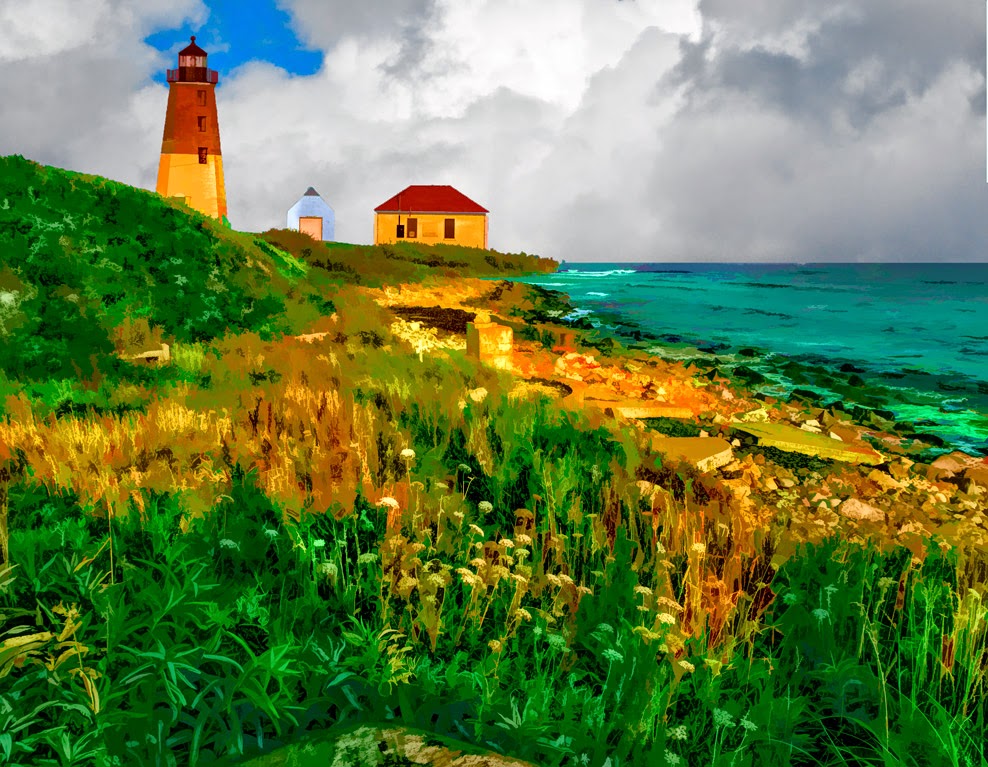
Topaz Labs (TL) just came out with a new version of it's Remask plugin. It's a free upgrade if you're already a Topaz Suite user and some minimal cost if you'd be interested in it as a stand alone. (With the suite pricing I can't imagine why anyone would pick and choose individual pieces.) I've really struggled with earlier versions of Remask, so I figured I'd download their newest and see what I thought. Not bad, much improved from what I've played with from them before. The caveat is that I can still do complex masks quicker using Adobe Photoshop (PS) Calculations if there's a lot of interior detail. (The sky showing through the leaves of a tree for example.) I tried a couple of "outline" only things (flowers, etc.) and the TL Remask does a very good job on those types of selections. While I was playing around with the Topaz Suite plugins I thought I'd take a look at a couple other pieces I've never played with. Today's image comes from TL's Simplify. I was pleasantly surprised, not that today's image is a simple as you might think. To find out why, hit the "Read More"
The reason it's not as simple as you might think is that it's actually a three image composite. Some may recognize Point Judith Lighthouse on the west side of the entrance to Narragansett Bay. If you're familiar with the light you might be a little confused as to where the shot comes from. If you were to go west on Ocean Road (Route 108) for a short distance you'd come to a dirt road turn off heading south to the South Shore Management Area. (If I remember correctly you can fish of launch a small boat there.) Walk down to the beach and look east. There's the lighthouse a ways down to shore. The foreground of today's image was taken from that spot. The lighthouse is very small in the shot containing the foreground. It took a 300 mm lens to get a good look at the lighthouse. I took the foreground shot as a reference because we thought it might be a real good spot for a night shot with the light shining out to sea. (When we went back it was so fogged in that we could only hear the horn. Couldn't even see the light from the light. Skunked!)
Playing around, as I am wont to do, I couldn't leave it as a "straight" composite of two images. One foreground and one distant. So, I figured I'd go back to the TL plugins and see what TL Simplify was all about. I flipped through the defaults of Cartoon (too hokey), Crisp Edge (nothing special), Painting Colorful (ay), Painting Harsh Color - wait - possibilities??? The big problem with it was the sky. It looked sort of like ragged glitter had been scattered across the sky. It came from the fact that the sky was pretty bald and I'd guess the plugin figure it "had to do something".
A quick trip back to Adobe Photoshop Lightroom (LR) Library to my clouds folder resulted in an okay cloud formation. Back to TL Simplify. Flipped through the defaults again and found something that made the clouds look strong but not garish. A quick replacement of the sky (and I did actually use the new version of TL Remask) resulted in the basis of today's image. Back to LR to finish up. I lightened up the waves, tinted a couple of the foreground flowers, intensified the colors a bit and declared the image done.
All in all, I had enough fun with TL Simplify to try it on a "straighter" image. Check the next post (probably) to see what that one is all about. I think I may have found a new toy.
Monday, July 28, 2014
Subscribe to:
Post Comments (Atom)


0 comments:
Post a Comment