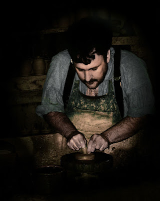
 I've written before about making the person looking at an image follow where you want them to go within the image. Here's a rather extreme example of the use of light and dark to guide the eye. A couple of techniques are in use here. Some of the color has been drawn out of the image, a severe vignette has been used to keep the viewer from exiting the shot on any corner or side and the areas of prime interest have been brightened. All of this is an attempt to match the concentration shown in the subject's action. The vignette isn't complete. You can see the shelves of pottery behind the potter. You get the idea that this is a vocation and, possibly, a calling. Someone showing that much intensity over producing a small, utilitarian piece has to have the power of the image match his work. The two key areas are his face and his hands. Everything else is darker and receding from those two points. To read more about the thinking behind this image, hit the "read more".
The origin of the shot was much fuller and more colorful. The brightness of the shop made colors that popped and didn't lend the tone of hard, concentrated work that the image needed. Decisions need to be made about each image produced and this is certainly a departure from the vibrant, richly colored prints I normally make. I wouldn't call this subtle, but it is subdued. There's a place for the loud, bright images I typically do and there is, most assuredly, a place for a restrained piece. Some of the best images I can remember have soft color shifts. One of the places I look to find outstanding landscapes is a site called "Landscapes 2.0" (link) . The images found there are typically, very soft, very luxurious, lush, opulent, and about any other descriptive word you can think of. The use of soft light, slow shutter speeds and (I'm fairly sure) the use of Neutral Density and colored filters is done with a deft hand by each of the photographers.
.
Okay, does the potter match up with the images found on Landscapes? No, of course not. They're two different sectors of what may be called subtle colors. I haven't departed too far from my typical "in your face" style. Certainly not to the point of the images found on Landscapes. Before the summer is over I'll make a attempt at producing a Landscapes worth image. It's not like I haven't "reverse engineered" the "how" of the shots and I do have the ND and colored filters sitting in my lighting bag. So, all I have to do is tap into my sensitive side and show a modicum of restraint.
.
I might have my chance this weekend. We'll be shooting along the shore in Rhode Island trying to get some sunset and night shots of the lighthouses. We'll see if I can keep my "normal" style in check and come back with quite a bit softer than my usual "stuff"


0 comments:
Post a Comment