Monday, December 26, 2011

When Is A Mask "Good Enough" in Photoshop CS5

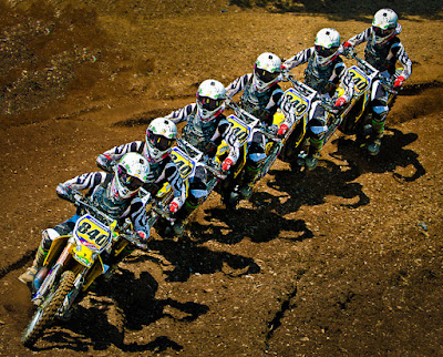
Today's image, obviously, is a series a images taken using continuous high speed shutter.  Before we get into it I'll talk a little bit about Nikon's (or any manufacturer's) continuous mode of shooting.  It kind of cracks me up when some friends say with certainty that their camera can shoot at six, seven or nine frames per second.  In the case of today's image(s) that's most likely the case.  But, if you're in low light and your shutter speed is one second, you can shoot at a maximum of --- one frame per second.  If you're shooting a seven shot bracket, and your "normal" shutter speed is 1/100 of a second, you'd have 1/12 of a second as your longest shutter speed.  Add up 1/12th +1/25th +1/50th +1/100th + 1/200, +1/400, and 1/800th and you'll find you've used up just about that whole second.  Start at 1/50th and that one second is long gone before you get that six frames per second over.  A friend of mine who has a D3 (not a D3X) found that out the hard way when he heard my D300 start to labor during a seven shot bracket.  He wanted to show me how fast his D3 was.  I told him to use the same Aperture I had, in Aperture Priority Mode.  His camera went click, click. click, click,  click,    click,        click, same as mine had.  There are some rules of physics that you can't break no matter how good your camera is.  But, back at today's image, it's a burst of exposures in high speed continuous mode with plenty of sunlight.  It was clicking away as fast as the mechanism would go.  Seeing as the Nikon D300 can run at six frames per second, today's image should be about a one second interval.  Putting the sequence together in Adobe Photoshop CS5 is easier than you might suspect.  To learn how it was done, hit the "Read More".
Read more!

Friday, December 23, 2011

Selective Sharpening, Selective Blurring, Selective Vignetting in Photoshop CS5

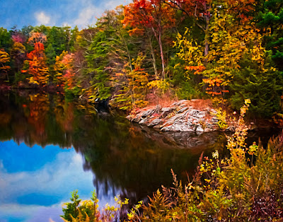
Today's image reminds me "a little bit of"  of Lou Bega's song Mambo No. 5.  In it he sings about a composite woman he'd like to have.  He's looking for "a little bit of ... " many different woman.  Check it out, it's a cute song from a couple years ago.  Today's image has "a little bit of" the Sharpening Tool (no keyboard shortcut), "a little bit of" the Blur Tool (same tool set), "a little bit of" selective vignetting, "a little bit of" Adobe's Pixel Bender and "a little bit of" Content Aware Fill.  I say "a little bit of" for each one because none are applied to the entire image.  The result is a cohesive image that appears to have been treated as a whole.  In addition, it has a sky dropped in with its resultant reflection in the water.  I'd be willing to bet that my buddy Lorri will look at it and think (at first) it was a one button filter application.  It's nothing if it's not really far from the case.  There's about a half dozen nested Smart Objects, a dozen independent Layers, at least four trip back and forth from Adobe Photoshop CS5 and Adobe Photoshop Lightroom 3.  Everything serves a function.  I don't believe there are any gratuitous operations.  We'll take a walk through the image and show where each alteration was done.  To follow along, hit the "Read More".
Read more!

Monday, December 19, 2011

Selective Sharpening In Photoshop CS5

Everybody (well, just about everybody) knows about using an Unsharp Mask (Filters/Sharpen/Unsharp Mask) to sharpen their images.  It is an oxymoron that comes from the film days of sharpening images.  Many (well, some) know how to use a High Pass Filter (Filters/Other/High Pass) to do some very controllable sharpening.  An even smaller set of people know about using the Luminance Channel in LAB (that's L A B, not referring to some laboratory somewhere) Mode.  There, you don't mess with the color Channels (the A Channel and the B Channel) and only Sharpen the L Channel .  By only Sharpening the grey scale of the L Channel you eliminate any chance of producing a color shift.  And then there's a Brush on Sharpening technique that very few people use.  I suppose some of the "early adopters" probably tried using the Sharpening Tool (no keyboard shortcut - it's located under the Blur Tool) and found it lacking.  I believe the Sharpening Tool fell into Adobe's JDI (just do it) tweaks that came in Adobe Photoshop CS5.  The JDI's were a set of little, niggling, things that bugged enough end users and (apparently) Adobe Product Managers that they made the decision to fix many things before releasing CS5.  Dodge and Burn is a good example.  They put in a checkbox that says "Protect Tones".  Prior to CS5 the Dodge and Burn Tools (O) would just muddy up whatever they were applied to.  With the JDI fix, they work as they were always supposed to.  Being able to set a default in the Stroke (Edit/Stroke) dialog box was another.  Before it was set to Red and had to be changed every time it was used.  In CS5, if you choose to do so, you can set the default color to whatever you frequently use.  If 90% of your Strokes are Black, set it to Black in one case and it'll remain "sticky" until you change it.  A great sanity fix.  Lots of people were bugged with that one.  Another is the subject of today's post.  To find out how it was used in today's image, hit the "Read More".
Read more!

Wednesday, December 14, 2011

Wednesday Q&A - Saving Files to Lightroom

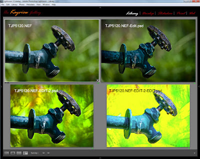
I gave a class last spring and saw one of the attendees the other day.  He said "ya gotta clear something up for me".  In the class I had taken an image from Adobe Photoshop Lightroom 3 (after going as far as I could initially) over to Adobe Photoshop CS5.  There I played with adding a couple Layers, added a couple pieces from other images and generally messed with the shot.  When I was done there, I wanted to do other things back in LR3.  The part the fellow wanted clarification on was how I saved it.  That took me back a little and I asked "what do you mean"?  He explained that he "always" does a Save As rather than just plain Save.  I asked him to tell me why he did that.  That's when I saw why he wanted some explanation.  His justification for using Save As was that he wanted to preserve his original image.  Take a look at today's image.  It's the same shot, four different ways.  The original is on the upper left.  The other three have had one, two and three trips over to PS CS5 and back.  Each time, a simple Save was used, yet there are now four files that show up in LR3.  (It also applies to Adobe Bridge.)  To find out what's going on, hit the "Read More".
Read more!

Monday, December 12, 2011

Simplifying Images With Adobe Photoshop CS5

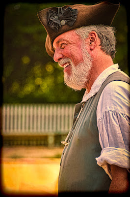
Simplifying today's image comes from trying to do "something" different from a shoot we did back in April.  We've featured about a half dozen shots here on The Kayview Gallery from that session.  I shoot with a typical Nikon DSLR, so the square format was the first change that was made.  The original image had too much room on the left side and a little confusing detail on the right.  One of the biggest things new shooters need to learn is making good decisions about their photography.  Good decisions when looking through the viewfinder.  Doing most of the composing in the camera.  Rick Sammon runs around with several clichés on how to turn "snapshots into great shots.  One of his axioms is 'the name of the game is fill the frame".  Rick is a good shooter, written a bunch of photography books, but is a little pompous for my taste.  Never the less, he's right about filling the frame.  The nothingness on the left of the original of today's image?  Get rid of it.    The part the fellow in the shot was working on became a maze of shapes on the right.  Get rid of the too.  One of the benefits it gives is that it puts the subject and his hands at two strong points in the composition.  Mentally project the tic-tac-toe grid of "the rule (suggestion) of thirds" on the image and you'll see the fellow's cheekbone and hands now align on the intersections of the upper horizontal line.  They say, if you know the "rules", you can break them.  If you know the "rules" you can also use them.  The "rule of thirds" in particular has come into some derision in recent years, but it's pretty much by those one US Vice President once called "the nattering nabobs of negativism".   The "rule of thirds" came a "rule" because it represents a powerful place to put important components of an image.  To read about other ways used to simplify today's image, hit the "Read More"
Read more!

Friday, December 9, 2011

Playing With Plug-ins In Photoshop CS5

Today's image is a bounce to the edge in one direction.  I occasionally ping pong between using plug-ins and not using plug-ins.  My thought is that there is nothing you can do with a plug-in that can't be done in Adobe Photoshop CS5 alone.  The way I think of it is sort of like the "Laws of Physics".  People can do some amazing things, but whatever someone does it can't break the Laws of Physics.  Same with plug-ins for Adobe Photoshop CS5.  Plug-ins allow people to make some amazing images, but they have to stay within the envelop of what CS5 can do.  If that's the case, why would anyone bother using a plug-in?  The answer is simple.  Ease!  If you listen to Photoshop educators like Scott Kelby, or if you've ever attended one of his seminars, he's says flat out:  "this is the way you do it in Photoshop" and shows the Photoshop way to get to an image.  He'll also say: "but this is the way I do it for my own use today", and bring up a plug-in.  In the early days of personal computers I went out and bought an Intel 286 based machine.  I mentioned it to my brother, who happens to be a EE (Electrical Engineer).  He said if he wanted one he'd build it himself.  That was like thirty years ago.  He's gone through several computers, but he has yet to build one.  Why?  Same reason.  Ease!  Being a EE, I'm sure he could have bought the individual components, plugged everything together, and assembled a computer.  But he hasn't.  Plug-ins are a crutch for those who don't know how to create an effect in raw CS5 (not CS5 ACR).  They'll push buttons until they wind up with a good looking image.  I'd prefer to know what the plug-in is doing and then let the plug-in do its job and get me someplace much quicker that recreating the wheel.  To find out what plug-in was used for today's image, hit the "Read More".
Read more!

Wednesday, December 7, 2011

Wednesday Q&A - Trust A Retail Salesperson?

Today's image does relate to the Q&A topic.  The topic comes from a direct email from the guy who was my last boss at Intel before retiring.  Back in the summer he had borrowed a lens from his brother (or brother-in-law ???) and used it to get closer to some landscape type subjects.  At that time he wanted a recommendation on which lens he should buy.  I gave him a couple options,  The serious route of going for a Canon 70 - 200 F2.8 IS and the less budget busting 70 - 300 F4 - 5.6 IS.  He thought he might be able to get the $150.00 75 - 300 "kit" lens.  I talked him out of it and he decided that he could wait until the holidays to get his lens as a "gift" from his wife.  That's where the problem came in.  She had lost the email I'd sent and went to a store knowing only that the upper end of the zoom was 300mm.  His wife explained that the use of the lens would be to get closer to the subjects of the photographs.  The salesperson at the store talked her into the cheap 75 - 300mm "kit" lens and --- wait for it ---a 25mm extension tube.  The explanation being that it was needed for his Canon camera to get closer to subjects.  The title of today's post in "Trust a Retail Salesperson?"  The simple answer is absolutely not.  To find out where this opinion comes from, hit the "Read More".
Read more!

Monday, December 5, 2011

A Little Weekend Shoot

What a beautiful weekend the past couple of days have been.  A slight chill in the air (it's about time), semi clear skies and a photowalk with a couple of friends down to Liberty State Park in New Jersey.  We had dinner with a couple friends last Tuesday and they mentioned they were going to Liberty SP on Saturday.  They asked if we'd be interested in joining them.  We had our usual zero on the calendar and thought it would be a fun day to do some shooting.  Lorri Freedman is the shooter of the pair and she has a great eye for images and does a great job doing some Photoshop magic with the images she shoots.  Check out her SmugMug portfolio.  I'm sure you'll agree.  Well, we left the house at 9:00 AM for what Google Maps said would a ninety minute drive.  We were supposed to meet at 11:30, so we'd left ourselves plenty of time.  Grabbed some coffee to go at the local Dunkin Donuts and set off.  Would you believe the GPS knows of a second Liberty State Park about twelve miles from the one that was our intended target?  In checking Google Maps I knew we wanted exit 15E on the New Jersey Turnpike.  Google had given one option of taking, basically, city streets once we'd crossed over into NJ on the George Washington Bridge.  I figured I'd ignore the GPS until we'd gotten to Exit 15E and then follow it on in.  After exiting at the appropriate spot the GPS said take a left, take a left and get back on the Turnpike in the opposite direction.  I knew that was wrong and if we just headed east the GPS would recalculate and find the way.  It fought with us for the next half hour and I finally surrendered and followed the directions from the GPS.  After all, it knew "a way" to get us there.  Followed the instructions until it said we were within a block or so of our destination.  I knew that couldn't be the case, because the LSP we were looking for was on the Hudson River Estuary and the GPS had us in the middle of Jersey City.  Asked Doris to reprogram the GPS using Statue of Liberty rather than Liberty State Park.  It gave three options.  Two in NYC and one said New Jersey access.  Asked Doris to use the Jersey access option and we were finally in route to the right spot.  Of course, instead of being a half hour early, we were now 45 minutes late.  Lorri and Mark were very gracious about our tardiness and had waited past one boat out to Ellis Island and the Statue.  It is nice to have understanding friends.  To find out about today's image and why they don't lineup exactly, hit the "Read More".
Read more!

Friday, December 2, 2011

Using Adobe Photoshop For Desktop Photography

Today's image looks like one shot.  Okay, maybe two.  After all, I really don't know anyone that small, or anyone who has a desk that big.  One or the other.  Today we have an example of what happens when you have too much time on your hands.  As I said in the last post, the year is winding down and jobs are getting a little scarce.  Happens every year.  People are busy with holidays, budgets have been spent, the marketing folks are more interested in cleaning things up before the end of the year rather than starting new projects and on and on.  Big thing on the calendar for today is paying the bills.  They don't do any winding down just because it's the last month of a year.  The tripod was sitting next to the desk yesterday.  The camera on the floor by the back wall.  Okay, let's stop right there.  You may be wondering why the camera is on the floor.  It's a psychological thing.  I've had this theory since I'd been in my early twenties.  "Always put cameras and drunks on the floor.  It's the only way you can be assured they won't fall off something."  I've had personal experience with both and it's stood me in good stead.  Alright, back to today's discussion.  The other thing I was doing was trying to resurrect a backup computer who's harddrive has bitten the dust (literarily I think).  At first I thought it might be interesting to take a couple shots of the inside of the computer through the grill on the back.  Sort of interesting, but nothing special.  I looked at my desk and thought it was interestingly messy.  The lighting is the key to today's image.  To find out about it and the post processing, hit the "Read More".
Read more!

Monday, November 28, 2011

PLaying with Adobe Photoshop's Polar Coordinates Filter

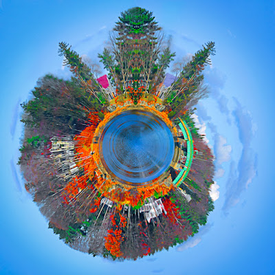
It's the holiday season, the year is winding down, jobs are getting a little scarce, so it must be time to play.  To go for the artsy stuff, something that might end up on a greeting card or some other form that can be done on spec.  It might even bring in a buck or two and that would be gravy.  Doing work aimed at the greeting card industry is kind of a seasonal crapshoot.  Too early and it won't be looked at.  Too late, same thing.  Too cute (they can hardly ever be too cute) and it won't be picked up because it's been done to death.  Too serious is probably worse than too cute.  Cards that say 'sorry you died' walk a very fine line.  Note cards, with photographs on the cover, have to convey what's written on the inside without giving away the sentiment. Today's image would fall under the heading of whimsical.  It started life as a photograph.  Actually, a five shot panorama, and ended up having something to do with a lake house.  It could be an invitation, a "new house" announcement, a cheery note signaling the start of the new season for the lake community, or other lighthearted information.  It probably wouldn't be the best card to say the house burned down or the EPA just shutdown swimming privileges because they found out someone did nuclear testing on the shore back in the forties.  You get the idea.  You have to set the right tone for the target audience.  I'll leave it up to you to figure out what you might use a card with today's image on the front.  What we'll do is discuss how the image was made.  To find out what alchemy was conjured to produce today's image, hit the "Read More".
Read more!

Monday, November 21, 2011

Special Monday Q&A - Getting Rid Of Smart Objects?

Before I decide what to write about for the Q&A on Wednesday I look through the searches that brought people to the site.  Without a doubt, the number one query has to do with Smart Objects.  I've written about the wonders of Smart Objects several times and people are directed to one of the posts.  For the past month, day in and day out, someone has been putting in a search string trying to find out how to "get rid" of Smart Objects.  At first I thought it might be one misguided soul who couldn't figure out what to do with Smart Objects.  In my opinion, the alpha and the omega of working in Adobe Photoshop CS5.  As the days wore on and the search sting was persistent I came to realize that someone really does need some help.  Not necessarily getting rid of a Smart Object, but understanding what a Smart Object is and how to use them.  I sat down over the weekend and tried to figure out "why" anyone would want to get rid of one.  The easiest explanation I could conjure up was that it could be someone new to CS5, who's not familiar with Layers (no one, on their first day, knows about Layers) and did a little right click exploring.  He/she right clicked on the Background Layer and saw that Convert For Smart Objects was available.  I'm also surmising the fact that where was considerable work put into the image the person had been working on.  Clicking on Convert For Smart Objects got her/him in trouble.  To find out how that caused trouble and how to get out of it, hit the "Read More"
Read more!

Wednesday, November 16, 2011

Wednesday Q & A: Using Photoshop CS5's Smudge Tool To Sharpen?


Today's title asked the question: "can Adobe Photoshop CS5's Smudge Tool be used as a sharpening device.  Well, looking at the two insets, flanked by the original image and the repaired image shows the answer is yes.  The (left) original image comes right out of Adobe Lightroom 3.  LR3 was used on most of the image to adjust color, tone, lighting and other things.  The Adjustment Brush was used to lighten the shadow area under the cap.  That resulted in a distinct light/dark light.  In the second inset the line is gone.  How was it done?  To find out how, hit the "Read More".

Read more!

Wednesday, November 9, 2011

Wednesday Q&A - Why Use Individual Hue/Saturation Layers?

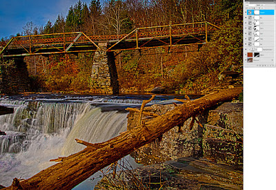
Oh boy, have I been getting questions about why I use individual (Red, Yellow, Green, Cyan, Blue, and Magenta) Hue/Saturation Adjustment Layer in Adobe Photoshop CS5.  The gist of the questions is why I'd bother using multiple H/S Adjustment Layers when it would be easier to scroll down through the colors on one Layer.  The answer is actually pretty simple.  I really don't care about the colors of the Adjustment Layers, I want the Layer Masks.  Do a double click on today's image to get to a larger view of the image.  Don't worry about the shot too much.  Look over to the right and checkout the Layers Panel I have attached.  In the Panel, look at the Layer Masks that go along with the individual colors of the Hue/Saturation Adjustment Layers.  You can see that each color (other than the Red) has a unique Mask.  There's even two Cyan H/S Adjustment Layers, each with a unique Mask.  The Masks are the key to the question of why I use the multiple Layers rather than adjusting each color on one Layer.  A secondary explanation is needed for the two Cyan Layers.  I often see tutorials where the instructor uses either different shade of gray with the brush Opacity at 100% or they'll bring the Brush Opacity down to 15%- 20% and build up the masking.  The problem I see with that technique is that if you go too far with the buildup it's almost impossible to paint over the area accurately.  By using multiple copies of the same colored H/S Adjustment Layer the area can be fine tuned and the amount of masking can be held.  So, the simple explanation of why I use multiple Hue/Saturation Adjustment Layers is to have more (better) control over what I'm getting more colors.  To find out how that effected today's image, hit the "Read More".
Read more!

Monday, November 7, 2011

Photoshop Has Led To A Photo Tour

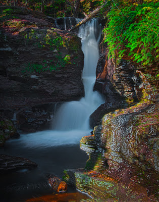
Today's image is typical of what may be found on the galleries first photo tour.  I've been asked by several people if I'd lead some sort of "domestic safari " for the purpose of shooting "something".  After looking at what's available and when to go and where to shoot, we're ready to set up a trip.  It's not meant to be a money making enterprise.  I'll just be the person coordinating a few like minded photographers, making the housing arrangements, figuring out a little Saturday night entertainment, setting up whatever needs to be set up, and generally doing the detail work to have a good time.  The place for the escapade is going to be Ricketts Glen State Park and the Endless Mountains in Pennsylvania, USA.  Today's image comes from the park, which has twenty two named waterfalls.  The trip will be a two night (Friday and Saturday nights), three day shoot with discussion and instruction about Adobe Photoshop and Adobe Photoshop Lightroom 3.  We hope to have a couple instructors and a panel for a round table discussion of photographic and Photoshop techniques.  Read future posts to find for more about the trip.   To learn more about today's image, hit the "Read More".
Read more!

Wednesday, October 26, 2011

Wednesday Q&A - Making Better Selections With Adobe Photoshop

I've seen a lot of frustration with friends and readers trying to make selections using Adobe Photoshop CS5's Content Aware Fill.  Today's image shows three versions of the same image.  It's not on the blog because it's some wonderful image.  It's here as a "teaching tool".  It's the same shot, duplicated twice and spread out across a canvas.  The first (left) shows the "as shot" image.  The middle version show a typical Content Aware Fill  result, trying to take out the middle "R" and the number "7".  The third (right) shows a better result using a modified version of Content Aware Fill.  Why someone would want to remove the "R" and the "7"?  I have no idea, I'm just trying to illustrate a point.  I didn't come up with the secret method of making a better fill.  I saw it in a video from Adobe.  I've been using it, tweaking the way I work with it, and have developed a strong confidence in being able to extract exactly what I want.  To find out what the trick is, hit the "Read More".
Read more!

Monday, October 24, 2011

Playing With Adobe Pixel Bender

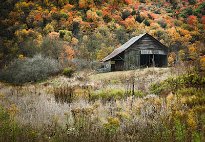
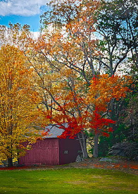
Actually, playing with Adobe's Pixel Bender is the last step in today's image.  It went through several trips back and forth from Adobe Photoshop Lightroom 3 to Adobe Photoshop CS5.  There are things I find easier in CS5 and other things easier in LR3.  As an example, the face of the barn was "texturized" in LR3, but the "brightness" of the red leaves was goosed in CS5.  The sky couldn't be (at least I couldn't) handled properly in CS5, so it was treated in LR3.  The end image wound up being TJP8764-Edit-2-Edit-Edit.psd.  That gives you a little idea of what when on in beating up this poor image.  Not only that, but it started life as a five stop HDR.  The biggest "trick" as far as I'm concerned was getting the texture of the face of the barn to come out.  To give the barn a nice weathered appearance the Clarity was brought up using the Adjustment Brush... five times.  The Adjustment Brush was selected with the Exposure brought down the maximum of 4 stops.  I find that to be an easy way to directly see where I'm selecting.  After the barn face was properly selected I double clicked on the word Exposure to reset the value back to zero.  I then put the Clarity up to 100%.  I did the same thing, placing four more pins.  "Paint" the face, return the Exposure to zero and crank the Clarity up.  After the fifth time the barn face had the texture I was looking for.  This same technique can be used to apply a "grunge" effect.  Thanks to Matt Kloskowski of NAPP for demonstrating that trick.  Where to apply it is up to you.  I picked this image to play with it.  I don't think it went all the way to "grunge", but it did supply something.  There's a half dozen (or so) other tricks that were applied to today's image.  To find out what they are, hit the "Read More".
Read more!

Friday, October 21, 2011

Use Adobe Photoshop's Lens Correction

There's always something new to play with in either Adobe Photoshop CS5 or Adobe Photoshop Lightroom 3.  I use to obsess about barrel distortion when taking wide angle shots at fairly close range.  Such was the case with today's image.  I almost looked like the window was semicircular in a vertical dimension.  We were up in Bar Harbor Maine over the past weekend and wandering around Main Street after dinner.  Bar Harbor is just a great little town for hanging out and window shopping.  Everywhere we looked there were neat little shops and neat little vignettes that would make interesting images.  Today's image is a good example of how either Photoshop CS5's ACR (Adobe Camera Raw) or Lightroom 3 can make a problem into a one click solution.  In either case, Adobe has a routine for Len Correction.  In LR3 it a panel available in the Develop Module.  In ACR it's on the all encompassing screen and looks like a lens group.  It's the sixth icon in on the set of icons just under the Histogram (just to the left of the FX icon).  Adobe maintains a large database of lenses from most of the major manufacturers.  There are two options, Manual and Profile.  Manual is just as it sounds.  You make any adjustments you feel are necessary.  There's another tab called Profile.  The camera manufacturer, the specific lens and Adobe's Profile for that combination is picked up from the EXIF data that accompanies each image.  Clicking on Enable Profile Corrections instantly "corrects" any distortion in the lens.  The straight lines in the window are the result of Adobe's lens correction.  The only thing done to the image (as far as any straightening goes) is to correct the tilt of the camera.  The entire image "leaned" to the left.  There is other processing that went into making today's image what it is.  To find out what was done after the Lens Correction, hit the "Read More".
Read more!

Wednesday, October 19, 2011

Wednesday Photoshop Q&A - What Happened To The Fall Colors


Luckily, the fall foliage season seems to be a little delayed in the southern Northeast USA.  Such was not the case in Bar Harbor Maine and Acadia National Park last week.  We arrived on a rainy Friday afternoon just in time to take a bus tour of the Park.  At one point I asked the driver/tour guide if this was a "trust tour".  He asked what I meant.  I told him every time we got to what was supposed to be a great view it was almost as if he'd say "trust me, there's a great view to the left or to the right".  The fog or low lying clouds were so dense that none of the views were visible.  What we did see, close to the road, was impressive and the promise of good photo ops once the fog had lifted was high.  The fog and rain didn't lift until overnight and a bright sunrise was the reward.  Unfortunately, so were some high winds.  As much as 60 MPH in gushes all day long.  The great color we did see on Friday was pretty much blown away on Saturday.  Some remained, but it involved a lot more hunting than it did in the rain on Friday.  Saturday night, after dark, I wanted to go up the summit road to Cadillac Mountain.  We stopped at one of the overlooks, I grabbed the tripod and started setting up for a night shot.  The moon was slightly to the right, Bar Harbor to the left, and a beautiful seascape filling in in between.  After almost being blown off the side of the mountain I thought better of trying for that shot that night.  We finally started getting some good shots on Sunday.  Today's image comes from the road going from Trenton down to Bar Harbor.  We spotted two photographers shooting on our way off the island and stopped to try our luck on the way back.  To learn the story of today's image and the processing involved, hit the "Read More".
Read more!

Friday, October 14, 2011

Wille Wonke Meets Photoshop HDR Pro

I don't know.  Seems like we're doing a couple mashups this week.  Monday was "Norman Rockwell Meets Photoshop" and that was a pretty straight looking HDR composition.  Today we go to the other end of the scale with a fictional character meeting the far side of HDR.  Today's image actually comes from the Scott Kelby World Wide Photowalk of a couple of weekends past.  It's just down the street from last week's image from the walk and miles away as far as technique goes.  Here's a little comparison of the two images:

·         Both are five shot HDRs

·         Both are in the small New England town of Kent Connecticut

·         Both are on the west side of Main Street

·         One tends toward the photorealistic, the other is more illustrative

·         One is a straight shot (for something that's HDR).  The other has large sections cloned out using Content Aware Fill

·         One tries for true (almost) colors.  The other kicks the sh** out of the colors.

If you'd like to see what was done to the photorealistic image from last week, click here.  To see what was done to today's image, hot the "Read More".
Read more!

Wednesday, October 12, 2011

Wednesday Photoshop Q&A - Why Use Lightroom If You Have Bridge?

Wow!  I get asked today's question every time I teach a class, do a program for a camera club or have discussions with people interested in getting recommendations about which programs to use.  The reason I've qualified the question to only Adobe Photoshop Lightroom (3) versus Adobe Bridge CS5 is because of the database functions.  The Develop Module in LR3 and Adobe Camera Raw (ACR) are the same thing.  So, if you're interested in the Develop Module and already have either Photoshop or Adobe Photoshop Elements 9 (or now PSE 10), you have the Develop Module  of LR3.  They're the same program.  The interface is slightly different, but layout does make the program.  The ability to do things is the issue.  So, my recommendation is always to stay with what you have if the Develop Module is the only draw for going to LR3.

The database portion of LR3 is far superior to the current versions of Bridge.  One demo I do when giving a presentation is to make a Smart Collection using Bridge.  I push the keystroke to get it started and then open LR3.  In LR3 I make the exact same Smart Collection.  I press the key to get it going and almost instantly the Smart Collection pops up.  I then switch back to Bridge, and it's still plugging away trying to build the Smart Collection.  The speed at which you can find images is a huge plus in favor of LR3. 

The general layout of LR3 is another plus.  Where Bridge has everything hidden in menu after menu, LR3 has everything needed for the Library organized into panels.  Start from the top and work your way down through each panel and you're done.  Nothing has to be searched for.  It's all right in front of you.

Keywording, ranking, rating, collecting images are very straight forward.  If you want to keep track of your images, grab a copy of Lightroom.  If you're interested in the Develop Module and have either CS5 or PSE9, stick with what you have.
Read more!

Monday, October 10, 2011

Norman Rockwell Meets Photoshop

A while back I mused that it would be interesting to do some Norman Rockwell-ish shots.  Today's image becomes the first in what, I hope, will be a series of either re-creations or homage type shots based on Rockwell's work.  One of the notable things about the way Rockwell worked was his use of photography to get fragments of ideas as a photo to incorporate into his paintings.  He'd hire neighbors as the "actors", a professional photographer to do the shoot and borrow locations in the Stockbridge, Massachusetts area as sets.  Rockwell immortalized many of the townsfolk and descendents today point with pride at Saturday Evening Post covers and say 'that's my" whoever.  Grandmother, uncle, brother, sister or more.  I don't know the fellow in today's image and he never knew I was taking a shot of him.  There's more to what Adobe Photoshop CS5 had to do with the image than meets the eye.   To find out what was done in CS5, hit the "Read More".

Read more!

Friday, October 7, 2011

Some Thoughts On Steve Jobs

Just so you don't get confused, I've always been a big admirer of Steve Jobs.

It was sad to hear of the death of Steve Jobs.  He's been influential in our lives if you acknowledge it or not.  There have been Apple zealots who have fallen all over the words Steve spoke.  There has been the other side of the fence, where some either thought of him as a maverick or a Don Quixote, tilting at windmills when Microsoft was, seemingly, in control of the future of computing.  Even if you were a Jobs hater, if you look at what you have today, even if you're a PC person versus a Mac person, you owe Jobs a thank you.  My thoughts are in the "Read More".
Read more!

Wednesday, October 5, 2011

Wednesday Photoshop Q&A - Scott Kelby's "Light it, Shoot It, Retouch It" Book

If you're a frequent reader, you probably remember that I just did a semi-review of Matt Kloskowski's compositing book a couple weeks ago.  Well, as soon as it was available I ordered Scott Kelby's latest book, "Light It, Shoot It, Retouch It".  It's been sort of busy around here, so I've only gotten through a few chapters, but enough to know the I'll be going through the rest of the exercises as quickly as possible.  If for no other reason, to get a chuckle from his sense of humor.  Naturally, if I was interested in a humor book, I'd buy a humorist's book.  The basic function of Kelby's book is to teach a little something about lighting, shooting and retouching.  (Can't imagine where he would have come up with the book's name.)  The first comment I'd have is that it's a well conceived book.  It teaches about lighting in a manner I haven't seen in other books.  One of the things that intrigued  me was the promos Kelby Media put out about using actual overhead photographs to show the setups rather than sketches.  Kelby credits his assistant Brad Moore for coming up with the idea and it works very well.  One thing I will have to say is that I don't have the range of lights Scott has at his disposal, so I've had to think through the setups using my gear to try to replicate what he was doing.  Which is fine and he acknowledges the fact that everyone doesn't have the same gear he's got.  I have a fairly good range of small strobes, ranging from Nikon SBs to Sunpack FP38 Flat Panels to miscellaneous small poppers.  I do have all sorts of modifiers.  Anything from umbrellas to softboxes to light spheres to a homemade beauty dish.  So, I can move the light (not just the lights) around.  I have a range of scrims, flags, diffusers, stands, reflectors, and other gear, so I'm not nailing things to the walls.  I am pretty flexible in my positioning and pushing of the photons.  All that said, to see some of the compromises I've had to make to use my gear with Scott's instructions, hit the "Read More".
Read more!

Monday, October 3, 2011

To HDR Or Not To HDR, That Is The Question

Over the weekend we took part in Scott Kelby's World Wide Photo Walk.  Ours was set up for Sunday and at quarter to seven my wife called down and said "it's raining, are we still going?".  I had just checked weather.com for Kent, Connecticut and saw that the rain would clear by 9:00 AM and we should have a nice day for a photo walk.  I called back and said we'd be fine and we'll still go.  Today's image gives an idea of what the result was at about 9:45.  A beautiful New England fall day.  Blue skies with puffy white clouds and just enough sun to produce some good shots.  It's not really hard to find good shots walking through the small town of Kent.  The total length of the walk was probably less than a half mile.  One quarter mile down Main Street and one quarter coming back, exploring the alleys and back yards (of businesses).  There's an art studio back there with sculptures in the yard, a highly decorated little outside mall with all sorts kitschy knickknacks, bric-a-brac, and the like.  Just a real fun place to get some of those small, detail shots that go well in a storytelling photo essay.  I spent most of the morning with the camera set to shoot five shot brackets in the high speed continuous shooting mode.  That way I could either select the exposure I liked best or go for a three or five shot HDR.  With at least one of the shots, the 2 Stop underexposed image is the one I like best of the five shots in the group.  It's dark and brooding, with great shadows and an old fashioned white outside lamp shade as the focal point.  You may see it here in the gallery later this week.  Today's image comes from the same technique.  Shoot a five shot bracket and either pick the best exposure or use three or five of the images to produce an HDR image.  Watta ya think?  Is it one shot, brought to its full potential?  Is it a three shot HDR?  Or, is it a five shot HDR?  Do your best analysis and make your SWAG (Scientific Wild A$$ Guess). To find out which it is, hit the "Read More".
Read more!

Friday, September 30, 2011

Combining Techniques In Photoshop CS5

A buddy of mine asked me the other day if I had ever heard of the Dave Hill Effect.  I laughed and told her she hadn't been reading the blog enough.  I've written a couple times about the DHE (and here).  Now, this friend is a very clever photographer and a master refinisher.  The fact that she hadn't used the DHE shocked me.  She does marvelous HDR work, her compositing is outstanding and anyone looking for a photographer to give them some very unique work should run out to hire this photographer.  Here's a link to her site.  Check it out.  We were out the other evening preparing for an night train shoot we're doing at the end of October  She was doing the test shots while I, along with her husband, was playing roadie.  Setting up locations, lights and carrying gear.  She sent me over one of her tests.   As usual, a great HDR of a passenger car we'll be using as a "prop" on the night of the shoot.  I asked her to send the 0 EV exposure over so I could see what a straight shot would good like.  I wanted to check how the interior versus exterior lights played.  Since we'd been talking about the Dave Hill Effect, and I just happened to have it queued up as a preset in Adobe Photoshop Lightroom 3, I just popped the image with it and sent it back for her to check out.  It got me to thinking about what would happen if HDR was combined with the DHE.  I'd guess it ends up as D2H2RE or something equally as confusing.  In any case I thought I explore it with today's image.  So, today we have an image that's one part HDR, one part DHE and a couple other parts "normal" finishing thrown in.  If you'd like to learn more about what this poor image went through to get where it is, hit the "Read More".
Read more!

Wednesday, September 28, 2011

Wednesday Photoshop Q&A - Do I Need My Computer Anymore?

I was out the other evening with some friends when one of them asked me if they needed their computer anymore.  My first response was "of course you do".  After a minute I asked what my friend was using the computer for.  ???  He said I do email, surf the web and doctor my photos.  There it was, the reason for having a computer.  Ah-ha,  you need a powerful computer to manipulate your images.  A no brainer, until I thought about it a little more.  Like almost all aspects of modern life, photography is moving toward the tablets.  I bought an iPAD 2 about six months ago.  It was for the typical reasons (although I still don't have a single song on it) and I thought it would be handy for checking email, online shopping, a couple of games and generally freeing me from running to the computer every time I needed access.  Thinking about how my usage has changed I had to qualify my snap response to my friend.  My initial retort came back to haunt me as we discussed his uses in more depth.  He does some very serious photography, but 99.9% of it is straight.  He's not familiar enough with his chosen image editing software to be any sort of heavy duty pixel pusher.  He makes great images, but they're all very straight.  He's been using Adobe Photoshop Elements through several iterations and is currently on PSE 9.  Having the ability to create a Layer Mask confuses him and Adjustment Layers are over his head.  Any tweaks he needs he does on the Base Layer and it makes me cringe when I see him work.  I had to rethink my initial reply.  To find out what switched my thinking, hit the "Read More".
Read more!

Monday, September 26, 2011

Sometimes It's Alright To Steal Ideas

The other day was our anniversary, so, being the good guy I am, I bought some roses for my wife.  Over the weekend she noticed how they had come into full bloom and said she might want to take a couple shots of them on Sunday.  No problem.  She didn't. So, today I took a couple shots of one rose.  That way, if she gets her camera out this evening, she has eleven left that haven't been shot.  The roses are actually kind of an orange color.  I know rose colors have all sorts of meanings and I'm not sure what orange roses stand for, but I'm sure it's some nice thought.  (I hope!)  The setup for today's image comes what a rather hairy accident.  The black glass top used to be part of a television stand.  The stairs going up from the playroom at home are open.  We were dog sitting our granddaughter's English Bulldog a couple weeks ago and I lost my balance stepping over the barrier we had set up to keep the dog in the playroom.  Unfortunately, the 50" flat panel television is right at the open stairway.  It was almost like trying to make a boogie board out of the set.  I wound up on the back of the television, "riding" it down to the floor.  I wound up with some bumps, bruises and cuts but the television smashed.  It had been sitting on a metal frame, glass topped stand.  The metal frame ended up bent, but all three pieces of black glass survived.  That's why I now have three black glass panels to use as sets for doing tabletop photography.  Today's image wasn't shot in "the usual" way.  To find out how it was shot, hit the "Read More".
Read more!

Thursday, September 22, 2011

Wednesday Photoshop Q&A - Wanting A New Lens

Today's question comes, not from searches that pointed to the blog but, from a short conversation with a guy who works with my wife.  We just happened to cross paths with him and he said he wanted to ask for my recommendation for a new lens.  Boy, is that a loaded question.  We had the length of an elevator ride to establish a problem statement.  The obvious question was "what are you shooting that you feel you need another lens?"  His explanation was that the kids were getting a little older and starting getting into sports.  The kit lens that came with the camera just wasn't getting him as close as he wanted/needed.  Next question: what sports are we talking about?  The big three were gymnastics, basketball and soccer.  The other factor was budget.  So, we have the problem statement.  To find my recommendations, hit the "Read More".
Read more!

Monday, September 19, 2011

With Photoshop CS5, It's Easy To Have Dramatic Clouds In Winter

Today's image is a mashup of four (actually three) images.  The street scene is a two shot panorama and the clouds in the background come from one cloud image, duplicated, flipped, joined and tilted.  If you think there was a fancy, intricate mask involved here you be pretty far off base.  I did use a knew trick I just thought of (at least I haven't seen it discussed anywhere) to make placing the clouds a snap.  At the start of the making of today's image there had to be a little Adobe Photoshop CS5 trickery applied.  The two images making up the street scene were two totally separate shots.  Two different focal lengths and probably ten minutes apart.  I noticed that the two images had one building in common, so I had a midpoint to start from.  One set of building was half again larger than the other set, so I wanted to see how clever CS5 would be trying to decipher the data being thrown at it.  I have to say, it did a darn nice job of figuring out what was what and how it would piece together.  The sky was pretty blah, with the palest of blues for the entire stretch.  Not much to look at. The street scene came along fairly nicely, but with as bald a sky as there was the image was nothing special.  To learn how the cloud filled sky got there without a Mask, hit the "Read More".
Read more!

Friday, September 16, 2011

Sometimes A Pretty Girl Is Just Sitting There.

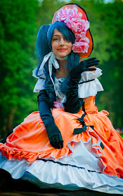
Every once in a while you stumble on a shot that works.  The young woman in today's image was just sitting in NYC's Central Park as we happened by.  She an several friends were there to portray characters from anime.  (see this companion post)  The big deal with today's image is that's it's a straight shot.  Maybe it was the makeup she wore, but her skin was that nice.  Maybe it was that she was sitting under the arms of a tree, but the lighting was that soft.  The colors of her dress and hat are as they were and she did have blue tint in her hair.  The fact that she was a very good looking young woman didn't hurt either.  The background was just as you see it (minus the vignette).  There were a couple things that had to be done to "finish" the image, but they were very minor.  To find out what they were, hit the "Read More".
Read more!