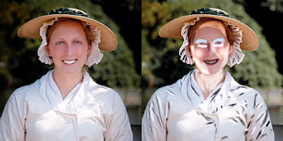
 What you see on the left side of today's image is a finished
product. What's on the right side is a
"work in progress" using about twenty Layers in Adobe Photoshop CS5. On the right I've gone back through the image
and made most of the Blend Modes Normal.
Except where you see the very black and very white shading marks. Those Layers had to be left in Overlay [or Soft
Light] Blend Mode to be able to "see through" the Layer to show how
it was done. The first thing to say is
that I didn't do all the touching up and then, at the end, changed all the
Blend Modes. The Blend Modes and the
Opacity of each little tweak were made as the adjustments were applied. I know I wouldn't, and I'm pretty sure no one
else would either, be able to "predict" what would happen if all the
Blend Modes and Opacity changes were made as a final step. Now, it's not like the young lady looked
terrible before I started to play with the image. I just felt opening things up a little and
creating better definition would "improve" the shot. To find out what all those marks mean, hit
the "Read More".
We'll start at the bottom and work our way up the
image. If you've ever read David Ziser's
blog, "Digital Pro Talk" you know that he goes into great detail
about putting shadows next to highlights.
That exactly what was done to the blouse and bonnet. Both are separate Layers, filled with 50%
grey and the Blend Mode switched to Overlay.
With the Layers in that mode the grey disappears. The Opacity of the Brush (B) used was reduced
to 10-15%. The Foreground and Background
colors were set to their default Black and White by tapping the "D"
key. To flip the colors while working,
the "X" key was tapped. This
shortcut makes for very quick working.
Where ever there was a fold in the fabric a shadow was produced. In order the put some emphasis on those tacks
and folds, the shadows were darkened and the brighter area next to the shadow
was lightened. This produces more
definition.
On her face you can see some very heavy handed colors around
the eyes and on the lips. If you click
on the image and enlarge it you'll see three different colors around the
eyes. Two above and one below. When these colors were applied they were done
at full Opacity. That allowed me to see
exactly where the color was being applied.
Above the eye the first swipe applied is a rosy pink color right along
the top of the eye. Above that is a
light blue swipe extending just a little bit further out than the pink. Both were done with a very soft Brush
(B). The objective is to lighten the eye
socket, making the eyes appear larger.
Under the eyes the light sand color took away the naturally darker
tone. On the "apple" of her
cheeks a fairly large, soft Brush (B) was used to put a single dab of another
shade of rose on each cheek. The lips
were brought out with the application of some serious red.
The "sculpting" of the face is another 50% grey
Layer with the Blend Mode at Overlay.
One side (the left as we face it) was lightened to a greater degree and
her neck was opened up so it wouldn't look like her head was put on a
stump. Under her hat, her forehead was
lightened slightly. Areas under hats are
notorious for being too deeply shaded.
One of the final touches was another Layer, made a Smart
Object, and put into a Multiply Blend Mode.
The young lady was selected using the Quick Selection Tool (W). The selection was feathered
(Select/Modify/Feather) to bring the selection inward. The selection was used to create a Layer Mask
(New Layer Mask icon at the bottom of the Layers Panel). This darkened the background and just a
little bit of the outline of the woman.
As can be seen, the difference between what's applied to the
image and what seen on the image are two very different things. As with just about all things in Photoshop, a
light touch often results in effective images.


0 comments:
Post a Comment