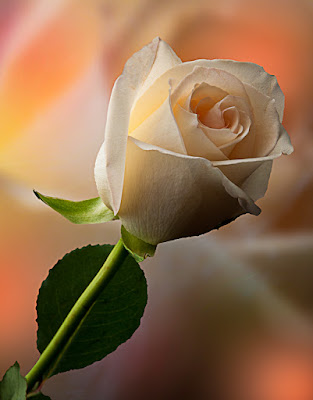
 Let's take a rather blah image and spike it up a little. The inspiration for today's image comes from
the work of Mike Calascibetta, an extremely talent photographer/Photoshop
wizard from Burbank California. You can
see a small sampling of his fine art photography here. Mike does a lot of flowers and they are true
works of art. It appears Mike puts Layers and Layers over a
base image and adds pops of color to create really interesting images. Today's image takes several Layers and plays
with Blend Modes and big fuzzy brushes to make things more interesting. One of the attributes of Mike's work is the
use of pastel colors. In his work it
adds such depth that you can literarily look into his images and sees things in
your imagination. Really outstanding
stuff. In today's image there is only
two different images. Two separate
Layers with the flower and one with a smoke pattern from burning incense. To find out what became of the second flower
Layer and how the smoke was used, hit the "Read More".
The base flower Layer was a shot taken using a large softbox
as a background. By exposing for the
flower, the background was blown out to completely white. Rather than using a white seamless roll of
paper and needing to light it, using the softbox serves a dual purpose. One, to be the background and two, to be the
light for the flower. There is no
foreground light. Having a large softbox
gave enough light to wrap around the flower.
The big deal, get your camera off any sort of mode that lets the camera
make the decisions. You definitely have
to be in Manual Mode if you're shooting directly into the path of the
light. You basically have to beat the
light into submission. If you're a
"light meter person" you could probably do some metering and figure
out what should be a close starting point for the exposure. Me, I take a SWAG (Scientific Wild Ass Guess),
take a look at what I've gotten and adjust.
Using Adobe Photoshop Lightroom 3 (or now 4 Beta) and shooting tethered
is the way to go for anything like this.
Trying to make decisions based on the 3" screen on the back of the
camera is almost useless. Seeing the
image on a 23" monitor is killer.
Adjustment to focus and exposure are nice, you can be as precise as you
wish and see exactly what you're doing.
If you're unsure, you can blow the image up immediately and be as
critical as you like. A great way to
shoot.
Okay, now we have the image we'll be playing with. The first thing that was done was to copy the
image to a new Layer. The Background
Layer was converted to a regular Layer by holding down the Alt key and Double
Clicking on the Layer in the Layers Panel.
On the lower Layer (the one that used to be the Background Layer) a Free
Transform (CTRL T) was used and the Image Scaled so the flower itself spilled completely
over the edges of the frame, making the flower the Background element. It was the converted to a Smart Object (right
click on the Layer and select Convert to Smart Object) so filters could be
applied. A large Gaussian Blur was put
on the Layer. Enough so the viewer could
barely make out the flower.
A Mask was made using the Quick Selection Tool (W) With the flower selected, click on the New
Layer Mask icon at the bottom of the Layers Panel. This makes a filled Mask, outlining the
flower. You can also make a selection of
the background and make that the basis of the Mask.
With the Mask in place it's time to adds a few pops of
color. The first thing was to bring in
an addition Layer under the Layer of the full image. This Layer was a shot of smoke from a burning
incense stick. It had been shot with a
black background, so the Blend Mode was changed to Screen to drop out the
blacks. On another new Layer a big (very
big) 100% soft brush (B) was used to just put a couple spots of Pastel
Magenta. Another Layer and spots of
Pastel Green. One more Layer and a
couple spots of Red. Each of the Layers
were given a Color Dodge Blend Mode change and clipped to the Smoke Layer. This had the effect of undefining the soft
spots of color and turning them into very soft, imprecise shapes of color. The Opacity of each Layer was adjusted
"to taste" to provide just "the right amount" of hue to
bring interest to the finished image.
This goes under the category of playing with an image. Experiment and have fun with your images.


0 comments:
Post a Comment