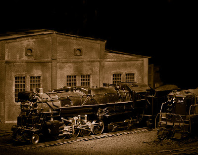
 Today's image was processed using Adobe Photoshop Lightroom
4 Beta. All I have to say is: what an
upgrade. The jump from version 2 to version
3 was big, but this is huge. What anyone
thought about the way the sliders worked (in just about all panels) in LR3 is
about to be blown away by the functionality of LR4. Instead of Recovery and Fill Light, we have
Highlight and Shadow. It's more than
just a name change. Where Recovery
worked if you pushed it far enough, Highlight gives some fine control over
what's going on in the highlights without affecting the mid-tones and shadows. Same thing with the Shadows Slider. Where Fill Light opened the shadows, but also
brightened the overall image, Shadows opens the darkest areas (that have
detail) and doesn't mess with anything higher.
Today's image was sort of a test bed for both of these functions. The "lighting" on today's image is
a flashlight. A friend and I were over
at the Danbury Railway Museum experimenting with some "light
painting". Playing with flashlights
to act as a light source is imprecise at best.
There's a lot of trial and error involved and having the light fill in
all the nooks and crannies is a trick at best.
So, what you end up with works right into LR4 Beta's lighting
adjustments. There's a lot I like about
LR4 and, being a Beta, a couple of things that still need work. To take a look at my thoughts, hit the
"Read More".
I've already spoken about a couple components of the Basic
Panel. The rest of the Basic Panel has
also been turbo charged. Clarity rocks,
Vibrance takes a lot longer to make colors go neon. It looks like Adobe went through each
function in the Basic Panel and said "put in finer control" on every
slider. I still don't think too highly
of Saturation, and if you're a frequent reader you know I like to saturate my
images. Guess they needed to leave something
for LR6.
A couple other of my favorite Panels and functions in the
Develop Module are the Details Panel, the Effects Panel (but still have a
gripe), and the HSL (specifically the "L"). The Sharpening in the Effects Panel looks to
produce better sharpening without creating halos. The Noise Reduction appears to be
unchanged. Good, but no upgrade. In the Effects Panel I use the Post Crop
Vignette on about 90% of all images produced.
The gripe is that it's fixed in position. I'd like to be able to grab a center control
point and move the position of the target to off center spots. Whenever I need an off center vignette I have
to go out to the Adjustment Brush and hand darken the area around the center of
interest. Being able to control the size
shape and hardness of the Post Crop Vignette and being able to move the radius
point would be great.
Love the improvements in the Print Module. The ability to tweak the brightness and
contrast to match your printers output to what you see on the screen is dynamite. No more guessing what the shift needs to be
to get the print to look like the screen.
The controls are "sticky", so once you dial in the numbers for
a particular paper you can pretty well set it and forget it. Only thing missing would be the ability to
save the setting as a preset. Haven't
seen where you can do that yet.
One thing that still needs work looks like choosing a font
for a custom Identity Plate in the Page Panel of the Print Module. I have a specific font I like to use either
on a "gallery" print or as an image marker of the printed area. Every time I went to change the font (to any
other font) and start typing, the font would bounce back to "Tahoma". I'm sure (pretty sure) this will be fixed
before the final version is set in stone.
All in all, I do believe the upgrade to LR4 from any previous
version will be worth the ticket price.
That's assuming the upgrade price will be the same as the past couple of
upgrades.


0 comments:
Post a Comment