Tuesday, July 31, 2012

Fighting With Photoshop CS6's Adaptive Wide Angle Filter


Okay, guess what?  The Adobe Photoshop CS6's Adaptive Wide Angle Filter (Filter/Adaptive Wide Angle) won.  What a shock!  Okay, maybe not so much.  It's new in CS6, I was playing with a pano and selected the Panorama option in the dropdown asking "what type of image are you working on".

Today's image is a five shot panorama.  The shots were taken vertically to get me the most of a very dramatic sky.  As is usual when shooting this type of pano, the wall in front was bowed,  It looked a lot like the landscape was smiling.  Made, what could be, a fairly serious landscape shot look rather comical.  The corn field at the crest of the hill appeared to be a crewcut hairstyle.  All that would have been needed was a couple of eyes to produce a landscape "smiley face".

The Fix:

Since the shot is made up of four images, CS6 couldn't figure out what (single) lens was used.  Once multiple shots are combined, CS6 drops the lens info from the meta data that goes along with a single shot.  Seems logical.  The computer can't keep track of if the combined image comes from a cohesive sets of shots (as in today's image) or if it's made from a combination of unrelated shots.  I chose to do the pano, as I have to live with that limitation.

It's a pano!  CS6's new Adaptive Wide Angle Filter has several choices when it wants information about what you're trying to do.  The dropdown is titled "Correction".  What you do is draw a line along the curve you'd like to straighten.  When click the dropdown and you see "Fisheye", "Perspective", "Panorama"  and "Full Spherical" to pick from.  Well I made a pano, so naturally I picked Panorama.  It turned the broad smile into a sly grin.  Not exactly what I was looked for.  That when the fighting started.  I tried anything I could think of.  I came to the conclusion that I just didn't get it.   I finally left it with its "sly grin" and thought I was asking too much of the Adaptive Wide Angle Filter (AWAF).

After a night's rest I thought I'd look at it again.  I'm a big fan of NAPP's Photoshop Guys.  One thing they all advocate is pushing buttons.  Sure, that's what it's "supposed to do" , but what happens if you try ....  What the heck, there's four choices and I'd been fighting with the one that seemed reasonable.  After all, I shot a pano and the AWAF had a panorama choice.  I couldn't "hurt" anything by pushing buttons.  I figured "it's not a Fisheye, it's a pano".  What's the worst that could happen if I selected Fisheye?  Make the grin back into another "big smile"?  Nope!  The wall instantly became straight as an arrow.  Just what I was fighting for. 

The "Morale":

If any version of Photoshop gives you choices, try them all.  You can't screw things up too bad.  You may get the effect you were trying for.  And, if nothing else, you'll learn a little more about Photoshop.
Read more!

Wednesday, July 25, 2012

Adding Drama To A Face Using Photoshop Curves


We had dinner with some friends last night (she's an excellent photographer and photoshopper) .  They're moving to Florida at the end of the week and it was our last time to get together.  During the course of dinner the subject of adding drama to a face came up and the fact that I routinely "enhance" a person's face using Scott Kelby's Curves Adjustment Layer "trick".  I've been playing with it since hearing SK explain it not too long ago.  She asked if I would let her in on Scott's secret.  It wound up too hard to explain just verbally, so I said I'd make today's post about it.   The easiest way I could come up to clearly show what was going on was to "cartoon" it.

Figure 1 is the little cartoon I made up in Adobe Photoshop CS6.  I'm a photographer, not a sketch artist, so don't laugh about my crude cartooning ability.  Hey, it's got two eyes, a nose and a mouth (sort of).  Think of it as a model with little to no makeup, flat lighting and a straight on shot.

Figure 2 shows the finished toning.  If you take a look at any of the shots with the Layer Panels showing you'll see that I copied both the shadows Layer and the highlight Layer.  In a real situation you wouldn't duplicate the Adjustment Layers.  I just had to do it so the highlighting and shading would be visible.  If you do it right (on a human) you won't see the changes unless you turn on and off the visibility of the Layer.  So, don't freak out about the copy Layers.  It's just so you can see what happened.

Figure 3 just proves that I did it in PSCS6.

Figures 4 through 7 is where the magic happens.  In Figure 4 we're looking at the Properties Panel for the Curves Adjustment Layer.  You can see that the Curve has been brought up very high in the highlights area.  This will give the overall image a really blown out look.  The Layer Mask is then Inverted (CTRL I [eye]) making it black and getting us back to a normal look to the image.  The "trick" is to use a small (5 or 6 pixel), hard (I was at 96%) brush and draw lines where ever the highlight needs to be emphasized.   In this case I went under the mouth, along the centerline of the nose, the cleft of the chin and above the eyes.  Since this is an Adjustment Layer of the original image you'll see variations based on the lightness of the shot.  I parts of the shot that are bright already the lines will look pretty faint.  In the highlights of darker areas of the image the lines will be pretty pronounced.  Because you're taking the cues from the images itself everything will match up well.

Figure 5 is just the opposite.  The Curve is pulled way down giving deep tones.  The same principle applies.  Anywhere you need to emphasize a shadow, put a line on it. 

Now here's "the secret".  Feather the Mask.  In CS6 you have a Properties Panel for every (I think it's every one of them) Adjustment Layer.  You can control either what you're adjusting and its Mask.  Click on the Mask icon and you have sliders for Density and Feathering.  Keeping an eye on your image, slide the Feather Slider until those lines are blurred enough so they become either shading or highlights.

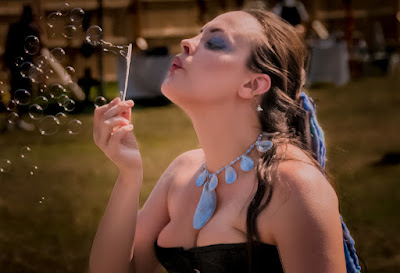
A few of the recent posts here have used this technique.  You can see it used in the post of the girl blowing bubbles, where it was used to define her chin and her cheekbone.  Others were in the 6/25 post and the 6/27 post putting emphasis on the uniforms
Read more!

Monday, July 23, 2012

Lightroom to Photoshop to Plug-Ins And Back (And Forth)


I decided to play with some Plug-ins, got half of what I was looking for, backed out, went to Adobe Photoshop CS6, played with a couple Alpha Channels , go more of what I was looking for and went round and round to come up with today's image.

I know, it's a run on sentence, but that's what working this image was like.  Let me take you through it.

I shot the image yesterday, thought it had something to it, so I played with it this morning.  I straightened and cropped it to taste in Adobe Photoshop Lightroom 4.  Tweaked the Color, the Clarity, the Vibrance and the Exposure.  I thought it might gain something, so I brought it into Nik's Color Efex Pro 4 (Photo/Edit in/Color Efex Pro 4).  Looked at a couple presets and combined a couple.  There were three used.  One was a detail enhancer, one said something about an early morning glow and I don't remember the third.  It gave me a little of what I wanted, but the grassy area and the sky were just too garish for my taste.  The barn and fences looked pretty interesting.  So, I clicked the "Do It" button and fled back to LR4 before I really screwed things up. 

Once back in LR4 I highlighted the original and the "Nik'd" copies and took them into Adobe Photoshop CS6 as Layers (Photo/Edit In/Open As Layers IN Photoshop).  Because they were based on the same cropped image I didn't have to worry about any misalignment. 

Using the Quick Selection Tool (W) I made Selections of the barn and silo, and the lower fence.  I then put a Layer Mask on the top Layer.  It happened to be the "Nik'd" Layer, but it really didn't matter which was the top Layer.  It would have just determined what I wanted the Mask to cover.  I filled the Mask with both Selections, leaving the structures converted and the grass and sky back at their natural state.

I took out the gold color on the barn sides and fences, leaving it only on the roof using a Hue/Saturation Adjustment Layer clipped to the "Nik'd" Layer.  From there it was back to LR4.

I used LR4 (you could just as easily use ACR) to darken the entire image by two stops using the Adjustment Brush.  I then went back and flipped the Brush from the Apply Mode to the Erase Mode and erased away everything the needed to be brought back to the exposure.  I applied a controlled vignette this way.

I did take one more trip into PSCS6 and created a New Layer.  With the Brush Tool (B) I used the Color Picker to get the gold tone from the roof of the barn.  I "painted" the "sun facing" surfaces of the cupolas and silo and then changed the Blend Mode to Color.
Read more!

Friday, July 20, 2012

Working With RAW Files In Photoshop CS6

I was over at a friend's studio the other day and as I got there she was working on one of her amazing images.  Great photographer, great post processor, she just comes up with images that blow me away.  Some are amazing in their simplicity, some in their attention to the fine details, some in content, others in concept, but always something that makes you say "WOW".  We were sitting around, flipping through some of her recent shoots when I stopped her and said a particular shot had some great potential.  She decided we should kick it around, tossing each of our ideas around to see what we could come up with.  That's when the fight started.  Here's this lovely woman and we almost came to a fist fight... over RAW file handling.  ???

We co-developed the image in Adobe Photoshop Lightroom 4 until we wanted to take it into Adobe Photoshop CS6.  The first thing she did to the modified, but still a RAW file was save it under another name.  The second thing was to make a copy of the Background Layer.  Then the verbal  fists began flying.  I asked what the heck was she doing.  Her reply was that she wanted to save the original file and she "always" worked on a copy.  Then she "always" made a copy of her Background Layer so she could get back to "ground zero" if she really made a hash of things.

We probably spent a half hour debating RAW files 101.  Whenever I do any one on one teaching I try to use a "guided discovery" style.  One of the first things you hear when you start using RAW files is that a RAW file (and I can't stress this enough) cannot be altered.  Short of tossing a grenade into your computer, a RAW file is a RAW file is a RAW file.  It's always going to be a RAW file.  In LR4 you can make nondestructive adjustments, but you have the ability to hit the Reset button and get back to the As Shot condition.  The RAW file is always there.

When you take a RAW file into CS6 (or any PS version that supports Raw files) the original RAW file stays put, if it's coming from LR4 (or any version of Lightroom) or from Adobe Bridge.  You can add Layers, Filters, Adjustment Layers, clip things to specific Layers, Liquefy parts of the image, turn it upside down, flip it horizontally and whatever other torture you'd like to apply to the image.  But (and this is the key) when you do a simple Save (not Save As) you wind up with another file sitting right next to the original RAW file. 

It goes back to the fact that a RAW file cannot be changed.  In my own workflow I bounce back and forth from LR4 to PSCS6 multiple times.  Every time I bring the latest iteration of what can best be done in LR4 into PSCS6 and Save it back to LR4 I get a new file.  I end up with 123.ABC.tif_Edit, Edit Edit, Edit Edit Edit, etc.  I saw a limit of three (Edit Edit Edit) in PSCS5, but haven't found a limit in PSCS6.  It just keeps going.

BTW:  Today's image IS NOT the photographer talked about in today's post.  It was just used to get your attention.  She was at a Renaissance Faire, hence the costume.


Read more!

Tuesday, July 17, 2012

Adding Interest With Multiple Images Using Photshop Blend Modes

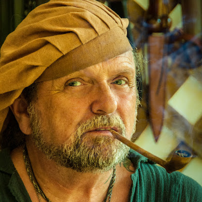
Where's a couple things "worked" in today's image that add to the interest.  The original shot was taken in a vendor's tent at a (reasonably) local renaissance fair.  In the US we seem to be fascinated with 16th century England and all that was (idyllically) going on during those days of yore.  It is interesting to see 21st century interpretations of what was a pretty miserable time to live.  The character in today's image is a leather smith at one of the fairs.  The sun was bright, basically insuring super contrasty  shots if attempted anywhere on the grounds.  In the shade (any shade) was the place for shooting.

A little "taming" of the tones in the image was done in Adobe Photoshop Lightroom 4.  Adding just a hint to "complete" the image was done in Adobe Photoshop CS6.  Neither application was a requirement to get similar results, but it was in my personal workflow.  The sun was blasting through the side wall of the tent and had to be reduced.  The other effect was that he was smoking a pipe, but the blazing sun made getting the smoke impossible.

Bring the bright wall down to a manageable tone was an LR4 job.  The new Auto Masking that goes along with the Adjustment Brush is simply great.  With the proper amount of size and feather dialed in it's possible to get very accurate lines between one object and the adjacent form.  The entire back wall was toned down after being selected with the Adjustment Brush.  Another Pin was placed on the wood slats and they were brought down more.  One more Pin for the knife and the background was much less distracting.  The eye is attracted to the lightest portion of an image.  Therefore it's important make sure the subject is the area a person's should be drawn to. 

The PS CS6 part of the finishing of this image was adding the smoke to the pipe.  I recommend everyone shot some smoke trails made by incense.  I have an entire folder of incense smoke.  The shots are all of white smoke on a black background.  I looked around through my "Smoke Folder) and found a trail that seemed to fit the subject matter.  The image was moved around until the smoke appeared to be coming from the pipe.  A simple Blend Mode change to Screen drops out the black background.  You might see the edge of the smoke image.  If that happens, throw a Layer Mask on the smoke Layer.  Take a very soft Brush (B), using black as a foreground color, and sweep around any sharp edges that show.  Bang, You're done.

"Normal" color adjustments were made to reflect the warm light due to the fabric of the tent.
Read more!

Monday, July 9, 2012

Add Emphasis Using One Of Photoshop's Oldest Tools


If you see a branch with its arm stretched out wide, with beautiful fall colored leaves on it, do I have to tell you it's from a tree?  We don't have to see the tree to know it's there.  All that's needed is the suggestion to help tell the story.  The same holds true for today's image.  You see the violin, the hand fingering the strings and a piece of the bow.  In your mind you know that the bow isn't magically floating there, gliding across the strings by some celestial force.  There's a hand somewhere below the edge of the image.

One of the most powerful, and least discussed tools in the Adobe Photoshop CS6 (and any number below it) is the Crop Tool (C).  It's a tool for cropping parts of an image, not just "trimming" the excess.  In today's image there was plenty of room in the original frame to include the top of the guy's head, the bottom of the bowl, and the belt he was using to hold his pants up.  The "big deal" is that none of that added to the story telling of the image.

One of the first "cool" images I made was for a holiday card to send to the relatives.  It was of our first born, a son.  It wasn't him standing tall (all 2' 6" of him at the time), showing him from head to foot.  It was his eyes.  Just a swath from the bridge of his nose to the brim of the hat he wore.  It told the complete story.

That was long before Photoshop was ever thought of.  But the "theory" is the same today as it was then.  Crop out whatever doesn't move the "story" of the image along.  Today's image never even got to Photoshop.  It was all done in Adobe Photoshop Lightroom 4 (or it could have been done, just as easily, in the ACR [Adobe Camera Raw] package that comes with Photoshop or Adobe Photoshop Elements.

I'm a big believer in ruthless cropping.  What more does today's image need to convey the story?  I don't think it needs any more.  Let me know if you think the image would be enhanced by having additional elements.  I'd like to know.
Read more!

Monday, July 2, 2012

Adobe Photoshop and Costco, What A Deal


I've fallen in love with the format I've been using in the past three of four posts.  Today's image is a 12" x 36" print that comes from Costco.  (A major "big box" warehouse chain in the US.)  A couple months ago a friend showed me a couple large pano prints.  They looked spectacular and I figured he'd spent some big bucks for the print.  I'd seen them on some of the online sites for about $16.00 each.  Well, when I get hold of something I typically like to push the boundaries and end up with dozens of examples of whatever it is I'm infatuated with at the moment.  $16.00 isn't bad if I were going to play with one image, but the thought of ending up with a stack of 12 x 36's at double digit prices each sort of made me pause.

I ran into the same friend a couple weeks ago and he said his prints had not been expensive.  In the discussion he mentioned he'd had them done at Costco.  I told him I'd never seen that offering on Costco's website and asked what was up.  He said he'd discovered it quite by accident.  It's only available (at this time) in store.  That does make it a little more of a hassle, but I've tried to time getting the prints to the times when we actually "needed" something there.

So what's the "deal"?  A 12" x 36" print at Costco is $4.99.  With tax it's a few cents above $5.00.  I can't print it at the gallery for anywhere near that low a cost.  It's more than $125.00 for the ink to feed the 13" wide printer.  Three feet of paper probably runs me $6.00 plus.  (A 32' roll goes for about $63.00.)  If the printer screws up or I don't like the look of the print I'd be multiplying the cost by however many times I want to run a sheet through the printer.  Yikes!  If Costco's printer throws up, or the print looks too magenta, I don't care.  With the printer hiccupping they'll reprint it automatically and I'll never even see the goof.  If the color's off, or the paper has a ding in it, or any other "store error", I can point it out to the folks running the machine and they'll try to fix whatever was wrong.    (Within reason I'm sure, but friends have said they have had things reprinted two and three times before they got the "perfect" print.)

A five dollar print is nice, but something to keep in mind is that a frame for a 12" x 36" print will set you back anywhere from $40.00 to a couple hundred dollars.  Something to keep in mind for the next show you'll be in.
Read more!