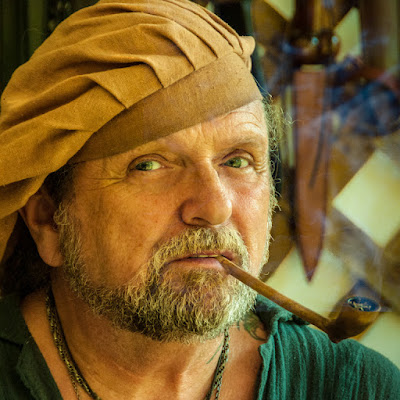
 Where's a couple things "worked" in today's image
that add to the interest. The original
shot was taken in a vendor's tent at a (reasonably) local renaissance
fair. In the US we seem to be fascinated
with 16th century England and all that was (idyllically) going on during those
days of yore. It is interesting to see
21st century interpretations of what was a pretty miserable time to live. The character in today's image is a leather
smith at one of the fairs. The sun was
bright, basically insuring super contrasty shots if attempted anywhere on the
grounds. In the shade (any shade) was
the place for shooting.
A little "taming" of the tones in the image was
done in Adobe Photoshop Lightroom 4.
Adding just a hint to "complete" the image was done in Adobe
Photoshop CS6. Neither application was a
requirement to get similar results, but it was in my personal workflow. The sun was blasting through the side wall of
the tent and had to be reduced. The
other effect was that he was smoking a pipe, but the blazing sun made getting
the smoke impossible.
Bring the bright wall down to a manageable tone was an LR4
job. The new Auto Masking that goes
along with the Adjustment Brush is simply great. With the proper amount of size and feather
dialed in it's possible to get very accurate lines between one object and the
adjacent form. The entire back wall was
toned down after being selected with the Adjustment Brush. Another Pin was placed on the wood slats and
they were brought down more. One more
Pin for the knife and the background was much less distracting. The eye is attracted to the lightest portion
of an image. Therefore it's important
make sure the subject is the area a person's should be drawn to.
The PS CS6 part of the finishing of this image was adding
the smoke to the pipe. I recommend
everyone shot some smoke trails made by incense. I have an entire folder of incense
smoke. The shots are all of white smoke
on a black background. I looked around
through my "Smoke Folder) and found a trail that seemed to fit the subject
matter. The image was moved around until
the smoke appeared to be coming from the pipe.
A simple Blend Mode change to Screen drops out the black
background. You might see the edge of
the smoke image. If that happens, throw
a Layer Mask on the smoke Layer. Take a
very soft Brush (B), using black as a foreground color, and sweep around any
sharp edges that show. Bang, You're
done.
"Normal" color adjustments were made to reflect the
warm light due to the fabric of the tent.


0 comments:
Post a Comment