 Little bit of a celebration before we get started. We've just pasted 400 posts here on The
Kayview Gallery. Not a bad
accomplishment (I think?). There's been
"about" 400 different images.
I say "about" because a couple posts had little sketchy kind
of things (like the other day) to explain how something was done and I think I updated the
processing of one image with new techniques.
So, like I said, "about" 400.
We were at Buttonwood Farm in Griswold Connecticut over the
weekend. They were having their annual
charity event and the place was mobbed.
Literally, you couldn't get near their ice cream stand and the line for
the rides through the fields must have been one hundred people long. The big "prize" for photographers
is the fields of in bloom sunflowers.
The farm is at the 90 degree intersection of two roads and the fields
occupy all four quadrants surrounding the crossing. They must switch off where they plant the
sunflowers, but there's always acres in blossom.
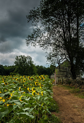
Today's image is at the edge of one of the fields. The sky was pretty dramatic, so I didn't have
to drop a sky into the composition. The
image did take a very short trip over to Adobe Photoshop CS6 to use Content
Aware Fill to take out a road sign on the far right. It ended up being an unnecessary excursion,
because the area with the sign got cropped out back over in Adobe Photoshop
Lightroom 4. That's where all "the
work" was done on today's image.
That means that (for me) it's a pretty darn straight image.
The first thing done was the Gradient Tool was used to bring
out the sky. It was stretched over the
entire length of the image from top to bottom.
Exposure was brought down a couple stops and Highlights reduced almost
to the max. Another round of the
Gradient too was used from the bottom to about three quarters up the
image. Here the Exposure and Shadows
were brought up to show off the plants. That
left the sunflowers themselves a little flat.
Most of the "work" on today's image is detail
work. The big areas that were hit with
the Adjustment Brush were the barns, the heads of the flowers, the lower left
piece of the sky and the road. The barns
were splashed with the brush (staying inside the lines), but the tree branch
looked dumb being brightened to the same degree as the barn. Getting in tight, any "adjustment"
was removed from the branch using the Erase Tool for the Adjustment Brush. It's often easier to make the
"mistake" and then go back and undo it. (Using the Erase Tool in LR4 or flipping the
color on the Mask in CS6.)
The flowers were the time consuming portion of the
work. The "working" monitor
was set to a 2:1 enlargement and the "control" monitor was set to an enlarged
view. Each petal (they were done as
groups) was increased in Exposure, Highlights, Clarity and Vibrance. (As an aside:
Without a Wacom Tablet it would have been much, much harder to control
any spillover.)
For the sky I thought I might "get away" without
changing the Adjustment Brush size and just painting over that small
piece. Nope! It looked really dumb. Like some celestial being had smeared the sky with his (her) finger. Had to back out and increase the size and
feather of the Brush. Then it worked
fine.
The last area of adjustment didn't use any of the typical
Adjustment Tools. Instead, the
Hue/Saturation/Luminance Panel was put into play. Using the Targeted Adjustment Tool (the
little meatball in the upper left) the Saturation was increased and the Luminance
reduced. Since the Targeted Tool was
used, LR4 did the math and figured out which colors had to be fiddled with and
made the proper adjustments.
Last step was to put a Post Crop Vignette on the image. Just 10% and closed the Midpoint in a
bit. That's it. That's pretty straight for one of my
images. Just one (unnecessary) trip over
to CS6. Everything else was done in LR4.


0 comments:
Post a Comment