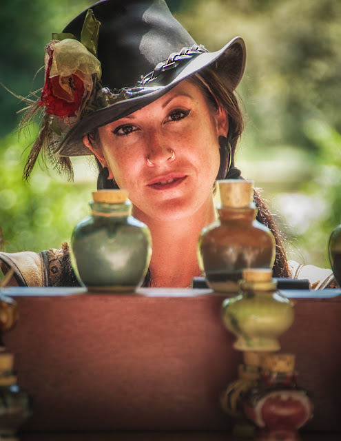
 We were running around the New York Renaissance Faire in
Tuxedo, NY over the weekend and had some challenging shot opportunities. Today's image is a good example of a tricky
lighting situation. Since we were just
at the Faire to have a nice summer afternoon we hadn't brought any reflectors,
speedlights or modifiers to try to tame the bright sunlight. I find it's always a good idea to ask
"the talent" for permission to shoot them. In fact, one of the performers, when asked
for his okay, said "sure, and thanks for asking". These people are there, being paid to
perform, sell and interact with the visitors.
I'm sure most (99%) are aware that part of the duty is being available
for people wondering around with cameras.
The young lady in today's image was most gracious. I asked and she offered to come around in
front of her stand to pose. I asked her
to stay in back so I could include her wares in the shot. She sold perfumes in interesting looking
bottles. To find out how the shot was
setup and what was done in Adobe Photoshop Lightroom 4 (LR4) and Adobe
Photoshop CS6 (CS6), hit the "Read More".
The first thing was the camera setup. I was using a Nikkor 18 - 200 mm F3.5 - 5.6
lens, set at F5.6, Aperture Priority Mode.
I knew, at the distance I was shooting, the Depth Of Field would be pretty
short giving a nice blurred background.
The foreground is also slightly soft, giving the impression of greater
sharpness on the face. I set both the Focus
Selector and the Meter Mode Selector on Single Point Mode. A higher end Nikon cameras, both Selector
knobs are right on the back of the camera, so setting them is no problem. I really didn't care if the background was
blown out (I was shooting through the covering of her stand) or if the
foreground was dark. The main point of
interest was to get a good focus and good meter reading on her face. As we walked up I had noticed she had several
sheets of white paper on the table of the stand. Bonus! With the bright sunlight coming over her
shoulder I knew I'd get a little up "Fill Light" bouncing off the
paper, off the stand and under her hat. (Nothing
but net.) So, the setup was about as
good as it could get.
It was all wine and roses and some work had to be done in
post processing. It started out in
LR4. There was still about a 3/4 to one
stop difference between the bright parts of the face and the deep shadow under
the hat. The LR4 Adjustment Brush made
short work of matching up the tones. I
didn't want to bring it to a one to one fix.
That would be unnatural. A third
to half stop difference gave the impression that the hat was casting a shadow
without blocking up the upper portion of the face.
General sharpening was done using LR4's Clarity Slider. Detail sharpening was done in CS6 using the
Sharpen Tool. The braid of the hat, the flower
on the hat, the rings in the nostrils,
and her lips were all hit with varying levels of sharpening on a separate
Layer, adjusting the Brush Opacity. Her
face was sculpted a little using Dark and Light Curves Adjustment Layers.
The finishing was done back
over in LR4. A gradient was applied to
the bottom and a vignette over the entire image.


0 comments:
Post a Comment